A New Look & Feel
This site was first designed in early 2008, it was time to give it a fresh look.
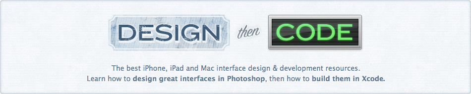
Design
I went through a lot of revisions to this design, I think the header is on its 10th fully-polished and implemented version. The goal with this design was to present a more cohesive look and have a more traditional layout enabling me to have a real sidebar. It still has a desaturated blue as its base color but I'm using semi-transparent colors and borders for various sections to liven it up a bit. The font in the header is Bello Pro and the main logo was made in Photoshop, however the faint text that fades in around the logo is native HTML text set using Bello Pro using Typekit.
One trend I really like right now is having various sections of your site have a totally custom design so I thought it'd be neat to see what I could put together. If you check out the new About or Contact pages you'll see they have some custom design elements that don't exist anywhere else on the site. I don't have the time or desire to do custom designs for each blog entry like some other folks, but I am working on new Portfolio and Services pages that follow with this motif. Those will be coming soon.
Code
This site now uses HTML5, but what does that mean? Well, it means a lot of things, mainly that I'm now using brand new HTML5 semantic tags like header, section, article and footer to give better structure to the outline of this site. After reading dozens of articles on semantic structuring of tags, I'm fairly happy with how things are nested and the semantic goodness that lies within. The new tags in HTML5 are still very new so there's bound to be some shifting so if you have any thoughts on how I can improve the structuring of my HTML, please give me a shout.
I also have a brand new Twitter sidebar. This is different from the last one because it has a little profile box on the top and, more importantly, only shows my full tweets, not any replies. I reply to people all day long so showing those is dumb, I wanted a system to show the meat of my Twitter stream. Unfortunately, this is actually a bit tricky so I ended up creating a list with my Twitter username on it and then using a widget to display this list. The default widget comes prepackaged with a bunch of CSS so I had to jump through some hoops to restyle it. I've also added Twitter @anywhere hovercards to the site which adds profile information to usernames you mention. With a bit of hacking I got these to show up in the sidebar widget as well.
I tested the site in the latest versions of Safari and Firefox and it looks good, which is all I care about.
Ads
I'm now part of Fusion Ads! You'll see their beautiful ads atop the right column on many pages of the site. I've found some very cool sites and iPhone apps through Fusion Ads on other people's sites so I wanted to give them a try. I'm psyched that they've included me in their network, thanks guys!
What's Missing
I wanted to get this new design out as soon as I could and that meant cutting features for the 1.0 release. Right now, comments are disabled across the site (and pre-existing comments are not displayed). I'm reworking the commenting system and plan to integrate some Twitter API features so that you can "reply" to posts and some other neat things, so that will be coming back soon. Other missing things: my portfolio, a new services page, a nicer way to browse archives and redesigned Beak & Digital Post sub-sites. Those are all coming soon as well.
Thank You
I've been posting little screenshots and snippets of the site to Twitter and Dribbble for a few weeks and have gotten some great feedback. Thanks for taking the time out to give it a look and tell me what you think! If you've got any more feedback please don't hesitate to hit me up on Twitter (@flyosity) or via my contact page.