One of the most anticipated web-based applications of this past year was the debut of 280 Slides, a presentation application whose interface matches or rivals Apple Keynote. Beyond it having a beautiful (and desktop-like) interface was the architecture that powered the app. It wasn't written like other web applications, it was written using Cappuccino, an open source application framework that marries the elegance and sophistication of Cocoa programming using Objective-C with Javascript allowing Cocoa programmers to create web-based applications the same way they'd write normal desktop apps.
The 280 Slides interface isn't like normal web applications — it's designed to look like a desktop-class Mac application with typical Mac-like interface stylings, and more specifically, it was designed so that Keynote users would feel at home.
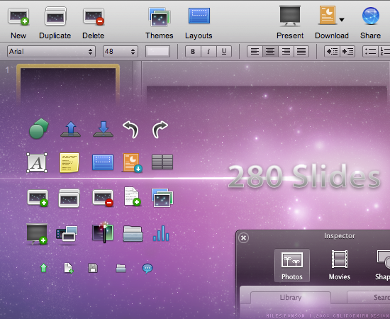
The extremely talented Miles Ponson designed the 280 Slides application icon as well as the entire user interface and was kind enough to answer a few questions I had regarding his work with the 280 North team.
Me: So Miles, how'd you get hooked up with the 280 North guys?
Miles: Well, almost a year ago, I got an email from John Hering about a UI project to design for developers who worked with the iPhone team. I didn't know a lot until I had a video conference with Francisco and Ross. and then I got really interested in designing the User Interface for 280Slides.
Me: For the application's interface, it sounds like it was important to make it look as "Mac-like" as possible, as if a Mac application suddenly landed in your browser. Have you worked on the UI for Mac software in the past? How did the process of designing a browser-based "desktop" application work compared to normal web-based design projects?
Miles: I started to design icons for desktop customization a few years ago, just for fun, and I really loved it. I enjoyed drawing my ideas and then share the shiny icon with everyone to enjoy. And then I started working more seriously for software developers, and open-source such as OpenOffice project.
I did not find any huge difference between a desktop and web-based app, simply because 280Slides is built on a powerful foundation, Cappuccino, that makes 280Slides amazingly behave and work the same way as a desktop class Mac application and therefore, makes the task of designing UI elements natural, as if it would be for a regular app. It worked the same for me. The toolbar icons are in 32 pixels, the buttons in 3 elements, etc... It's just great!
Me: When it came time to integrate it into the application, what was that like? Did you hand over PNGs or any HTML/CSS? How did you have to slice up the various UI widgets, if at all?
Miles: When the time has come to integrate everything, you have to slice the pizza, the buttons must be in 3 elements, left corner, right corner and 1 pixel wide middle, the HUD window was in 7 elements, the top-left, top-right, bottom-left, bottom-right corners, bottom-center and top center part, and body middle part. When it comes to slice all the elements, I got some sweat on the forehead and a load of tiny 1x30 windows open everywhere in Photoshop. The hardest is to keep track of all the elements, put them in assigned folders and make sure that you did not forgot a piece of the puzzle, hehe. I did not hand any kind of code over though. The 280 North team made an incredible job at coding everything.
Me: Thanks Miles!
(See more of Miles' work at Californian Design or follow him on Twitter.)
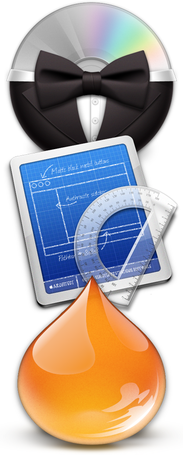 Laurent Baumann is a brilliantly talented designer and is very well-known within the Mac UI customization community for his icon sets and work on Bowtie among many other projects. He's currently working on a next generation Mac theming app Architect and its soon-to-be-unveiled partner app, Façade. I caught up with him over email to pick his brain!
Me: Hey Laurent, great to be chatting with you! I've gotten to know your brilliant icon and UI design work over the past year but still don't know as much about you personally. Where are you currently living? How did your interest in design — especially icon design — get started?
Laurent: Thanks for the chat Mike, I'm really glad you like my work! I'm currently living in Cannes, in the south of France. I had interest in drawing and design since as far as I can remember. After 4 studious years at a design school in Aix-en-Provence, I started as a freelance designer in print and web design. To be honest, it didn't work out very well, and I often had some free time, so I started designing for myself. My interest in icon design really started when I switched from OS9 to OSX. I had the idea of making a full system replacement set based on the bezel design (I think you can still find them somewhere on InterfaceLift). And since I didn't know how to create an icon, I started to search for some good advices, and found MacThemes and its early small community. I met some of the best icon designers here, and I learnt a lot from them. After some time and releases, I figured out that icon design was just something I loved, was not that bad at, and was comfortable with.
Me: You've designed some fantastic application icons as well as quite a few free system replacement sets. What would be a typical process for you when starting out a new icon design project? What are the differences between designing an icon set (toolbar or system replacement) versus an application icon?
Laurent: When I'm designing a free system replacement set, I just obey my passion for design. I'm haunted by ideas until I can't help it, and start sketching the first drafts. It's also a good way to try new stuff, to challenge myself (with a totally black and white system replacement for example). It usually takes me months to finish an icon set. For an application icon, it's different of course. In my opinion, an application icon is at the crossroad of logo design and illustration. An application icon concept, just like a logo, has to be understood in 2 seconds at most, while still providing enough details to be eye-catching even after a long period of time. I guess I would say that I'm less available when I'm designing an application icon, but in fact it really depends on the client ;-)
Me: Bowtie is a huge hit with the Mac design and GUI customization community right now, especially over at MacThemes where it debuted. How did the idea for the project start? Who else is working on it with you?
Laurent: I started working with Matt Patenaude on his application TuneConnect, then did some work for a small utility called Colors. At some point, I felt the need to rethink the whole iTunes desktop controller concept, because I wasn't satisfied with desktop coverart/controller in every software I worked on (mainly CoverSutra and Cover Stream). So I came up with a mockup and asked Matt if he would like to help me concretize it. Each time we were talking, I was changing the mockup, without being able to nail the controller of my dreams. I guess he got tired of me, so to speak, when he offered me to implement a fully themable html+css+js controller, so I could play with it by myself, try to implement some ideas (and letting him work on Façade and Architect, *laughing*). And it turned out that I started making tons of themes for it, exploring paths none of the other iTunes controllers did. We then found a fun name for the app, along with a playful icon, trying to stay in line with with the simple concept we both love now, and keep it that way.
Me: You've worked with Pieter Omvlee to define DrawIt's updated interface, and then designed the icon for the application *with* the drawing program itself. I've been playing with DrawIt for a few weeks and find it a lot of fun to use. How did your design process change when using DrawIt instead of your usual arsenal?
Laurent: DrawIt uses a radically different approach than my usual "arsenal", which is Photoshop in fact. I think the beauty of DrawIt lies in the simplicity of the UI, along with the "coherent" workflow you can have (objects creation on left, object position on center, and objects effects on right). When I was working in Photoshop, I often had to duplicate my layers multiple times, to achieve multiple inner-shadows for example. And effects like radial-blurs were so annoying to handle that I avoided them. In DrawIt, the CoreImage engine make everything live and non-destructive, along with very "layers saving". Last, but not least, I'm a Cocoa applications lover, and DrawIt blends deeply with my system than my usual arsenal…
Me: There's a lot of buzz about the two Mac OS customization apps you're working on, Architect and Façade. GUI customization fans have been waiting for these two programs for awhile and are really excited that they'll usher in a new wave of Mac OS customization and theming. I downloaded the beta of Architect and it looks awesome -- how's work on Façade coming? Could you explain how Architect and Façade work, and how they'll be working together?
Laurent: Architect is the "free, developer" part of the couple. It allows you to easily create a theme by drag and dropping your custom-made elements in place of system ones. A validation system insure that the format and the size are valid. A live preview system, called LiveAqua, allows you to quickly check how your elements go together. When your theme is done, you can release it as a bundle, the Façade theme format. Façade is the other side of the couple, intended for people who will apply themes. See Façade as an iPhoto, specialized for themes. It perform all the necessary backups in order to make switching system resources very safe, along with some more features I can't talk about right now :)
Me: You've designed the interfaces for applications like DrawIt, Architect, and a bunch more. What is your process like for designing a program's interface, and when the project is complete, what are the deliverables you send over? If you use Interface Builder, how does that fit into your normal design process?
Laurent: Designing a user interface is really different than designing icons. There is no "artistic" part in this job. This is more about laying out a good interface, and to constantly see it as it was the first time you were discovering it, trying to always make it simple and welcoming for the first time the user will see it. I'm very curious about other software's user interface, and I'm trying a lot of them, to keep up-to-date with (numerous) innovations in this domain. I'm not using Interface Builder, because switching nib/xib in projects is not a easy task (and you would have to link every actions and outlet again from the "early working UI" the developer often start before I ship him the final UI). The biggest base of a mockup is usually a collage of Apple apps screenshots, in order to look and feel like a regular OSX UI, then I'm drawing the custom elements, like I would do for an icon. I'm delivering complete mockups of every views of the software, as pictures. If the gradients and such are not drawn in code, I also need to slice every needed tiles and caps.
Me: Thanks, Laurent!