Miles Ponson Talks About Designing The 280 Slides User Interface
One of the most anticipated web-based applications of this past year was the debut of 280 Slides, a presentation application whose interface matches or rivals Apple Keynote. Beyond it having a beautiful (and desktop-like) interface was the architecture that powered the app. It wasn't written like other web applications, it was written using Cappuccino, an open source application framework that marries the elegance and sophistication of Cocoa programming using Objective-C with Javascript allowing Cocoa programmers to create web-based applications the same way they'd write normal desktop apps.
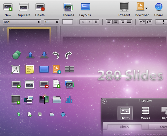
The 280 Slides interface isn't like normal web applications — it's designed to look like a desktop-class Mac application with typical Mac-like interface stylings, and more specifically, it was designed so that Keynote users would feel at home.
The extremely talented Miles Ponson designed the 280 Slides application icon as well as the entire user interface and was kind enough to answer a few questions I had regarding his work with the 280 North team.
Me: So Miles, how'd you get hooked up with the 280 North guys?
Miles: Well, almost a year ago, I got an email from John Hering about a UI project to design for developers who worked with the iPhone team. I didn't know a lot until I had a video conference with Francisco and Ross. and then I got really interested in designing the User Interface for 280Slides.
Me: For the application's interface, it sounds like it was important to make it look as "Mac-like" as possible, as if a Mac application suddenly landed in your browser. Have you worked on the UI for Mac software in the past? How did the process of designing a browser-based "desktop" application work compared to normal web-based design projects?
Miles: I started to design icons for desktop customization a few years ago, just for fun, and I really loved it. I enjoyed drawing my ideas and then share the shiny icon with everyone to enjoy. And then I started working more seriously for software developers, and open-source such as OpenOffice project.
I did not find any huge difference between a desktop and web-based app, simply because 280Slides is built on a powerful foundation, Cappuccino, that makes 280Slides amazingly behave and work the same way as a desktop class Mac application and therefore, makes the task of designing UI elements natural, as if it would be for a regular app. It worked the same for me. The toolbar icons are in 32 pixels, the buttons in 3 elements, etc... It's just great!
Me: When it came time to integrate it into the application, what was that like? Did you hand over PNGs or any HTML/CSS? How did you have to slice up the various UI widgets, if at all?
Miles: When the time has come to integrate everything, you have to slice the pizza, the buttons must be in 3 elements, left corner, right corner and 1 pixel wide middle, the HUD window was in 7 elements, the top-left, top-right, bottom-left, bottom-right corners, bottom-center and top center part, and body middle part. When it comes to slice all the elements, I got some sweat on the forehead and a load of tiny 1x30 windows open everywhere in Photoshop. The hardest is to keep track of all the elements, put them in assigned folders and make sure that you did not forgot a piece of the puzzle, hehe. I did not hand any kind of code over though. The 280 North team made an incredible job at coding everything.
Me: Thanks Miles!
(See more of Miles' work at Californian Design or follow him on Twitter.)