How To Draw The Billings Application Icon
When I first started designing for the web (don't ask how long ago that was!) I was constantly finding websites that had a particular "look" that I didn't know how to reproduce. When you're a flat-out beginner you don't have anything in your mental repertoire to pull from — techniques and concepts that you can do blindfolded. Now that I'm working harder on icon design, I've found that the easiest way for me to get experience and learn is to try and reproduce the fantastic work that others have put together. It's only for learning, however, I absolutely do not advocate taking anyone's creative work and passing it off as your own.
 Now that I've got that out of the way, let's take a crack at doing our own version of the brilliant Billings application icon (designed by the extremely talented Cian Walsh) in Photoshop.
Step 1: Draw the basic shape
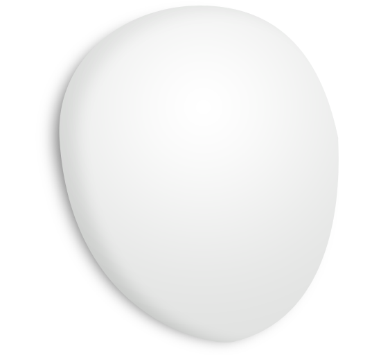
The Billings icon is meant to look like some sort of futuristic stopwatch (and perhaps EVE from WALL•E!) so the shape is essentially a stretched out circle. To get this shape, I grabbed the Ellipse Tool and drew a circle that approximated the dimensions of the top half of the stopwatch.
The full shape isn't a circle, so we've got some work to do to make it look how we want. Grab the Direct Selection Tool. Click directly on the object's path and drag the bottom point of the circle down to where the bottom point of our stopwatch object will end up being. This will warp the circle, but not to worry, you can reshape it by grabbing directly on the curve and moving it to where you want it to be. Manipulating the path's curves will force the bezier points on either end of the curve to adjust themselves to fit your adjustment. Tweak the individual bezier curve handles in order to fine-tune your shape, but remember to leave the overall shape smooth with no jagged points. I've got my stopwatch shape colored #e1e2e1 as my base color for the object.

Step 2: Draw the shadow
I like to work on the shadow early in the design process as it gets my mind into 3D mode faster, letting me better visualize the lighting of the object.
I find it easier to create drop shadows on icons via separate layers rather than Layer Styles because when trying to emulate perspective, the shadow's size needs to look like it's behind the object and therefore visually smaller to your eye. Feel free to use normal Layer Styles to create the drop shadow if you'd like.
Duplicate the layer you were just working on and move the duplicate behind your actual stopwatch layer. Next, give it a black fill and resize it down a little bit — proportionally — using the top-right handle. Rasterize the layer and give it a Guassian Blur enough to start making it look like a nice shadow. I also gave my shadow a Motion Blur from left to right to spread it out a bit more. Here's what we've got so far

Step 3: Initial shading on the base object
The shape we're drawing has some complex lighting so it can't be taken care of with just one Layer Style, it'll take a few layers overlapped on top of each other to finish the shading. In this step, we'll be roughing out the initial shading with a Gradient Overlay and an Inner Shadow.
The Gradient Overlay has Blend Mode: Normal, Opacity: 100%, Gradient: #fff->transparent, Style: Radial, Angle: -65°, and Scale: 117%. For radial gradients, the angle changes the size of the radial gradient. To get the placement of the gradient exactly where I want, while I was working on the Gradient Overlay I just grabbed and moved the gradient right on the object itself while the dialog box was still open.
The Inner Shadow has Blend Mode: Overlay #000, Opacity: 100%, Angle: 164°, Distance: 26px, Choke: 9%, Size: 24px. Just like with the Gradient Overlay, to get the perfect placement I grabbed and moved the shadow myself. This was important because to duplicate the shading exactly, there should be no shadow on nearly the entire right side of the object.
There's a lot more work left to be done, but here's where we are so far:
Step 4: Onion-skinning your way to realism
Most of the time your object will need additional shading details that just can't be created with a single group of Layer Styles — you'll need to layer a bunch of effects on top of each other to make it look how you want. Here's what a typical process is like:
- Duplicate your original layer, name it something recognizable.
- Drop your Fill to 0% if it's not there already. You want your effects to layer up and not block-out the original layer.
- Add new Layer Styles and adjust your Blend Mode to accomplish the look you want.
- To build up additional effects, start back at 1, rinse and repeat
Why is this necessary? Because Photoshop doesn't allow you to have multiple versions of the same Layer Effect on a layer. That means if you want an inner stroke, and outer stroke, and a center-aligned stroke on the same layer, you're out of luck. Multiple inner shadows? Sorry, no can do. You can accomplish a build-up of the same effect via this onion-skinning technique, but keep in mind if you ever have to change your initial shape you'll have to tweak all your duplicated layers as well.
I've got 3 duplicate layers on top, each with 0% Fill and a series of Layer Effects applied. Here's the list of layers and their effects in the order they're shown in Photoshop:
- Inner Shadow: giving a bit more depth
- Stroke: a white stroke to give the bottom corner of the stopwatch a small bevel
- Gradient Overlay & Inner Glow: the gradient overlay is a transparent -> white linear gradient from left to right, and a thin white inner glow around the entire object.

Step 5: Drawing the face of the stopwatch
Compared to the body of the stopwatch and all its shading, the face is much easier technically. It's comprised of only a few layers:
- Dark blue dial — an ellipse that's been tweaked for perspective, it has Radial Gradient for the center highlight, an Inner Shadow for the top left dark area, a Stroke for the thick blue border, and a Drop Shadow of white at the top.
- Minute/hour markers — just a bunch of circles drawn with the object tool in a circular pattern around the dial. Each has an Outer Glow applied.
- The time wedge — this was drawn with the Pen Tool and has a Gradient Overlay and Inner Shadow.
- The sheen — I duplicated the blue dial, shrunk it a bit, applied a Gradient Overlay, then chopped the bottom part off with a circular cut.

Finished!
There are some small tweaks to be made like darkening up certain areas of the icon for enhanced contrast, and adding the stopwatch button at the top right, but I think this is a good place to leave off. Some quick tips:
- If you're designing an icon for multiple resolutions, it's a good idea to stay vector as long as possible for easy scaling. I usually keep my layers as editable vector shapes with Layer Effects applied, and only rasterize if absolutely necessary. Also, if I rasterize a vector shape, I like to keep an original vector version around (hidden) if I need it later.
- Use the "onion-skinning" technique to get a build-up of multiple effects that can't be done in one layer style. Multiple inner shadows, multiple strokes & gradients are crucial when designing icons for maximum realism.
And that's it for now!