Great product design involves thinking about what features to prioritize, planning the user flow from screen to screen, getting user feedback and lots more, but at the end of the day, someone is going to be in Photoshop pushing pixels. The final visual design of a digital interface isn't going to design itself, and when a designer is crafting the look and feel, here are some elements they're typically designing:
Buttons
Panels
Windows
Profile Pictures
Icons
If you really think about it, most interfaces (especially for iOS apps) use tons of rounded rectangles in different shapes and sizes. Long and skinny ones with lots of shine. Squarer, flatter ones with some texture. Smaller, slightly inset ones with photos inside. The list just keeps on going. I actually joke around with friends that my main job is making rounded rectangles look great, so I thought it was time to show off some common techniques.
Drawing Them
It's important to keep your elements in Photoshop in vector format as long as you can because they can be scaled and re-styled easily. To draw a rounded rectangle, I use (gasp!) the Rounded Rectangle Tool with Snap To Pixels turned on. This is incredibly important or the edges of your shape will lie on a half-pixel and look blurry. There are some other ways to draw rounded rectangles in Photoshop (which Marc Edwards has conveniently outlined) but I typically stay with the vector shape tool because it's easy.
If the edges of your shape aren't sharp, then strokes/gradients/highlights/shadows you add later won't be perfect.
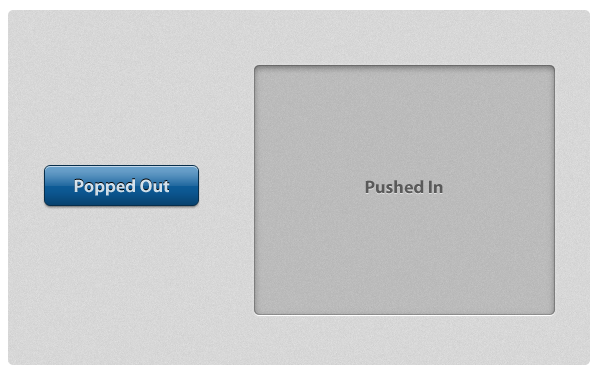
Up or Down?
If your goal is to craft subtle and realistic user interfaces that look and feel like real world surfaces, you'll be making a choice: is this element popping off the screen (convex) or indented into the screen (concave)? Buttons are convex whereas large panels containing text and other elements are typically concave.
On the left is a convex button that is designed to look like it's bulging off the screen. It appears bulged out because it's made to appear just like a convex object would appear in real life if it had 90°, top-down lighting. That means that 1) the light catches the top of the object and adds a lighter stripe of highlight, 2) as the bottom bends back down towards the screen, the light is blocked and it gets darker (light-to-dark gradient), and 3) it casts a very subtle shadow, indicating that it's sitting on top of the surface. This specific combination of highlights, gradients and shadows is the most basic way to make a rounded rectangle appear bulged out and convex.
On the right is a larger panel that is designed to look inset into the screen. The fill color is a mostly-transparent black, it has some inner shadows, and then a thin white drop shadow at the bottom. If we analyze this using the same lighting conditions as the previous example, it's made to look sunken in because 1) the edges or lips of the shape are at the surface and cast an inner shadow inside (these edges block light like an awning off a building blocks the rain, causing a shadow) and 2) as the bottom edge of the shape comes back up to meet the surface, the light catches that lip and causes an edge highlight.
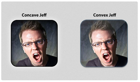
Most iPhone apps that display profile images have them look slightly sunken into the surface or popped out and semi-glossy. This is achieved with mainly the same techniques from above, but for the glossy one I added a diagonal gloss line (a white-to-transparent gradient cut into a triangle) as a separate layer.
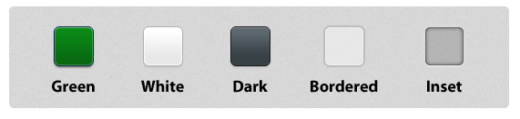
Although there are distinct elements common in most convex-or-concave elements, there's no special formula for how to accomplish these effects in Photoshop. I typically tweak size and opacity sliders on Inner Glow, Inner Shadow, Stroke and Drop Shadow layer styles until things look good. Other people are Bevel & Emboss specialists. Here are some more examples of rounded rectangles styled in some different (but reusable!) ways.
These are just some of the myriad ways you can style and use rounded rectangles in your interfaces. If you really want to see some creative designs, check out some icon designs on Dribbble. All it takes is some imagination and experimentation, and you can use gorgeous rounded rectangle designs throughout your interface.
I'm great at starting things, not so great at finishing them. I get really excited about something, work on it intently for weeks or a month or two, then the next cool project catches my eye and I shift over to that leaving the old project to sit forever unfinished.
Near the end of last summer I had an idea of what I could do with these various unfinished projects: turn them into in-depth tutorials. So many friends of mine are designers who have never programmed before, or developers who never learned iPhone development, so the least I could do is re-package these forgotten projects (and new ones!) into something that might teach others what I've learned about iPhone UI design and development.
Design Then Code will be the site where these tutorials are published. If you go there now you can register to be notified when the first set of tutorials are available.
Design, Development or Both
Each tutorial has two parts: design and development. The design half discusses how to create a particular app's user interface in Photoshop with all steps explained along the way including lots of screenshots. It includes the PSD file as well. The development half discusses how to execute that design in code. This half includes the Xcode project.
I imagine that current iPhone UI designers would only want the development half, whereas iPhone developers would want the design half. And many others might want to read the entire thing. That's why I split them in two instead of making each one a monolithic guide.
I don't go through every screen and every feature of these fictitious apps. What I discuss is more like a fully functional interface prototype for a single screen. Each tutorial includes high-fidelity design instruction coupled with the UI code to make the interface real for a part of an app, usually the main screen. I think that coding custom iOS app interfaces by hand is an extremely important skill, and I want to teach people what I've learned about Cocoa user interface development.
Here's a preview of the first two tutorials. The first is a futuristic music production app for iPad, the second is a retro, western-themed design app for iPhone.
Building iOS Apps From Scratch
While working on these tutorials, I realized that if someone is starting with no knowledge of Objective-C or the Cocoa frameworks they might have some trouble getting up and running. To help teach people the fundamentals of iOS development I wrote an e-book called Building iOS Apps From Scratch and will be providing that for free so people can learn the basics of Objective-C and Cocoa. If you signup at Design Then Code you'll get instant access to an early (but complete) version of this guide. The final version will launch at the same time as the main site.
Look for the full site and the first set of tutorials soon!
One of the challenges of creating a Twitter app for Mac is exactly how to build the timeline interface. Not the design, although that's very challenging as well, but the implementation of the timeline since it's very important to the overall stability of your app. Beak used a Webview because when I built it I didn't know much about AppKit or custom interface drawing. It's good for when you're just starting out, but if you really want to build great apps, you're going to eventually need to learn how to draw things natively.
Earlier this year I started work on a totally native implementation of Beak and the timeline code was perplexing. I played around with using an NSTableView (NSCells suck), an NSCollectionView (uses too much memory to have all tweet views in the timeline at once, also, inflexible), a custom NSScrollView (built like UIKit's UITableView with reusable views, this was the best solution), but in the end the most interesting part was drawing the individual tweets.
Drawing plain text with the same style throughout isn't that tricky. Drawing an NSAttributedString with some custom styles isn't that tricky either. The tricky part is that there are various interesting parts of a tweet's text (links, hashtags, usernames) and they all need custom styles and the ability for the user to click on them to initiate an action.
Step 1: Initial Paragraph Style
The content within our NSTextView is an NSAttributedString. What's an attributed string? It's actually a very simple concept: it's a string with some key-value pairs attached to parts of the string. These key-value pairs could be anything, but if you're adding styles, the key has to be one of a variety of pre-defined values that AppKit provides. For example, say a string has three words in it and you want each word to be a different color. You could set a color for the special key of NSForegroundColorAttributeName for each word and then you're golden, it'll be drawn with three different colors. There are a number of these stylistic attributes and a full list can be found here.
You can have more than one attribute defined for a particular word or range of characters. By default, we're going to set a number of styles for the entire range of the status string. These include a paragraph style (line height, spacing, text alignment), a text shadow to make the text appear inset on the gray background, a color, font size and more.
We're looking for links, usernames and hashtags, so the best and most customizable way to do this is to use regular expressions to parse through the string and pluck them out.
I used RegexKitLite and the libicucore framework to provide the backing for the regular expression code, and then wrote the following methods to return an NSArray holding strings that matched the expression.
These regular expressions aren't as great as they would need to be to ship, but they do the job for the purposes of this tutorial. There are better regular expressions out there for matching URLs in strings, and if you find one, make sure to adhere to the strict escaping rules outlined in the RegexKitLite documentation.
Step 3: Do Something With The Matched Strings
We have arrays holding the interesting bits of our tweet status string, so what do we do now? I iterated across each array, found the character range where the string exists, then added custom attributes to the NSAttributedString at that exact position to style it differently.
for (NSString *linkMatchedString in linkMatches) {
    NSRange range = [statusString rangeOfString:linkMatchedString];
    if( range.location != NSNotFound ) {
        // Add custom attribute of LinkMatch to indicate where our URLs are found.
        // Could be blue or any other color.
        NSDictionary *linkAttr = [[NSDictionary alloc] initWithObjectsAndKeys:
          [NSCursor pointingHandCursor], NSCursorAttributeName,
          [NSColor blueColor], NSForegroundColorAttributeName,
          [NSFont boldSystemFontOfSize:14.0], NSFontAttributeName,
          linkMatchedString, @"LinkMatch", nil];

        [attributedStatusString addAttributes:linkAttr range:range];
        [linkAttr release];
    }
}
This is all pretty normal except for the final attribute I add for the custom key "LinkMatch". Here, I attach the actual matched string as the object attached to the "LinkMatch" key. Now, our attributes are not only storing style information for this link, they're also holding the URL itself. This will come in handy in a bit.
I also iterated across the username and hashtag matches and added the custom attributes "UsernameMatch" and "HashtagMatch" respectively.
Step 4: Display In An NSTextView
At this point our NSAttributedString is good to go. It has default styling across its full length, and it also has custom styling for individual parts defined by our regular expression. If we display it within an NSTextView it should look perfect, and, from the screenshot at the top of the entry, you can see that it does.
Displaying a tweet is all well and good, but what about user interaction? How do we trigger custom actions when a user clicks on the links, hashtags and usernames within the status text? Ah, that's where the custom key-value pairs described up above come in. What we want to do is know when the user clicks on anything inside the tweet text, and then identify the exact mouse coordinate of the click. Using this coordinate we can then make some calls to figure out what was under their mouse when they clicked and if it was a part of the text we want to take an action on.
First, we need to be notified when clicks happen within our text view. I found that the easiest way to do this is to subclass NSTextView and override the -mouseDown: selector to inject our own functionality. Here's the first part of that code.
@implementation TVTextView

- (void)mouseDown:(NSEvent *)theEvent {
    // Here's where we're going to do stuff
    [super mouseDown:theEvent];
}

@end
Notice that at the end of the selector we pass the event back up to super. This is so that the default NSTextView mouse-handling code can fire, like selecting text with a mouse cursor. If we didn't pass the event up to the super class then all built-in mouse click actions would be broken.
Now for the meat of our implementation. We have to identify the coordinates of the mouse event, then translate that into the part of the string that falls underneath the mouse cursor.
The characterIndexForInsertionAtPoint: call is the key to this entire tutorial. Starting in Leopard, NSTextView provides this neat functionality to retrieve the character position for a given coordinate, that is, if you provide a specific point it will tell you at how many characters into the string it occurred. Since we can retrieve the index of the mouse event, we can then make the following call to retrieve the attributes for that specific position:
Why access the attributes? Well, we tucked away some interesting metadata back in our original attributed string definition, so we can get that back and immediately know what username, hashtag or URL is sitting underneath the user's mouse cursor when they click and act on it accordingly. Presto!
if( [attributes objectForKey:@"LinkMatch"] != nil ) {
    // Could open this URL...
    NSLog( @"LinkMatch: %@", [attributes objectForKey:@"LinkMatch"] );
}

if( [attributes objectForKey:@"UsernameMatch"] != nil ) {
    // Could show a Twitter profile HUD overlay...
    NSLog( @"UsernameMatch: %@", [attributes objectForKey:@"UsernameMatch"] );
}

if( [attributes objectForKey:@"HashtagMatch"] != nil ) {
    // Could flip to the Search view and search for this hashtag...
    NSLog( @"HashtagMatch: %@", [attributes objectForKey:@"HashtagMatch"] );
}
And that's it! Custom-styled tweet text displayed in an NSTextView subclass that can identify when users click on different parts of the tweet and act accordingly.
Download the full Xcode project here and, as noted in the source code files, you can do whatever you want with the code.
A design can be wrong. The entire thing can be wrong, parts can be wrong, or even a tiny, 10x10 pixel area can be wrong. Not, "I think it's good but it needs improvement" but flat-out wrong. 1 + 1 = 3 wrong. A spelling mistake in a book wrong. A syntax error in a code file wrong. It's not an opinion, it's not a matter of subjectivity, it's a fact: a design can be wrong.
Dribbble Mayhem
Dribbble is a site where designers can upload small screenshots of their upcoming work and receive critiques from other designers. Recently Jason Lynes posted a screenshot challenging the status quo at Dribbble and asking others to hold all feedback unless the designer explicitly asks for it. A mini-firestorm kicked up in the comments, but the most interesting comment was from Jason himself regarding the concept of design criticism:
Screenshots are 400x300, too small to convey purpose, context, and intent in the design. How is that enough information for you to tell me my font's not working, or my color's wrong? For design criticism to be effective, you absolutely must have context. Dribbble has none.
Is he right? Do you really need to see the whole picture before commenting on design execution? No. Definitely, absolutely, positively no. A design can be wrong without any context. Here's why.
What Can Go Wrong
Designs can succeed or fail on a number of levels, some of which are subjective, some of which aren't. Things like the overall concept, mood and its visual appeal are subjective: one person might think a design succeeded in its overall goals whereas another might think it failed. To decide this you probably need to have knowledge of the big picture, the overall design goals, the context. In most cases this cannot be decided by a quick glance at a 400x300 screenshot. If it's a miserable, hopeless failure then you can, but if it's on the border then context is what's needed to make a final call.
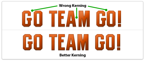
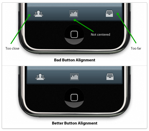
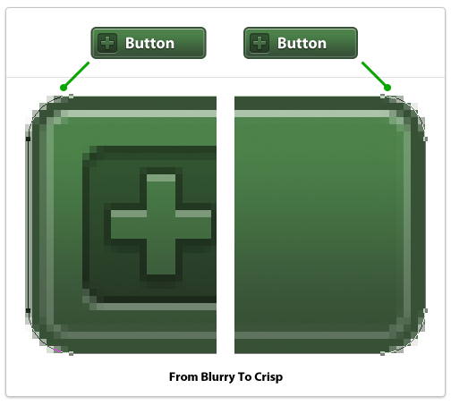
So without any context what can you really critique? Design execution. The execution of a design is the nitty-gritty details of the design. The pixel-level details. The alignment of individual elements. The kerning of a logo or headline. The sharpness of an edge. These can be wrong. These can be so incredibly wrong that they stand out no matter how good the overall concept, mood and visual appeal may be. Screwing up the execution of a design ruins the design. Game over, it's wrong, and no context is needed to understand its wrongness. A 400x300 pixel screenshot on Dribbble can be wrong without knowing anything about the project. An iPhone app icon can go from right to wrong in just a few pixels. One misplaced pixel. One misaligned button. One blurry edge. This is what makes a design wrong, this is what makes an execution of a design go from good to garbage.
Examples Of Wrong Design
Wrong kerning on a logo or headlineYes, you can screw this up if it's obvious enough so make sure to manually adjust kerning between letters if needed.
Misaligned elements, uneven paddingElements in a design should be aligned to something: other elements, a grid, a golden ratio frame, the edge of the page, something. If it looks like you tried to align it to something else and it's not perfectly aligned then you failed, it's wrong. Either something is perfectly aligned to something else or it's not aligned to the other element at all. If it's 98% aligned it's wrong. The same goes for padding around elements and whitespace. If you are designing tabs for a website and the text is not aligned properly within each tab it's wrong. 1px off is wrong. It's sloppy, it's junior, it's not professional. What if a plumber only half-tightened a pipe and it was only leaking a little bit? Would you think that was acceptable or would you ask him to actually stop the leak? The same applies here. Either things are aligned properly and have uniform padding or they don't. Either a pipe is leaking or it's not. Simple as that.
Blurry edgesThese look terrible and can ruin a design instantly. What's a blurry edge? It's an edge of a vector object that doesn't lie fully on a single pixel but straddles two pixels. The most egregious examples are long, straight lines that the designer was too lazy to make sure were the width of a whole pixel so they end up using 2 pixels when they should only use 1. To fix these in Photoshop (if using vector shapes) switch to the white arrow tool and select points of your shape individually, then zoom in close and use the arrow keys to move points over a tiny amount until they're perfect.
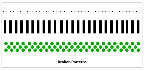
Broken patternsA pattern is a technique that a designer sets up and reuses in a repeating fashion. Dotted lines would be one example, an overlapping plaid pattern could be another. Anything that repeats in a set manner needs to adhere to its own defined pattern or else it's a mistake. A dotted border that is missing a pixel or has too much spacing between two dots. Ten boxes in a row and the space between the 3rd and 4th is a few pixels off. A stripe pattern using lines 10 pixels wide uses a 9 pixel line by accident. These are mistakes, it's not a subjective matter. If you're not careful when copying and pasting layers in Photoshop it can happen.
Techniques To Avoid Design Errors
If you're not sweating every pixel then you're already off to a bad start. What does that mean? It means using alignment and measurement tools to make sure everything is perfect. It means double-checking to make sure an element that's supposed to be centered actually is. The details are the design. They're not an afterthought or something you fix later, it's something embedded in everything you do. Every icon, every line of text, every box, every pixel should be cared after as if it's 10 feet tall staring you in the face.
Design errors separate stock-photo-slappers, clip-art-arrangers, and programmers-turned-wannabe-designers from real, world-class, totally-fucking-amazing professional visual designers. If you're not a world-class designer but aspire to be one, don't ever commit a design error. Your visual tone could be off, the colors could be muddy, the concept could need tweaking but you should never, ever make a mistake that I've listed. There's no excuse, and the best part? Fixing a design error requires no design talent. You don't have to write like Ernest Hemingway to be able to spell words correctly and you don't have to be a great designer to simply double-check every pixel and make sure it's in the precise place you planned it to be.
Back To Dribbble
Designers who care about their work want to know when something is wrong. Not subjectively wrong (although that's good to discuss as well) but objectively wrong like a design error. A flat-out mistake. If someone spots a design mistake in my work I want to know because I want to fix it; I want my work to be perfect and represent my best efforts. It's not an ego thing, it's not a hurt feelings thing, it's a professional thing. If a plumber leaves a pipe leaking then it's a mistake. If a writer misspells a word in a novel then it's a mistake. If a designer makes a design error then it's a mistake. Plumbers who don't care about leaky pipes aren't professionals. Neither are writers who leave misspellings in books nor designers who make egregious design errors in final designs. Either you're a professional or you're not, it's as simple as that.
Digital Post, my newspaper app for the iPad, uses a number of custom user interface elements to build out the full user experience. One of these custom components is a horizontal topic selector that you can swipe and also tap to select individual topics.
Original Concept
Facebook for iPhone was one of the first apps to use a horizontal scroller to let you navigate various screens or topics. When first designing the interface for Digital Post I thought it was a perfect opportunity to do my own version suitable for an iPad app.
Building The Main Slider
The requirements were simple: can be swiped left or right and each item in the menu can be selected. This led me to make the main component a UIScrollView subclass. I subclassed it because I needed to do my own custom drawing in its drawRect method to execute the design. Let's take a look at the drawing code, it's very simple:
Here we're taking a PNG, stretching it horizontally, and drawing it in the precise location that this scrollview is located. The left cap of 15px means that the first 15px of the image are kept pixel-precise, the 16th pixel is used to stretch across the wide area, then the final right pixels are kept pixel precise also. This is a common technique to execute custom designs, I wish I could do this in CSS!
Adding The Tappable Topics
To make a UIScrollView actually scroll you need to know the total width (or height) of the content it contains. For my scrollview, I programmatically add the tappable topics and then calculate the total width of them once I'm finished. I first thought to make each topic a custom UIButton but for some reason, if the buttons are one-after-another with no pixels in between, the touch events they intercepted stopped the slider from scrolling. I couldn't quite figure out the issue but fortunately there are numerous ways to accomplish the same design. Instead of UIButtons I decided to use UILabel subclasses and add the tap events myself using UIGestureRecognizers, one of the new APIs available on the iPad. Here's the code that calculates the total width of this scrollview's content:
Here I'm using NSString's method sizeWithFont to calculate the exact size of a string rendered using a given font. The 30px extra is to account for 15px padding on the left and right of each one. Once I've iterated across my entire array of topics, I now have an exact pixel amount to assign to the contentSize property.
After calculating the total width, I add each topic one at a time to the scrollview. (DPTopicLabel is my UILabel subclass.)
First, I create the CGRect that will be the exact position of my tappable topic. The CGPoint startingPoint is updated at the end of each iteration to push it ahead to where the next topic will go. Next, I create my new DPTopicLabel and use my custom initWithFrame:andText: method to pass in what the text should be. If the string is "Top Stories" then I call my setSelected method which draws the custom background for a selected topic.
After I create the topic I need to make it respond to touch events. There are a few ways to do this but I like how the new gesture recognizers work so I used that. Once you add a gesture recognizer to a view, you tell it what type of gesture you want it to recognize (complicated, eh?) and then what method you want it to call when it happens. In this case I'm catching tap events and passing in my handleTap method which will toggle the selected state of my label.
All that's left to do at the end is change my startingPoint variable and add the label to the overall scrollview. Done!
Conclusion
This isn't magic and it's not all that complex. Building custom UI components is all about being thoughtful and planning out each step. The steps here:
Add a scrollview
Draw its background
Add custom labels one at a time
Set one of those to be selected, that has a custom background
Feel free to use these techniques & code in any personal or commercial projects you may work on.
The underlying secret to beautiful user interface design is realism: making 2D objects on your screen appear to sit in 3D space with volume, surface properties and undulations that might appear in real life. These faux 3D objects have highlights and shadows just like objects on your desk might have, and they have textures that emulate real objects from glass to sandpaper and everything in between. Designing beautiful user interfaces has more to do with the why than the how.
Thinking in 3D
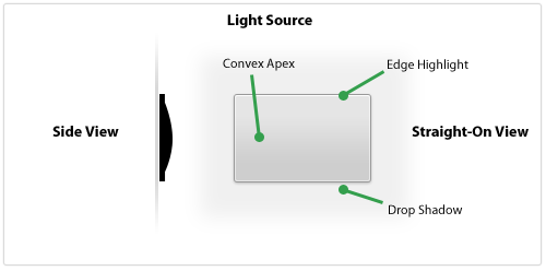
If you're trying to design a realistic-looking user interface element then you have to think about what that object would look like in the real world. What's the easiest way to do that? Look at it from the side. What would a button look like if you viewed it from the side of your monitor? Let's take a look.
Here's a button-shaped panel that's designed to look slightly raised and have a matte surface. It's thin, has a subtle convex shape, and has a small edge that goes around the outside. In a 3D space, the light source would illuminate the edges (slightly brighter on the topmost edge) and would not fully illuminate the bottom slope of the panel past the apex. The object would cast a small shadow since it's not raised off the surface very much.
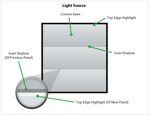
Pastebot, the new app from Tapbots, has a table view filled with panels that look similar to the one from above. Let's see what it'd look like with multiple panels next to each other.
This looks like a realistic series of panels because of the Top Edge Highlight up against the Inset Shadow which, from the side, would look like this: <. The Inset Shadow appears because the light source does not illuminate that area but then the next panel starts and pokes out, catching the light and showing a highlight.
Design elements that we think look great are usually the ones that look the most realistic, as if they could be in front of us on our desk or on the wall. Paying close attention to how light would strike the object as if it were real is crucial to executing a realistic user interface element.
Designing The Material & Surface
In my internet globe icon tutorial I stressed the impact an object's material has on its overall look. Not accustomed to thinking about an object's material? Get used to it! It adds a new dimension to your design and keeps the object's realism in the front of your mind. If you're designing an interface element and can't immediately name what type of material you're emulating then how can you execute it with perfect realism?
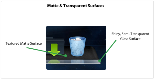
I recently linked to some beautiful Dock replacements for your Mac and many of these illustrate how important the material is to your overall design. In one named Phantom the designer uses two different materials to make the Dock: a textured, grainy surface coupled with a semi-transparent glass edge. The textured surface seems like the back of a notebook pad or a heavily-used wallet whereas the front edge looks like a clear, solid block of lucite.
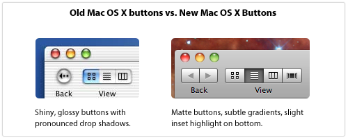
Apple has been using shiny, gloss-laden user interface elements in Mac OS X for awhile but recently there has been some chatter that they were gearing up for a total interface refresh using matte elements. This full refresh never happened but matte interface elements have been steadily making their way into Mac OS X for a number of years.
With the latest version of iTunes, many user interface elements like scrollbar sliders and buttons have been given the updated, matte look.
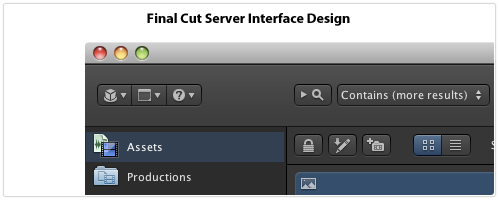
Apple's also been using the matte look in some of their Pro software, most notably Final Cut Server. In that application's interface, Apple's removed the gloss from nearly everything and kept convex buttons close to flat with only a slight highlight on the edge. Also, the icons on buttons are not set into the button (accomplished via a thin, white drop shadow on the bottom, a style used throughout Mac OS X) but instead sit on top of the button through the use of a dark drop shadow on the icon. The entire interface pane is slightly raised and looks like dark, textured steel, making the application look like the instrument panel to a high-tech piece of equipment.
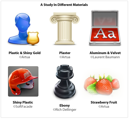
Here's an assortment of icons that all show how different surface materials contribute to the overall look of the element:
Next time you want to create something shiny, think about what type of material you're really executing: is it plastic? Glass? Reflective aluminum? If you're designing a matte element, think about just how grainy and textured it should be. Paper or sandpaper? Cardboard or anodized aluminum like an iMac? Is there transparency? Are you emulating something in real life or creating a material that's more hyperrealistic?
Tips For Execution
It's one thing to look at beautiful interface elements, icons and illustrations and quite another to build them yourself. Here are some ways that I build designs using Photoshop.
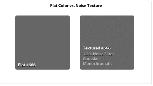
Noise Layer Matte interfaces are hot right now and one of the key elements of a matte surface is that it's not perfectly symmetrical, it has some texture and grain to it. The easiest way to accomplish this is by creating a layer of one flat color and then using the Noise Filter to add some texture. The key is to keep it subtle and barely noticeable.
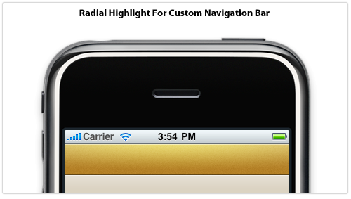
Radial Highlights The main light source comes from the top but that doesn't mean you can't introduce a secondary light source for emphasis. Below I've created a custom navigation bar for an iPhone application that uses a subtle radial highlight for added dimension and detail. The Blend Mode has been set to Overlay to brighten and saturate the overall color and the transparency has been knocked way down to keep it realistic. Also note the edge highlights to make it look more like a raised surface.
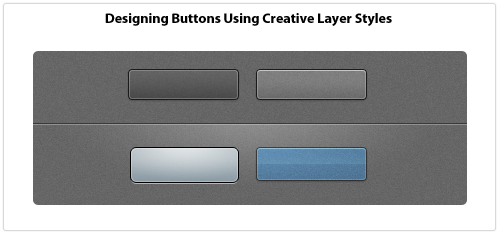
Creative Layer Styles Layer Styles are a key part of my design workflow, I use them for everything. Usually I'll draw a vector object, set the Fill to 0%, and design the entire thing using Layer Styles. Anyone can add a Drop Shadow to something, but if you get creative with Layer Styles then it enables you to really transform what you're working on. For example, you can only apply one Stroke but you can emulate 3-4 different stroke styles through creative use of the Inner Glow and Outer Glow styles if you crank up the Spread and Choke sliders and turn your glows into solid lines.
Once you turn glows and drop shadow styles into solid lines you can achieve a lot of effects with minimal effort. Below are some Layer Styles applied to rounded rectangles that use 1px glows and shadows. The PSD file for the following examples is released under a Creative Commons license: Button Examples
Reality Is Subtle
When something looks "off" in an interface, it probably looks fake, like it wouldn't exist in the real world. How do you keep your interface elements looking real? Here are some things to always keep in mind:
Keep it crisp. No blurry lines or edges.
Always adjust opacity. Nothing is totally black or white, dark or bright. A semi-transparent black or white line, glow, shadow or shape goes a long way.
Go vector when you can, it can be resized later. Don't Free Transform vector objects: use the Direct Selection Tool to move individual points.
Experiment with Layer Styles. White Inner Glow makes shapes pop. Use Overlay blending mode to liven up and saturate colors.
Drop Shadows will ruin your design if you don't do it right. Things should be right up against their surface which means using a 1-3px Drop Shadow size. And 0-3px distance. This isn't WordArt.
To save a complex shape as a PNG or GIF, turn the layer into a Smart Object first, then Rasterize it. This preserves color blending modes.
When using type within an interface element, it either sits on top (dark 1px drop shadow) or is inset (white 1px drop shadow), it's never at the same surface as a button or widget.
Real-world objects rarely have perfectly square corners. Use subtle rounded corners to make objects look real.
In real life, everything casts a shadow. Unless you're drawing vampires, if you intend your object to have depth and be resting on a surface then it better have a drop shadow, even an incredibly subtle one.
Apple's paradigm for indicating network connectivity is nicely-detailed globe icon with crisscrossing wires across it — you can see it in the System Preferences for Network settings. Wolfgang recently rejuvenated this UI analogy in his work on LittleSnapper's interface. I thought it'd be fun to do my version of this icon and step you through the process as I go.
Spheric Realism
Before getting into the tutorial's steps I thought it'd be good to go over some key techniques for creating a realistic sphere.
Designing a nice, shiny ball has many applications and is a nice skill to have in your back pocket. When designing a ball that's meant to look as round as possible here are some things to keep in mind:
What material is it? Glass, plastic, anodized aluminum? The material of an object is its most important attribute as that defines how it is supposed to reflect and transmit light in the real world. Most textures on shiny spheres are semi-reflective glass or metal, rarely do you see a rough metal used as the material.
It reflects light inside too. Not only do you have to worry about the global OS light but you have to keep in mind that light gets reflected inside the sphere as well, bouncing around the walls. Depending on the type of material of your sphere and the transmittance properties it will look different. Opaque material lets no light pass through so there will be no internal reflections.
Is it totally round? Designing a perfectly spherical ball is not necessary all the time, sometimes all you want is a mostly-rounded button or disk. These have similar properties as spheres but the edges will have light reflections and shadows rather than the top or bottom of the ball. Spheres don't really have edges to catch the light since, um, they're spheres!
Lots to think about! Don't remember high school physics and how a material's refractive index changes light passing through it? Don't worry, just follow along and we'll have you building spheres in no time.
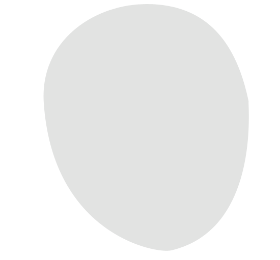
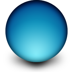
Step 1: Draw Your Base Circles
To make the globe look three-dimensional, it'll take more than one crack at Photoshop's Layer Styles which means a little onion-skinning will be necessary.
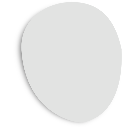
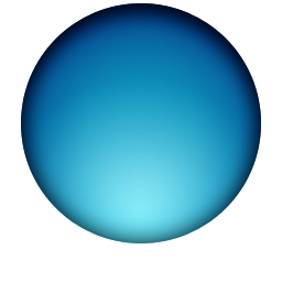
We're designing our icon at 256px so get your new document open and use the Ellipse Tool to make a circle sized so that it allows for a shadow underneath it. We're applying two layer styles — Gradient Overlay and Inner Shadow — in order to get the basic lighting in place. The Gradient Overlay is radial and I used the mouse to move it down to the bottom of the sphere representing the light passing through the top of the sphere, reflecting off the bottom. The Inner Shadow was also positioned at the top to give it some initial radial shading.
I need to apply some additional effects to the base circle so I duplicated my previous circle, turned the Fill to 0%, and re-opened my Layer Styles. I gave this second circle an Inner Glow with Multiply blending (half opacity) and an additional Inner Shadow positioned only at the top with Soft Light blending.
Step 2: Lay Your Shadows
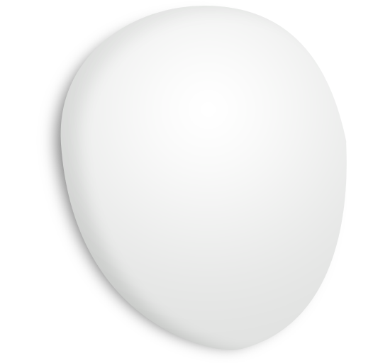
Before we add the final lighting to our sphere, let's position its shadow first.
I drew a small ellipse at the bottom of the sphere and filled it black. Next I converted it to a Smart Object and applied a 73px horizontal Motion Blur and a 12.5px Gaussian Blur. To darken the center a bit more since that's where the sphere is "touching" the surface I duplicate my previous shadow and shrink it down a bit.
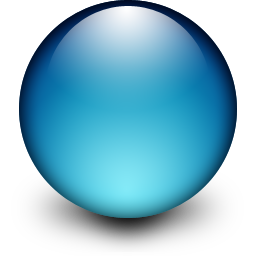
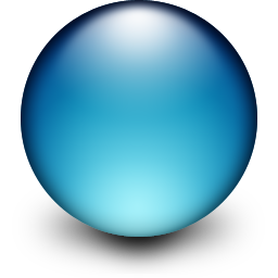
Step 3: Circular Highlights
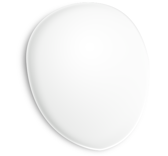
Realistic lighting and highlights can't be fully reproduced using Layer Styles, you'll need to draw some more ovals.
Draw a circle about 3/4 the height of your previous ones and align it a few pixels from the top of the main circle. Make sure it has a 0% Fill and give it a Radial Gradient layer style from white to transparent with the white directly on top.
Now convert it to a Smart Object and give it a 3.9px Guassian Blur to soften it a bit. This represents the main OS light hitting the top of our sphere. (Note: Others may have a different preference regarding how blurred they want their top highlight. Some people won't want to blur it at all. Do whatever you think looks best.)
To make the center of our top highlight a little brighter, let's duplicate the layer and shrink it down proportionally. Now we have two ovals at the top of the sphere representing our top-down lighting.
For the bottom-up lighting, duplicate your larger highlight you created, flip it vertically, and move it down to the bottom of the sphere. Change the Blending to Soft Light. Here's what it looks like:
At this point we're done with our sphere but we still have the lines to draw, so let's get to it.
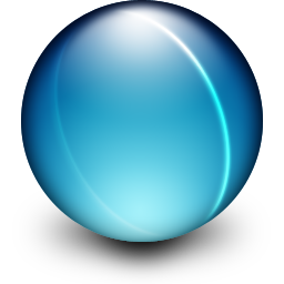
Step 4: Draw The Network Lines & Hubs
The network lines proved to be a little tricky to get just right. Here's how I did them:
Use the Ellipse Tool to draw a circle that is approximately the same size as your main sphere.
Free Transform your circle to flatten it out a bit.
Rotate it a bit on its center axis, make it look like a hula hoop wrapped around your globe.
I hopped into the Layer Styles and gave it a 2px white stroke with Blend Mode of Overlay. I also gave it 4px Inner & Outer Glows both white. Doesn't look like much yet, but here's what we've got at this stage:
I'm going to use this loop as both a foreground and background network line, so I duplicated the layer and hid the second one for now.
I used my Eraser Tool with a big brush that's fluffy on the edges so I can keep the edges of the loop anti-aliased as it hits the sides of our sphere. On your foreground loop, erase the left side completely, and erase just enough right at the top and bottom of your loop so that it fades into the sides of the sphere. ow for the background loop, erase the right side and use the same technique for the top and bottom edges.
To make the lines look as if they're sitting on top of the globe more, I duplicated each layer, gave it a slight Gaussian Blur, and then nudged it a few pixels away from its twin. I could've achieved this look with an Inner Glow, but hey, there's different ways of doing what you want in Photoshop.
I've now done this a few more times (foreground and background loops) and we're done with this step.
Final Step: Adding The Network Nodes
At this stage I think it looks pretty good, but we're not quite finished yet. Where our network lines cross we need some glowing network nodes. Fortunately, these are really easy. Take your Ellipse Tool, draw the node, fill it white, convert to Smart Object. Then, give it a little Gaussian Blur and change the blending and opacity appropriately. We're done!
Our final icon is on the left. On the right is a slightly tweaked example showing what you can do by changing some Blending Modes just for kicks.
Download The PSD
Reading about Layer Styles isn't that appealing, so if you want to check out exactly how the objects look, download the PSD all zipped up right here: you're free to do whatever you want with it.
When I first started designing for the web (don't ask how long ago that was!) I was constantly finding websites that had a particular "look" that I didn't know how to reproduce. When you're a flat-out beginner you don't have anything in your mental repertoire to pull from — techniques and concepts that you can do blindfolded. Now that I'm working harder on icon design, I've found that the easiest way for me to get experience and learn is to try and reproduce the fantastic work that others have put together. It's only for learning, however, I absolutely do not advocate taking anyone's creative work and passing it off as your own.
Now that I've got that out of the way, let's take a crack at doing our own version of the brilliant Billings application icon (designed by the extremely talented Cian Walsh) in Photoshop.
Step 1: Draw the basic shape
The Billings icon is meant to look like some sort of futuristic stopwatch (and perhaps EVE from WALL•E!) so the shape is essentially a stretched out circle. To get this shape, I grabbed the Ellipse Tool and drew a circle that approximated the dimensions of the top half of the stopwatch.
The full shape isn't a circle, so we've got some work to do to make it look how we want. Grab the Direct Selection Tool. Click directly on the object's path and drag the bottom point of the circle down to where the bottom point of our stopwatch object will end up being. This will warp the circle, but not to worry, you can reshape it by grabbing directly on the curve and moving it to where you want it to be. Manipulating the path's curves will force the bezier points on either end of the curve to adjust themselves to fit your adjustment. Tweak the individual bezier curve handles in order to fine-tune your shape, but remember to leave the overall shape smooth with no jagged points. I've got my stopwatch shape colored #e1e2e1 as my base color for the object.
Step 2: Draw the shadow
I like to work on the shadow early in the design process as it gets my mind into 3D mode faster, letting me better visualize the lighting of the object.
I find it easier to create drop shadows on icons via separate layers rather than Layer Styles because when trying to emulate perspective, the shadow's size needs to look like it's behind the object and therefore visually smaller to your eye. Feel free to use normal Layer Styles to create the drop shadow if you'd like.
Duplicate the layer you were just working on and move the duplicate behind your actual stopwatch layer. Next, give it a black fill and resize it down a little bit — proportionally — using the top-right handle. Rasterize the layer and give it a Guassian Blur enough to start making it look like a nice shadow. I also gave my shadow a Motion Blur from left to right to spread it out a bit more. Here's what we've got so far
Step 3: Initial shading on the base object
The shape we're drawing has some complex lighting so it can't be taken care of with just one Layer Style, it'll take a few layers overlapped on top of each other to finish the shading. In this step, we'll be roughing out the initial shading with a Gradient Overlay and an Inner Shadow.
The Gradient Overlay has Blend Mode: Normal, Opacity: 100%, Gradient: #fff->transparent, Style: Radial, Angle: -65°, and Scale: 117%. For radial gradients, the angle changes the size of the radial gradient. To get the placement of the gradient exactly where I want, while I was working on the Gradient Overlay I just grabbed and moved the gradient right on the object itself while the dialog box was still open.
The Inner Shadow has Blend Mode: Overlay #000, Opacity: 100%, Angle: 164°, Distance: 26px, Choke: 9%, Size: 24px. Just like with the Gradient Overlay, to get the perfect placement I grabbed and moved the shadow myself. This was important because to duplicate the shading exactly, there should be no shadow on nearly the entire right side of the object.
There's a lot more work left to be done, but here's where we are so far:
Step 4: Onion-skinning your way to realism
Most of the time your object will need additional shading details that just can't be created with a single group of Layer Styles — you'll need to layer a bunch of effects on top of each other to make it look how you want. Here's what a typical process is like:
Duplicate your original layer, name it something recognizable.
Drop your Fill to 0% if it's not there already. You want your effects to layer up and not block-out the original layer.
Add new Layer Styles and adjust your Blend Mode to accomplish the look you want.
To build up additional effects, start back at 1, rinse and repeat
Why is this necessary? Because Photoshop doesn't allow you to have multiple versions of the same Layer Effect on a layer. That means if you want an inner stroke, and outer stroke, and a center-aligned stroke on the same layer, you're out of luck. Multiple inner shadows? Sorry, no can do. You can accomplish a build-up of the same effect via this onion-skinning technique, but keep in mind if you ever have to change your initial shape you'll have to tweak all your duplicated layers as well.
I've got 3 duplicate layers on top, each with 0% Fill and a series of Layer Effects applied. Here's the list of layers and their effects in the order they're shown in Photoshop:
Inner Shadow: giving a bit more depth
Stroke: a white stroke to give the bottom corner of the stopwatch a small bevel
Gradient Overlay & Inner Glow: the gradient overlay is a transparent -> white linear gradient from left to right, and a thin white inner glow around the entire object.
Step 5: Drawing the face of the stopwatch
Compared to the body of the stopwatch and all its shading, the face is much easier technically. It's comprised of only a few layers:
Dark blue dial — an ellipse that's been tweaked for perspective, it has Radial Gradient for the center highlight, an Inner Shadow for the top left dark area, a Stroke for the thick blue border, and a Drop Shadow of white at the top.
Minute/hour markers — just a bunch of circles drawn with the object tool in a circular pattern around the dial. Each has an Outer Glow applied.
The time wedge — this was drawn with the Pen Tool and has a Gradient Overlay and Inner Shadow.
The sheen — I duplicated the blue dial, shrunk it a bit, applied a Gradient Overlay, then chopped the bottom part off with a circular cut.
Finished!
There are some small tweaks to be made like darkening up certain areas of the icon for enhanced contrast, and adding the stopwatch button at the top right, but I think this is a good place to leave off. Some quick tips:
If you're designing an icon for multiple resolutions, it's a good idea to stay vector as long as possible for easy scaling. I usually keep my layers as editable vector shapes with Layer Effects applied, and only rasterize if absolutely necessary. Also, if I rasterize a vector shape, I like to keep an original vector version around (hidden) if I need it later.
Use the "onion-skinning" technique to get a build-up of multiple effects that can't be done in one layer style. Multiple inner shadows, multiple strokes & gradients are crucial when designing icons for maximum realism.
One of my favorite pieces of UI design on the iPhone is the toggle switch that lets you turn something on or off. The design and the smooth flow between the two states is perfect. I thought it'd be fun to emulate this element in Photoshop as a quick tutorial.
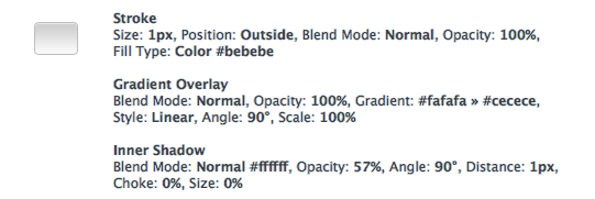
Step 1: Design The Button
For maximum flexibility, I'm going to be using vector shapes and Layer Styles. To draw the button, grab the Rounded Rectangle Tool and use a 3px radius. Draw the shape similar to what I've got below.
Hint: When you resize vector shapes, it scales each part of the shape to the new size which means your rectangle's corners will get stretched out. To keep the correct border radius, use the Direct Selection Tool to select the 4 points on the side of the shape you want to move. This will keep the corner radius intact.
The coloring for these effects comes straight from the iPhone's slider via a screenshot. I typically use both Gradient Overlay and Inner Shadow together to render my lighting effects. The gradient is for the overall light hitting the button, and the inner shadow (in this case, a thin white line at the top) is the highlight right at the top of the bevel.
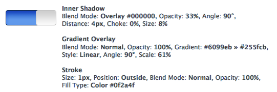
Step 2: Design The Track
Here, we'll be designing the blue "On" state of the toggle switch. The "Off" state has the same shape but is a light grey instead of a vibrant blue.
The track has the same height and border radius as the slider button, so the easiest way to create your track object is to duplicate the slider button you just made. Select your Move Tool and have your slider button object highlighted. Hold down the Option + Shift keys and drag your cloned object to the left of your original slider button. Now, resize your slider track so that it's about 1.5x the width of your slider button and make their right sides line up.
Now it's starting to look pretty close!
There should be a shadow on the left side of the slider button, indicating that the slider track is recessed and that the button is closer to the light source than the track. Let's add that in the next step.
Step 3: Finish The Switch
To show the drop shadow to the left of the slider button, we'll go back to our button layer and add a Drop Shadow that's facing directly to the left — Blend Mode: Normal #000000, Opacity: 38%, Angle: 0%, Distance: 3px, Spread: 23%, Size: 2px.
The relatively high shadow spread is so that it will fill out a few pixels to the left of the object, eliminating the "leak" we'd get if we simply boosted the size of the shadow. If we increased the size beyond 2px, it would show the drop shadow above and below the slider button which isn't what we're looking for.
To finish it off we've added the "On" text and gave it a thin drop shadow to indicate that it's inset on the slider's track.
And that's it! Now you've got an iPhone toggle switch that you can use on your own projects.
 It's important to keep your elements in Photoshop in vector format as long as you can because they can be scaled and re-styled easily. To draw a rounded rectangle, I use (gasp!) the Rounded Rectangle Tool with Snap To Pixels turned on. This is incredibly important or the edges of your shape will lie on a half-pixel and look blurry. There are some other ways to draw rounded rectangles in Photoshop (which Marc Edwards has conveniently outlined) but I typically stay with the vector shape tool because it's easy.
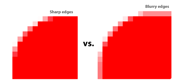


 Now that I've got that out of the way, let's take a crack at doing our own version of the brilliant