Making Rounded Rectangles Look Great
Great product design involves thinking about what features to prioritize, planning the user flow from screen to screen, getting user feedback and lots more, but at the end of the day, someone is going to be in Photoshop pushing pixels. The final visual design of a digital interface isn't going to design itself, and when a designer is crafting the look and feel, here are some elements they're typically designing:
- Buttons
- Panels
- Windows
- Profile Pictures
- Icons
If you really think about it, most interfaces (especially for iOS apps) use tons of rounded rectangles in different shapes and sizes. Long and skinny ones with lots of shine. Squarer, flatter ones with some texture. Smaller, slightly inset ones with photos inside. The list just keeps on going. I actually joke around with friends that my main job is making rounded rectangles look great, so I thought it was time to show off some common techniques.
Drawing Them
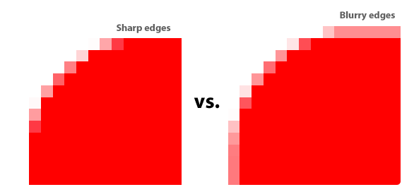
 It's important to keep your elements in Photoshop in vector format as long as you can because they can be scaled and re-styled easily. To draw a rounded rectangle, I use (gasp!) the Rounded Rectangle Tool with Snap To Pixels turned on. This is incredibly important or the edges of your shape will lie on a half-pixel and look blurry. There are some other ways to draw rounded rectangles in Photoshop (which Marc Edwards has conveniently outlined) but I typically stay with the vector shape tool because it's easy.
If the edges of your shape aren't sharp, then strokes/gradients/highlights/shadows you add later won't be perfect.

Up or Down?
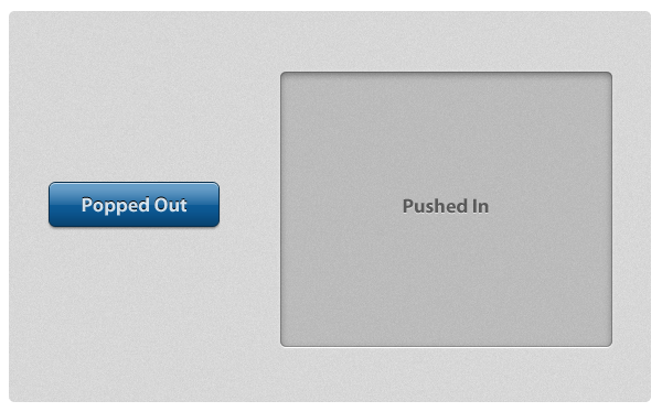
If your goal is to craft subtle and realistic user interfaces that look and feel like real world surfaces, you'll be making a choice: is this element popping off the screen (convex) or indented into the screen (concave)? Buttons are convex whereas large panels containing text and other elements are typically concave.

On the left is a convex button that is designed to look like it's bulging off the screen. It appears bulged out because it's made to appear just like a convex object would appear in real life if it had 90°, top-down lighting. That means that 1) the light catches the top of the object and adds a lighter stripe of highlight, 2) as the bottom bends back down towards the screen, the light is blocked and it gets darker (light-to-dark gradient), and 3) it casts a very subtle shadow, indicating that it's sitting on top of the surface. This specific combination of highlights, gradients and shadows is the most basic way to make a rounded rectangle appear bulged out and convex.
On the right is a larger panel that is designed to look inset into the screen. The fill color is a mostly-transparent black, it has some inner shadows, and then a thin white drop shadow at the bottom. If we analyze this using the same lighting conditions as the previous example, it's made to look sunken in because 1) the edges or lips of the shape are at the surface and cast an inner shadow inside (these edges block light like an awning off a building blocks the rain, causing a shadow) and 2) as the bottom edge of the shape comes back up to meet the surface, the light catches that lip and causes an edge highlight.
Pictures
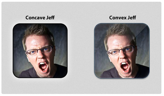
Most iPhone apps that display profile images have them look slightly sunken into the surface or popped out and semi-glossy. This is achieved with mainly the same techniques from above, but for the glossy one I added a diagonal gloss line (a white-to-transparent gradient cut into a triangle) as a separate layer.

Mixing It Up
Although there are distinct elements common in most convex-or-concave elements, there's no special formula for how to accomplish these effects in Photoshop. I typically tweak size and opacity sliders on Inner Glow, Inner Shadow, Stroke and Drop Shadow layer styles until things look good. Other people are Bevel & Emboss specialists. Here are some more examples of rounded rectangles styled in some different (but reusable!) ways.

Scratching The Surface
These are just some of the myriad ways you can style and use rounded rectangles in your interfaces. If you really want to see some creative designs, check out some icon designs on Dribbble. All it takes is some imagination and experimentation, and you can use gorgeous rounded rectangle designs throughout your interface.
