Back when I was doing design work for clients, it seemed like my work would get re-purposed by fledgling and not-so-fledgling designers every month. Sometimes I'd get a tip in my email about a theft that someone saw, or sometimes the offenders would link the assets right off my client's website, but regardless of how I found out about the theft, it'd piss me off more than anything else. I was the one who opened Photoshop, I cranked through iteration after iteration, I thought of execution details in the shower, I stayed up late at night, and then someone else just takes all that work and passes it off as their own. Sure, usually there were some slight modifications, but designers can always tell when someone else is using their design. It's sort of like a parent being able to identify their baby's cry while all the other babies are crying as well.
Lack Of Understanding
A few friends and I were the co-founders of 9rules, one of the largest independent blog networks of its day. I designed the fairly well-known (if you had a blog back in the mid-2000s!) 9rules leaf logo, which, to this day, is still the only good thing I've ever made while using Illustrator. For some reason, this was my most copied design ever. Toyota copied it for a yearly conference they run. Hell, it's even used as the logo for a mall in South Africa.
The dumbest thing about using the 9rules leaf logo for something other than 9rules is that the logo had a specific meaning. We had 9 principles we followed with the startup so there were 9 leaves. The design was meant to resemble a '9' and an 'r' side by side. The colors meant something, too. The logo represented our startup, it wasn't some arbitrary swoosh or vector swirl, we spent a lot of time on it and it was unique to our business.
When companies steal a design made for something else, they skip the part where they toil over the design and develop a deep love and appreciation for it. In 2009, Jason Fried wrote a blog entry about why you shouldn't copy them or anyone else. Here's a snippet.
"Here’s the problem with copying: Copying skips understanding. Understanding is how you grow. You have to understand why something works or why something is how it is. When you copy it, you miss that. You just repurpose the last layer instead of understanding all the layers underneath."
Copying someone else's designs, the way Samsung did with Apple's interface and industrial designs, skips over the whole part about why they were like that in the first place. Why did a designer throw out 20 iterations and pick the 21st design to be the one to ship? What led them to the those specific conclusions and insights? What down-the-road thinking influenced the design? Samsung doesn't know why Apple went with a homescreen with a fixed row at the bottom, they just know that the iPhone is hot and they want all their phones to look like the iPhone in the eyes of consumers. That's why they stole Apple's interface designs: to short-circuit the innovation process and jump straight into the line ahead of everyone else.
I really don't care about patents or trademarks or trade dress or any of that. To me, a designer, it's just about honor. Deciding to use someone else's pixels as your own is not just lazy, but it's dishonest. It's a slap in the face. And that's why I'm glad Samsung owes Apple over a billion dollars, because so much design theft happens in the world, it's about time someone or some company got knocked down a few pegs because of it. This victory isn't just a victory for Apple, it's a victory for every designer who has been ripped off by people who didn't care or thought they could get away with it. Tonight it's clear that sometimes they can't.
Great product design involves thinking about what features to prioritize, planning the user flow from screen to screen, getting user feedback and lots more, but at the end of the day, someone is going to be in Photoshop pushing pixels. The final visual design of a digital interface isn't going to design itself, and when a designer is crafting the look and feel, here are some elements they're typically designing:
Buttons
Panels
Windows
Profile Pictures
Icons
If you really think about it, most interfaces (especially for iOS apps) use tons of rounded rectangles in different shapes and sizes. Long and skinny ones with lots of shine. Squarer, flatter ones with some texture. Smaller, slightly inset ones with photos inside. The list just keeps on going. I actually joke around with friends that my main job is making rounded rectangles look great, so I thought it was time to show off some common techniques.
Drawing Them
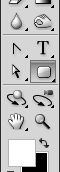
It's important to keep your elements in Photoshop in vector format as long as you can because they can be scaled and re-styled easily. To draw a rounded rectangle, I use (gasp!) the Rounded Rectangle Tool with Snap To Pixels turned on. This is incredibly important or the edges of your shape will lie on a half-pixel and look blurry. There are some other ways to draw rounded rectangles in Photoshop (which Marc Edwards has conveniently outlined) but I typically stay with the vector shape tool because it's easy.
If the edges of your shape aren't sharp, then strokes/gradients/highlights/shadows you add later won't be perfect.
Up or Down?
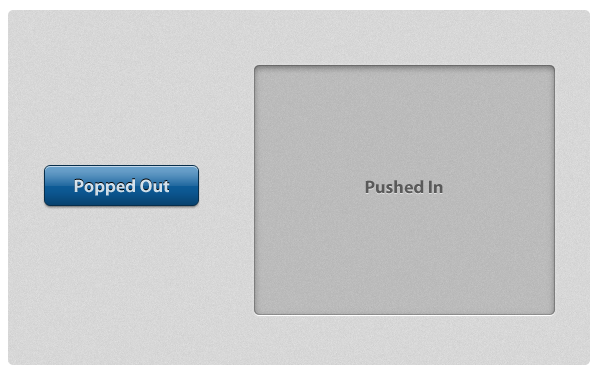
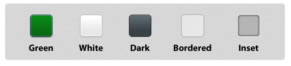
If your goal is to craft subtle and realistic user interfaces that look and feel like real world surfaces, you'll be making a choice: is this element popping off the screen (convex) or indented into the screen (concave)? Buttons are convex whereas large panels containing text and other elements are typically concave.
On the left is a convex button that is designed to look like it's bulging off the screen. It appears bulged out because it's made to appear just like a convex object would appear in real life if it had 90°, top-down lighting. That means that 1) the light catches the top of the object and adds a lighter stripe of highlight, 2) as the bottom bends back down towards the screen, the light is blocked and it gets darker (light-to-dark gradient), and 3) it casts a very subtle shadow, indicating that it's sitting on top of the surface. This specific combination of highlights, gradients and shadows is the most basic way to make a rounded rectangle appear bulged out and convex.
On the right is a larger panel that is designed to look inset into the screen. The fill color is a mostly-transparent black, it has some inner shadows, and then a thin white drop shadow at the bottom. If we analyze this using the same lighting conditions as the previous example, it's made to look sunken in because 1) the edges or lips of the shape are at the surface and cast an inner shadow inside (these edges block light like an awning off a building blocks the rain, causing a shadow) and 2) as the bottom edge of the shape comes back up to meet the surface, the light catches that lip and causes an edge highlight.
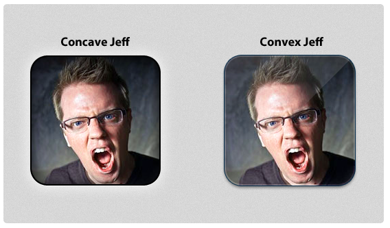
Most iPhone apps that display profile images have them look slightly sunken into the surface or popped out and semi-glossy. This is achieved with mainly the same techniques from above, but for the glossy one I added a diagonal gloss line (a white-to-transparent gradient cut into a triangle) as a separate layer.
Although there are distinct elements common in most convex-or-concave elements, there's no special formula for how to accomplish these effects in Photoshop. I typically tweak size and opacity sliders on Inner Glow, Inner Shadow, Stroke and Drop Shadow layer styles until things look good. Other people are Bevel & Emboss specialists. Here are some more examples of rounded rectangles styled in some different (but reusable!) ways.
These are just some of the myriad ways you can style and use rounded rectangles in your interfaces. If you really want to see some creative designs, check out some icon designs on Dribbble. All it takes is some imagination and experimentation, and you can use gorgeous rounded rectangle designs throughout your interface.
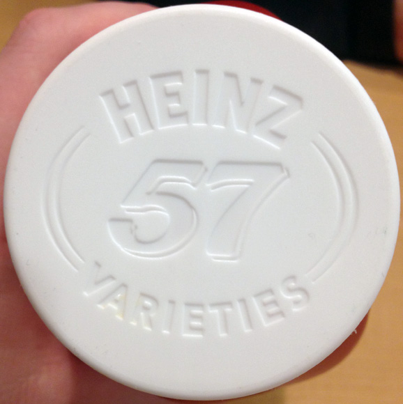
At lunch earlier today I snapped a picture of the top of a Heinz ketchup bottle.
It's not remarkable, but it caught my eye because the look of the embossed text in the cap is exactly the look that so many designers are trying to replicate these days, myself included. What look is that?
The emulation of physicality.
A current trend in the design of digital interfaces is to subtly hint that the objects on the screen have weight, volume and surface undulations like they would if they were manufactured and held up in front of you. This is why Apple puts defined, shiny gloss lines on buttons and toolbars: because they're emulating a plastic lens shape and how lenses interact with light. Lenses refract light in precise ways and the specific coloring, gradients and glows used in iOS toolbars and buttons were put there specifically to make them look more like a long, plastic convex-on-both-sides piece of glass instead of just pixels on a screen.
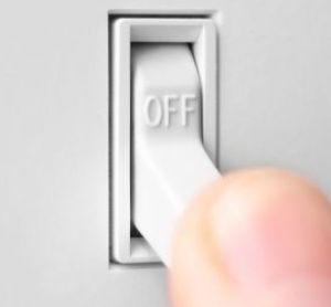
Imagine if the iPhone's interface were manufactured and put up on a wall. There'd be realistic textures like linen, leather, shiny plastic and matte aluminum. These textures wouldn't all sit at the same distance from the surface, they'd be staggered — some elements indented, some elements poking out — because the real world isn't flat. Everything is either convex or concave, shadowed or highlighted. Just look at how many angles and surfaces a simple light switch has. Convex, bubbled text that casts a shadow. Indented, shadowed crevices. Light-to-dark gradients on surfaces.
And peopleallover are putting realistic switches into digital interfaces. They're trying to emulate the highlights, shadows and gradients that a real switch has when lit from above. Indented buttons, convex panels, glossy shines, textured mattes, embossed text, and it goes on. These are the elements that interface designers use to make their products appear touchable, tactile and hefty.
Now this physical emulation of real objects can be taken too far, but just like with everything else, moderation is the key. Some of the top apps in the App Store use these exact techniques to great effect. The leather and embossed buttons in Camera+. The indented and matte tweet actions row in Tweetbot. The textured opening screen of Path. You may not immediately notice these little details, but they make digital interfaces appear more valuable, like little hand-crafted executive paperweights: expensive, heavy and solid.
The pixel-perfect emulation of physical surfaces and lighting in a digital interface is the secret weapon of interface designers. Little touches like panels that are slightly indented and shadowed, subtle cloth-like texturing, and white highlights on embossed label text may not be immediately perceptible, but they add a richness to the overall experience that most apps just don't have.
Today, Twitter unveiled redesigns for their website, iPhone and Android apps. As a long-time Twitter user and Twitter app aficionado, I've come to expect a certain level of thought & polish in everything Twitter does, so I'm sad to say I'm not a huge fan of their new direction.
Low Information Density
Mobile phone screens are small so each pixel is incredibly valuable. Horizontal screen real estate is even more valuable because you have fewer pixels on the horizontal axis than you do the vertical if you're holding your phone in portrait orientation.
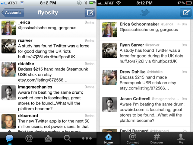
Apple provides UITableViews two main display modes: plain and grouped. Plain rows extend to both edges of the screen and are primarily used when a lot of information needs to be displayed like in Mail, the App Store, Facebook, Music and all previous versions of Twitter for iPhone. For reasons I cannot explain, the latest version of Twitter's iPhone app uses the grouped style that doesn't extend to either side of the screen. This automatically introduces 10px of padding on each side which cuts the horizontal resolution down to 300px, leaving 20px less room for each tweet. Since the primary focus of Twitter is to, wait for it, read tweets, this is not a good thing. In fact, this coupled with the removal of the text size setting causes the new version to show fewer tweets per screen compared to the old version.
Twitter yesterday is on the left, Twitter today is on the right. I scrolled to the same spot in both apps to make the row height comparison more obvious.
And I can't exactly put my finger on it, but the new grouped tableview style makes the interface feel more claustrophobic, more boxed in and constricting. Because of this change it no longer feels like you're in Twitter, it feels like you're just watching Twitter, or viewing Twitter's website inside the app. Margins on either side of an interface are for the web. This is an app, and apps need to expertly use the few measly pixels they have.
Forced "Discovery"
A main focus of this redesign is the new Discover tab which 1) shows random things to you, and 2) cannot be hidden. Seriously, I can't make heads or tails of what it's supposed to be showing me. I think it's a personalized-social-graph-recommendations-search thing all jumbled together. Unfortunately, using search and/or giving a shit about hashtags is at the bottom of things I use Twitter for, mainly because the trending topics are dominated by stupid rap music memes or Justin Bieber fans. Here are some of the most popular trending topics this past year: #aintnothingsexyabout, #4wordsaftersex, #BestSexSongs, #secretturnon, #youknowitslovewhen, #muchlove, #IsmileWhen, #yougottaloveitwhen, #youdeserveashoutout, #ItsMyAddiction, #WhatNotToSayAfterSex, #sevenwordsaftersex, #thingsblackgirlsdo, #thingsblackpeopledo, #doesntmeanyourblack and #NotAllBlackPeople so please excuse me if I don't trust Twitter to bubble up and show me interesting, recommended, personalized content.
Removal Of Gesture Shortcuts
My primary usage of Twitter includes the following:
Clicking on a link within a tweet.
Replying to tweets.
When I wake up in the morning and check Twitter, these are the actions I take. I see tweets with links and I check out the link. I see mentions and I reply back. The way that I accomplish these tasks is through the use of gesture-based shortcuts that I've come to know and love, and, unfortunately, the shortcuts I use to quickly accomplish these two tasks are now missing and I have to tap more times to do it.
Previously, to view a link inside a tweet, I'd tap once on a tweet, then tap on the link to view the webpage, then swipe back in the navigation bar when I was done. In the new version of Twitter, it takes the same number of taps to get to the webpage, but it now takes 2 taps to get back to the spot in the timeline where I was previously at instead of a single swipe.
To reply to a tweet from the timeline view, you used to be able to swipe on the row to expose the action icons allowing me to swipe-then-tap to initiate a reply. In the new Twitter, this gesture has been removed so I need to tap on a tweet, wait until the next screen loads up, then tap on the reply icon on that screen to start the reply. Then, after I post the reply, the new version of Twitter brings me back to the single tweet view forcing me to tap one more time to get back to the timeline. On the old version of Twitter, as soon as the modal tweet window is dismissed, you're already back in your timeline. More taps, more waiting.
Removal Of Features
Removing features from an app once they're in place and being used is a tricky decision. On one hand, it can make your overall product simpler and cleaner but on the other hand it pisses off people who were using those features. The latest version of Twitter for iPhone ditched a lot of existing features and it's already causing some consternation. Here are a few features that are no longer available:
Favstar integration
Translation of tweets
Link reposting
Copying a link by long-holding it
Turning a Twitter user into a contact
Shortcut to reading a link later
Changing text size
Showing only username or only full name in timeline
Landscape mode
Can no longer quickly tell if someone follows you
This is a fairly long list of things to remove, and I'm sure I still missed a few. I'm already really annoyed at seeing full names in my timeline and having a larger text size means fewer tweets shown on the screen at once.
Things I Like
The new Twitter for iPhone isn't all bad, there are some significant additions that I'm a fan of. I like the Interactions area which shows favorite, follow and retweet activity. I like the favorite and retweet counts on the individual tweet screen. And, although the padding on the outside of tweets is a bad thing, I do like the slightly-tweaked padding on the inside of tweets and the removal of the gradient.
I think the new app will be more inviting and accessible to new users, but I don't like that this comes at the expense of the user experience and existing gesture shortcuts. There's a way to make both novice and advanced users happy, and I hope Twitter 4.1 does a better job at appealing to all sides of their userbase than 4.0 has done.
The previous design looked faddish and I stopped liking it almost instantly after it went live. Too blue, too bubbly, too a lot of things. For this design I wanted something that would stand up and look good awhile from now, not fall on its face and be dated in a month. But at the same time, I wanted to keep the elements of the previous design that I thought worked well, namely, the typography design for an individual article. The column width is the same, the fonts are the same, and the spacing is nearly the same, but the chrome around it is now cleaner and more subdued.
Up to about a week ago, a lot of things on the page animated into position; logos fading in, navigation sliding across, etc. After taking a hard look at it, I decided to remove the superfluous initial animations and take the experience down a notch into a more subdued feel. I love animation, and I really love CSS3 keyframe animation, but I don't want people to be distracted if they're here on my site to read an article, especially if they came here via a search engine. So, I took it all out.
One design concept I really liked about the previous site was that nearly every section of the site had its own feel with a slightly customized version of the main layout. I wanted to retain that same feeling with the redesign, so you'll notice that my portfolio, services page, about section and contact form all have a look that's unique compared to the other main sections. Personal sites can get rather tedious so I wanted to make sure visitors were greeted with a little bit more personality than they were expecting.
Services
I don't take on much client work, in fact, I haven't said "yes" to a project for a number of years until very recently. The reasons for this are numerous, but primarily it's a matter of time. I have a fun full-time job (that I don't plan on quitting) so outside of work if I'm using my computer I'm typically working on Design Then Code or various unfinished apps. However, outside projects can be fun if they're the right kind of project, so I'm taking a bit of a leap and plan to take on a few, small projects throughout the year. My new services page outlines the type of things I offer as well as my current hourly rate.
And Finally
As someone who doesn't blog as much as he should, I believe I'm contractually obligated to say that this redesign will make me want to write more. I hope that's the case, but please don't hold your breath!
And, oh yeah, there's a tweet button now at the bottom of all entries. I hear it's what the cool kids are doing.
Human attention is a scarce commodity in this flashy, New Thing Comes Out Every Day™ world we live in. Startups that dominate the blog headlines one day may be all but forgotten a mere 24 hours later. This is especially true for mobile apps. If you're launching a mobile app, how do you stand out from the crowd and gain traction? Here are four ways.
Delight users with a beautiful look & feel
Take a novel approach to an interesting problem or market niche
Inspire user confidence through user experience consistency and ease-of-use
Guide newcomers around so they can learn and then show others
Making users feel comfortable, welcomed and intrigued at the possibilities your app offers are some of the most important things you can focus on. Don't just dump them into a field and expect they'll find their way to water, guide them and teach them so they'll become experts at using your app (then tell their friends!).
Here's John Gruber's take on the importance of the first-run user experience.
Another aspect of the Mac OS X user interface that I think has been tremendously influenced by Steve Jobs is the setup and first-run experience. I think Jobs is keenly aware of the importance of first impressions... I think Jobs looks at the first-run experience and thinks, it may only be 1/1000th of a user's overall experience with the machine, but it's the most important 1/1000th, because it's the first 1/1000th, and it sets their expectations and initial impression.
The tough part about focusing on the first-run user experience is that, as a developer, you never see it. You start up your app, start adding data and using it, develop, test, develop, test, debug, use it some more, then launch it. Unless you're consciously thinking about it, you'll probably never see a bunch of blank screens. This is incredibly dangerous because all your users will see a blank screen in the first 10 seconds, and you may not have seen it in weeks, months, or ever.
Color
Color, a new photo-sharing app, just launched last night and while the major news outlets were gushing over the money they raised, the real story unfolding is that the app has a terrible first-run user experience and their app is getting decimated in the App Store with 1-star reviews.
The primary reason why users hate Color is because they completely botched the blank slate user experience. From Jason Fried:
Ignoring the blank slate stage is one of the biggest mistakes you can make. The blank slate is your app's first impression and you never get a second...well, you know. […]
Unfortunately, the customer decides if an application is worthy at this blank slate stage — the stage when there's the least amount of information, design, and content on which to judge the overall usefulness of the application. When you fail to design an adequate blank slate, people don't know what they are missing because everything is missing.
When you first start up Color it asks for your name, then it prompts you to take a photo of yourself. Once you've completed these two steps it essentially feels like there's nothing else to do. The screen shows the photo you just took and… nothing else. It's all whitespace. There's nothing to browse or explore, nothing to poke around or get interested in, no indicators that there are other things to do.
Now there are most certainly cool aspects of Color, but these are only apparent if the app is being used by a number of people all within the same vicinity of each other. Unless a dozen people all in the same room or event are using Color at the same time, there's really nothing to see. It's a photo-sharing app that only works if others near you are also using it. The problem is that since no one is currently using it, no one wants to continue using it. It's a classic chicken or the egg problem, and unfortunately for Color, the $41 million they raised didn't solve it.
What's really interesting is that Color could have actually gotten around this problem by launching at SXSW and making a big splash to get tons of people using it all in the same geographic area. This might have vaulted them past all the issues people are experiencing now as people download it around the world, but few people are using it in close proximity to one another. The idea that the executives at Color specifically chose not to launch at SXSW boggles my mind.
Solving The Color Problem
Color already blew their first impressions with hundreds of thousands of people, but there are some changes they could make right now to stop the bleeding.
Check geographic regions at increasing sizes until a decent number of photos are actually available to be seen, then show those in the app. The point of Color is to show photos from people nearby, but showing photos from people in other states is at least better than showing absolutely nothing.
Work hard on a well-designed interactive tutorial that is launched the first time someone starts the app. It should explain what Color is, why it's cool, why you want to use it, and get users started and interested to find out more.
Acknowledge that Color is more interesting when many people in the same vicinity are using it, encourage people to tell their friends about Color. They have $41 million, if they gave away a few dozen iPad 2s, t-shirts and stickers that'd probably jumpstart users' excitement.
Is it too little too late? Time will tell. Let's hope Color doesn't turn out to be the Cuil of 2011.
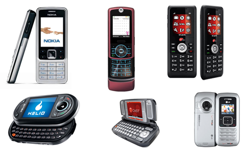
Before the iPhone came out, phones looked like this:
Different shapes and sizes. Flip phones and sliders. Candybars and decks of cards. Lots of hardware buttons. A hundred takes on the D-pad. A small screen (or two). This is what mobile phones looked like from the time I bought my first in the late 90s till early 2007.
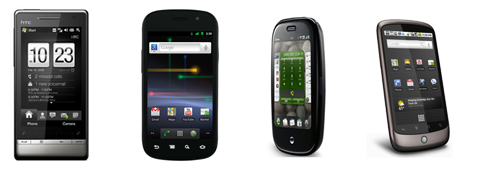
But since the iPhone debuted, they all look like this:
They're all rectangular with a screen that fills up nearly the whole front face of the phone. Some still have physical keyboards, but that's a vestigial tail that will certainly fall off at some point in the future. All have only a few hardware buttons. All have nearly the same dimensional proportions. All have nearly the same thickness, give or take some tenths of an inch. All have nearly the same weight and feel in your hand.
Why is this?
Because the future of mobile hardware design is for it to fade away completely and have the focus be the OS and apps it runs.
Nokia's Windows Phone 7 Concept
Engadget recently posted a concept design showing a new Nokia phone that would run Windows Phone 7. Predictably, it looks like an iPhone and every other smartphone that's been manufactured in the past year or two: rectangular, a huge screen, small outside bezel, thin.
It looks good, or, I should say, the tiny amount of surface area not dedicated to the screen looks good. It will probably feel good in a person's hand, but what phones don't feel good in a person's hand nowadays? They all do, because they're all designed to look the same. They're all designed to look like the iPhone. A glowing rectangle surrounded by a thin strip of material that sends data to the rectangle.
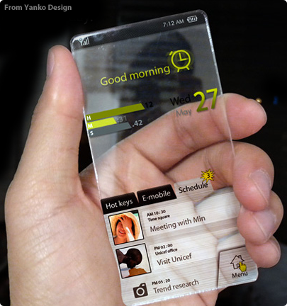
The Future Of Mobile Hardware Design
I've looked into the future and have seen what mobile devices will soon look like. I know, it sounds impossible, but here it is.
All screen, no bezel, no chrome, just interface.
Look at the mobile hardware trends in the last few years: the screens are staying about the same size but the hardware around them is shrinking. Thinner phones, thinner bezels, more focus on the screen. At some point in the future all we'll have is the screen and the software that it's running because that's all that matters.
The iPhone started the trend of the focus being on the software. Your phone becomes the app that it's running. How many people focus intently on the bezel around the screen while they're using their phone? No one does. You stare at the screen. As technology advances and miniaturizes, everything will get faster and smaller. The hardware will fade away and software will be the only thing people care about.
I'm great at starting things, not so great at finishing them. I get really excited about something, work on it intently for weeks or a month or two, then the next cool project catches my eye and I shift over to that leaving the old project to sit forever unfinished.
Near the end of last summer I had an idea of what I could do with these various unfinished projects: turn them into in-depth tutorials. So many friends of mine are designers who have never programmed before, or developers who never learned iPhone development, so the least I could do is re-package these forgotten projects (and new ones!) into something that might teach others what I've learned about iPhone UI design and development.
Design Then Code will be the site where these tutorials are published. If you go there now you can register to be notified when the first set of tutorials are available.
Design, Development or Both
Each tutorial has two parts: design and development. The design half discusses how to create a particular app's user interface in Photoshop with all steps explained along the way including lots of screenshots. It includes the PSD file as well. The development half discusses how to execute that design in code. This half includes the Xcode project.
I imagine that current iPhone UI designers would only want the development half, whereas iPhone developers would want the design half. And many others might want to read the entire thing. That's why I split them in two instead of making each one a monolithic guide.
I don't go through every screen and every feature of these fictitious apps. What I discuss is more like a fully functional interface prototype for a single screen. Each tutorial includes high-fidelity design instruction coupled with the UI code to make the interface real for a part of an app, usually the main screen. I think that coding custom iOS app interfaces by hand is an extremely important skill, and I want to teach people what I've learned about Cocoa user interface development.
Here's a preview of the first two tutorials. The first is a futuristic music production app for iPad, the second is a retro, western-themed design app for iPhone.
Building iOS Apps From Scratch
While working on these tutorials, I realized that if someone is starting with no knowledge of Objective-C or the Cocoa frameworks they might have some trouble getting up and running. To help teach people the fundamentals of iOS development I wrote an e-book called Building iOS Apps From Scratch and will be providing that for free so people can learn the basics of Objective-C and Cocoa. If you signup at Design Then Code you'll get instant access to an early (but complete) version of this guide. The final version will launch at the same time as the main site.
Look for the full site and the first set of tutorials soon!
About 4 years ago I heard Jim Coudal give the opening remarks at SXSW Interactive and his words struck a chord with me.
He spoke of a changing industry where "creatives" were no longer stuck in the wacky room at some large corporate entity but were now responsible for crafting products from beginning to end. Forget consulting work, now anyone could create a thing and sell it on their own. Illustrators learning sales forecasting. Designers learning media buying. Writers building widgets.
How does someone learn new things like this?
By being curious.
The CEO of a company I worked at in the 90s was talking to me about their new website I had built. We talked about some tagline and copy adjustments and out of the blue he fired up an FTP client and dove into the HTML. He had 20 years of experience in sales and didn't know RAM from ROM, but he told me he read some web design tutorials and "knew enough to be dangerous."
He learned something new, on his own, just because.
Learn New Things
You've heard this story before: a "product guy" has an idea but can't do anything with it unless he finds a designer and a coder to make it a reality. Or how about this one: a designer has the grandest ideas and mockups for iPhone apps but has never written one line of code. Or a coder that makes interfaces that look like a FrontPage template. Or user experience professionals who can only make wireframes, not real designs.
What's the common thread throughout all these examples? A lack of curiosity.
Just because your business card says you do X doesn't mean you can't dabble in A, B, C or Y in your spare time. Designers should learn how to code a bit. Hackers should learn the fundamentals of good design. Business guys should learn enough about technology that they don't sound uninformed. Technology folks should learn about finance and economics. Web designers should learn the basics of print design. Print designers should learn how to make a webpage. Marketers should have a deep knowledge of how their products work.
If you do something and then hand it off to someone else, learn about what the next person is actually doing. Talk to them, read books, subscribe to blogs, be curious. Learn in your spare time. Have a side project that makes you uncomfortable. Force yourself to figure things out. Get just enough knowledge to be dangerous.
How I Learned About Design
I've been designing professionally for many years but I have no classic design training. I drew some things as a kid but never considered myself an artist. I learned and experimented and played and worked for many years to develop good design taste and it wasn't an overnight thing.
Here's how I taught myself about design: I read every single design book in my college's bookstore. I'm not lying. There was a huge, comfy, leather chair in the bookstore and there were 4 gigantic shelves filled with design, art and typography books. Every day after class I'd stop in, pick up a few books where I had left off, and retire to the comfy chair to poke through them. I didn't read every word, but I did look at every page and tried to absorb what I was seeing. It took the entire fall semester but I finished the entire section.
And when I was done I started reading programming books. And science books. And math books. And business books. And anything else that looked interesting.
 It's important to keep your elements in Photoshop in vector format as long as you can because they can be scaled and re-styled easily. To draw a rounded rectangle, I use (gasp!) the Rounded Rectangle Tool with Snap To Pixels turned on. This is incredibly important or the edges of your shape will lie on
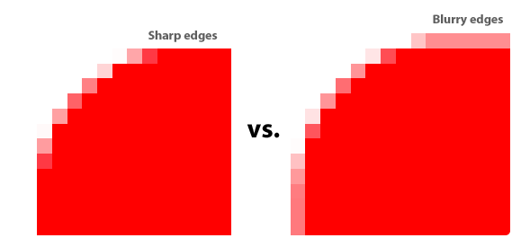