Ketchup Bottles & The Physicality Of Design
At lunch earlier today I snapped a picture of the top of a Heinz ketchup bottle.
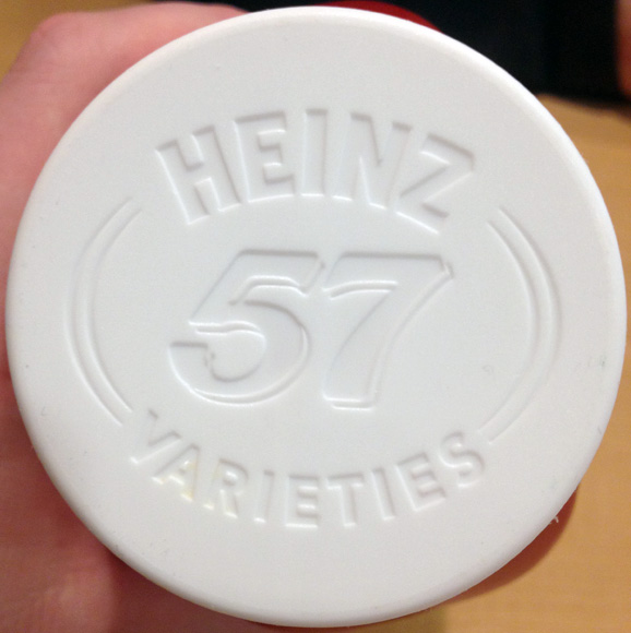
It's not remarkable, but it caught my eye because the look of the embossed text in the cap is exactly the look that so many designers are trying to replicate these days, myself included. What look is that?
The emulation of physicality.
A current trend in the design of digital interfaces is to subtly hint that the objects on the screen have weight, volume and surface undulations like they would if they were manufactured and held up in front of you. This is why Apple puts defined, shiny gloss lines on buttons and toolbars: because they're emulating a plastic lens shape and how lenses interact with light. Lenses refract light in precise ways and the specific coloring, gradients and glows used in iOS toolbars and buttons were put there specifically to make them look more like a long, plastic convex-on-both-sides piece of glass instead of just pixels on a screen.
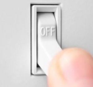
Imagine if the iPhone's interface were manufactured and put up on a wall. There'd be realistic textures like linen, leather, shiny plastic and matte aluminum. These textures wouldn't all sit at the same distance from the surface, they'd be staggered — some elements indented, some elements poking out — because the real world isn't flat. Everything is either convex or concave, shadowed or highlighted. Just look at how many angles and surfaces a simple light switch has. Convex, bubbled text that casts a shadow. Indented, shadowed crevices. Light-to-dark gradients on surfaces.
And people all over are putting realistic switches into digital interfaces. They're trying to emulate the highlights, shadows and gradients that a real switch has when lit from above. Indented buttons, convex panels, glossy shines, textured mattes, embossed text, and it goes on. These are the elements that interface designers use to make their products appear touchable, tactile and hefty.
Now this physical emulation of real objects can be taken too far, but just like with everything else, moderation is the key. Some of the top apps in the App Store use these exact techniques to great effect. The leather and embossed buttons in Camera+. The indented and matte tweet actions row in Tweetbot. The textured opening screen of Path. You may not immediately notice these little details, but they make digital interfaces appear more valuable, like little hand-crafted executive paperweights: expensive, heavy and solid.
The pixel-perfect emulation of physical surfaces and lighting in a digital interface is the secret weapon of interface designers. Little touches like panels that are slightly indented and shadowed, subtle cloth-like texturing, and white highlights on embossed label text may not be immediately perceptible, but they add a richness to the overall experience that most apps just don't have.