Crafting Subtle & Realistic User Interfaces
The underlying secret to beautiful user interface design is realism: making 2D objects on your screen appear to sit in 3D space with volume, surface properties and undulations that might appear in real life. These faux 3D objects have highlights and shadows just like objects on your desk might have, and they have textures that emulate real objects from glass to sandpaper and everything in between. Designing beautiful user interfaces has more to do with the why than the how.
Thinking in 3D
If you're trying to design a realistic-looking user interface element then you have to think about what that object would look like in the real world. What's the easiest way to do that? Look at it from the side. What would a button look like if you viewed it from the side of your monitor? Let's take a look.
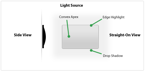
Here's a button-shaped panel that's designed to look slightly raised and have a matte surface. It's thin, has a subtle convex shape, and has a small edge that goes around the outside. In a 3D space, the light source would illuminate the edges (slightly brighter on the topmost edge) and would not fully illuminate the bottom slope of the panel past the apex. The object would cast a small shadow since it's not raised off the surface very much.
Pastebot, the new app from Tapbots, has a table view filled with panels that look similar to the one from above. Let's see what it'd look like with multiple panels next to each other.
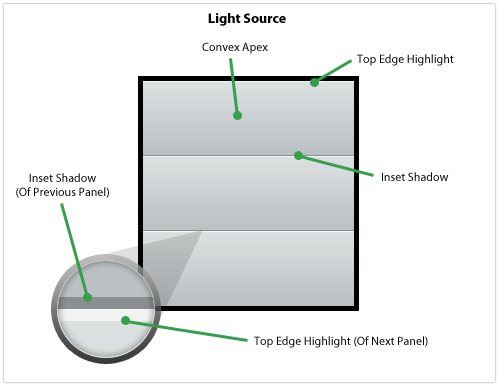
This looks like a realistic series of panels because of the Top Edge Highlight up against the Inset Shadow which, from the side, would look like this: <. The Inset Shadow appears because the light source does not illuminate that area but then the next panel starts and pokes out, catching the light and showing a highlight.
Design elements that we think look great are usually the ones that look the most realistic, as if they could be in front of us on our desk or on the wall. Paying close attention to how light would strike the object as if it were real is crucial to executing a realistic user interface element.
Designing The Material & Surface
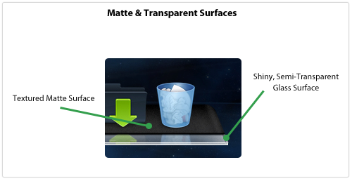
In my internet globe icon tutorial I stressed the impact an object's material has on its overall look. Not accustomed to thinking about an object's material? Get used to it! It adds a new dimension to your design and keeps the object's realism in the front of your mind. If you're designing an interface element and can't immediately name what type of material you're emulating then how can you execute it with perfect realism?
I recently linked to some beautiful Dock replacements for your Mac and many of these illustrate how important the material is to your overall design. In one named Phantom the designer uses two different materials to make the Dock: a textured, grainy surface coupled with a semi-transparent glass edge. The textured surface seems like the back of a notebook pad or a heavily-used wallet whereas the front edge looks like a clear, solid block of lucite.
Apple has been using shiny, gloss-laden user interface elements in Mac OS X for awhile but recently there has been some chatter that they were gearing up for a total interface refresh using matte elements. This full refresh never happened but matte interface elements have been steadily making their way into Mac OS X for a number of years.
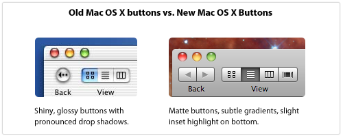
With the latest version of iTunes, many user interface elements like scrollbar sliders and buttons have been given the updated, matte look.
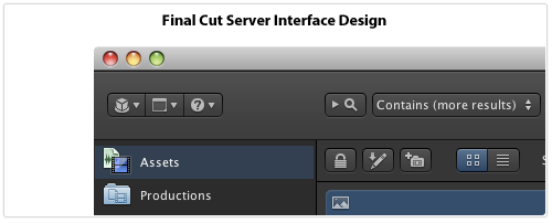
Apple's also been using the matte look in some of their Pro software, most notably Final Cut Server. In that application's interface, Apple's removed the gloss from nearly everything and kept convex buttons close to flat with only a slight highlight on the edge. Also, the icons on buttons are not set into the button (accomplished via a thin, white drop shadow on the bottom, a style used throughout Mac OS X) but instead sit on top of the button through the use of a dark drop shadow on the icon. The entire interface pane is slightly raised and looks like dark, textured steel, making the application look like the instrument panel to a high-tech piece of equipment.
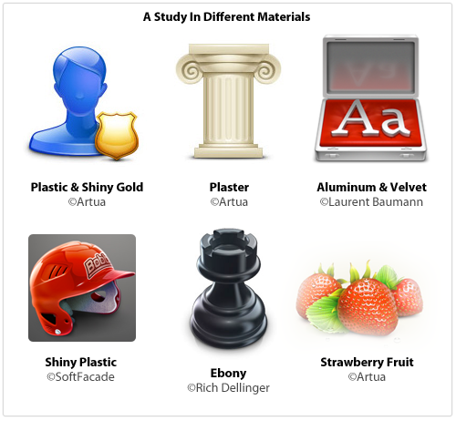
Here's an assortment of icons that all show how different surface materials contribute to the overall look of the element:
Next time you want to create something shiny, think about what type of material you're really executing: is it plastic? Glass? Reflective aluminum? If you're designing a matte element, think about just how grainy and textured it should be. Paper or sandpaper? Cardboard or anodized aluminum like an iMac? Is there transparency? Are you emulating something in real life or creating a material that's more hyperrealistic?
Tips For Execution
It's one thing to look at beautiful interface elements, icons and illustrations and quite another to build them yourself. Here are some ways that I build designs using Photoshop.
Noise Layer
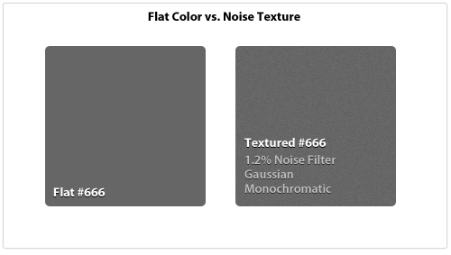
Matte interfaces are hot right now and one of the key elements of a matte surface is that it's not perfectly symmetrical, it has some texture and grain to it. The easiest way to accomplish this is by creating a layer of one flat color and then using the Noise Filter to add some texture. The key is to keep it subtle and barely noticeable.
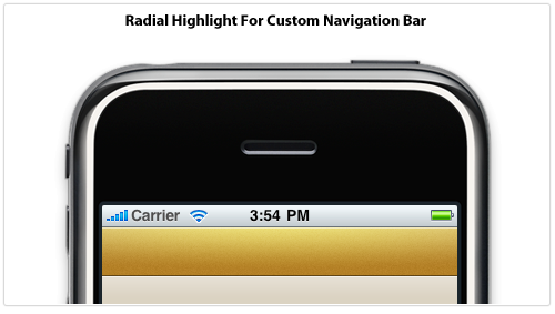
Radial Highlights
The main light source comes from the top but that doesn't mean you can't introduce a secondary light source for emphasis. Below I've created a custom navigation bar for an iPhone application that uses a subtle radial highlight for added dimension and detail. The Blend Mode has been set to Overlay to brighten and saturate the overall color and the transparency has been knocked way down to keep it realistic. Also note the edge highlights to make it look more like a raised surface.
Creative Layer Styles
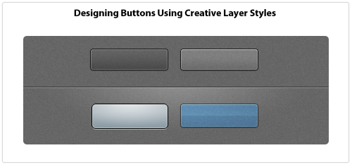
Layer Styles are a key part of my design workflow, I use them for everything. Usually I'll draw a vector object, set the Fill to 0%, and design the entire thing using Layer Styles. Anyone can add a Drop Shadow to something, but if you get creative with Layer Styles then it enables you to really transform what you're working on. For example, you can only apply one Stroke but you can emulate 3-4 different stroke styles through creative use of the Inner Glow and Outer Glow styles if you crank up the Spread and Choke sliders and turn your glows into solid lines.
Once you turn glows and drop shadow styles into solid lines you can achieve a lot of effects with minimal effort. Below are some Layer Styles applied to rounded rectangles that use 1px glows and shadows. The PSD file for the following examples is released under a Creative Commons license: Button Examples
Reality Is Subtle
When something looks "off" in an interface, it probably looks fake, like it wouldn't exist in the real world. How do you keep your interface elements looking real? Here are some things to always keep in mind:
- Keep it crisp. No blurry lines or edges.
- Always adjust opacity. Nothing is totally black or white, dark or bright. A semi-transparent black or white line, glow, shadow or shape goes a long way.
- Go vector when you can, it can be resized later. Don't Free Transform vector objects: use the Direct Selection Tool to move individual points.
- Experiment with Layer Styles. White Inner Glow makes shapes pop. Use Overlay blending mode to liven up and saturate colors.
- Drop Shadows will ruin your design if you don't do it right. Things should be right up against their surface which means using a 1-3px Drop Shadow size. And 0-3px distance. This isn't WordArt.
- To save a complex shape as a PNG or GIF, turn the layer into a Smart Object first, then Rasterize it. This preserves color blending modes.
- When using type within an interface element, it either sits on top (dark 1px drop shadow) or is inset (white 1px drop shadow), it's never at the same surface as a button or widget.
- Real-world objects rarely have perfectly square corners. Use subtle rounded corners to make objects look real.
- In real life, everything casts a shadow. Unless you're drawing vampires, if you intend your object to have depth and be resting on a surface then it better have a drop shadow, even an incredibly subtle one.