Earlier today I tweeted a link to Andy Rutledge's latest entry, "Web Design is Product Design" which, in the first line, offended at least 50 of my followers on Twitter:
A designer who does not write markup and CSS is not designing for the web, but drawing pictures.
The reason I know that this stirred up controversy is because I received dozens of replies, nearly instantly, about how much they disagreed with the statement. On the other hand, the tweet was retweeted over 70 times so that means a healthy number of people agreed with Andy's view of the web design profession.
So who's right? Is there a correct answer? I don't know, but what I do know is that designers who are also programmers are incredibly valuable so let's talk about why.
I'm the odd combination of both a designer and software engineer. I've been designing websites and software for more than half my life, and I've also been developing websites and software for the same span of time. In the early 2000s I helped start a successful design firm and a (mostly) successful startup, and as any entrepreneur can tell you, you have to be able to wear multiple hats and do a great job no matter what you're doing. Hell, I was even half-decent at cold-emailing companies and selling advertising spots. After the iPhone came out I learned Objective-C and the Cocoa APIs and now I also design and build iOS software. I work on web software during the day and mobile apps at night.
I design all day long, I code all day long.
But most people don't do that.
Most of my friends who are designers are pretty amazing at what they do. World-class icon artists. Apple Design Award-winning user interface designers. Terrific web designers. The crazy thing about most of my hyper-talented friends is that, for the most part, they were the ones who disagreed with the notion of designers needing to know how to code. They had well-written thoughts about the importance of specialization and how teams of individuals doing individual jobs worked well, and there's really nothing wrong with that.
My issue with this whole situation is that it seems that designers were against even learning, just a little bit, about how to be a programmer. It's like the mere notion of them stepping outside their comfort zone was an affront to their talents, when nothing could be further from the truth.
If someone is talented enough to do a great job within his or her skill set, then they're probably talented enough to learn a bit about someone else's job, too. Designers learning how to program. Programmers learning how to design. Product people learning how to actually design or build something instead of just writing about it. (I kid! Sorta.) Whoever you hand your work product over to, that other person's skill set is what you should learn about.
Do It All, Reap The Rewards
Almost everyone has read stories about businesspeople with ideas for products or mobile apps and "all they need are some programmers and designers" to make it real. Or perhaps about programmers who build amazing systems and prototypes but they lack the polish a designer can bring. Or how about designers who design immaculate interface mockups but need a developer to make them real. All these stories are cop-outs. They're tales of woe from people who lack the curiosity and drive to just Figure It Out™ and start learning a new skill.
Do you know who the most valuable software people are in the world? They're the ones who can think up great ideas, elaborate these ideas on paper, design the interface, then prototype and build the idea into a real thing. Idea to design to code to product. One person who can do it all. One person whose skills cut across job titles and areas of purview with an overwhelming drive to do the whole thing because that's just how they do things.
I can't really speak for anyone else, but I'm guessing the common trait amongst us is that we're curious, almost to a fault. I'll read about programming languages, science, math, psychology, economics and space until the cows come home. I absolutely had to write software for the iPhone when it was announced so I had to teach myself C and Objective-C. Jesus, it was hard, but I did it. It took awhile, but now I consider myself a fairly competent Cocoa software engineer and I write & sell tutorials that try to teach others what I learned.
So do designers absolutely have to learn how to program to be a good designer? No, it's not a requirement. There are plenty of amazing designers out there who don't know CSS. But there are also plenty of designers out there who know CSS and advanced JavaScript. There are others who know CSS, JavaScript, Ruby on Rails and some SQL. And a few more who can setup and administer web servers. And a couple more who can write iPhone apps. And maybe a few more who know Java pretty well, too.
Can you be one of those people? Someone who is great at their main area of expertise, but also pretty good at other areas of expertise as well? Someone who can dream up software then design it, build it, and ship it? Yes. A thousand times yes. Like anything else, it takes determination, hard work, and lots of curiosity.
(This is a guest post by my friend Nick Paulson @nckplsn who is a Cocoa Developer working on various cool things including CloudApp.)
As a developer, I want to keep my applications safe from piracy. Itʼs always a predicament to find a solution that will not bother your real customers. We are going to look into some common licensing schemes, but before we do, letʼs make sure we are all on the same page.
Definitions
Serial Sharing Giving a serial number to a friend or a group of friends that use it beyond the purchased license count. This can be done by both sharing the serial number itself or by sharing the preferences property list file that is most commonly found in ~/Library/ Preferences/.
Cracking Also known as patching: changing certain bytes in an application in order to make it think itʼs registered at all times. It also includes the app being changed in a way so that it accepts any registration information. Every application update has to be cracked individually, it does not carry over version to version.
Keygenning Creating an application that generates serial numbers. This is done by inspecting what an application checks for in a serial and then producing serial numbers that will validate under that scheme. For example, a serial might be considered valid if it is 5 characters long and the first character is A and the third character is 1. Therefore, a pirate would create an application that creates serial numbers that follow that scheme, such as A21GD, AQ111, etc. Keygens are overall the worst thing that can happen to your application because you cannot differentiate between a serial number that is legal and one that is illegal, except using a purchased serial number database.
RSA An acronym for Rivest, Shamir and Adleman, the original creators of RSA. It is a form of cryptography that uses a pair of private and public keys to encrypt and verify data. A message sent encrypted using the private key will only decrypt properly with the public key, which makes it possible to verify that the sender of the message is who you truly believe they are. Licensing schemes sometimes use RSA in order to confirm that licenses only came from the application developer, and not a pirate.
Now that that is out of the way, on to the schemes.
Offline Activation
This is the most basic of licensing schemes. It involves the user inputting a serial number with an optional name or email address, and verifying it locally on the userʼs computer. It is vulnerable to all forms of piracy because the verification schemes are available for the pirate to reverse engineer and there is no checking against a purchased serial database. Blacklisting can be implemented to stop rampant serial numbers, but because it vulnerable to keygenning, blacklisting can only go so far.
Though it is vulnerable, it does not bother real customers. It is a great solution if you are confident in your application and arenʼt concerned with piracy.
Online Activation
Online activation is the next step up from offline. It verifies the serial number over the internet in order to prevent people from sharing their licenses. If a license were activated 500 times on 500 different computers, obviously the license is being shared. Online activation makes it easy for a developer to blacklist serial numbers on the fly. Usually the verification is done by loading a URL such as https://myawesomeapp.com/verify? user=nickpaulson&serial=THIS-ISMY-LICE-NSE1 and reading the response. The responses can be many different things, but two are most common, with one being more secure than the other.
The first is by returning plaintext information about the result of the verification. It could return something like “status: success” or “status: blacklisted”.
There is a problem, however. Once the serial number is verified, it is most likely going to be placed in the applicationʼs property list so it can be verified locally on the next startup. It would be a burden on the user to have to verify their serial number with the server on each startup, especially if they are trying to run it without an internet connection. Therefore, this method is vulnerable to serial sharing, cracking, and keygenning. A keygen can be created that generates a serial number and then writes it to the applicationʼs preference file. This bypasses the internet verification completely. The userʼs preferences file can also be shared, and a crack can be made by changing (usually) just a few bytes.
The second response is something more complicated, but also more secure. Instead of returning a simple string, it can return an RSA-encrypted message containing the result of verification along with the serial number. If this cannot be decrypted, then someone else must have created the message artificially, and it therefore must be invalid.
Instead of writing the serial number to the preferences file to be verified on startup, the RSA-encrypted message would be. On the next startup, if the message in the property list fails to decrypt, someone was messing with the license. Because the RSA- encrypted message cannot be created by a third-party, this method is not vulnerable to keygenning. It is, however, vulnerable to serial sharing (via a shared preferences file) and cracking.
Third-Party Solutions
Many companies provide licensing schemes for a cost. Two examples of such companies are Kagi and Esellerate. There is also a free, open-source solution named Aquatic Prime. Letʼs take a quick look into how they work.
Kagi & Esellerate These companies provide a framework or library to be included in your application. They supply you with a unique identifier that is used to verify licenses. It is a quick and simple drop-in solution for your application, and they also handle payment processing for you. However, there are some rather large drawbacks to using these companies. It is very obvious to a pirate that you are using Kagi or Esellerate, and it makes the stealing processing much easier for them. Once the generic algorithm for verification is reversed to create serial numbers, your application, along with all others that use Kagi or Esellerate, are instantly vulnerable. It is not difficult for a pirate to find the identifier in your application, and stealing your application becomes very simple. As a result, Kagi and Esellerate are vulnerable to cracking, serial sharing, and keygenning.
Aquatic Prime Aquatic Prime is an open-source framework for the creation and verification of licenses. It provides an application that developers can use to generate licenses, along with a framework that can be dropped into an application for license verification. It is RSA-backed, which adds to license security. But donʼt be deceived, Aquatic Prime is quite vulnerable. First off, like Kagi and Esellerate, it has a generic scheme with a unique identifier. In this case, the unique identifier is the RSA public key. This generic scheme is very easily patched by pirates. Also, if the framework is linked instead of compiled inside the application, a pirate can just replace the AquaticPrime.framework in the application bundle with his own. He or she might force all licenses to verify as correct or even hardcode a different public key inside so they can generate their own licenses. Therefore, Aquatic Prime is vulnerable to serial sharing (sharing the license file), and cracking, and a keygen+crack combo.
DES3 Protection Caution: Advanced Topic
This is a form of application protection that, while not widely used, is interesting to take a look at. DES (which stands for data encryption standard) is a form of encryption/ decryption that uses a secret key. One way to use DES3 in an piracy protection scheme is to use it for application integrity. For example, you could create a plist file that contains some constants as keys along with class names or selector strings as their values:
Once the application has been compiled and is ready to ship, the property list can be encrypted using the SHA1 value of the application binary. This can be calculated using the following command in Terminal:
Then, put that file in the application resources folder and make sure the unencrypted property list file is not inside.
On the application side, it should calculate the SHA1 value of the application binary using a third-party framework (such as SSCrypto.framework) and then create an NSTask object that does the following command:
Read the property list into the application, get the needed constant, and return to the workflow. Make sure to delete the decrypted file when completed. If the property list fails to decrypt, the constant will not be returned and cause some application functionality to cripple. Basically, if even one byte is changed in the application binary (such as, for a crack), the application becomes crippled. This will help to hinder pirates from cracking your application, but it does not prevent it whatsoever. It will also slow down your application quite a bit depending how many constants you use, because the decryption must be done each time it is loaded. So this method will hurt your real customers.
You may be asking, “how can this be cracked?” Basically, the pirate decrypts the encrypted property list file and replaces the encrypted one with the newly decrypted one. After, he NOPs (no operation) the decryption process, so the application essentially just loads the “encrypted” file into memory, and then converts it to a property list without decryption. Because it is already decrypted, this works fine and the piracy protection has been broken.
Conclusion
There are a number of ways to protect your application from piracy. However, when it comes down to it, piracy cannot be stopped. Whether you like it or not, if someone wants to steal your application, they will. On this note, pirated copies should not be considered lost sales. Most pirates had no intention of purchasing your application in the first place. Donʼt hurt your real customers. If your application is good enough, people will buy it. The best way to prevent piracy?
A design can be wrong. The entire thing can be wrong, parts can be wrong, or even a tiny, 10x10 pixel area can be wrong. Not, "I think it's good but it needs improvement" but flat-out wrong. 1 + 1 = 3 wrong. A spelling mistake in a book wrong. A syntax error in a code file wrong. It's not an opinion, it's not a matter of subjectivity, it's a fact: a design can be wrong.
Dribbble Mayhem
Dribbble is a site where designers can upload small screenshots of their upcoming work and receive critiques from other designers. Recently Jason Lynes posted a screenshot challenging the status quo at Dribbble and asking others to hold all feedback unless the designer explicitly asks for it. A mini-firestorm kicked up in the comments, but the most interesting comment was from Jason himself regarding the concept of design criticism:
Screenshots are 400x300, too small to convey purpose, context, and intent in the design. How is that enough information for you to tell me my font's not working, or my color's wrong? For design criticism to be effective, you absolutely must have context. Dribbble has none.
Is he right? Do you really need to see the whole picture before commenting on design execution? No. Definitely, absolutely, positively no. A design can be wrong without any context. Here's why.
What Can Go Wrong
Designs can succeed or fail on a number of levels, some of which are subjective, some of which aren't. Things like the overall concept, mood and its visual appeal are subjective: one person might think a design succeeded in its overall goals whereas another might think it failed. To decide this you probably need to have knowledge of the big picture, the overall design goals, the context. In most cases this cannot be decided by a quick glance at a 400x300 screenshot. If it's a miserable, hopeless failure then you can, but if it's on the border then context is what's needed to make a final call.
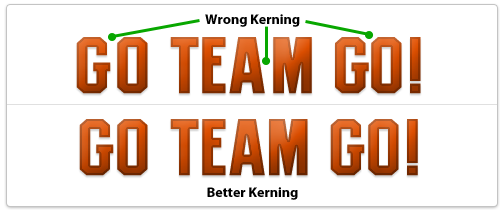
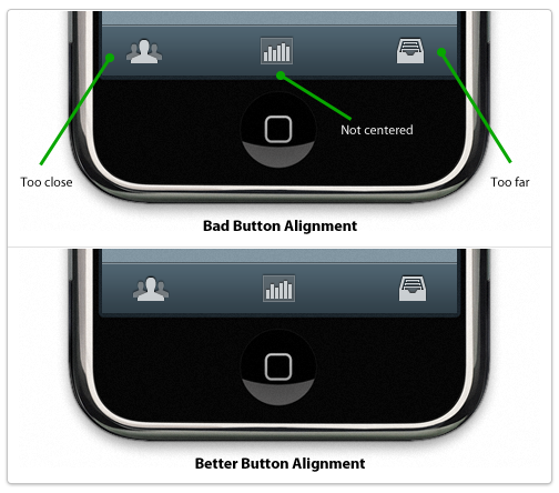
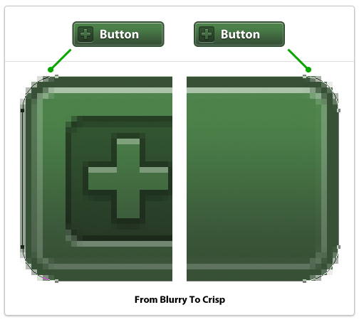
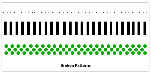
So without any context what can you really critique? Design execution. The execution of a design is the nitty-gritty details of the design. The pixel-level details. The alignment of individual elements. The kerning of a logo or headline. The sharpness of an edge. These can be wrong. These can be so incredibly wrong that they stand out no matter how good the overall concept, mood and visual appeal may be. Screwing up the execution of a design ruins the design. Game over, it's wrong, and no context is needed to understand its wrongness. A 400x300 pixel screenshot on Dribbble can be wrong without knowing anything about the project. An iPhone app icon can go from right to wrong in just a few pixels. One misplaced pixel. One misaligned button. One blurry edge. This is what makes a design wrong, this is what makes an execution of a design go from good to garbage.
Examples Of Wrong Design
Wrong kerning on a logo or headlineYes, you can screw this up if it's obvious enough so make sure to manually adjust kerning between letters if needed.
Misaligned elements, uneven paddingElements in a design should be aligned to something: other elements, a grid, a golden ratio frame, the edge of the page, something. If it looks like you tried to align it to something else and it's not perfectly aligned then you failed, it's wrong. Either something is perfectly aligned to something else or it's not aligned to the other element at all. If it's 98% aligned it's wrong. The same goes for padding around elements and whitespace. If you are designing tabs for a website and the text is not aligned properly within each tab it's wrong. 1px off is wrong. It's sloppy, it's junior, it's not professional. What if a plumber only half-tightened a pipe and it was only leaking a little bit? Would you think that was acceptable or would you ask him to actually stop the leak? The same applies here. Either things are aligned properly and have uniform padding or they don't. Either a pipe is leaking or it's not. Simple as that.
Blurry edgesThese look terrible and can ruin a design instantly. What's a blurry edge? It's an edge of a vector object that doesn't lie fully on a single pixel but straddles two pixels. The most egregious examples are long, straight lines that the designer was too lazy to make sure were the width of a whole pixel so they end up using 2 pixels when they should only use 1. To fix these in Photoshop (if using vector shapes) switch to the white arrow tool and select points of your shape individually, then zoom in close and use the arrow keys to move points over a tiny amount until they're perfect.
Broken patternsA pattern is a technique that a designer sets up and reuses in a repeating fashion. Dotted lines would be one example, an overlapping plaid pattern could be another. Anything that repeats in a set manner needs to adhere to its own defined pattern or else it's a mistake. A dotted border that is missing a pixel or has too much spacing between two dots. Ten boxes in a row and the space between the 3rd and 4th is a few pixels off. A stripe pattern using lines 10 pixels wide uses a 9 pixel line by accident. These are mistakes, it's not a subjective matter. If you're not careful when copying and pasting layers in Photoshop it can happen.
Techniques To Avoid Design Errors
If you're not sweating every pixel then you're already off to a bad start. What does that mean? It means using alignment and measurement tools to make sure everything is perfect. It means double-checking to make sure an element that's supposed to be centered actually is. The details are the design. They're not an afterthought or something you fix later, it's something embedded in everything you do. Every icon, every line of text, every box, every pixel should be cared after as if it's 10 feet tall staring you in the face.
Design errors separate stock-photo-slappers, clip-art-arrangers, and programmers-turned-wannabe-designers from real, world-class, totally-fucking-amazing professional visual designers. If you're not a world-class designer but aspire to be one, don't ever commit a design error. Your visual tone could be off, the colors could be muddy, the concept could need tweaking but you should never, ever make a mistake that I've listed. There's no excuse, and the best part? Fixing a design error requires no design talent. You don't have to write like Ernest Hemingway to be able to spell words correctly and you don't have to be a great designer to simply double-check every pixel and make sure it's in the precise place you planned it to be.
Back To Dribbble
Designers who care about their work want to know when something is wrong. Not subjectively wrong (although that's good to discuss as well) but objectively wrong like a design error. A flat-out mistake. If someone spots a design mistake in my work I want to know because I want to fix it; I want my work to be perfect and represent my best efforts. It's not an ego thing, it's not a hurt feelings thing, it's a professional thing. If a plumber leaves a pipe leaking then it's a mistake. If a writer misspells a word in a novel then it's a mistake. If a designer makes a design error then it's a mistake. Plumbers who don't care about leaky pipes aren't professionals. Neither are writers who leave misspellings in books nor designers who make egregious design errors in final designs. Either you're a professional or you're not, it's as simple as that.
Your app has too many settings, too many things to tweak. API endpoints? Colors of the rainbow? 100 different fonts and font sizes? Temperature in Kelvin? Switch the app to use Esperanto?
Kill the settings, kill them all.
Your Vision Is Your Software
You're the developer, build what you want. Your app should be an expression of your opinions. Jason Fried from 37signals shares this thought as well. Here's what he had to say in his first book Getting Real:
Some people argue software should be agnostic. They say it's arrogant for developers to limit features or ignore feature requests. They say software should always be as flexible as possible.
We think that's bullshit. The best software has a vision. The best software takes sides. When someone uses software, they're not just looking for features, they're looking for an approach. They're looking for a vision. Decide what your vision is and run with it.
And remember, if they don't like your vision there are plenty of other visions out there for people. Don't go chasing people you'll never make happy.
His company has made millions of dollars leaving out the fluff that others love to include. They built their first application Basecamp to satisfy their own needs and left out the features they didn't think were important. Jason considers his team software curators, continually trimming and editing features down to their essence. They build opinionated software.
Trim The Fat
If there's a choice between setting a value to A or B, and you always choose A, why not just make A the main, unsettable, unchangeable choice? If you think A is the best decision, why even let people choose B? Well, in App Store land, people like to whine about B. They'll post 1-star reviews asking when B will exist and say that they'll bump it up to a 5-star review when B is implemented. Others will see that review and ask about C, or D, because they think those are equally important.
This is all bullshit.
You're the developer. Everything is up to you. Apple doesn't listen to users and they're the most successful technology company in the world. They have a fearless leader who's not afraid to piss people off by removing floppy drives or buttons on a mouse. He's not afraid to scrap successful, acclaimed products and start over from the ground up. He builds what he wants because he knows he's building great stuff. That's what you should do, too.
The previous design ended up being overwhelming for normal users (and even some experienced ones) and became very confusing for people with multiple accounts since it was unclear which account was performing a search or looking at trending topics. There were also three different areas to set preferences and many of the options in the preferences were unnecessary and confusing to most users so they were avoided or left to defaults anyhow. So we took a leap and removed the preferences completely, only adding them back in when we found something that absolutely needed it.
Here's a comparison screenshot between the old Settings options and the new, completely slimmed-down version. They gutted their Settings; they're nearly gone. This takes a lot of guts and you can only do this if you really know what kind of software you want to build. You've gotta have the big picture in your head and you have to know where you won't compromise. Inevitably some power users may be upset but the Iconfactory is looking at the overall user experience and that matters more than what some tech bloggers think.
Power Users Don't Matter, Build For The Masses
Feature lists and pages of settings get a small segment of power users excited, not regular users. Regular users want elegant, smart software that just works right without having to fiddle with any additional settings. A perfect example is multitasking in Android vs. iOS 4.0. Apple waited to introduce multitasking because they didn't want to build a system where background apps drain the battery. Compare this to Android: just a few weeks ago Larry Page said that some background apps will drain your battery if you let them. Multitasking in Android was built solely for power users who are expected to force-quit apps and manage their phone's radios in order to maximize battery life. (Here are 20 tips to improve an HTC Evo's battery life.) Jobs made the call to build multitasking the way he saw fit, not the way the tinkerers and phone hackers wanted.
Don't compromise your vision, don't compromise your opinion. If you think 12px font looks best in an interface, don't allow people to move it to 10px. If you could never picture yourself changing a setting to anything else but A, don't even give the option to change it to B. Just don't do it. Build software for you. There are many, many people out there just like you who will appreciate it.
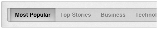
Digital Post, my newspaper app for the iPad, uses a number of custom user interface elements to build out the full user experience. One of these custom components is a horizontal topic selector that you can swipe and also tap to select individual topics.
Original Concept
Facebook for iPhone was one of the first apps to use a horizontal scroller to let you navigate various screens or topics. When first designing the interface for Digital Post I thought it was a perfect opportunity to do my own version suitable for an iPad app.
Building The Main Slider
The requirements were simple: can be swiped left or right and each item in the menu can be selected. This led me to make the main component a UIScrollView subclass. I subclassed it because I needed to do my own custom drawing in its drawRect method to execute the design. Let's take a look at the drawing code, it's very simple:
Here we're taking a PNG, stretching it horizontally, and drawing it in the precise location that this scrollview is located. The left cap of 15px means that the first 15px of the image are kept pixel-precise, the 16th pixel is used to stretch across the wide area, then the final right pixels are kept pixel precise also. This is a common technique to execute custom designs, I wish I could do this in CSS!
Adding The Tappable Topics
To make a UIScrollView actually scroll you need to know the total width (or height) of the content it contains. For my scrollview, I programmatically add the tappable topics and then calculate the total width of them once I'm finished. I first thought to make each topic a custom UIButton but for some reason, if the buttons are one-after-another with no pixels in between, the touch events they intercepted stopped the slider from scrolling. I couldn't quite figure out the issue but fortunately there are numerous ways to accomplish the same design. Instead of UIButtons I decided to use UILabel subclasses and add the tap events myself using UIGestureRecognizers, one of the new APIs available on the iPad. Here's the code that calculates the total width of this scrollview's content:
Here I'm using NSString's method sizeWithFont to calculate the exact size of a string rendered using a given font. The 30px extra is to account for 15px padding on the left and right of each one. Once I've iterated across my entire array of topics, I now have an exact pixel amount to assign to the contentSize property.
After calculating the total width, I add each topic one at a time to the scrollview. (DPTopicLabel is my UILabel subclass.)
First, I create the CGRect that will be the exact position of my tappable topic. The CGPoint startingPoint is updated at the end of each iteration to push it ahead to where the next topic will go. Next, I create my new DPTopicLabel and use my custom initWithFrame:andText: method to pass in what the text should be. If the string is "Top Stories" then I call my setSelected method which draws the custom background for a selected topic.
After I create the topic I need to make it respond to touch events. There are a few ways to do this but I like how the new gesture recognizers work so I used that. Once you add a gesture recognizer to a view, you tell it what type of gesture you want it to recognize (complicated, eh?) and then what method you want it to call when it happens. In this case I'm catching tap events and passing in my handleTap method which will toggle the selected state of my label.
All that's left to do at the end is change my startingPoint variable and add the label to the overall scrollview. Done!
Conclusion
This isn't magic and it's not all that complex. Building custom UI components is all about being thoughtful and planning out each step. The steps here:
Add a scrollview
Draw its background
Add custom labels one at a time
Set one of those to be selected, that has a custom background
Feel free to use these techniques & code in any personal or commercial projects you may work on.
The underlying secret to beautiful user interface design is realism: making 2D objects on your screen appear to sit in 3D space with volume, surface properties and undulations that might appear in real life. These faux 3D objects have highlights and shadows just like objects on your desk might have, and they have textures that emulate real objects from glass to sandpaper and everything in between. Designing beautiful user interfaces has more to do with the why than the how.
Thinking in 3D
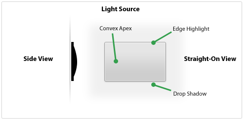
If you're trying to design a realistic-looking user interface element then you have to think about what that object would look like in the real world. What's the easiest way to do that? Look at it from the side. What would a button look like if you viewed it from the side of your monitor? Let's take a look.
Here's a button-shaped panel that's designed to look slightly raised and have a matte surface. It's thin, has a subtle convex shape, and has a small edge that goes around the outside. In a 3D space, the light source would illuminate the edges (slightly brighter on the topmost edge) and would not fully illuminate the bottom slope of the panel past the apex. The object would cast a small shadow since it's not raised off the surface very much.
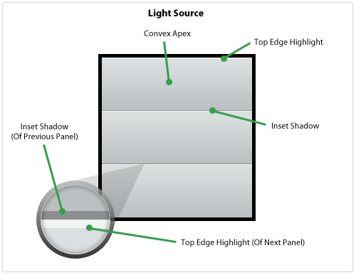
Pastebot, the new app from Tapbots, has a table view filled with panels that look similar to the one from above. Let's see what it'd look like with multiple panels next to each other.
This looks like a realistic series of panels because of the Top Edge Highlight up against the Inset Shadow which, from the side, would look like this: <. The Inset Shadow appears because the light source does not illuminate that area but then the next panel starts and pokes out, catching the light and showing a highlight.
Design elements that we think look great are usually the ones that look the most realistic, as if they could be in front of us on our desk or on the wall. Paying close attention to how light would strike the object as if it were real is crucial to executing a realistic user interface element.
Designing The Material & Surface
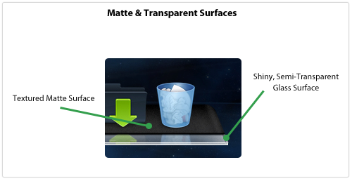
In my internet globe icon tutorial I stressed the impact an object's material has on its overall look. Not accustomed to thinking about an object's material? Get used to it! It adds a new dimension to your design and keeps the object's realism in the front of your mind. If you're designing an interface element and can't immediately name what type of material you're emulating then how can you execute it with perfect realism?
I recently linked to some beautiful Dock replacements for your Mac and many of these illustrate how important the material is to your overall design. In one named Phantom the designer uses two different materials to make the Dock: a textured, grainy surface coupled with a semi-transparent glass edge. The textured surface seems like the back of a notebook pad or a heavily-used wallet whereas the front edge looks like a clear, solid block of lucite.
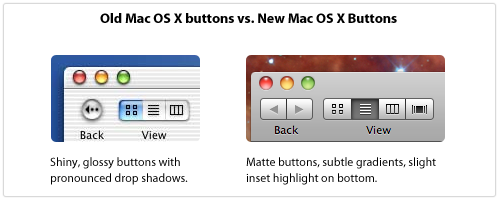
Apple has been using shiny, gloss-laden user interface elements in Mac OS X for awhile but recently there has been some chatter that they were gearing up for a total interface refresh using matte elements. This full refresh never happened but matte interface elements have been steadily making their way into Mac OS X for a number of years.
With the latest version of iTunes, many user interface elements like scrollbar sliders and buttons have been given the updated, matte look.
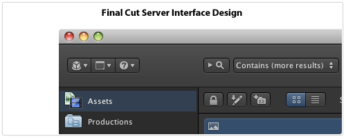
Apple's also been using the matte look in some of their Pro software, most notably Final Cut Server. In that application's interface, Apple's removed the gloss from nearly everything and kept convex buttons close to flat with only a slight highlight on the edge. Also, the icons on buttons are not set into the button (accomplished via a thin, white drop shadow on the bottom, a style used throughout Mac OS X) but instead sit on top of the button through the use of a dark drop shadow on the icon. The entire interface pane is slightly raised and looks like dark, textured steel, making the application look like the instrument panel to a high-tech piece of equipment.
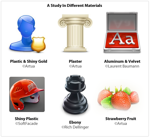
Here's an assortment of icons that all show how different surface materials contribute to the overall look of the element:
Next time you want to create something shiny, think about what type of material you're really executing: is it plastic? Glass? Reflective aluminum? If you're designing a matte element, think about just how grainy and textured it should be. Paper or sandpaper? Cardboard or anodized aluminum like an iMac? Is there transparency? Are you emulating something in real life or creating a material that's more hyperrealistic?
Tips For Execution
It's one thing to look at beautiful interface elements, icons and illustrations and quite another to build them yourself. Here are some ways that I build designs using Photoshop.
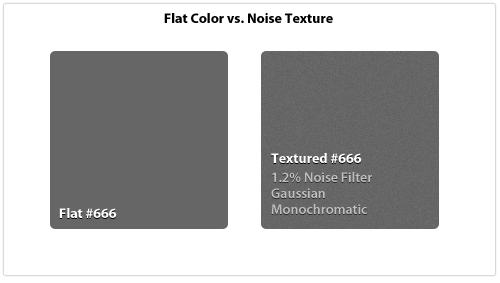
Noise Layer Matte interfaces are hot right now and one of the key elements of a matte surface is that it's not perfectly symmetrical, it has some texture and grain to it. The easiest way to accomplish this is by creating a layer of one flat color and then using the Noise Filter to add some texture. The key is to keep it subtle and barely noticeable.
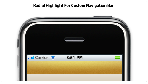
Radial Highlights The main light source comes from the top but that doesn't mean you can't introduce a secondary light source for emphasis. Below I've created a custom navigation bar for an iPhone application that uses a subtle radial highlight for added dimension and detail. The Blend Mode has been set to Overlay to brighten and saturate the overall color and the transparency has been knocked way down to keep it realistic. Also note the edge highlights to make it look more like a raised surface.
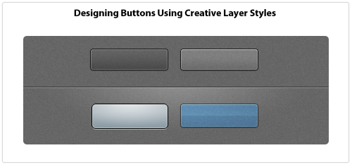
Creative Layer Styles Layer Styles are a key part of my design workflow, I use them for everything. Usually I'll draw a vector object, set the Fill to 0%, and design the entire thing using Layer Styles. Anyone can add a Drop Shadow to something, but if you get creative with Layer Styles then it enables you to really transform what you're working on. For example, you can only apply one Stroke but you can emulate 3-4 different stroke styles through creative use of the Inner Glow and Outer Glow styles if you crank up the Spread and Choke sliders and turn your glows into solid lines.
Once you turn glows and drop shadow styles into solid lines you can achieve a lot of effects with minimal effort. Below are some Layer Styles applied to rounded rectangles that use 1px glows and shadows. The PSD file for the following examples is released under a Creative Commons license: Button Examples
Reality Is Subtle
When something looks "off" in an interface, it probably looks fake, like it wouldn't exist in the real world. How do you keep your interface elements looking real? Here are some things to always keep in mind:
Keep it crisp. No blurry lines or edges.
Always adjust opacity. Nothing is totally black or white, dark or bright. A semi-transparent black or white line, glow, shadow or shape goes a long way.
Go vector when you can, it can be resized later. Don't Free Transform vector objects: use the Direct Selection Tool to move individual points.
Experiment with Layer Styles. White Inner Glow makes shapes pop. Use Overlay blending mode to liven up and saturate colors.
Drop Shadows will ruin your design if you don't do it right. Things should be right up against their surface which means using a 1-3px Drop Shadow size. And 0-3px distance. This isn't WordArt.
To save a complex shape as a PNG or GIF, turn the layer into a Smart Object first, then Rasterize it. This preserves color blending modes.
When using type within an interface element, it either sits on top (dark 1px drop shadow) or is inset (white 1px drop shadow), it's never at the same surface as a button or widget.
Real-world objects rarely have perfectly square corners. Use subtle rounded corners to make objects look real.
In real life, everything casts a shadow. Unless you're drawing vampires, if you intend your object to have depth and be resting on a surface then it better have a drop shadow, even an incredibly subtle one.
Beak was an experiment, a way for me to do something new and be proud of it. It was my first application for the Mac and my first time using Cocoa. I never took C in college, I had to learn the Cocoa APIs, Objective-C, and C all at the same time. It was, and still is, a great adventure, and the adventure is just getting started.
A Complete Rewrite
When I originally wrote Beak, I wanted to do things with the interface that I didn't yet know how to code. I took a shortcut and made most of the user interface a WebView, allowing me to design the UI in HTML & CSS with Javascript as the "glue" between the UI and the Objective-C application code. This allowed me to rapidly produce an application I was proud of without getting in over my head.
Only one problem, WebViews are a memory-hogging, slow-scrolling cop-out.
I didn't want to release Beak 1.0 and have it still use a WebView so I went back to the drawing board. I rewrote the entire interface using native drawing methods and I rewrote the entire backend, too, to be more scalable and flexible. Not one line of code is shared between Beak 1.0 and the current version 0.95. It's all new.
Oh, and there's an iPhone version, too.
Beak for iPhone
I never planned on building an iPhone version of Beak. One day, while struggling to build a scalable, elegant timeline view for the new Mac version (more on this down below) I got so frustrated I started a new iPhone project in Xcode and threw my models and backend code in there. Then, I spent about 2 hours throwing together a nice, custom UITableView and poof, Beak for iPhone was born. So why make Beak for iPhone? Because it's easy! The Cocoa Touch APIs are so thoughtful, new and elegant that it makes building applications a joy. Using AppKit to build complicated interfaces is tedious and complex but the newer components in UIKit for iPhone are fantastic. It's like going from eating cauliflower (AppKit) to cheesecake (UIKit): I'll choke down the cauliflower because it's good for me but the cheesecake I'll eat and love it.
Building a Timeline View in AppKit
80% of the total amount of time I've spent building Beak 1.0 for Mac has been spent on the timeline view. Why? It's not because I couldn't make up my mind in Photoshop, it's because it's hard to code! There are no perfect-for-this-problem, pre-built, drop-in components that let you build beautiful, one-column listings of boxes that support multiple heights.
For the iPhone there's UITableView, a staple of iPhone development. Every row is a UIView object that can be customized to your heart's content. For Mac, you have NSTableView, an antiquated slug of a component that uses NSCell objects instead of NSViews for various historical and performance-related reasons. NSCells are difficult to customize and cannot contain NSView objects (without jumping through hoops and introducing unnecessary complexity) which are the lifeblood of an interactive, engaging interface. Clickable hyperlinks inside of a span of text inside an NSCell? Good luck! Hover effects and Core Animation slickness? Yeah right! NSCell is like a mirage: it looks nice from afar but once you get up close and personal with it you wish you never saw it to begin with.
I think every native Twitter application for the Mac currently does something different for their timeline. Loren Brichter essentially wrote a UITableView port in order to make Tweetie's timeline and Steven Degutis has recently been working on an NSCollectionView-based timeline for his Twitter app. The new Echofon beta timeline is something different entirely with a completely custom text and layout manager that allows for hover effects on links as if it were a WebView. As for Beak I won't be getting into specifics in this entry but I'll just say that it's a totally custom NSScrollView with some fancy caching in the background. And, yes, it took me a long-ass time to come to this version after many, MANY other implementations.
Motivations & Business Ruminations
After lots of thought and back and forth, I've come to the following conclusions regarding the price of Beak for Mac & iPhone:
They will be free. Gratis. $0.00. (Not open source, however.)
They will have some beautifully-integrated and unobtrusive ads.
You can make a small donation to remove the ads.
The price coincides with a change in thinking about my motivations for building Beak and I wanted to get some of these thoughts down, digitally, before they escape my head.
First and foremost, I'm building Beak for me. I'm a designer and developer who has worked on the web for a very long time and I'm desperate to build something more tangible and real. Beak fills this need. Beak also lets me be creative and have fun without worrying if it will pay the bills since I have a fantastic full-time job that does that for me. I'm not building Beak to supplant my full-time income, I'm building it because it's interesting and lets me learn new things.
Second, Beak is not competing for your Twitter application-purchasing funds. I want you to go out, right now, and buy Tweetie, Twitterrific, Birdfeed, Reportage, Birdbrain and every other beautifully-designed Twitter-related application for Mac & iPhone. Go support quality developers, it's extremely important. When Beak 1.0 ships the new website will have links to my favorite Twitter apps at the bottom. Why? Because they deserve to be purchased and supported.
Third, Beak is a side project and will not have every feature you love. I have some strong opinions about which Twitter API features should be included in Beak and not all of them will be there, because, again, I'm building Beak for me. Lists & Retweets are in Beak 1.0 but they've got a twist. Things I don't like about Twitter or that I think are pointless probably won't be included, but that's just because I'm going to work on what I want to work on, and lame features just aren't fun to implement. I'd rather sweat the details on the things I choose to include instead of half-assed features that have been suggested that I hate.
When?
When it's done! The screenshots at the beginning of the entry are taken from real, working versions of Beak 1.0 for Mac & iPhone, so if that gives you some insight into the timeline then so be it :)
Sign Up To Learn More
People signed up for the email announcement list will be the first to hear breaking news so please head there and sign up if you haven't already done so. Also, there is no alpha/beta testing going on at this time but if I need some guinea pigs in the near future you'll be the first to know if you follow me on Twitter.
One of the largest remaining questions about the Apple slate device (aka, the iTablet, Mac touch, or my favorite, the iPod maxi) is its operating system. Why? Because the iPhone's main selling point is the App Store and last I checked, apps listed in the App Store only run on the iPhone OS. So does this guarantee the Apple tablet will run jumbo-sized iPhone applications on a larger screen? I'm not so sure. Here are some potential scenarios:
It Runs iPhone OS With Scaled-Up Apps
If Apple were rushing to get this product to market then this could be a possibility: iPhone apps scaled-up to fit the larger screen resolution of a tablet. Everything would look the same except everything is bigger — perhaps exactly 2x as large with a 640x960 resolution screen.
Advantages: If all UI elements are automatically scaled then nearly every currently available iPhone app would immediately be available on the new tablet.
Disadvantages: This seems like a half-assed solution. A tablet's screen resolution is much larger than the iPhone and merely scaling existing apps is a cop-out. It doesn't use the advantages of a tablet-sized device so why pay extra for a tablet-sized device? Also, the normal way to interact with an iPhone is to hold it in one hand in portrait orientation. The normal way to interact with a tablet-sized device is to hold it in two hands in landscape orientation. Most iPhone applications are made to be used in portrait orientation so if they're scaled to tablet-sized proportions and not rotated then you'll have to hold the Apple tablet like a Kindle and not like a normal tablet to use any of the apps. This isn't optimal for a variety of reasons.
It Runs Customized iPhone OS With Multiple Running Apps
If the resolution of the tablet's screen is 960x480 then you could potentially run multiple iPhone apps at once, side by side, on the screen all at the same exact pixel dimensions for which they were designed.
Advantages: Developers wouldn't have to rewrite their applications and users could finally run multiple applications at once.
Disadvantages: This still doesn't let individual apps take advantage of the larger screen resolution — they'd still be locked into 320x480. Also, this would only really work if the apps were all using portrait orientation so they could be tiled side by side when holding the tablet horizontally. If an application was built to be used in landscape mode then it'd throw off the other applications on the screen and would look cluttered and messy.
It Runs Customized iPhone OS For Usage On Larger Screen, No Third Party Apps To Start
This seems like the most Apple-like solution to me. When the iPhone first launched there was no iPhone SDK, there were only Apple-created apps. Developers were clamoring for an SDK and by the time it was introduced there was a feeding frenzy — it was a gold rush.
The apps included on this tablet device would be a small assortment of Apple-created apps like Mail, Safari, iTunes, etc. These would all have redesigned user interfaces that would use the entire resolution of the new screen. Imagine iTunes LP format on a beautiful, new, widescreen display or Mail with multiple-panels just like its Mail.app big brother on the Mac.
Advantages: Totally redesigned applications made for a larger screen open up a world of possibilities for user interaction and functionality. There's no doubt that the ones Apple redesigns (or, more accurately, re-develops) will be beautiful and will be a wonderful showcase and selling-point for the tablet.
Disadvantages: If Apple's trying to keep the tablet a secret then there will be no publicly-available SDK at launch and therefore no third-party, tablet-centric redesigns of App Store gems when the tablet first goes on sale. This is a big disadvantage but it could be downplayed in a few ways: 1) large App Store developers (EA comes to mind) would gain early access to the SDK and could rewrite some key iPhone apps to be included in the "Tablet-Only" section of the App Store at launch or 2) Steve Jobs announces the tablet and sets a launch date a few months in the future, just enough time for serious iPhone developers to get an early, tablet-centric version of their app completed for launch.
It Runs Mac OS X
An unlikely scenario is that the tablet simply runs Mac OS X at a smaller resolution than normal.
Advantages: Running full-blown Mac apps would be great in some ways, especially for the creative crowd. Developing for it wouldn't require any new SDKs and Snow Leopard already has multi-touch support built-in.
Disadvantages: No App Store, no access to the current 85,000 apps is a gigantic negative. Other problems include the fact that a finger is a lot larger than a cursor and Mac OS X interface elements are designed for cursors so expect a lot of misplaced touches.
It Runs Some OS X & iPhone OS Hybrid
This would be the best of both worlds but it'd be very tricky to get exactly right. Do you launch iPhone apps from the Finder? Do you launch OS X apps from Springboard? Do iPhone apps run in little simulator rectangles? Do you use AppKit or UIKit to code interfaces?
Advantages: The key advantage is that you'd still be able to access the full App Store catalog but also run full-blown Mac apps if needed.
Disadvantages: Jack of all trades, master of none. If the tablet isn't 100% focused on a singular type of application user experience then there will be problems. Tiny buttons on Mac OS X apps would be frustrating to hit but then when running iPhone apps UI elements are correctly-sized — the dichotomy would be very annoying. The overlapping APIs would also be really tricky for developers to figure out.
Other Tricky User Experience Issues
The form-factor of a tablet is fascinating because it surfaces so many user interaction dilemmas that haven't been totally solved yet.
For example, the simple act of entering text via an on-screen keyboard. When holding the device in portrait orientation then the on-screen keyboard could be essentially the same as the iPhone's in concept, but what about when you're holding the tablet horizontally with two hands? How does the keyboard work in that scenario? If you stretch the keyboard across the device's screen when in landscape orientation then your thumbs won't be able to hit the middle keys without stretching and reaching. This orientation works on the iPhone because the screen is only 480 pixels wide but what happens when the horizontal dimension of the screen is 800px or 1200px? This same layout just doesn't work.
One idea is to split the keyboard and have the left side anchored to the left side of the device and the right side anchored on the opposite end with a large, open gap in the middle. It might look funky but now your thumbs can easily reach the middle keys since they're physically closer to where your hands are located.
Another issue is how you watch movies. The natural angle of the screen is to be flat whereas a traditional laptop's screen is angled up which increases visibility. How do you watch movies on a 7-10" tablet screen that has no keyboard? I know how much of a pain it is to watch movies on an iPhone since I usually do that when I fly — most times I end up holding it front of my face with one hand for an hour or so. I imagine that the tablet will come with some sort of stand — either built into the back like a picture frame or external like a small wedge — because otherwise users will have a hell of a time getting it at the correct viewing angle for prolonged interaction.
Fascinating Time To Be An Apple Fan
The build-up to the launch of the original iPhone was unprecedented. Years of rumors, tidbits, second- and third-hand accounts all culminated with the famous Steve Jobs unveiling of three magic devices that were actually one iPhone. I remember where I was when I first saw the magic text stream across MacRumors' live feed and how I felt, it really was magical. I think I'll have the same feeling when the Apple tablet is unveiled because it's Apple and I can't see them launching something that's not incredible. It won't just be a device to surf the web in the bathroom, it will be a new way to consume media that will revolutionize many industries.
Update: Changed the blog entry title to reduce confusion.
The iPhone is one big constraint — no keyboard, small screen, few buttons — so designing applications for the iPhone is an exercise in building smart, simple software. Bloated apps on the iPhone? You won't find many. Most applications pick one feature or group of related features and centralize the product around that central theme.
When Apple began crafting UIKit, the set of APIs used to build the user interface for an iPhone app, they had to see into the future and predict what the most common application design models would be and make sure those could be accomplished easily. It may seem obvious to us now because we're so used to iPhone application design but the high-level navigation and interaction concepts available to iPhone application developers are really quite brilliant:
Dive deep into hierarchical levels of application information and then surface back to the top easily
Switch between different main pieces of functionality without losing your place on one when moving to another
Edit and adjust information without losing your place contextually
Display a list of information or choices
These three main interaction concepts correspond to three different types of View Controllers: Navigation Controllers, Tab Bar Controllers, Modal View Controllers and Table View Controllers respectfully. These are the building blocks for crafting iPhone applications.
Displaying Main Application Features
Displaying a list of available features of your iPhone application so the user can navigate through your app is a common practice. But given the variety of ways to display structured information in an iPhone app, which is the best way? What's the best way to present entry points to an app's main features? There is no best way but there are a variety of established patterns you can learn from.
Things, iStat & Birdfeed
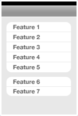
Things, iStat and Birdfeed are three iPhone applications that have a variety (or variable number) of main views, too many to fit inside a Tab Bar Controller on the bottom of the screen. How do they deal with this? They use a Table View Controller as the application's main screen and list the main features there in a scrollable panel. Each table row would normally display a Navigation Controller once tapped.
Advantages: Main app features available in a simple, clean list design. Order & grouping connotes importance of features.
Disadvantages: No way to directly move from Feature 1 to Feature 2 if within Feature 1's Navigation Controller hierarchy, takes extra taps to get back to main screen.
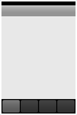
Squirrel, Tags & Tweetie
Squirrel, Tags and Tweetie utilize a Tab Bar Controller as the main navigational pivot for the application. (Note: Squirrel & Tweetie have an initial view before their main Tab Bar Controller view. Squirrel has a vault passcode lock and Tweetie has a Table View of your saved accounts.) Typically when using a Tab Bar Controller each tab item would display a Navigation Controller and have a full feature hierarchy beneath it. When pushing & popping views within a specific tab, you can choose to hide the main Tab Bar to give your new view more room on the screen.
Advantages: One-tap access to switch between main application features. Switching back keeps your place within the Navigation Controller hierarchy (if used).
Disadvantages: Only works well when there are less than 5 main application views. If an app has more than that then the Tab Bar would typically show a More tab item as the 5th, and secondary application features would be tucked away below that tab.
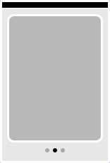
ESPN ScoreCenter, Phases & Weather
ESPN ScoreCenter, Phases and the default Weather app are examples of a flattened navigational hierarchy where there's a single type of main view and a variable number of them showing. Applications using this design pattern are normally information-rich and designed to be utilities rather than applications you spend a lot of time in.
Advantages: Natural gesture interface for navigating between views, quickly display structured information.
Disadvantages: Getting from Card 1 to Card 4 takes a variety of swipes. No direct access between views more than 1 card away. Useful only for flattened (or nearly flattened) navigational hierarchy.
Follow The Leader Or Blaze Your Own Trail?
The application design patterns and examples shown above work with nearly-default navigational models that Apple has provided. They may customize the interface elements but the general interaction concepts are stock UIKit. There's nothing wrong with following standard Apple conventions for navigating around your app but what if you need to go beyond? What if you have a totally custom paradigm? The following are examples of applications that have defined their own interface paradigms.
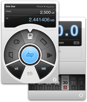
Weightbot & Convertbot
Arguably two of the most tactile and beautiful applications available for the iPhone, both the applications from Tapbots have completely custom interfaces that center around a specific interaction point they designed from scratch. For Weightbot they use a horizontally-scrolling picker wheel and in Convertbot they have a mechanical, spinning dial for selecting units. There's a great behind the scenes entry at their blog about the making of the Convertbot dial.
Collage & Fortune
Tapulous has been making fantastic applications for the iPhone for awhile, and both Collage and Fortune are less well-known than their big brother Tap Tap Revenge. Fortune is a simple application that lets you crack open a fortune cookie and read the message but instead of going the simple route they designed a totally custom interface for what is essentially a fairly simple application. Simple concept + brilliant interface = winner.
Collage is a social picture-sharing app that redefines what a Tab Bar Controller paradigm can end up as. Their totally custom film strip interface and sliding, animating panels is some of the finest UI work you'll find in the App Store.
Beats
Beats by Bjango is a beat and key-matching app for DJs and musicians. There are a variety of custom elements but the main screen design emulates a Tab Bar Controller in the middle of the screen with the main content areas extending above and below this tab bar.
Postage
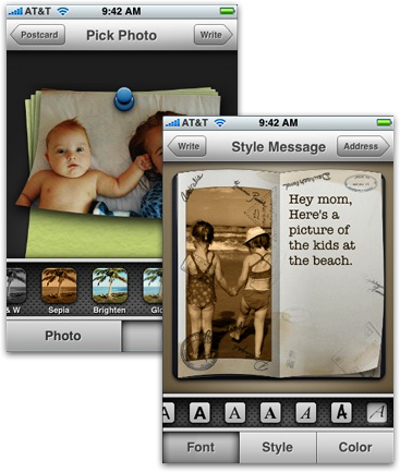
Postage by RogueSheep is an Apple Design Award Winner and has an iLife-feel to the entire application. Postage uses standard Apple UI conventions with a totally custom implementation that perfectly matches the app's postcard-creation workflow. An important part of Postage's interface is the custom horizontal slider letting a user choose a specific style or font from a group of choices.
Choose What Works Best
There's nothing wrong with using unmodified Apple UIKit elements and paradigms, in fact most of the applications in the App Store and those coming from Apple get along fine with the built-in interface paradigms and objects. Apple's built a solid framework to use when creating applications, but some app developers aren't fully satisfied so they take designs and interaction paradigms into their own hands. This was a showcase of some beautiful interface design decisions but be careful as it's easy to go overboard and screw things up.
A good rule of thumb is this: if you can't design something better than Apple, don't do it.
This morning a good conversation broke out in Twitter, which is not the best medium for real-time conversation, but hey we take what we get. It was concerning this article where Lukas Mathis said that for people who design user experiences, knowing how to code is detrimental to your ability to produce quality, user-centric designs. I greatly disagreed with his article, and we then had a conversation on Twitter spanning many dozens of Tweets.
A user experience designer designs the user experience, obviously... but is it really that obvious? What's the user experiencing when we say "the user experience"? On the web, there are many things that contribute to the user's overall experience using the website or application:
Look & feel of the application
Ability of the user to accomplish the tasks they set out to accomplish
The overall perceived speed of the website or web application
Expectations being met. If a user thinks X will happen and it doesn't, there's a gulf of execution
These are just a small sampling. So what's part of a quality user experience? Everything is.
The user's experience with your website or application isn't just what the app looks like or what happens when a user clicks a button. It's not just the workflow they navigate through to execute a task. It's everything. Everything that the user does and experiences from the moment they load up your website or application to the moment they leave it is part of the overall user experience. A user experience designer's job is very important and requires having knowledge of many things in order to be effective.
What Should A User Experience Designer Know?
Designing the user's overall experience is not the same as designing the user interface, it's a lot more than that. In my mind, a user experience designer's job includes user interface design, includes designing the workflow to complete tasks and accomplish goals, includes being knowledgeable about usability testing, includes being knowledgeable about accessibility and users with special needs, and includes having knowledge about how the underlying application architecture works.
The best user experience designers are the ones that bring in knowledge from multiple disciplines (design, development, psychology) and put it all together so that the user benefits.
For example, in my Twitter conversation with Lukas, I gave the example of a UX designer needing to know how Ajax works in order to use it effectively. If you don't know how Ajax works or how web server requests work, how can you decide that in a particular situation Ajax would be best for the user's experience? Lukas replied with this tweet:
That's a perfect example of ignoring the code for a better user experience; page refresh would be easier and quicker to implement.
As I pointed out in my next tweet, what Lukas said is actually not true — in many circumstances an Ajax request is literally faster to execute than a full page refresh. Refreshing the full page makes more HTTP requests to the server (to pull CSS & Javascript files, images) however an Ajax request is only sending back a block of text in many circumstances, so it makes far fewer roundtrip requests to the web server. In most cases, an Ajax request to send data and get data back is faster than a full page refresh.
How do I know that? Because as someone who designs the user experience for web applications, I know how HTTP requests work and how Apache responds to a browser's request, I know about what happens at most places within the roundtrip to the server, and I know about what code is executing server-side when I make an Ajax request. I need to know about these things in order to make the call to use Ajax in a certain scenario over a page refresh. Most often when I decide to use Ajax it's because it will simply be faster and will make the application appear more responsive to the user. A big part of the overall user experience is how the user perceives the speed of the application, so I made a user-centered decision to use Ajax because I know it will enhance a user's experience.
If someone only knows how Ajax works from a superficial standpoint ("something happens without the page refreshing"), then when the choice is made to use Ajax instead of a page refresh, that decision is made without full knowledge of how Ajax works, what it's good for, what it's not good for, how it affects application performance, how it impacts application caching infrastructure, etc. It's a decision made without full knowledge of the consequences.
A Master Designer Knows His Tools
Architects don't just draw blueprints, they need to know what the ground is like under the building, what types of weather the region receives, and what building materials work best considering all the variables. They don't just draw, the craft the entire structure, and need a deep understanding of materials and processes in order to effectively do their job.
Chefs don't just put ingredients together and hope for a delicious dish, they have a deep knowledge of food and how things taste to people in certain situations.
Potters aren't just sculpting clay blocks into beautiful forms, but also firing the clay to keep it in its shape forever. They need to know about glazes and temperature and the science of firing in order to create their works of art.
User experience designers on the web need to know the environment and medium too, just like architects, chefs, and potters. A web designer is someone who designs for the web and knows the HTML & CSS needed to make their designs into real interfaces. If they don't know HTML & CSS, then they're not really designing for the web because they're not designing for the constraints of the medium. So what happens when someone who considers themselves a web designer doesn't have an in-depth knowledge of the medium? They make poor decisions. Decisions made without full knowledge of how their decision impacts the overall user experience. Here's a scenario:
Designer A hands HTML & CSS developer B a mockup of an interface. It's a complex interface and every single corner of every box in the design is rounded and has 3 different borders on it, plus a drop shadow. Every typeface in the mockup is a font the designer just bought, not any default web fonts that users will have.
In this scenario, because the designer isn't familiar with the constraints of the web, they are making design choices that negatively impact the quality of the user's overall experience. To execute rounded corners on a box — one that will expand with the content inside of it — you need additional HTML markup, CSS, and images to make it happen. Multiple borders and border styles? That's more markup and images. Drop shadows? That's a whole bunch of extra transparent PNGs. Custom fonts? You're either using a Flash image replacement method of dynamically-generated images for each one.
Tons of additional markup, images, Flash files, and Javascript just to execute an effect that doesn't make anything better or simpler for the user. Many more kilobytes of data needed to be loaded by the user before they can see the page as it was intended. Additional milliseconds or seconds of load time just because a designer with no knowledge of the web medium didn't design with the environment or constraints of the medium in mind.
Does this mean you can't execute a beautiful interface on the web? Of course not, look at how many beautiful websites and web applications are out there that also work beautifully, too. But a graphically heavy website or web application that is bulky and slow? That has visual effects that don't better the overall user experience? That's not so beautiful, and that's not how you design for the web.
You Don't Gotta Be An Expert
To understand how an Ajax request works you don't need to be able to write the Javascript needed for an Ajax request by hand off the top of your head, or wax technical on Apache process handling, but you do need to understand it fully enough so that you can make educated decisions about its usage. Architects don't choose one material over another just because one looks cooler, they make the decision based on many factors like structural rigidity, price, regional scarcity, etc. They know enough about the material to make an educated decision about whether to use it.
A user experience designer on the web needs to know enough about the environment and the web medium to make quality, user-centric decisions. If a UX designer wants to use a complicated interaction paradigm like drag-and-drop, then they should know the programatic constraints of its usage on the web. Drag-and-drop on the web isn't like drag-and-drop in a desktop app, so you have to know why it's different, how it's different, and how to correctly use drag-and-drop in order to effectively implement it. If you're obsessed with your application's speed then knowledge about how many kilobytes of Javascript it takes to implement DnD is important. You also have to be knowledgeable about how an impaired person uses the web and how to make a drag-and-drop experience still usable for them. You have to know how to handle a situation where a user has Javascript turned off.
Making what seems to simply be a "design decision" never is. It's a decision based on numerous factors encompassing design, development, architecture, usability, and accessibility. A user experience designer's job is to make decisions based on the entire scenario and environment in order to be as effective as possible. Benefiting a user's experience in one aspect, while negating that benefit in another, is the result of not being knowledgeable enough about what you're deciding.
...But It Helps To Be An Expert
Having sufficient knowledge to make a good, user-centric decision is great, but having a more in-depth, advanced knowledge is the best scenario. If you're a user experience designer and you want to use drag-and-drop in an interface, it helps if you can prototype the full interaction to get a feel for the timing and overall experience of the feature. There are some things you just can't know about until you're using a real, live interface, and it's extremely valuable to be able to build a prototype of a real interface to flush those things out early in the design process.
As Apple's operating systems have evolved, so too have their paradigms for user interaction. In Leopard and in many newer Apple applications, animations and advanced user interaction scenarios are used as part of the overall user experience. If a UX designer at Apple has no idea how CoreAnimation works at any level, and they can't use an application like Keynote or Flash to at least prototype an animation effect, then they can't truly express their vision for an interface. In fact, Visual Interface Designers at Apple are expected to know either Flash or Keynote in order to prototype their interfaces. Wait... an interface designer is expected to know how to code ActionScript in order to do their job? Yup, and if you don't, you can't be as effective as other interface designers on your team who do.
Take a look at the folks who are creating cutting-edge Mac and iPhone applications — they're designers with intimate knowledge of how their interfaces are implemented and developed. Designers who are learning Cocoa so they can prototype iPhone interfaces since the key component of good iPhone application design isn't just the visual design, but the interaction. These are the folks who are most successful on the iPhone — the ones who know both design and development and are intimately aware of the constraints of both. Look at the iPhone! It's tiny, low-powered, and doesn't have a keyboard. The entire device is one big constraint, so you have to know what these constraints are to be successful on the platform.
What's A User Experience Designer Mean To You?
There are so many titles for what people do on the web nowadays it's just ludicrous. You've got interface designers, interface engineers, visual interface designers, UI developers, information architects and user experience designers. Then you've got usability engineers, usability testers, web designers, and web developers. With so many titles, and so many people whose skills span a variety of these separate disciplines, where does one know where a UX designer stops and a UI developer begins?
All I can discuss is what's made me more successful in my career, and that's learning as much as possible about the medium in which I work. On the web that means I design workflows, interaction scenarios, interface design mockups, full HTML/CSS/Javascript prototypes, and occasionally implement these prototypes into the backend and hook it up to a database. I started out designing for the web and knowing HTML and Javascript, then I learned CSS, jQuery & Prototype libraries, then PHP, MySQL and some Ruby. I continued my education wherever possible because it's impossible to be too familiar with something when you're trying to make the most educated decision you possibly can. The more information you have access to, real-life experience you can fall back on, and in-depth knowledge you have the better your overall decisions are and the better and more user-friendly your websites and web applications are.
You can't be too knowledgeable when making an important, user-facing decision. The more knowledge you have the more likely it is that you'll see a decision from all possible sides.


 The application design patterns and examples shown above work with nearly-default navigational models that Apple has provided. They may customize the interface elements but the general interaction concepts are stock UIKit. There's nothing wrong with following standard Apple conventions for navigating around your app but what if you need to go beyond? What if you have a totally custom paradigm? The following are examples of applications that have defined their own interface paradigms.
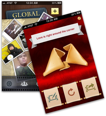 Collage is a social picture-sharing app that redefines what a Tab Bar Controller paradigm can end up as. Their totally custom film strip interface and sliding, animating panels is some of the finest UI work you'll find in the App Store.