How To Draw A Mac Internet Globe Icon
Apple's paradigm for indicating network connectivity is nicely-detailed globe icon with crisscrossing wires across it — you can see it in the System Preferences for Network settings. Wolfgang recently rejuvenated this UI analogy in his work on LittleSnapper's interface. I thought it'd be fun to do my version of this icon and step you through the process as I go.
Spheric Realism
Before getting into the tutorial's steps I thought it'd be good to go over some key techniques for creating a realistic sphere.
Designing a nice, shiny ball has many applications and is a nice skill to have in your back pocket. When designing a ball that's meant to look as round as possible here are some things to keep in mind:
- What material is it? Glass, plastic, anodized aluminum? The material of an object is its most important attribute as that defines how it is supposed to reflect and transmit light in the real world. Most textures on shiny spheres are semi-reflective glass or metal, rarely do you see a rough metal used as the material.
- It reflects light inside too. Not only do you have to worry about the global OS light but you have to keep in mind that light gets reflected inside the sphere as well, bouncing around the walls. Depending on the type of material of your sphere and the transmittance properties it will look different. Opaque material lets no light pass through so there will be no internal reflections.
- Is it totally round? Designing a perfectly spherical ball is not necessary all the time, sometimes all you want is a mostly-rounded button or disk. These have similar properties as spheres but the edges will have light reflections and shadows rather than the top or bottom of the ball. Spheres don't really have edges to catch the light since, um, they're spheres!
Lots to think about! Don't remember high school physics and how a material's refractive index changes light passing through it? Don't worry, just follow along and we'll have you building spheres in no time.
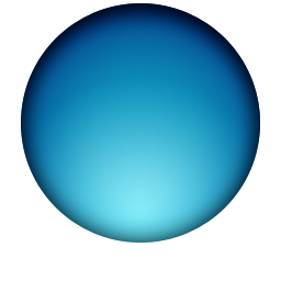
Step 1: Draw Your Base Circles
To make the globe look three-dimensional, it'll take more than one crack at Photoshop's Layer Styles which means a little onion-skinning will be necessary.
We're designing our icon at 256px so get your new document open and use the Ellipse Tool to make a circle sized so that it allows for a shadow underneath it. We're applying two layer styles — Gradient Overlay and Inner Shadow — in order to get the basic lighting in place. The Gradient Overlay is radial and I used the mouse to move it down to the bottom of the sphere representing the light passing through the top of the sphere, reflecting off the bottom. The Inner Shadow was also positioned at the top to give it some initial radial shading.

I need to apply some additional effects to the base circle so I duplicated my previous circle, turned the Fill to 0%, and re-opened my Layer Styles. I gave this second circle an Inner Glow with Multiply blending (half opacity) and an additional Inner Shadow positioned only at the top with Soft Light blending.
Step 2: Lay Your Shadows
Before we add the final lighting to our sphere, let's position its shadow first.
I drew a small ellipse at the bottom of the sphere and filled it black. Next I converted it to a Smart Object and applied a 73px horizontal Motion Blur and a 12.5px Gaussian Blur. To darken the center a bit more since that's where the sphere is "touching" the surface I duplicate my previous shadow and shrink it down a bit.

Step 3: Circular Highlights
Realistic lighting and highlights can't be fully reproduced using Layer Styles, you'll need to draw some more ovals.
Draw a circle about 3/4 the height of your previous ones and align it a few pixels from the top of the main circle. Make sure it has a 0% Fill and give it a Radial Gradient layer style from white to transparent with the white directly on top.

Now convert it to a Smart Object and give it a 3.9px Guassian Blur to soften it a bit. This represents the main OS light hitting the top of our sphere. (Note: Others may have a different preference regarding how blurred they want their top highlight. Some people won't want to blur it at all. Do whatever you think looks best.)

To make the center of our top highlight a little brighter, let's duplicate the layer and shrink it down proportionally. Now we have two ovals at the top of the sphere representing our top-down lighting.
For the bottom-up lighting, duplicate your larger highlight you created, flip it vertically, and move it down to the bottom of the sphere. Change the Blending to Soft Light. Here's what it looks like:

At this point we're done with our sphere but we still have the lines to draw, so let's get to it.
Step 4: Draw The Network Lines & Hubs
The network lines proved to be a little tricky to get just right. Here's how I did them:
- Use the Ellipse Tool to draw a circle that is approximately the same size as your main sphere.
- Free Transform your circle to flatten it out a bit.
- Rotate it a bit on its center axis, make it look like a hula hoop wrapped around your globe.
I hopped into the Layer Styles and gave it a 2px white stroke with Blend Mode of Overlay. I also gave it 4px Inner & Outer Glows both white. Doesn't look like much yet, but here's what we've got at this stage:

I'm going to use this loop as both a foreground and background network line, so I duplicated the layer and hid the second one for now.
I used my Eraser Tool with a big brush that's fluffy on the edges so I can keep the edges of the loop anti-aliased as it hits the sides of our sphere. On your foreground loop, erase the left side completely, and erase just enough right at the top and bottom of your loop so that it fades into the sides of the sphere. ow for the background loop, erase the right side and use the same technique for the top and bottom edges.
To make the lines look as if they're sitting on top of the globe more, I duplicated each layer, gave it a slight Gaussian Blur, and then nudged it a few pixels away from its twin. I could've achieved this look with an Inner Glow, but hey, there's different ways of doing what you want in Photoshop.

I've now done this a few more times (foreground and background loops) and we're done with this step.

Final Step: Adding The Network Nodes
At this stage I think it looks pretty good, but we're not quite finished yet. Where our network lines cross we need some glowing network nodes. Fortunately, these are really easy. Take your Ellipse Tool, draw the node, fill it white, convert to Smart Object. Then, give it a little Gaussian Blur and change the blending and opacity appropriately. We're done!
Our final icon is on the left. On the right is a slightly tweaked example showing what you can do by changing some Blending Modes just for kicks.


Download The PSD
Reading about Layer Styles isn't that appealing, so if you want to check out exactly how the objects look, download the PSD all zipped up right here: you're free to do whatever you want with it.