One of the challenges of creating a Twitter app for Mac is exactly how to build the timeline interface. Not the design, although that's very challenging as well, but the implementation of the timeline since it's very important to the overall stability of your app. Beak used a Webview because when I built it I didn't know much about AppKit or custom interface drawing. It's good for when you're just starting out, but if you really want to build great apps, you're going to eventually need to learn how to draw things natively.
Earlier this year I started work on a totally native implementation of Beak and the timeline code was perplexing. I played around with using an NSTableView (NSCells suck), an NSCollectionView (uses too much memory to have all tweet views in the timeline at once, also, inflexible), a custom NSScrollView (built like UIKit's UITableView with reusable views, this was the best solution), but in the end the most interesting part was drawing the individual tweets.
Drawing plain text with the same style throughout isn't that tricky. Drawing an NSAttributedString with some custom styles isn't that tricky either. The tricky part is that there are various interesting parts of a tweet's text (links, hashtags, usernames) and they all need custom styles and the ability for the user to click on them to initiate an action.
Step 1: Initial Paragraph Style
The content within our NSTextView is an NSAttributedString. What's an attributed string? It's actually a very simple concept: it's a string with some key-value pairs attached to parts of the string. These key-value pairs could be anything, but if you're adding styles, the key has to be one of a variety of pre-defined values that AppKit provides. For example, say a string has three words in it and you want each word to be a different color. You could set a color for the special key of NSForegroundColorAttributeName for each word and then you're golden, it'll be drawn with three different colors. There are a number of these stylistic attributes and a full list can be found here.
You can have more than one attribute defined for a particular word or range of characters. By default, we're going to set a number of styles for the entire range of the status string. These include a paragraph style (line height, spacing, text alignment), a text shadow to make the text appear inset on the gray background, a color, font size and more.
We're looking for links, usernames and hashtags, so the best and most customizable way to do this is to use regular expressions to parse through the string and pluck them out.
I used RegexKitLite and the libicucore framework to provide the backing for the regular expression code, and then wrote the following methods to return an NSArray holding strings that matched the expression.
These regular expressions aren't as great as they would need to be to ship, but they do the job for the purposes of this tutorial. There are better regular expressions out there for matching URLs in strings, and if you find one, make sure to adhere to the strict escaping rules outlined in the RegexKitLite documentation.
Step 3: Do Something With The Matched Strings
We have arrays holding the interesting bits of our tweet status string, so what do we do now? I iterated across each array, found the character range where the string exists, then added custom attributes to the NSAttributedString at that exact position to style it differently.
for (NSString *linkMatchedString in linkMatches) {
    NSRange range = [statusString rangeOfString:linkMatchedString];
    if( range.location != NSNotFound ) {
        // Add custom attribute of LinkMatch to indicate where our URLs are found.
        // Could be blue or any other color.
        NSDictionary *linkAttr = [[NSDictionary alloc] initWithObjectsAndKeys:
          [NSCursor pointingHandCursor], NSCursorAttributeName,
          [NSColor blueColor], NSForegroundColorAttributeName,
          [NSFont boldSystemFontOfSize:14.0], NSFontAttributeName,
          linkMatchedString, @"LinkMatch", nil];

        [attributedStatusString addAttributes:linkAttr range:range];
        [linkAttr release];
    }
}
This is all pretty normal except for the final attribute I add for the custom key "LinkMatch". Here, I attach the actual matched string as the object attached to the "LinkMatch" key. Now, our attributes are not only storing style information for this link, they're also holding the URL itself. This will come in handy in a bit.
I also iterated across the username and hashtag matches and added the custom attributes "UsernameMatch" and "HashtagMatch" respectively.
Step 4: Display In An NSTextView
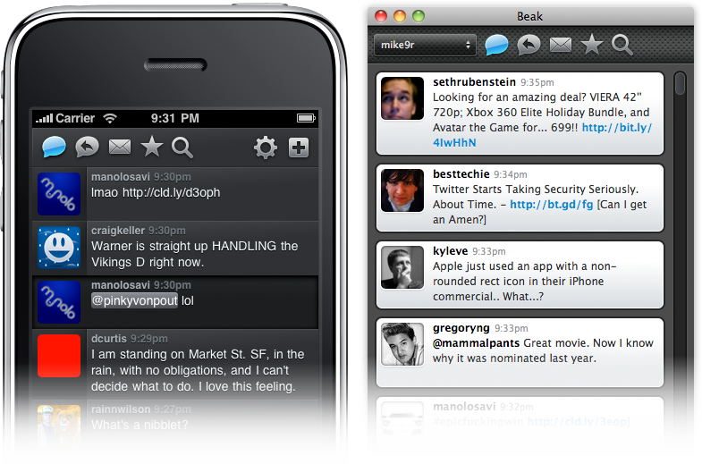
At this point our NSAttributedString is good to go. It has default styling across its full length, and it also has custom styling for individual parts defined by our regular expression. If we display it within an NSTextView it should look perfect, and, from the screenshot at the top of the entry, you can see that it does.
Displaying a tweet is all well and good, but what about user interaction? How do we trigger custom actions when a user clicks on the links, hashtags and usernames within the status text? Ah, that's where the custom key-value pairs described up above come in. What we want to do is know when the user clicks on anything inside the tweet text, and then identify the exact mouse coordinate of the click. Using this coordinate we can then make some calls to figure out what was under their mouse when they clicked and if it was a part of the text we want to take an action on.
First, we need to be notified when clicks happen within our text view. I found that the easiest way to do this is to subclass NSTextView and override the -mouseDown: selector to inject our own functionality. Here's the first part of that code.
@implementation TVTextView

- (void)mouseDown:(NSEvent *)theEvent {
    // Here's where we're going to do stuff
    [super mouseDown:theEvent];
}

@end
Notice that at the end of the selector we pass the event back up to super. This is so that the default NSTextView mouse-handling code can fire, like selecting text with a mouse cursor. If we didn't pass the event up to the super class then all built-in mouse click actions would be broken.
Now for the meat of our implementation. We have to identify the coordinates of the mouse event, then translate that into the part of the string that falls underneath the mouse cursor.
The characterIndexForInsertionAtPoint: call is the key to this entire tutorial. Starting in Leopard, NSTextView provides this neat functionality to retrieve the character position for a given coordinate, that is, if you provide a specific point it will tell you at how many characters into the string it occurred. Since we can retrieve the index of the mouse event, we can then make the following call to retrieve the attributes for that specific position:
Why access the attributes? Well, we tucked away some interesting metadata back in our original attributed string definition, so we can get that back and immediately know what username, hashtag or URL is sitting underneath the user's mouse cursor when they click and act on it accordingly. Presto!
if( [attributes objectForKey:@"LinkMatch"] != nil ) {
    // Could open this URL...
    NSLog( @"LinkMatch: %@", [attributes objectForKey:@"LinkMatch"] );
}

if( [attributes objectForKey:@"UsernameMatch"] != nil ) {
    // Could show a Twitter profile HUD overlay...
    NSLog( @"UsernameMatch: %@", [attributes objectForKey:@"UsernameMatch"] );
}

if( [attributes objectForKey:@"HashtagMatch"] != nil ) {
    // Could flip to the Search view and search for this hashtag...
    NSLog( @"HashtagMatch: %@", [attributes objectForKey:@"HashtagMatch"] );
}
And that's it! Custom-styled tweet text displayed in an NSTextView subclass that can identify when users click on different parts of the tweet and act accordingly.
Download the full Xcode project here and, as noted in the source code files, you can do whatever you want with the code.
Sorry folks: Beak, my fledgling, ever-unfinished Twitter app for the Mac and iPhone is dead and will never be worked on again. Why? Please let me explain.
Beak's Beginnings
The first line of Objective-C I ever wrote was for Beak. Starting out in the world of Mac development with a Twitter app is pretty ambitious and I learned a lot. I didn't know what delegates were until I started using MGTwitterEngine. I never knew how to build custom AppKit user interfaces either. I never opened Interface Builder before I started designing Beak's (underwhelming) Preferences window. In short, I cut my teeth on Beak and it shows. It was never really polished, nor did it represent any kind of best practices for Mac development; the main interface component is a WebView so that says a lot by itself. It was my learning tool, my first trek into Cocoa development.
Why I'm Done With It
I have a full-time job working on the web and Cocoa development is my evening & weekend passion. If I'm lucky I'll have a solid 2 hours at night to crank on some code, but many nights it's less than an hour, or no time at all. Building a fully-functional Twitter app is hard and it takes a lot of time. To build a nice offering in the market you have to implement the same 30 features as everyone else and then after that you can start to differentiate. Ever heard of a Twitter app without Favorites? Or Direct Messages? There are a bunch of things you absolutely need or else people complain. Heck, I still get a few emails a week about Beak not saving your password. (Hint: I didn't forget about that feature, I just didn't know how to store anything in the Keychain when I first wrote it.)
Besides lack of time, I broke the golden rule: I didn't build an app that filled my own needs. I don't use Beak. I never used Beak. I also never used Twitterrific or TweetieoranyotherMacTwitterapp. I use the Twitter website. Why? Because my primary usage of Twitter is for finding new links and I read those in a browser. I don't like being in a desktop Twitter app, clicking a link, being transferred to Safari, reading an article, then switching back to my timeline in a different application. It's just how I use Twitter. Everyone uses it differently, and I'm probably the oddball here, but that's just how it is. Perhaps if I made Beak a gigantic, full-screen application with a built-in web browser I would've used it.
My third reason is simply a lack of interest in long, time-sucking projects. Like I said before, I do Cocoa development on the side, as a hobby, and as such I like to be entertained and to feel motivated. Dragging along to build an app for months isn't exciting to me. I like tiny projects because they keep me excited and I can always see the light at the end of the tunnel. Digital Post was a nice, concise project. I spent about 40-50 hours of work to build the 1.0 version. I could envision the entire project in my head at all points, so I was always shooting for the finish line. These kinds of projects just fit me better and they keep me motivated, excited and pushing hard at all times. It seems like a simple concept but it's taken me years to understand what motivates me and what doesn't. Beak 1.0 for Mac and, recently, Beak 1.0 for iPhone were both so complex their launch loomed far in the distance, like a mirage I could never run fast enough to touch.
Lots Of UI, Not As Much Code
I'm a designer. More specifically, I'm a user interface engineer. I design software and then I implement these designs. The main reason I write software is to make my mockups clickable and real. I have 50+ PSDs of never-implemented Beak interfaces. I have dozens of NSView & UIView subclasses with prototyped custom interface components ready to be hooked up. My brain and mouse would rush ahead to knock out the user interface and UI code but then, time after time, I'd get sidetracked and bogged down by network code, error-handling, API issues, memory leaks, 45fps scrolling instead of 60fps, caching code written & rewritten, complex text layout problems, etc. I'm good at solving these problems but after spending night after night tweaking and rewriting non-UI code I'd just get burnt out and would ditch Xcode for Photoshop just to give the other side of my brain something to latch onto. Then, inevitably, I'd start designing the UI for the next big Beak feature and would get frustrated knowing that I still had the previous feature to finish before I could move on.
Thank You
Over 30,000 people have downloaded Beak since it first debuted, a number that's just incredible to me. Even with all its flaws I still get emails and Twitter replies from people who think it's fantastic. It sounds crazy, but Beak made people think of me as an app developer and no longer just a web designer. It completely revitalized my skill set and realigned my career trajectory. It taught me Objective-C and made it possible for me to build an iPad app that launched Day 1 of the iPad App Store. It opened my eyes to real, double-clickable (and single-tappable) software development that I had never experienced when working on the web. I owe Beak and everyone who ever downloaded Beak a sincere Thank You that cannot be expressed in hypertext. Honestly, thank you.
(To answer a question before it pops up, I have no plans to open source Beak, nor do I want to hand the project off to someone else to finish. It's a project too close to my heart to give away so it will simply die an elegant death on my hard drive and in the cloud where it sleeps at night.)
Beak was an experiment, a way for me to do something new and be proud of it. It was my first application for the Mac and my first time using Cocoa. I never took C in college, I had to learn the Cocoa APIs, Objective-C, and C all at the same time. It was, and still is, a great adventure, and the adventure is just getting started.
A Complete Rewrite
When I originally wrote Beak, I wanted to do things with the interface that I didn't yet know how to code. I took a shortcut and made most of the user interface a WebView, allowing me to design the UI in HTML & CSS with Javascript as the "glue" between the UI and the Objective-C application code. This allowed me to rapidly produce an application I was proud of without getting in over my head.
Only one problem, WebViews are a memory-hogging, slow-scrolling cop-out.
I didn't want to release Beak 1.0 and have it still use a WebView so I went back to the drawing board. I rewrote the entire interface using native drawing methods and I rewrote the entire backend, too, to be more scalable and flexible. Not one line of code is shared between Beak 1.0 and the current version 0.95. It's all new.
Oh, and there's an iPhone version, too.
Beak for iPhone
I never planned on building an iPhone version of Beak. One day, while struggling to build a scalable, elegant timeline view for the new Mac version (more on this down below) I got so frustrated I started a new iPhone project in Xcode and threw my models and backend code in there. Then, I spent about 2 hours throwing together a nice, custom UITableView and poof, Beak for iPhone was born. So why make Beak for iPhone? Because it's easy! The Cocoa Touch APIs are so thoughtful, new and elegant that it makes building applications a joy. Using AppKit to build complicated interfaces is tedious and complex but the newer components in UIKit for iPhone are fantastic. It's like going from eating cauliflower (AppKit) to cheesecake (UIKit): I'll choke down the cauliflower because it's good for me but the cheesecake I'll eat and love it.
Building a Timeline View in AppKit
80% of the total amount of time I've spent building Beak 1.0 for Mac has been spent on the timeline view. Why? It's not because I couldn't make up my mind in Photoshop, it's because it's hard to code! There are no perfect-for-this-problem, pre-built, drop-in components that let you build beautiful, one-column listings of boxes that support multiple heights.
For the iPhone there's UITableView, a staple of iPhone development. Every row is a UIView object that can be customized to your heart's content. For Mac, you have NSTableView, an antiquated slug of a component that uses NSCell objects instead of NSViews for various historical and performance-related reasons. NSCells are difficult to customize and cannot contain NSView objects (without jumping through hoops and introducing unnecessary complexity) which are the lifeblood of an interactive, engaging interface. Clickable hyperlinks inside of a span of text inside an NSCell? Good luck! Hover effects and Core Animation slickness? Yeah right! NSCell is like a mirage: it looks nice from afar but once you get up close and personal with it you wish you never saw it to begin with.
I think every native Twitter application for the Mac currently does something different for their timeline. Loren Brichter essentially wrote a UITableView port in order to make Tweetie's timeline and Steven Degutis has recently been working on an NSCollectionView-based timeline for his Twitter app. The new Echofon beta timeline is something different entirely with a completely custom text and layout manager that allows for hover effects on links as if it were a WebView. As for Beak I won't be getting into specifics in this entry but I'll just say that it's a totally custom NSScrollView with some fancy caching in the background. And, yes, it took me a long-ass time to come to this version after many, MANY other implementations.
Motivations & Business Ruminations
After lots of thought and back and forth, I've come to the following conclusions regarding the price of Beak for Mac & iPhone:
They will be free. Gratis. $0.00. (Not open source, however.)
They will have some beautifully-integrated and unobtrusive ads.
You can make a small donation to remove the ads.
The price coincides with a change in thinking about my motivations for building Beak and I wanted to get some of these thoughts down, digitally, before they escape my head.
First and foremost, I'm building Beak for me. I'm a designer and developer who has worked on the web for a very long time and I'm desperate to build something more tangible and real. Beak fills this need. Beak also lets me be creative and have fun without worrying if it will pay the bills since I have a fantastic full-time job that does that for me. I'm not building Beak to supplant my full-time income, I'm building it because it's interesting and lets me learn new things.
Second, Beak is not competing for your Twitter application-purchasing funds. I want you to go out, right now, and buy Tweetie, Twitterrific, Birdfeed, Reportage, Birdbrain and every other beautifully-designed Twitter-related application for Mac & iPhone. Go support quality developers, it's extremely important. When Beak 1.0 ships the new website will have links to my favorite Twitter apps at the bottom. Why? Because they deserve to be purchased and supported.
Third, Beak is a side project and will not have every feature you love. I have some strong opinions about which Twitter API features should be included in Beak and not all of them will be there, because, again, I'm building Beak for me. Lists & Retweets are in Beak 1.0 but they've got a twist. Things I don't like about Twitter or that I think are pointless probably won't be included, but that's just because I'm going to work on what I want to work on, and lame features just aren't fun to implement. I'd rather sweat the details on the things I choose to include instead of half-assed features that have been suggested that I hate.
When?
When it's done! The screenshots at the beginning of the entry are taken from real, working versions of Beak 1.0 for Mac & iPhone, so if that gives you some insight into the timeline then so be it :)
Sign Up To Learn More
People signed up for the email announcement list will be the first to hear breaking news so please head there and sign up if you haven't already done so. Also, there is no alpha/beta testing going on at this time but if I need some guinea pigs in the near future you'll be the first to know if you follow me on Twitter.
One of the largest remaining questions about the Apple slate device (aka, the iTablet, Mac touch, or my favorite, the iPod maxi) is its operating system. Why? Because the iPhone's main selling point is the App Store and last I checked, apps listed in the App Store only run on the iPhone OS. So does this guarantee the Apple tablet will run jumbo-sized iPhone applications on a larger screen? I'm not so sure. Here are some potential scenarios:
It Runs iPhone OS With Scaled-Up Apps
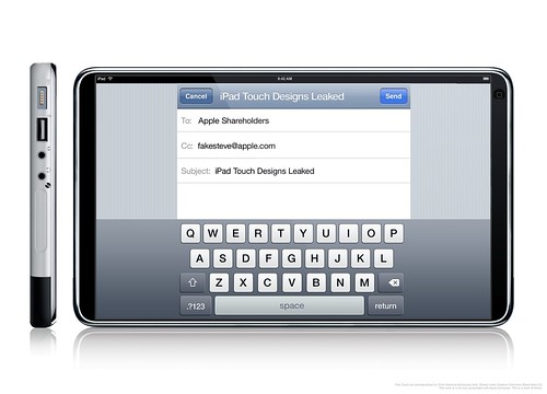
If Apple were rushing to get this product to market then this could be a possibility: iPhone apps scaled-up to fit the larger screen resolution of a tablet. Everything would look the same except everything is bigger — perhaps exactly 2x as large with a 640x960 resolution screen.
Advantages: If all UI elements are automatically scaled then nearly every currently available iPhone app would immediately be available on the new tablet.
Disadvantages: This seems like a half-assed solution. A tablet's screen resolution is much larger than the iPhone and merely scaling existing apps is a cop-out. It doesn't use the advantages of a tablet-sized device so why pay extra for a tablet-sized device? Also, the normal way to interact with an iPhone is to hold it in one hand in portrait orientation. The normal way to interact with a tablet-sized device is to hold it in two hands in landscape orientation. Most iPhone applications are made to be used in portrait orientation so if they're scaled to tablet-sized proportions and not rotated then you'll have to hold the Apple tablet like a Kindle and not like a normal tablet to use any of the apps. This isn't optimal for a variety of reasons.
It Runs Customized iPhone OS With Multiple Running Apps
If the resolution of the tablet's screen is 960x480 then you could potentially run multiple iPhone apps at once, side by side, on the screen all at the same exact pixel dimensions for which they were designed.
Advantages: Developers wouldn't have to rewrite their applications and users could finally run multiple applications at once.
Disadvantages: This still doesn't let individual apps take advantage of the larger screen resolution — they'd still be locked into 320x480. Also, this would only really work if the apps were all using portrait orientation so they could be tiled side by side when holding the tablet horizontally. If an application was built to be used in landscape mode then it'd throw off the other applications on the screen and would look cluttered and messy.
It Runs Customized iPhone OS For Usage On Larger Screen, No Third Party Apps To Start
This seems like the most Apple-like solution to me. When the iPhone first launched there was no iPhone SDK, there were only Apple-created apps. Developers were clamoring for an SDK and by the time it was introduced there was a feeding frenzy — it was a gold rush.
The apps included on this tablet device would be a small assortment of Apple-created apps like Mail, Safari, iTunes, etc. These would all have redesigned user interfaces that would use the entire resolution of the new screen. Imagine iTunes LP format on a beautiful, new, widescreen display or Mail with multiple-panels just like its Mail.app big brother on the Mac.
Advantages: Totally redesigned applications made for a larger screen open up a world of possibilities for user interaction and functionality. There's no doubt that the ones Apple redesigns (or, more accurately, re-develops) will be beautiful and will be a wonderful showcase and selling-point for the tablet.
Disadvantages: If Apple's trying to keep the tablet a secret then there will be no publicly-available SDK at launch and therefore no third-party, tablet-centric redesigns of App Store gems when the tablet first goes on sale. This is a big disadvantage but it could be downplayed in a few ways: 1) large App Store developers (EA comes to mind) would gain early access to the SDK and could rewrite some key iPhone apps to be included in the "Tablet-Only" section of the App Store at launch or 2) Steve Jobs announces the tablet and sets a launch date a few months in the future, just enough time for serious iPhone developers to get an early, tablet-centric version of their app completed for launch.
It Runs Mac OS X
An unlikely scenario is that the tablet simply runs Mac OS X at a smaller resolution than normal.
Advantages: Running full-blown Mac apps would be great in some ways, especially for the creative crowd. Developing for it wouldn't require any new SDKs and Snow Leopard already has multi-touch support built-in.
Disadvantages: No App Store, no access to the current 85,000 apps is a gigantic negative. Other problems include the fact that a finger is a lot larger than a cursor and Mac OS X interface elements are designed for cursors so expect a lot of misplaced touches.
It Runs Some OS X & iPhone OS Hybrid
This would be the best of both worlds but it'd be very tricky to get exactly right. Do you launch iPhone apps from the Finder? Do you launch OS X apps from Springboard? Do iPhone apps run in little simulator rectangles? Do you use AppKit or UIKit to code interfaces?
Advantages: The key advantage is that you'd still be able to access the full App Store catalog but also run full-blown Mac apps if needed.
Disadvantages: Jack of all trades, master of none. If the tablet isn't 100% focused on a singular type of application user experience then there will be problems. Tiny buttons on Mac OS X apps would be frustrating to hit but then when running iPhone apps UI elements are correctly-sized — the dichotomy would be very annoying. The overlapping APIs would also be really tricky for developers to figure out.
Other Tricky User Experience Issues
The form-factor of a tablet is fascinating because it surfaces so many user interaction dilemmas that haven't been totally solved yet.
For example, the simple act of entering text via an on-screen keyboard. When holding the device in portrait orientation then the on-screen keyboard could be essentially the same as the iPhone's in concept, but what about when you're holding the tablet horizontally with two hands? How does the keyboard work in that scenario? If you stretch the keyboard across the device's screen when in landscape orientation then your thumbs won't be able to hit the middle keys without stretching and reaching. This orientation works on the iPhone because the screen is only 480 pixels wide but what happens when the horizontal dimension of the screen is 800px or 1200px? This same layout just doesn't work.
One idea is to split the keyboard and have the left side anchored to the left side of the device and the right side anchored on the opposite end with a large, open gap in the middle. It might look funky but now your thumbs can easily reach the middle keys since they're physically closer to where your hands are located.
Another issue is how you watch movies. The natural angle of the screen is to be flat whereas a traditional laptop's screen is angled up which increases visibility. How do you watch movies on a 7-10" tablet screen that has no keyboard? I know how much of a pain it is to watch movies on an iPhone since I usually do that when I fly — most times I end up holding it front of my face with one hand for an hour or so. I imagine that the tablet will come with some sort of stand — either built into the back like a picture frame or external like a small wedge — because otherwise users will have a hell of a time getting it at the correct viewing angle for prolonged interaction.
Fascinating Time To Be An Apple Fan
The build-up to the launch of the original iPhone was unprecedented. Years of rumors, tidbits, second- and third-hand accounts all culminated with the famous Steve Jobs unveiling of three magic devices that were actually one iPhone. I remember where I was when I first saw the magic text stream across MacRumors' live feed and how I felt, it really was magical. I think I'll have the same feeling when the Apple tablet is unveiled because it's Apple and I can't see them launching something that's not incredible. It won't just be a device to surf the web in the bathroom, it will be a new way to consume media that will revolutionize many industries.
It's an interesting experience, diving head-first into the unknown, trying to soak up all the information you possibly can on the way down into the abyss of Mac application development. Everything is new, most of it is documented, and the rest can be learned by reading as much as possible and asking for help when you're lost.
I'm new to Objective-C, new to Cocoa, but have been a hardcore Mac aficionado since 1996 when I got my first Mac — a Performa 6200 — so I have "Apple-ness" running through my veins which is extremely helpful. Creating a beautiful and successful application for the Mac usually means that it looks as if the engineers at Apple could have created something similar, so the expectations are extremely high as far as interface polish is concerned. I'm learning just how much effort goes into a beautiful Cocoa app, and it sure is a lot.
As far as the development process is concerned, it's a big crap shoot. I worked on piecing together the user interface components early in the development process so I could get a better feel for how the app behaves, but making the interface actually function can't happen until X is written, which is dependent upon Y code, which I'm confused about until I do an hour or so of Googling, so it's a chicken and the egg problem. Fortunately, I've been working hard on a lot of the application glue code so that in the next few days I'll be hooking up the interface and giving things some real-world usage.
I've been coding for a long time, but have never really learned C, so initially writing Objective-C was difficult because not only did I have to learn ObjC's syntax, I also had to give myself a crash course on pointers, header files and memory management at the same time. After being absorbed in the Cocoa development world for a few months, I've realized that reading other people's code is the single greatest way for me to get acclimated to "how things are" when developing for the Mac. How to structure your classes, how to load NIBs, the best way to store user data, all these things I learned by pouring over open source Cocoa code I've found online or in Apple's example applications. Seeing how other people have conquered similar problems is probably the best shot in the arm out there.
Finding Other Developers
One thing that has made a huge impact in my ability to learn Cocoa is having a group of people I know can potentially help me if I get too confused along the way. Here's a short list of people who have helped tremendously:
So how did I find all these people? Mainly through being a Mac application connoisseur — downloading everything that comes out — and then finding the brilliant people that created them. Twitter has been extremely helpful, in fact I follow every one of those people on Twitter so I can try to absorb their offhand tips and tricks. Emailing people is good too — you'd be surprised how helpful and friendly people are if you just send them a nice email. I've always made an effort to email people out of the blue and commend them on the work they've done, and my Mac development experience has been no different.
So What Am I Working On?
I don't really believe in nebulous descriptions of work-in-progress, written to pique curiosity. I'm working on my first Mac application, an application that I've had in my head (in some form or another) since 2005, and I'm building it mainly to fill my own needs, but I'm hoping that it fills the needs of others, too. Like most Mac applications, you'll be able to download and use it for free, but additional features/functionality will need to be paid for.
I'm working hard on it, and details will surely be coming soon, but for now I think I should shut my mouth and get back to work! Nothing is worse than vaporware.
Designing icons for Mac OS X is an intricate and painstaking process because the maximum resolution is so high, up to 512x512 pixels. At that size, Apple suggests that your icons be as photorealistic as possible, which calls for a lot of design talent. Icons for OS 9 and earlier versions of Mac OS X didn't need to be so incredible detailed as they were never shown at large sizes — letting a designer get away with some pixel imperfections here and there.
The current school of icon designers aren't typically at 1600% zoom in Photoshop placing each pixel precisely, but are using scalable vector illustrations and 3D renderings to produce the realism they desire. I've talked to many icon designers and although rendering icons in 3D is the ultimate way to get photorealism in an object (shading, lighting, perspective, etc.) many are still using Illustrator and Photoshop to work their magic. The last few versions of Photoshop have offered vector drawing tools similar to Illustrator, so now even Photoshop allows you to design nicely-scalable graphics which are very important when designing application dock icons.
I download applications all the time — normally to actually use the program — but sometimes just because I like to study the dock icon at full-size and see how certain lighting and shading scenarios were created. In case you're not aware, here's a quick way of viewing the full .icns file with the high resolution icons:
Download the application, find the main .app bundle.
Right-click on it, go to "Show Package Contents".
Navigate to Contents > Resources and find the .icns file for the app.
Open the file in Preview to see all sizes.
Shown above are some beautiful application icons I've seen recently. In numerical order is 1) Relationship designed by Icon Drawer, 2) Architect & 3) Bowtie, both designed by Laurent Baumann, and 4) CSSEdit.
I've spoken to Laurent and he's told me that he still works completely in Photoshop for all his icon work, even though his designs look beautifully photorealistic. The chess pieces in the Relationship icon look very real, so I'll guess that it was easier to accomplish that realism by using a 3D rendering app like Cinema 4D. The CSSEdit icon has some great hidden text on the bottom left if you're viewing it at full-size.
Seen any other great icon design work recently? Let me know!
I've been blogging since 2003, but this is my first "brand new" blog I've started in a few years. So why did I do it?
To learn, to teach, and to explore the realm of software interface design.
I've been working on my first Mac OS X application, and off the bat I learned that there weren't a lot of resources to show you the best practices of designing a Mac-like interface. Obviously there are the Apple Human Interface Guidelines, but when comparing the layout and positioning of similar UI elements in Apple-made applications like the Finder, Address Book, and iPhoto, I found that they were all slightly different. Sometimes, more than slightly different. Apple doesn't follow their own standards, so how was I to know what the best place for a particular button is?
When designing a Mac OS X application, I've found the goal isn't to follow the Apple HIG to the exact letter, but to make your app look "Mac-like". Here's a quote from John Gruber:
"Anyone involved in Mac software development is familiar with arguments over whether a particular app is "Mac-like". In the early days of the Mac -- the first decade or so -- the entire Mac community was largely in agreement about just what this meant. To be un-Mac-like was to be ignorant of the fundamental concepts and norms of the Mac OS. It was something you could spot in an instant -- software designed by engineers who just did not get it."
"In the last decade, however, accusations of "un-Mac-likeness" have largely degenerated into meaningless hand-waving. You still occasionally see UI mistakes that are genuinely un-Mac-like -- like, say, outright Windows-isms such as ordering dialog box buttons OK/Cancel rather than Cancel/OK -- but in most cases, when someone complains "that's not Mac-like", what they really mean is "I don't like that."
This blog will attempt to discuss what makes interfaces and icons "Mac-like" and how you achieve that look through articles and tutorials.

 I never opened Interface Builder before I started designing Beak's (underwhelming) Preferences window. In short, I cut my teeth on Beak and it shows. It was never really polished, nor did it represent any kind of best practices for Mac development; the main interface component is a