Back when I was doing design work for clients, it seemed like my work would get re-purposed by fledgling and not-so-fledgling designers every month. Sometimes I'd get a tip in my email about a theft that someone saw, or sometimes the offenders would link the assets right off my client's website, but regardless of how I found out about the theft, it'd piss me off more than anything else. I was the one who opened Photoshop, I cranked through iteration after iteration, I thought of execution details in the shower, I stayed up late at night, and then someone else just takes all that work and passes it off as their own. Sure, usually there were some slight modifications, but designers can always tell when someone else is using their design. It's sort of like a parent being able to identify their baby's cry while all the other babies are crying as well.
Lack Of Understanding
A few friends and I were the co-founders of 9rules, one of the largest independent blog networks of its day. I designed the fairly well-known (if you had a blog back in the mid-2000s!) 9rules leaf logo, which, to this day, is still the only good thing I've ever made while using Illustrator. For some reason, this was my most copied design ever. Toyota copied it for a yearly conference they run. Hell, it's even used as the logo for a mall in South Africa.
The dumbest thing about using the 9rules leaf logo for something other than 9rules is that the logo had a specific meaning. We had 9 principles we followed with the startup so there were 9 leaves. The design was meant to resemble a '9' and an 'r' side by side. The colors meant something, too. The logo represented our startup, it wasn't some arbitrary swoosh or vector swirl, we spent a lot of time on it and it was unique to our business.
When companies steal a design made for something else, they skip the part where they toil over the design and develop a deep love and appreciation for it. In 2009, Jason Fried wrote a blog entry about why you shouldn't copy them or anyone else. Here's a snippet.
"Here’s the problem with copying: Copying skips understanding. Understanding is how you grow. You have to understand why something works or why something is how it is. When you copy it, you miss that. You just repurpose the last layer instead of understanding all the layers underneath."
Copying someone else's designs, the way Samsung did with Apple's interface and industrial designs, skips over the whole part about why they were like that in the first place. Why did a designer throw out 20 iterations and pick the 21st design to be the one to ship? What led them to the those specific conclusions and insights? What down-the-road thinking influenced the design? Samsung doesn't know why Apple went with a homescreen with a fixed row at the bottom, they just know that the iPhone is hot and they want all their phones to look like the iPhone in the eyes of consumers. That's why they stole Apple's interface designs: to short-circuit the innovation process and jump straight into the line ahead of everyone else.
I really don't care about patents or trademarks or trade dress or any of that. To me, a designer, it's just about honor. Deciding to use someone else's pixels as your own is not just lazy, but it's dishonest. It's a slap in the face. And that's why I'm glad Samsung owes Apple over a billion dollars, because so much design theft happens in the world, it's about time someone or some company got knocked down a few pegs because of it. This victory isn't just a victory for Apple, it's a victory for every designer who has been ripped off by people who didn't care or thought they could get away with it. Tonight it's clear that sometimes they can't.
Today, Twitter unveiled redesigns for their website, iPhone and Android apps. As a long-time Twitter user and Twitter app aficionado, I've come to expect a certain level of thought & polish in everything Twitter does, so I'm sad to say I'm not a huge fan of their new direction.
Low Information Density
Mobile phone screens are small so each pixel is incredibly valuable. Horizontal screen real estate is even more valuable because you have fewer pixels on the horizontal axis than you do the vertical if you're holding your phone in portrait orientation.
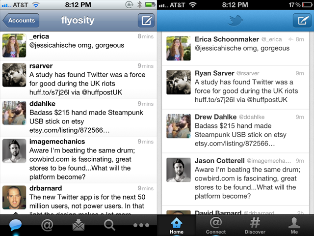
Apple provides UITableViews two main display modes: plain and grouped. Plain rows extend to both edges of the screen and are primarily used when a lot of information needs to be displayed like in Mail, the App Store, Facebook, Music and all previous versions of Twitter for iPhone. For reasons I cannot explain, the latest version of Twitter's iPhone app uses the grouped style that doesn't extend to either side of the screen. This automatically introduces 10px of padding on each side which cuts the horizontal resolution down to 300px, leaving 20px less room for each tweet. Since the primary focus of Twitter is to, wait for it, read tweets, this is not a good thing. In fact, this coupled with the removal of the text size setting causes the new version to show fewer tweets per screen compared to the old version.
Twitter yesterday is on the left, Twitter today is on the right. I scrolled to the same spot in both apps to make the row height comparison more obvious.
And I can't exactly put my finger on it, but the new grouped tableview style makes the interface feel more claustrophobic, more boxed in and constricting. Because of this change it no longer feels like you're in Twitter, it feels like you're just watching Twitter, or viewing Twitter's website inside the app. Margins on either side of an interface are for the web. This is an app, and apps need to expertly use the few measly pixels they have.
Forced "Discovery"
A main focus of this redesign is the new Discover tab which 1) shows random things to you, and 2) cannot be hidden. Seriously, I can't make heads or tails of what it's supposed to be showing me. I think it's a personalized-social-graph-recommendations-search thing all jumbled together. Unfortunately, using search and/or giving a shit about hashtags is at the bottom of things I use Twitter for, mainly because the trending topics are dominated by stupid rap music memes or Justin Bieber fans. Here are some of the most popular trending topics this past year: #aintnothingsexyabout, #4wordsaftersex, #BestSexSongs, #secretturnon, #youknowitslovewhen, #muchlove, #IsmileWhen, #yougottaloveitwhen, #youdeserveashoutout, #ItsMyAddiction, #WhatNotToSayAfterSex, #sevenwordsaftersex, #thingsblackgirlsdo, #thingsblackpeopledo, #doesntmeanyourblack and #NotAllBlackPeople so please excuse me if I don't trust Twitter to bubble up and show me interesting, recommended, personalized content.
Removal Of Gesture Shortcuts
My primary usage of Twitter includes the following:
Clicking on a link within a tweet.
Replying to tweets.
When I wake up in the morning and check Twitter, these are the actions I take. I see tweets with links and I check out the link. I see mentions and I reply back. The way that I accomplish these tasks is through the use of gesture-based shortcuts that I've come to know and love, and, unfortunately, the shortcuts I use to quickly accomplish these two tasks are now missing and I have to tap more times to do it.
Previously, to view a link inside a tweet, I'd tap once on a tweet, then tap on the link to view the webpage, then swipe back in the navigation bar when I was done. In the new version of Twitter, it takes the same number of taps to get to the webpage, but it now takes 2 taps to get back to the spot in the timeline where I was previously at instead of a single swipe.
To reply to a tweet from the timeline view, you used to be able to swipe on the row to expose the action icons allowing me to swipe-then-tap to initiate a reply. In the new Twitter, this gesture has been removed so I need to tap on a tweet, wait until the next screen loads up, then tap on the reply icon on that screen to start the reply. Then, after I post the reply, the new version of Twitter brings me back to the single tweet view forcing me to tap one more time to get back to the timeline. On the old version of Twitter, as soon as the modal tweet window is dismissed, you're already back in your timeline. More taps, more waiting.
Removal Of Features
Removing features from an app once they're in place and being used is a tricky decision. On one hand, it can make your overall product simpler and cleaner but on the other hand it pisses off people who were using those features. The latest version of Twitter for iPhone ditched a lot of existing features and it's already causing some consternation. Here are a few features that are no longer available:
Favstar integration
Translation of tweets
Link reposting
Copying a link by long-holding it
Turning a Twitter user into a contact
Shortcut to reading a link later
Changing text size
Showing only username or only full name in timeline
Landscape mode
Can no longer quickly tell if someone follows you
This is a fairly long list of things to remove, and I'm sure I still missed a few. I'm already really annoyed at seeing full names in my timeline and having a larger text size means fewer tweets shown on the screen at once.
Things I Like
The new Twitter for iPhone isn't all bad, there are some significant additions that I'm a fan of. I like the Interactions area which shows favorite, follow and retweet activity. I like the favorite and retweet counts on the individual tweet screen. And, although the padding on the outside of tweets is a bad thing, I do like the slightly-tweaked padding on the inside of tweets and the removal of the gradient.
I think the new app will be more inviting and accessible to new users, but I don't like that this comes at the expense of the user experience and existing gesture shortcuts. There's a way to make both novice and advanced users happy, and I hope Twitter 4.1 does a better job at appealing to all sides of their userbase than 4.0 has done.
On mobile devices, there is absolutely no room for error. No room for blurry pixels, no room for confusing icons, no room for user experience mistakes, no room for sluggishness. The entire device is one big constraint: a flat piece of glass that accepts touch input with a few millimeters of metal chrome around it. That's it. All you have is the glass and how things behave under the glass.
If things under the glass move as you move your finger, the illusion of direct manipulation of a digital interface is created. If you move your finger and, then, a split-second later something moves in response to your movement, that breaks the illusion. Apple has fully understood this from the beginning, and the iPhone has always responded to pinches and flicks with nearly 1:1 accuracy, especially in the browser, which is where iPhone users (myself included) seem to spend most of their time.
Android, on the other hand, has always felt laggy to me. I've used the Nexus One, all the carrier versions of the Galaxy S, the Nexus S, HTCs, Droids, the list goes on, and none of them have felt right-on-the-button perfect when I move my finger around on the screen. I move, the phone processes some things, and then the interface moves. This has been the Android way since Android's inception. The built-in browser is the most egregious example of sluggishness, especially when pinch-zooming or double-tapping. Check out this video of an iPhone 3GS vs. a Nexus S. Astoundingly, jaw-droppingly bad.
Now with this in mind I just saw that the Galaxy Nexus, the new supreme king of Android phones, has been unveiled. This Is My Next has a hands-on review and this is the single line that stood out to me:
The subtle, pervasive lag that has characterized the Android UI since its inception is still there, which is not a heartening thing to hear when you’re talking about a super-powered dual-core device like the Galaxy Nexus.
Pervasive lag? On a mobile device that's running the very latest Android version? Powered by one of the beefiest mobile processors in the world? Samsung's cream-of-the-crop phone running Ice Cream Sandwich is still, still laggy?
Totally fucking unacceptable.
Imagine if your mouse cursor couldn't keep up with your hand movements, or if letters didn't appear on the screen until a moment after you pressed your keyboard. That's how egregious of a user experience problem this is. If a user interface doesn't respond as quickly as possible to a user's intentions and movements, it's a pile of rubbish. Immediate touch response has been solved by Apple for years, why can't Google and Samsung and Motorola and HTC solve it as well?
Some teams spend a year or more crafting an iPhone app that uses every ounce of their good taste and development talents. These apps are big gambles and a big payoff is needed to justify all the expense and self-sacrifice.
Other teams crank out apps every few weeks, throwing the proverbial app at the wall to see what sticks. To be frank, most of these apps are ugly and useless and they bring the overall bar of the App Store lower and lower. Unfortunately, some huge successes in the App Store have fell into this category: apps that nearly every developer has taken a look at and said, "I could build this in a weekend!"
The most recent trend-cum-scam in the App Store is the faux security app where you build background images that look like an Android lock screen graphic. These apps just make images, they don't really do anything related to security. Tens of thousands of people have bought these apps under the guise of enhanced security but, inevitably, leave low-star reviews when the app doesn't actually do anything it says in the description.
After discussing these Android-lock-screen-maker apps with my friend Kyle, I told him I wanted to do a little experiment: I wanted to build an app in about 10 hours that was made "for the masses" to see how it might do. I don't know why, but the first thought that popped into my mind was an app that showed reaffirming, positive messages to the user after they press a big red button. Very exciting. So I started working on it and I gave myself a maximum timeframe of about 10 hours to design it and code it.
After the design was done and the app was mostly developed, at about 2am one morning, I woke up with an idea. Why just show nice phrases? Why not show mean ones, and do the whole yin/yang good/evil thing? It adds a new dimension to the app and it might expand the audience to a wider demographic. So after a little bit more time than I had originally planned for, I had a finished app. Two sides, each has a big red button. One side tells the user Something Nice, the other tells them Something Mean. The icon uses the well-known greek tragedy & comedy masks.
May I present Nice & Mean, an app that can brighten your day (or ruin it!) depending on which side of the app you use. Find Nice & Mean in the App Store.
An Experiment
I have no idea what to expect. It could sell 10 copies, 100 copies or 10,000 copies. People might love it, they might hate it, they might think it's dumb or they might think it's hilarious. All I know is that even though it's a simple app, I put a lot of thought and polish into it. I don't know how it will sell, but I do intend to write a follow-up after a few weeks.
Human attention is a scarce commodity in this flashy, New Thing Comes Out Every Day™ world we live in. Startups that dominate the blog headlines one day may be all but forgotten a mere 24 hours later. This is especially true for mobile apps. If you're launching a mobile app, how do you stand out from the crowd and gain traction? Here are four ways.
Delight users with a beautiful look & feel
Take a novel approach to an interesting problem or market niche
Inspire user confidence through user experience consistency and ease-of-use
Guide newcomers around so they can learn and then show others
Making users feel comfortable, welcomed and intrigued at the possibilities your app offers are some of the most important things you can focus on. Don't just dump them into a field and expect they'll find their way to water, guide them and teach them so they'll become experts at using your app (then tell their friends!).
Here's John Gruber's take on the importance of the first-run user experience.
Another aspect of the Mac OS X user interface that I think has been tremendously influenced by Steve Jobs is the setup and first-run experience. I think Jobs is keenly aware of the importance of first impressions... I think Jobs looks at the first-run experience and thinks, it may only be 1/1000th of a user's overall experience with the machine, but it's the most important 1/1000th, because it's the first 1/1000th, and it sets their expectations and initial impression.
The tough part about focusing on the first-run user experience is that, as a developer, you never see it. You start up your app, start adding data and using it, develop, test, develop, test, debug, use it some more, then launch it. Unless you're consciously thinking about it, you'll probably never see a bunch of blank screens. This is incredibly dangerous because all your users will see a blank screen in the first 10 seconds, and you may not have seen it in weeks, months, or ever.
Color
Color, a new photo-sharing app, just launched last night and while the major news outlets were gushing over the money they raised, the real story unfolding is that the app has a terrible first-run user experience and their app is getting decimated in the App Store with 1-star reviews.
The primary reason why users hate Color is because they completely botched the blank slate user experience. From Jason Fried:
Ignoring the blank slate stage is one of the biggest mistakes you can make. The blank slate is your app's first impression and you never get a second...well, you know. […]
Unfortunately, the customer decides if an application is worthy at this blank slate stage — the stage when there's the least amount of information, design, and content on which to judge the overall usefulness of the application. When you fail to design an adequate blank slate, people don't know what they are missing because everything is missing.
When you first start up Color it asks for your name, then it prompts you to take a photo of yourself. Once you've completed these two steps it essentially feels like there's nothing else to do. The screen shows the photo you just took and… nothing else. It's all whitespace. There's nothing to browse or explore, nothing to poke around or get interested in, no indicators that there are other things to do.
Now there are most certainly cool aspects of Color, but these are only apparent if the app is being used by a number of people all within the same vicinity of each other. Unless a dozen people all in the same room or event are using Color at the same time, there's really nothing to see. It's a photo-sharing app that only works if others near you are also using it. The problem is that since no one is currently using it, no one wants to continue using it. It's a classic chicken or the egg problem, and unfortunately for Color, the $41 million they raised didn't solve it.
What's really interesting is that Color could have actually gotten around this problem by launching at SXSW and making a big splash to get tons of people using it all in the same geographic area. This might have vaulted them past all the issues people are experiencing now as people download it around the world, but few people are using it in close proximity to one another. The idea that the executives at Color specifically chose not to launch at SXSW boggles my mind.
Solving The Color Problem
Color already blew their first impressions with hundreds of thousands of people, but there are some changes they could make right now to stop the bleeding.
Check geographic regions at increasing sizes until a decent number of photos are actually available to be seen, then show those in the app. The point of Color is to show photos from people nearby, but showing photos from people in other states is at least better than showing absolutely nothing.
Work hard on a well-designed interactive tutorial that is launched the first time someone starts the app. It should explain what Color is, why it's cool, why you want to use it, and get users started and interested to find out more.
Acknowledge that Color is more interesting when many people in the same vicinity are using it, encourage people to tell their friends about Color. They have $41 million, if they gave away a few dozen iPad 2s, t-shirts and stickers that'd probably jumpstart users' excitement.
Is it too little too late? Time will tell. Let's hope Color doesn't turn out to be the Cuil of 2011.
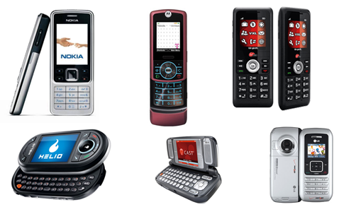
Before the iPhone came out, phones looked like this:
Different shapes and sizes. Flip phones and sliders. Candybars and decks of cards. Lots of hardware buttons. A hundred takes on the D-pad. A small screen (or two). This is what mobile phones looked like from the time I bought my first in the late 90s till early 2007.
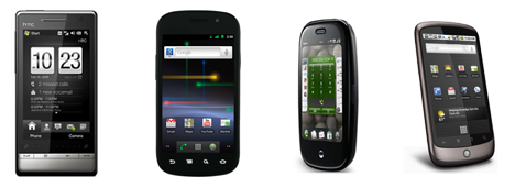
But since the iPhone debuted, they all look like this:
They're all rectangular with a screen that fills up nearly the whole front face of the phone. Some still have physical keyboards, but that's a vestigial tail that will certainly fall off at some point in the future. All have only a few hardware buttons. All have nearly the same dimensional proportions. All have nearly the same thickness, give or take some tenths of an inch. All have nearly the same weight and feel in your hand.
Why is this?
Because the future of mobile hardware design is for it to fade away completely and have the focus be the OS and apps it runs.
Nokia's Windows Phone 7 Concept
Engadget recently posted a concept design showing a new Nokia phone that would run Windows Phone 7. Predictably, it looks like an iPhone and every other smartphone that's been manufactured in the past year or two: rectangular, a huge screen, small outside bezel, thin.
It looks good, or, I should say, the tiny amount of surface area not dedicated to the screen looks good. It will probably feel good in a person's hand, but what phones don't feel good in a person's hand nowadays? They all do, because they're all designed to look the same. They're all designed to look like the iPhone. A glowing rectangle surrounded by a thin strip of material that sends data to the rectangle.
The Future Of Mobile Hardware Design
I've looked into the future and have seen what mobile devices will soon look like. I know, it sounds impossible, but here it is.
All screen, no bezel, no chrome, just interface.
Look at the mobile hardware trends in the last few years: the screens are staying about the same size but the hardware around them is shrinking. Thinner phones, thinner bezels, more focus on the screen. At some point in the future all we'll have is the screen and the software that it's running because that's all that matters.
The iPhone started the trend of the focus being on the software. Your phone becomes the app that it's running. How many people focus intently on the bezel around the screen while they're using their phone? No one does. You stare at the screen. As technology advances and miniaturizes, everything will get faster and smaller. The hardware will fade away and software will be the only thing people care about.
A design can be wrong. The entire thing can be wrong, parts can be wrong, or even a tiny, 10x10 pixel area can be wrong. Not, "I think it's good but it needs improvement" but flat-out wrong. 1 + 1 = 3 wrong. A spelling mistake in a book wrong. A syntax error in a code file wrong. It's not an opinion, it's not a matter of subjectivity, it's a fact: a design can be wrong.
Dribbble Mayhem
Dribbble is a site where designers can upload small screenshots of their upcoming work and receive critiques from other designers. Recently Jason Lynes posted a screenshot challenging the status quo at Dribbble and asking others to hold all feedback unless the designer explicitly asks for it. A mini-firestorm kicked up in the comments, but the most interesting comment was from Jason himself regarding the concept of design criticism:
Screenshots are 400x300, too small to convey purpose, context, and intent in the design. How is that enough information for you to tell me my font's not working, or my color's wrong? For design criticism to be effective, you absolutely must have context. Dribbble has none.
Is he right? Do you really need to see the whole picture before commenting on design execution? No. Definitely, absolutely, positively no. A design can be wrong without any context. Here's why.
What Can Go Wrong
Designs can succeed or fail on a number of levels, some of which are subjective, some of which aren't. Things like the overall concept, mood and its visual appeal are subjective: one person might think a design succeeded in its overall goals whereas another might think it failed. To decide this you probably need to have knowledge of the big picture, the overall design goals, the context. In most cases this cannot be decided by a quick glance at a 400x300 screenshot. If it's a miserable, hopeless failure then you can, but if it's on the border then context is what's needed to make a final call.
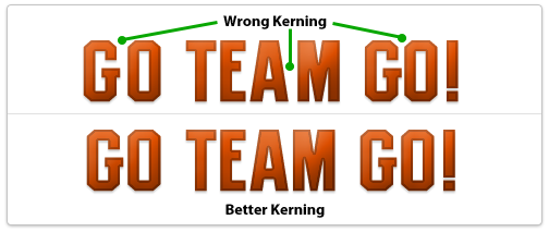
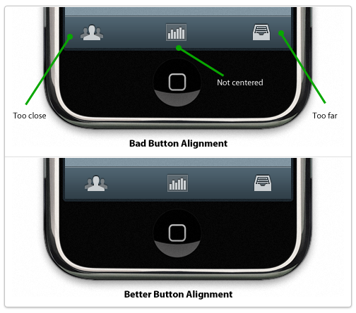
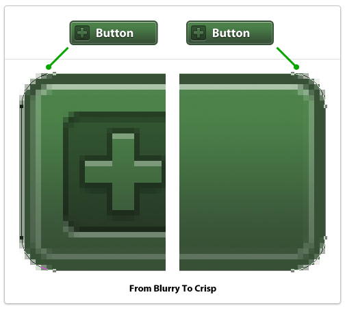
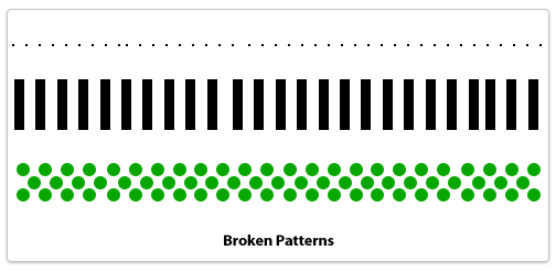
So without any context what can you really critique? Design execution. The execution of a design is the nitty-gritty details of the design. The pixel-level details. The alignment of individual elements. The kerning of a logo or headline. The sharpness of an edge. These can be wrong. These can be so incredibly wrong that they stand out no matter how good the overall concept, mood and visual appeal may be. Screwing up the execution of a design ruins the design. Game over, it's wrong, and no context is needed to understand its wrongness. A 400x300 pixel screenshot on Dribbble can be wrong without knowing anything about the project. An iPhone app icon can go from right to wrong in just a few pixels. One misplaced pixel. One misaligned button. One blurry edge. This is what makes a design wrong, this is what makes an execution of a design go from good to garbage.
Examples Of Wrong Design
Wrong kerning on a logo or headlineYes, you can screw this up if it's obvious enough so make sure to manually adjust kerning between letters if needed.
Misaligned elements, uneven paddingElements in a design should be aligned to something: other elements, a grid, a golden ratio frame, the edge of the page, something. If it looks like you tried to align it to something else and it's not perfectly aligned then you failed, it's wrong. Either something is perfectly aligned to something else or it's not aligned to the other element at all. If it's 98% aligned it's wrong. The same goes for padding around elements and whitespace. If you are designing tabs for a website and the text is not aligned properly within each tab it's wrong. 1px off is wrong. It's sloppy, it's junior, it's not professional. What if a plumber only half-tightened a pipe and it was only leaking a little bit? Would you think that was acceptable or would you ask him to actually stop the leak? The same applies here. Either things are aligned properly and have uniform padding or they don't. Either a pipe is leaking or it's not. Simple as that.
Blurry edgesThese look terrible and can ruin a design instantly. What's a blurry edge? It's an edge of a vector object that doesn't lie fully on a single pixel but straddles two pixels. The most egregious examples are long, straight lines that the designer was too lazy to make sure were the width of a whole pixel so they end up using 2 pixels when they should only use 1. To fix these in Photoshop (if using vector shapes) switch to the white arrow tool and select points of your shape individually, then zoom in close and use the arrow keys to move points over a tiny amount until they're perfect.
Broken patternsA pattern is a technique that a designer sets up and reuses in a repeating fashion. Dotted lines would be one example, an overlapping plaid pattern could be another. Anything that repeats in a set manner needs to adhere to its own defined pattern or else it's a mistake. A dotted border that is missing a pixel or has too much spacing between two dots. Ten boxes in a row and the space between the 3rd and 4th is a few pixels off. A stripe pattern using lines 10 pixels wide uses a 9 pixel line by accident. These are mistakes, it's not a subjective matter. If you're not careful when copying and pasting layers in Photoshop it can happen.
Techniques To Avoid Design Errors
If you're not sweating every pixel then you're already off to a bad start. What does that mean? It means using alignment and measurement tools to make sure everything is perfect. It means double-checking to make sure an element that's supposed to be centered actually is. The details are the design. They're not an afterthought or something you fix later, it's something embedded in everything you do. Every icon, every line of text, every box, every pixel should be cared after as if it's 10 feet tall staring you in the face.
Design errors separate stock-photo-slappers, clip-art-arrangers, and programmers-turned-wannabe-designers from real, world-class, totally-fucking-amazing professional visual designers. If you're not a world-class designer but aspire to be one, don't ever commit a design error. Your visual tone could be off, the colors could be muddy, the concept could need tweaking but you should never, ever make a mistake that I've listed. There's no excuse, and the best part? Fixing a design error requires no design talent. You don't have to write like Ernest Hemingway to be able to spell words correctly and you don't have to be a great designer to simply double-check every pixel and make sure it's in the precise place you planned it to be.
Back To Dribbble
Designers who care about their work want to know when something is wrong. Not subjectively wrong (although that's good to discuss as well) but objectively wrong like a design error. A flat-out mistake. If someone spots a design mistake in my work I want to know because I want to fix it; I want my work to be perfect and represent my best efforts. It's not an ego thing, it's not a hurt feelings thing, it's a professional thing. If a plumber leaves a pipe leaking then it's a mistake. If a writer misspells a word in a novel then it's a mistake. If a designer makes a design error then it's a mistake. Plumbers who don't care about leaky pipes aren't professionals. Neither are writers who leave misspellings in books nor designers who make egregious design errors in final designs. Either you're a professional or you're not, it's as simple as that.
I've been playing with my iPhone for a little bit, here are my quick, unorganized thoughts.
I bought a bumper, and before I put it on, it felt like the phone was incredibly droppable. The tapered edges feel like they want to slip through your fingers. I highly recommend the bumper.
The plastic back on the 3GS has a slightly higher coefficient of friction (less slippery) than the new iPhone 4 back which I assumed before I got the phone. Not slippery, but definitely slipperier than my previous iPhone.
The camera is astounding. I took a quick picture of a flowering tree outside the office and it was incredibly sharp and beautiful. Probably the nicest picture I've taken in years.
It's thinner, about the same size as just the plastic case on the 3GS. Slightly thicker than the iPod touch which is like a wafer.
The screen is making my eyes buggy because it's so sharp. I've never seen a screen with this type of pixel density and it's so sharp it's almost jarring, like my eyes aren't used to it yet.
The screen is brighter and has a different color profile than the 3GS. It's a lot more contrast-y, blacks are blacker, whites are whiter. The angle at which you can view the screen is incredible due to the new IPS display.
Text rendered on the new screen looks foreign it's so sharp. I've never seen Helvetica like this. Viewing text on the display is now my favorite thing to look at.
Apps that haven't been updated with 2x-resolution raster images look like shit; pixelated and blocky and clunky. I didn't think I'd notice but I definitely do, it's unmistakeable which ones aren't optimized for the new screen.
The fast app switching feature in iOS 4.0 makes the phone feel way faster than the 3GS. Obviously if you load iOS 4.0 on your 3GS it'll seem faster too. I think this feature is biasing my overall feeling of quickness on the iPhone 4, but everything seems much faster. Apps feel like they want to start displaying their interface before their opening image is done zooming out. Reminds me of when apps open really fast on a Mac, before their first bounce is done.
Your app has too many settings, too many things to tweak. API endpoints? Colors of the rainbow? 100 different fonts and font sizes? Temperature in Kelvin? Switch the app to use Esperanto?
Kill the settings, kill them all.
Your Vision Is Your Software
You're the developer, build what you want. Your app should be an expression of your opinions. Jason Fried from 37signals shares this thought as well. Here's what he had to say in his first book Getting Real:
Some people argue software should be agnostic. They say it's arrogant for developers to limit features or ignore feature requests. They say software should always be as flexible as possible.
We think that's bullshit. The best software has a vision. The best software takes sides. When someone uses software, they're not just looking for features, they're looking for an approach. They're looking for a vision. Decide what your vision is and run with it.
And remember, if they don't like your vision there are plenty of other visions out there for people. Don't go chasing people you'll never make happy.
His company has made millions of dollars leaving out the fluff that others love to include. They built their first application Basecamp to satisfy their own needs and left out the features they didn't think were important. Jason considers his team software curators, continually trimming and editing features down to their essence. They build opinionated software.
Trim The Fat
If there's a choice between setting a value to A or B, and you always choose A, why not just make A the main, unsettable, unchangeable choice? If you think A is the best decision, why even let people choose B? Well, in App Store land, people like to whine about B. They'll post 1-star reviews asking when B will exist and say that they'll bump it up to a 5-star review when B is implemented. Others will see that review and ask about C, or D, because they think those are equally important.
This is all bullshit.
You're the developer. Everything is up to you. Apple doesn't listen to users and they're the most successful technology company in the world. They have a fearless leader who's not afraid to piss people off by removing floppy drives or buttons on a mouse. He's not afraid to scrap successful, acclaimed products and start over from the ground up. He builds what he wants because he knows he's building great stuff. That's what you should do, too.
The previous design ended up being overwhelming for normal users (and even some experienced ones) and became very confusing for people with multiple accounts since it was unclear which account was performing a search or looking at trending topics. There were also three different areas to set preferences and many of the options in the preferences were unnecessary and confusing to most users so they were avoided or left to defaults anyhow. So we took a leap and removed the preferences completely, only adding them back in when we found something that absolutely needed it.
Here's a comparison screenshot between the old Settings options and the new, completely slimmed-down version. They gutted their Settings; they're nearly gone. This takes a lot of guts and you can only do this if you really know what kind of software you want to build. You've gotta have the big picture in your head and you have to know where you won't compromise. Inevitably some power users may be upset but the Iconfactory is looking at the overall user experience and that matters more than what some tech bloggers think.
Power Users Don't Matter, Build For The Masses
Feature lists and pages of settings get a small segment of power users excited, not regular users. Regular users want elegant, smart software that just works right without having to fiddle with any additional settings. A perfect example is multitasking in Android vs. iOS 4.0. Apple waited to introduce multitasking because they didn't want to build a system where background apps drain the battery. Compare this to Android: just a few weeks ago Larry Page said that some background apps will drain your battery if you let them. Multitasking in Android was built solely for power users who are expected to force-quit apps and manage their phone's radios in order to maximize battery life. (Here are 20 tips to improve an HTC Evo's battery life.) Jobs made the call to build multitasking the way he saw fit, not the way the tinkerers and phone hackers wanted.
Don't compromise your vision, don't compromise your opinion. If you think 12px font looks best in an interface, don't allow people to move it to 10px. If you could never picture yourself changing a setting to anything else but A, don't even give the option to change it to B. Just don't do it. Build software for you. There are many, many people out there just like you who will appreciate it.
Apple's differentiator has been quality for a long time; beautiful industrial design coupled with an elegant user experience. Independent developers building Mac OS X apps know how high Apple's standards are because to build a really great app for the Mac it should act and feel as if Apple made it. Some developers go above and beyond the HIG and produce beautiful, custom UIs that surpass what Apple might have built if they developed the same app. If you're working at this caliber then perhaps you're gunning for an Apple Design Award or have already won one.
When the iPhone App Store first launched, many of the first available apps were written by established, well-known Mac developers who were well aware of Apple's standards for quality. Few people had experience with Objective-C and Cocoa outside the Mac developer community so it was a given that Mac developers would be out in front, leading the way.
Now that the App Store is hugely profitable most iPhone apps are developed by newly-minted iPhone developers, not hardened Mac folks like when the App Store debuted. These developers are coming from dozens of other platforms to try and strike gold on the iPhone. This may be the first time they've heard of Cocoa or even used a Mac. If you haven't been using a Mac for awhile then you're bound to not really understand what makes an app "Mac-like." Here's a quote from John Gruber:
"Anyone involved in Mac software development is familiar with arguments over whether a particular app is "Mac-like". In the early days of the Mac -- the first decade or so -- the entire Mac community was largely in agreement about just what this meant. To be un-Mac-like was to be ignorant of the fundamental concepts and norms of the Mac OS. It was something you could spot in an instant -- software designed by engineers who just did not get it."
If you love the iPhone platform and want to build an app that feels "iPhone-like" then using Xcode and standard UIKit interface elements is a simple way to start. You'll subscribe to some iPhone development blogs, buy some Cocoa Touch books, and really dive into the new platform. If you really, deeply care about the user's experience then you'll probably hire an interface designer and tell him or her that you want your iPhone app to look as if Apple could've designed it. You'll sweat every detail including every icon, every widget, every pixel, every font. You'll cherish the first time you use your finished app.
If you're building an iPhone app because the iPhone is the hot platform and you're interested in cashing in then you might take a different path. You might be coming from another platform and another language and want to get started right away. You might not want to spend the effort and time to learn Objective-C, you'll probably want to utilize the skills you already have. Hell, you might not even own a Mac or even particularly like the iPhone. You'll probably search for ways to start building iPhone apps without using Objective-C and find some interesting "meta-platforms" that you can use. You care about the user's experience insofar as the user can access the features of your app without much trouble. You're not interested in fancy animations and other things you think are just window dressing, you just want your app to work. You'll cherish the first time you sell a copy of your app.
Using Xcode and Objective-C are not surefire ways to build decent iPhone apps, and using "meta-platforms" and other languages are not surefire ways to build crappy, non-Apple-like iPhone apps. Are they indicators about how much passion someone has for the iPhone platform and building quality iPhone user experiences? In my experience the answer is yes.
Steve Jobs wants Apple to be the arbiter of quality in the App Store, denying apps that are ugly, poorly-thought, lame, explicit or featureless. He can't say that in the Terms and Conditions so instead they're using carefully-worded language that excludes certain technologies associated with the kinds of apps he doesn't like. Steve Jobs doesn't want shit in his App Store. If you're a developer who may be interested in building shit, there's another platform right down the street.
Speaking from the point of view of someone who wants to build beautiful, high-quality apps for the iPhone and iPad: if you're too lazy to learn how to build iPhone-like iPhone apps using Apple-supplied tools then get the hell out of my App Store, too.
I'm a power user; a professional software designer and developer. I use computers (specifically, Macs running Mac OS X) to do my job and I'm guessing that most of you are in the same boat.
Most people are not power users, they mainly consume content using their computer rather than produce it. When they produce content it's more casual: posting to Twitter, updating Facebook, writing personal blog entries and notes, uploading photos. Their personal computer usage may include the following:
Chatting with friends
Sending and receiving email
Listening to music
Watching videos
Playing games
Browsing the web
The iPad excels at almost all of those things. Some of those tasks can be done at the same time on the iPad (or using the same application) but some cannot, so building multitasking into the iPad seems like the logical way to fully duplicate how most people use their personal computers at the moment.
Most people who attended the iPad unveiling and are now writing about the iPad are misunderstanding its intended audience because they're not in it. Some smart folks — who happen to also be power users — see the iPad's potential and are trying to convince everyone else. This will certainly take some time, just like there are still iPhone doubters even after Apple sold 40 million of them.
The market for potential iPad users is tremendous, possibly larger than the iPhone's market. There are millions of PC users who are dissatisfied with their virus-ridden, clunky computers who just want it to work better for the simple things they do every day. They might want a MacBook knowing that it's easier to use, but the thousand-dollar price point scares them off. But wait! For $500 less they can own a piece of Apple technology that lets them do almost everything they currently do in a form-factor that's more convenient, mobile and beautiful. This is the iPad's intended audience. People who have a PC and use 10% of its features and software 90% of the time. People like my Mom & Dad who browse the web, read news, send email and watch videos. People like my cousin Jenny who chats with friends, uses Facebook and uploads photos. Regular folks. Consumers. People who use computers to stay informed, connected and entertained.
There are also many people not in the iPad's intended audience who want one, myself included. We'd use it as a secondary computing device; a casual, home-browsing entertainment piece. The iPad is perfect for this.
The iPad is not made for you, it's made for everyone else.
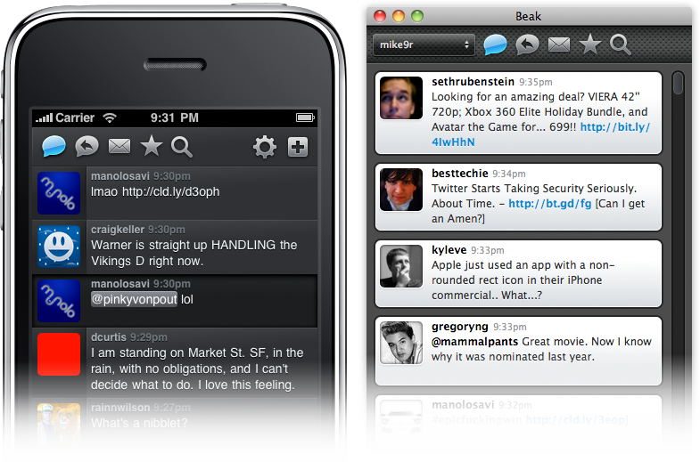
Beak was an experiment, a way for me to do something new and be proud of it. It was my first application for the Mac and my first time using Cocoa. I never took C in college, I had to learn the Cocoa APIs, Objective-C, and C all at the same time. It was, and still is, a great adventure, and the adventure is just getting started.
A Complete Rewrite
When I originally wrote Beak, I wanted to do things with the interface that I didn't yet know how to code. I took a shortcut and made most of the user interface a WebView, allowing me to design the UI in HTML & CSS with Javascript as the "glue" between the UI and the Objective-C application code. This allowed me to rapidly produce an application I was proud of without getting in over my head.
Only one problem, WebViews are a memory-hogging, slow-scrolling cop-out.
I didn't want to release Beak 1.0 and have it still use a WebView so I went back to the drawing board. I rewrote the entire interface using native drawing methods and I rewrote the entire backend, too, to be more scalable and flexible. Not one line of code is shared between Beak 1.0 and the current version 0.95. It's all new.
Oh, and there's an iPhone version, too.
Beak for iPhone
I never planned on building an iPhone version of Beak. One day, while struggling to build a scalable, elegant timeline view for the new Mac version (more on this down below) I got so frustrated I started a new iPhone project in Xcode and threw my models and backend code in there. Then, I spent about 2 hours throwing together a nice, custom UITableView and poof, Beak for iPhone was born. So why make Beak for iPhone? Because it's easy! The Cocoa Touch APIs are so thoughtful, new and elegant that it makes building applications a joy. Using AppKit to build complicated interfaces is tedious and complex but the newer components in UIKit for iPhone are fantastic. It's like going from eating cauliflower (AppKit) to cheesecake (UIKit): I'll choke down the cauliflower because it's good for me but the cheesecake I'll eat and love it.
Building a Timeline View in AppKit
80% of the total amount of time I've spent building Beak 1.0 for Mac has been spent on the timeline view. Why? It's not because I couldn't make up my mind in Photoshop, it's because it's hard to code! There are no perfect-for-this-problem, pre-built, drop-in components that let you build beautiful, one-column listings of boxes that support multiple heights.
For the iPhone there's UITableView, a staple of iPhone development. Every row is a UIView object that can be customized to your heart's content. For Mac, you have NSTableView, an antiquated slug of a component that uses NSCell objects instead of NSViews for various historical and performance-related reasons. NSCells are difficult to customize and cannot contain NSView objects (without jumping through hoops and introducing unnecessary complexity) which are the lifeblood of an interactive, engaging interface. Clickable hyperlinks inside of a span of text inside an NSCell? Good luck! Hover effects and Core Animation slickness? Yeah right! NSCell is like a mirage: it looks nice from afar but once you get up close and personal with it you wish you never saw it to begin with.
I think every native Twitter application for the Mac currently does something different for their timeline. Loren Brichter essentially wrote a UITableView port in order to make Tweetie's timeline and Steven Degutis has recently been working on an NSCollectionView-based timeline for his Twitter app. The new Echofon beta timeline is something different entirely with a completely custom text and layout manager that allows for hover effects on links as if it were a WebView. As for Beak I won't be getting into specifics in this entry but I'll just say that it's a totally custom NSScrollView with some fancy caching in the background. And, yes, it took me a long-ass time to come to this version after many, MANY other implementations.
Motivations & Business Ruminations
After lots of thought and back and forth, I've come to the following conclusions regarding the price of Beak for Mac & iPhone:
They will be free. Gratis. $0.00. (Not open source, however.)
They will have some beautifully-integrated and unobtrusive ads.
You can make a small donation to remove the ads.
The price coincides with a change in thinking about my motivations for building Beak and I wanted to get some of these thoughts down, digitally, before they escape my head.
First and foremost, I'm building Beak for me. I'm a designer and developer who has worked on the web for a very long time and I'm desperate to build something more tangible and real. Beak fills this need. Beak also lets me be creative and have fun without worrying if it will pay the bills since I have a fantastic full-time job that does that for me. I'm not building Beak to supplant my full-time income, I'm building it because it's interesting and lets me learn new things.
Second, Beak is not competing for your Twitter application-purchasing funds. I want you to go out, right now, and buy Tweetie, Twitterrific, Birdfeed, Reportage, Birdbrain and every other beautifully-designed Twitter-related application for Mac & iPhone. Go support quality developers, it's extremely important. When Beak 1.0 ships the new website will have links to my favorite Twitter apps at the bottom. Why? Because they deserve to be purchased and supported.
Third, Beak is a side project and will not have every feature you love. I have some strong opinions about which Twitter API features should be included in Beak and not all of them will be there, because, again, I'm building Beak for me. Lists & Retweets are in Beak 1.0 but they've got a twist. Things I don't like about Twitter or that I think are pointless probably won't be included, but that's just because I'm going to work on what I want to work on, and lame features just aren't fun to implement. I'd rather sweat the details on the things I choose to include instead of half-assed features that have been suggested that I hate.
When?
When it's done! The screenshots at the beginning of the entry are taken from real, working versions of Beak 1.0 for Mac & iPhone, so if that gives you some insight into the timeline then so be it :)
Sign Up To Learn More
People signed up for the email announcement list will be the first to hear breaking news so please head there and sign up if you haven't already done so. Also, there is no alpha/beta testing going on at this time but if I need some guinea pigs in the near future you'll be the first to know if you follow me on Twitter.
One of the largest remaining questions about the Apple slate device (aka, the iTablet, Mac touch, or my favorite, the iPod maxi) is its operating system. Why? Because the iPhone's main selling point is the App Store and last I checked, apps listed in the App Store only run on the iPhone OS. So does this guarantee the Apple tablet will run jumbo-sized iPhone applications on a larger screen? I'm not so sure. Here are some potential scenarios:
It Runs iPhone OS With Scaled-Up Apps
If Apple were rushing to get this product to market then this could be a possibility: iPhone apps scaled-up to fit the larger screen resolution of a tablet. Everything would look the same except everything is bigger — perhaps exactly 2x as large with a 640x960 resolution screen.
Advantages: If all UI elements are automatically scaled then nearly every currently available iPhone app would immediately be available on the new tablet.
Disadvantages: This seems like a half-assed solution. A tablet's screen resolution is much larger than the iPhone and merely scaling existing apps is a cop-out. It doesn't use the advantages of a tablet-sized device so why pay extra for a tablet-sized device? Also, the normal way to interact with an iPhone is to hold it in one hand in portrait orientation. The normal way to interact with a tablet-sized device is to hold it in two hands in landscape orientation. Most iPhone applications are made to be used in portrait orientation so if they're scaled to tablet-sized proportions and not rotated then you'll have to hold the Apple tablet like a Kindle and not like a normal tablet to use any of the apps. This isn't optimal for a variety of reasons.
It Runs Customized iPhone OS With Multiple Running Apps
If the resolution of the tablet's screen is 960x480 then you could potentially run multiple iPhone apps at once, side by side, on the screen all at the same exact pixel dimensions for which they were designed.
Advantages: Developers wouldn't have to rewrite their applications and users could finally run multiple applications at once.
Disadvantages: This still doesn't let individual apps take advantage of the larger screen resolution — they'd still be locked into 320x480. Also, this would only really work if the apps were all using portrait orientation so they could be tiled side by side when holding the tablet horizontally. If an application was built to be used in landscape mode then it'd throw off the other applications on the screen and would look cluttered and messy.
It Runs Customized iPhone OS For Usage On Larger Screen, No Third Party Apps To Start
This seems like the most Apple-like solution to me. When the iPhone first launched there was no iPhone SDK, there were only Apple-created apps. Developers were clamoring for an SDK and by the time it was introduced there was a feeding frenzy — it was a gold rush.
The apps included on this tablet device would be a small assortment of Apple-created apps like Mail, Safari, iTunes, etc. These would all have redesigned user interfaces that would use the entire resolution of the new screen. Imagine iTunes LP format on a beautiful, new, widescreen display or Mail with multiple-panels just like its Mail.app big brother on the Mac.
Advantages: Totally redesigned applications made for a larger screen open up a world of possibilities for user interaction and functionality. There's no doubt that the ones Apple redesigns (or, more accurately, re-develops) will be beautiful and will be a wonderful showcase and selling-point for the tablet.
Disadvantages: If Apple's trying to keep the tablet a secret then there will be no publicly-available SDK at launch and therefore no third-party, tablet-centric redesigns of App Store gems when the tablet first goes on sale. This is a big disadvantage but it could be downplayed in a few ways: 1) large App Store developers (EA comes to mind) would gain early access to the SDK and could rewrite some key iPhone apps to be included in the "Tablet-Only" section of the App Store at launch or 2) Steve Jobs announces the tablet and sets a launch date a few months in the future, just enough time for serious iPhone developers to get an early, tablet-centric version of their app completed for launch.
It Runs Mac OS X
An unlikely scenario is that the tablet simply runs Mac OS X at a smaller resolution than normal.
Advantages: Running full-blown Mac apps would be great in some ways, especially for the creative crowd. Developing for it wouldn't require any new SDKs and Snow Leopard already has multi-touch support built-in.
Disadvantages: No App Store, no access to the current 85,000 apps is a gigantic negative. Other problems include the fact that a finger is a lot larger than a cursor and Mac OS X interface elements are designed for cursors so expect a lot of misplaced touches.
It Runs Some OS X & iPhone OS Hybrid
This would be the best of both worlds but it'd be very tricky to get exactly right. Do you launch iPhone apps from the Finder? Do you launch OS X apps from Springboard? Do iPhone apps run in little simulator rectangles? Do you use AppKit or UIKit to code interfaces?
Advantages: The key advantage is that you'd still be able to access the full App Store catalog but also run full-blown Mac apps if needed.
Disadvantages: Jack of all trades, master of none. If the tablet isn't 100% focused on a singular type of application user experience then there will be problems. Tiny buttons on Mac OS X apps would be frustrating to hit but then when running iPhone apps UI elements are correctly-sized — the dichotomy would be very annoying. The overlapping APIs would also be really tricky for developers to figure out.
Other Tricky User Experience Issues
The form-factor of a tablet is fascinating because it surfaces so many user interaction dilemmas that haven't been totally solved yet.
For example, the simple act of entering text via an on-screen keyboard. When holding the device in portrait orientation then the on-screen keyboard could be essentially the same as the iPhone's in concept, but what about when you're holding the tablet horizontally with two hands? How does the keyboard work in that scenario? If you stretch the keyboard across the device's screen when in landscape orientation then your thumbs won't be able to hit the middle keys without stretching and reaching. This orientation works on the iPhone because the screen is only 480 pixels wide but what happens when the horizontal dimension of the screen is 800px or 1200px? This same layout just doesn't work.
One idea is to split the keyboard and have the left side anchored to the left side of the device and the right side anchored on the opposite end with a large, open gap in the middle. It might look funky but now your thumbs can easily reach the middle keys since they're physically closer to where your hands are located.
Another issue is how you watch movies. The natural angle of the screen is to be flat whereas a traditional laptop's screen is angled up which increases visibility. How do you watch movies on a 7-10" tablet screen that has no keyboard? I know how much of a pain it is to watch movies on an iPhone since I usually do that when I fly — most times I end up holding it front of my face with one hand for an hour or so. I imagine that the tablet will come with some sort of stand — either built into the back like a picture frame or external like a small wedge — because otherwise users will have a hell of a time getting it at the correct viewing angle for prolonged interaction.
Fascinating Time To Be An Apple Fan
The build-up to the launch of the original iPhone was unprecedented. Years of rumors, tidbits, second- and third-hand accounts all culminated with the famous Steve Jobs unveiling of three magic devices that were actually one iPhone. I remember where I was when I first saw the magic text stream across MacRumors' live feed and how I felt, it really was magical. I think I'll have the same feeling when the Apple tablet is unveiled because it's Apple and I can't see them launching something that's not incredible. It won't just be a device to surf the web in the bathroom, it will be a new way to consume media that will revolutionize many industries.
Update: Changed the blog entry title to reduce confusion.
The iPhone is one big constraint — no keyboard, small screen, few buttons — so designing applications for the iPhone is an exercise in building smart, simple software. Bloated apps on the iPhone? You won't find many. Most applications pick one feature or group of related features and centralize the product around that central theme.
When Apple began crafting UIKit, the set of APIs used to build the user interface for an iPhone app, they had to see into the future and predict what the most common application design models would be and make sure those could be accomplished easily. It may seem obvious to us now because we're so used to iPhone application design but the high-level navigation and interaction concepts available to iPhone application developers are really quite brilliant:
Dive deep into hierarchical levels of application information and then surface back to the top easily
Switch between different main pieces of functionality without losing your place on one when moving to another
Edit and adjust information without losing your place contextually
Display a list of information or choices
These three main interaction concepts correspond to three different types of View Controllers: Navigation Controllers, Tab Bar Controllers, Modal View Controllers and Table View Controllers respectfully. These are the building blocks for crafting iPhone applications.
Displaying Main Application Features
Displaying a list of available features of your iPhone application so the user can navigate through your app is a common practice. But given the variety of ways to display structured information in an iPhone app, which is the best way? What's the best way to present entry points to an app's main features? There is no best way but there are a variety of established patterns you can learn from.
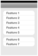
Things, iStat & Birdfeed
Things, iStat and Birdfeed are three iPhone applications that have a variety (or variable number) of main views, too many to fit inside a Tab Bar Controller on the bottom of the screen. How do they deal with this? They use a Table View Controller as the application's main screen and list the main features there in a scrollable panel. Each table row would normally display a Navigation Controller once tapped.
Advantages: Main app features available in a simple, clean list design. Order & grouping connotes importance of features.
Disadvantages: No way to directly move from Feature 1 to Feature 2 if within Feature 1's Navigation Controller hierarchy, takes extra taps to get back to main screen.
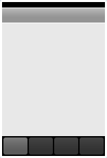
Squirrel, Tags & Tweetie
Squirrel, Tags and Tweetie utilize a Tab Bar Controller as the main navigational pivot for the application. (Note: Squirrel & Tweetie have an initial view before their main Tab Bar Controller view. Squirrel has a vault passcode lock and Tweetie has a Table View of your saved accounts.) Typically when using a Tab Bar Controller each tab item would display a Navigation Controller and have a full feature hierarchy beneath it. When pushing & popping views within a specific tab, you can choose to hide the main Tab Bar to give your new view more room on the screen.
Advantages: One-tap access to switch between main application features. Switching back keeps your place within the Navigation Controller hierarchy (if used).
Disadvantages: Only works well when there are less than 5 main application views. If an app has more than that then the Tab Bar would typically show a More tab item as the 5th, and secondary application features would be tucked away below that tab.
ESPN ScoreCenter, Phases & Weather
ESPN ScoreCenter, Phases and the default Weather app are examples of a flattened navigational hierarchy where there's a single type of main view and a variable number of them showing. Applications using this design pattern are normally information-rich and designed to be utilities rather than applications you spend a lot of time in.
Advantages: Natural gesture interface for navigating between views, quickly display structured information.
Disadvantages: Getting from Card 1 to Card 4 takes a variety of swipes. No direct access between views more than 1 card away. Useful only for flattened (or nearly flattened) navigational hierarchy.
Follow The Leader Or Blaze Your Own Trail?
The application design patterns and examples shown above work with nearly-default navigational models that Apple has provided. They may customize the interface elements but the general interaction concepts are stock UIKit. There's nothing wrong with following standard Apple conventions for navigating around your app but what if you need to go beyond? What if you have a totally custom paradigm? The following are examples of applications that have defined their own interface paradigms.
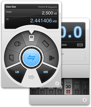
Weightbot & Convertbot
Arguably two of the most tactile and beautiful applications available for the iPhone, both the applications from Tapbots have completely custom interfaces that center around a specific interaction point they designed from scratch. For Weightbot they use a horizontally-scrolling picker wheel and in Convertbot they have a mechanical, spinning dial for selecting units. There's a great behind the scenes entry at their blog about the making of the Convertbot dial.
Collage & Fortune
Tapulous has been making fantastic applications for the iPhone for awhile, and both Collage and Fortune are less well-known than their big brother Tap Tap Revenge. Fortune is a simple application that lets you crack open a fortune cookie and read the message but instead of going the simple route they designed a totally custom interface for what is essentially a fairly simple application. Simple concept + brilliant interface = winner.
Collage is a social picture-sharing app that redefines what a Tab Bar Controller paradigm can end up as. Their totally custom film strip interface and sliding, animating panels is some of the finest UI work you'll find in the App Store.
Beats
Beats by Bjango is a beat and key-matching app for DJs and musicians. There are a variety of custom elements but the main screen design emulates a Tab Bar Controller in the middle of the screen with the main content areas extending above and below this tab bar.
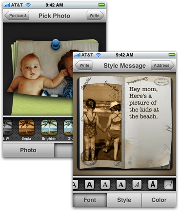
Postage
Postage by RogueSheep is an Apple Design Award Winner and has an iLife-feel to the entire application. Postage uses standard Apple UI conventions with a totally custom implementation that perfectly matches the app's postcard-creation workflow. An important part of Postage's interface is the custom horizontal slider letting a user choose a specific style or font from a group of choices.
Choose What Works Best
There's nothing wrong with using unmodified Apple UIKit elements and paradigms, in fact most of the applications in the App Store and those coming from Apple get along fine with the built-in interface paradigms and objects. Apple's built a solid framework to use when creating applications, but some app developers aren't fully satisfied so they take designs and interaction paradigms into their own hands. This was a showcase of some beautiful interface design decisions but be careful as it's easy to go overboard and screw things up.
A good rule of thumb is this: if you can't design something better than Apple, don't do it.
One of my favorite pieces of UI design on the iPhone is the toggle switch that lets you turn something on or off. The design and the smooth flow between the two states is perfect. I thought it'd be fun to emulate this element in Photoshop as a quick tutorial.
Step 1: Design The Button
For maximum flexibility, I'm going to be using vector shapes and Layer Styles. To draw the button, grab the Rounded Rectangle Tool and use a 3px radius. Draw the shape similar to what I've got below.
Hint: When you resize vector shapes, it scales each part of the shape to the new size which means your rectangle's corners will get stretched out. To keep the correct border radius, use the Direct Selection Tool to select the 4 points on the side of the shape you want to move. This will keep the corner radius intact.
The coloring for these effects comes straight from the iPhone's slider via a screenshot. I typically use both Gradient Overlay and Inner Shadow together to render my lighting effects. The gradient is for the overall light hitting the button, and the inner shadow (in this case, a thin white line at the top) is the highlight right at the top of the bevel.
Step 2: Design The Track
Here, we'll be designing the blue "On" state of the toggle switch. The "Off" state has the same shape but is a light grey instead of a vibrant blue.
The track has the same height and border radius as the slider button, so the easiest way to create your track object is to duplicate the slider button you just made. Select your Move Tool and have your slider button object highlighted. Hold down the Option + Shift keys and drag your cloned object to the left of your original slider button. Now, resize your slider track so that it's about 1.5x the width of your slider button and make their right sides line up.
Now it's starting to look pretty close!
There should be a shadow on the left side of the slider button, indicating that the slider track is recessed and that the button is closer to the light source than the track. Let's add that in the next step.
Step 3: Finish The Switch
To show the drop shadow to the left of the slider button, we'll go back to our button layer and add a Drop Shadow that's facing directly to the left — Blend Mode: Normal #000000, Opacity: 38%, Angle: 0%, Distance: 3px, Spread: 23%, Size: 2px.
The relatively high shadow spread is so that it will fill out a few pixels to the left of the object, eliminating the "leak" we'd get if we simply boosted the size of the shadow. If we increased the size beyond 2px, it would show the drop shadow above and below the slider button which isn't what we're looking for.
To finish it off we've added the "On" text and gave it a thin drop shadow to indicate that it's inset on the slider's track.
And that's it! Now you've got an iPhone toggle switch that you can use on your own projects.
I've been blogging since 2003, but this is my first "brand new" blog I've started in a few years. So why did I do it?
To learn, to teach, and to explore the realm of software interface design.
I've been working on my first Mac OS X application, and off the bat I learned that there weren't a lot of resources to show you the best practices of designing a Mac-like interface. Obviously there are the Apple Human Interface Guidelines, but when comparing the layout and positioning of similar UI elements in Apple-made applications like the Finder, Address Book, and iPhoto, I found that they were all slightly different. Sometimes, more than slightly different. Apple doesn't follow their own standards, so how was I to know what the best place for a particular button is?
When designing a Mac OS X application, I've found the goal isn't to follow the Apple HIG to the exact letter, but to make your app look "Mac-like". Here's a quote from John Gruber:
"Anyone involved in Mac software development is familiar with arguments over whether a particular app is "Mac-like". In the early days of the Mac -- the first decade or so -- the entire Mac community was largely in agreement about just what this meant. To be un-Mac-like was to be ignorant of the fundamental concepts and norms of the Mac OS. It was something you could spot in an instant -- software designed by engineers who just did not get it."
"In the last decade, however, accusations of "un-Mac-likeness" have largely degenerated into meaningless hand-waving. You still occasionally see UI mistakes that are genuinely un-Mac-like -- like, say, outright Windows-isms such as ordering dialog box buttons OK/Cancel rather than Cancel/OK -- but in most cases, when someone complains "that's not Mac-like", what they really mean is "I don't like that."
This blog will attempt to discuss what makes interfaces and icons "Mac-like" and how you achieve that look through articles and tutorials.
 The application design patterns and examples shown above work with nearly-default navigational models that Apple has provided. They may customize the interface elements but the general interaction concepts are stock UIKit. There's nothing wrong with following standard Apple conventions for navigating around your app but what if you need to go beyond? What if you have a totally custom paradigm? The following are examples of applications that have defined their own interface paradigms.
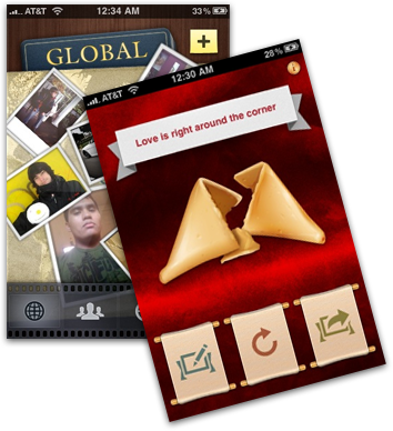 Collage is a social picture-sharing app that redefines what a Tab Bar Controller paradigm can end up as. Their totally custom film strip interface and sliding, animating panels is some of the finest UI work you'll find in the App Store.
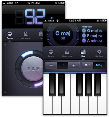
