Twitter For iPhone Takes A Step Back
Today, Twitter unveiled redesigns for their website, iPhone and Android apps. As a long-time Twitter user and Twitter app aficionado, I've come to expect a certain level of thought & polish in everything Twitter does, so I'm sad to say I'm not a huge fan of their new direction.
Low Information Density
Mobile phone screens are small so each pixel is incredibly valuable. Horizontal screen real estate is even more valuable because you have fewer pixels on the horizontal axis than you do the vertical if you're holding your phone in portrait orientation.
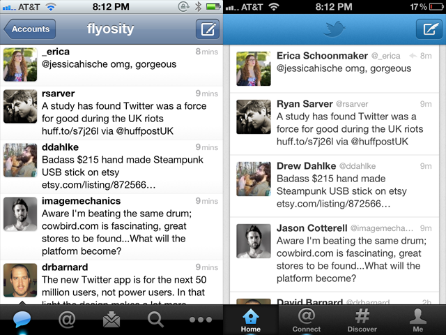
Apple provides UITableViews two main display modes: plain and grouped. Plain rows extend to both edges of the screen and are primarily used when a lot of information needs to be displayed like in Mail, the App Store, Facebook, Music and all previous versions of Twitter for iPhone. For reasons I cannot explain, the latest version of Twitter's iPhone app uses the grouped style that doesn't extend to either side of the screen. This automatically introduces 10px of padding on each side which cuts the horizontal resolution down to 300px, leaving 20px less room for each tweet. Since the primary focus of Twitter is to, wait for it, read tweets, this is not a good thing. In fact, this coupled with the removal of the text size setting causes the new version to show fewer tweets per screen compared to the old version.
Twitter yesterday is on the left, Twitter today is on the right. I scrolled to the same spot in both apps to make the row height comparison more obvious.
And I can't exactly put my finger on it, but the new grouped tableview style makes the interface feel more claustrophobic, more boxed in and constricting. Because of this change it no longer feels like you're in Twitter, it feels like you're just watching Twitter, or viewing Twitter's website inside the app. Margins on either side of an interface are for the web. This is an app, and apps need to expertly use the few measly pixels they have.
Forced "Discovery"
A main focus of this redesign is the new Discover tab which 1) shows random things to you, and 2) cannot be hidden. Seriously, I can't make heads or tails of what it's supposed to be showing me. I think it's a personalized-social-graph-recommendations-search thing all jumbled together. Unfortunately, using search and/or giving a shit about hashtags is at the bottom of things I use Twitter for, mainly because the trending topics are dominated by stupid rap music memes or Justin Bieber fans. Here are some of the most popular trending topics this past year: #aintnothingsexyabout, #4wordsaftersex, #BestSexSongs, #secretturnon, #youknowitslovewhen, #muchlove, #IsmileWhen, #yougottaloveitwhen, #youdeserveashoutout, #ItsMyAddiction, #WhatNotToSayAfterSex, #sevenwordsaftersex, #thingsblackgirlsdo, #thingsblackpeopledo, #doesntmeanyourblack and #NotAllBlackPeople so please excuse me if I don't trust Twitter to bubble up and show me interesting, recommended, personalized content.
Removal Of Gesture Shortcuts
My primary usage of Twitter includes the following:
- Clicking on a link within a tweet.
- Replying to tweets.
When I wake up in the morning and check Twitter, these are the actions I take. I see tweets with links and I check out the link. I see mentions and I reply back. The way that I accomplish these tasks is through the use of gesture-based shortcuts that I've come to know and love, and, unfortunately, the shortcuts I use to quickly accomplish these two tasks are now missing and I have to tap more times to do it.
Previously, to view a link inside a tweet, I'd tap once on a tweet, then tap on the link to view the webpage, then swipe back in the navigation bar when I was done. In the new version of Twitter, it takes the same number of taps to get to the webpage, but it now takes 2 taps to get back to the spot in the timeline where I was previously at instead of a single swipe.
To reply to a tweet from the timeline view, you used to be able to swipe on the row to expose the action icons allowing me to swipe-then-tap to initiate a reply. In the new Twitter, this gesture has been removed so I need to tap on a tweet, wait until the next screen loads up, then tap on the reply icon on that screen to start the reply. Then, after I post the reply, the new version of Twitter brings me back to the single tweet view forcing me to tap one more time to get back to the timeline. On the old version of Twitter, as soon as the modal tweet window is dismissed, you're already back in your timeline. More taps, more waiting.
Removal Of Features
Removing features from an app once they're in place and being used is a tricky decision. On one hand, it can make your overall product simpler and cleaner but on the other hand it pisses off people who were using those features. The latest version of Twitter for iPhone ditched a lot of existing features and it's already causing some consternation. Here are a few features that are no longer available:
- Favstar integration
- Translation of tweets
- Link reposting
- Copying a link by long-holding it
- Turning a Twitter user into a contact
- Shortcut to reading a link later
- Changing text size
- Showing only username or only full name in timeline
- Landscape mode
- Can no longer quickly tell if someone follows you
This is a fairly long list of things to remove, and I'm sure I still missed a few. I'm already really annoyed at seeing full names in my timeline and having a larger text size means fewer tweets shown on the screen at once.
Things I Like
The new Twitter for iPhone isn't all bad, there are some significant additions that I'm a fan of. I like the Interactions area which shows favorite, follow and retweet activity. I like the favorite and retweet counts on the individual tweet screen. And, although the padding on the outside of tweets is a bad thing, I do like the slightly-tweaked padding on the inside of tweets and the removal of the gradient.
I think the new app will be more inviting and accessible to new users, but I don't like that this comes at the expense of the user experience and existing gesture shortcuts. There's a way to make both novice and advanced users happy, and I hope Twitter 4.1 does a better job at appealing to all sides of their userbase than 4.0 has done.