Designing The iPhone's Toggle Switch Interface Element
One of my favorite pieces of UI design on the iPhone is the toggle switch that lets you turn something on or off. The design and the smooth flow between the two states is perfect. I thought it'd be fun to emulate this element in Photoshop as a quick tutorial.
Step 1: Design The Button
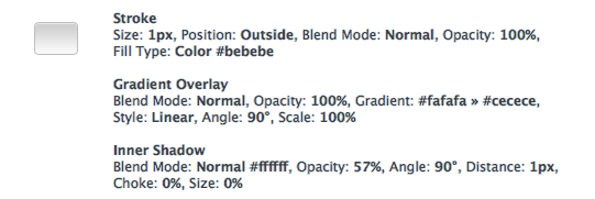
For maximum flexibility, I'm going to be using vector shapes and Layer Styles. To draw the button, grab the Rounded Rectangle Tool and use a 3px radius. Draw the shape similar to what I've got below.
Hint: When you resize vector shapes, it scales each part of the shape to the new size which means your rectangle's corners will get stretched out. To keep the correct border radius, use the Direct Selection Tool to select the 4 points on the side of the shape you want to move. This will keep the corner radius intact.

The coloring for these effects comes straight from the iPhone's slider via a screenshot. I typically use both Gradient Overlay and Inner Shadow together to render my lighting effects. The gradient is for the overall light hitting the button, and the inner shadow (in this case, a thin white line at the top) is the highlight right at the top of the bevel.
Step 2: Design The Track
Here, we'll be designing the blue "On" state of the toggle switch. The "Off" state has the same shape but is a light grey instead of a vibrant blue.
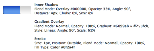
The track has the same height and border radius as the slider button, so the easiest way to create your track object is to duplicate the slider button you just made. Select your Move Tool and have your slider button object highlighted. Hold down the Option + Shift keys and drag your cloned object to the left of your original slider button. Now, resize your slider track so that it's about 1.5x the width of your slider button and make their right sides line up.

Now it's starting to look pretty close!
There should be a shadow on the left side of the slider button, indicating that the slider track is recessed and that the button is closer to the light source than the track. Let's add that in the next step.
Step 3: Finish The Switch
To show the drop shadow to the left of the slider button, we'll go back to our button layer and add a Drop Shadow that's facing directly to the left — Blend Mode: Normal #000000, Opacity: 38%, Angle: 0%, Distance: 3px, Spread: 23%, Size: 2px.
The relatively high shadow spread is so that it will fill out a few pixels to the left of the object, eliminating the "leak" we'd get if we simply boosted the size of the shadow. If we increased the size beyond 2px, it would show the drop shadow above and below the slider button which isn't what we're looking for.
To finish it off we've added the "On" text and gave it a thin drop shadow to indicate that it's inset on the slider's track.

And that's it! Now you've got an iPhone toggle switch that you can use on your own projects.
