Your Design Is Wrong (And Here's Why)
A design can be wrong. The entire thing can be wrong, parts can be wrong, or even a tiny, 10x10 pixel area can be wrong. Not, "I think it's good but it needs improvement" but flat-out wrong. 1 + 1 = 3 wrong. A spelling mistake in a book wrong. A syntax error in a code file wrong. It's not an opinion, it's not a matter of subjectivity, it's a fact: a design can be wrong.
Dribbble Mayhem
Dribbble is a site where designers can upload small screenshots of their upcoming work and receive critiques from other designers. Recently Jason Lynes posted a screenshot challenging the status quo at Dribbble and asking others to hold all feedback unless the designer explicitly asks for it. A mini-firestorm kicked up in the comments, but the most interesting comment was from Jason himself regarding the concept of design criticism:
Screenshots are 400x300, too small to convey purpose, context, and intent in the design. How is that enough information for you to tell me my font's not working, or my color's wrong? For design criticism to be effective, you absolutely must have context. Dribbble has none.
Is he right? Do you really need to see the whole picture before commenting on design execution? No. Definitely, absolutely, positively no. A design can be wrong without any context. Here's why.
What Can Go Wrong
Designs can succeed or fail on a number of levels, some of which are subjective, some of which aren't. Things like the overall concept, mood and its visual appeal are subjective: one person might think a design succeeded in its overall goals whereas another might think it failed. To decide this you probably need to have knowledge of the big picture, the overall design goals, the context. In most cases this cannot be decided by a quick glance at a 400x300 screenshot. If it's a miserable, hopeless failure then you can, but if it's on the border then context is what's needed to make a final call.
So without any context what can you really critique? Design execution. The execution of a design is the nitty-gritty details of the design. The pixel-level details. The alignment of individual elements. The kerning of a logo or headline. The sharpness of an edge. These can be wrong. These can be so incredibly wrong that they stand out no matter how good the overall concept, mood and visual appeal may be. Screwing up the execution of a design ruins the design. Game over, it's wrong, and no context is needed to understand its wrongness. A 400x300 pixel screenshot on Dribbble can be wrong without knowing anything about the project. An iPhone app icon can go from right to wrong in just a few pixels. One misplaced pixel. One misaligned button. One blurry edge. This is what makes a design wrong, this is what makes an execution of a design go from good to garbage.
Examples Of Wrong Design
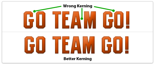
Wrong kerning on a logo or headlineYes, you can screw this up if it's obvious enough so make sure to manually adjust kerning between letters if needed.
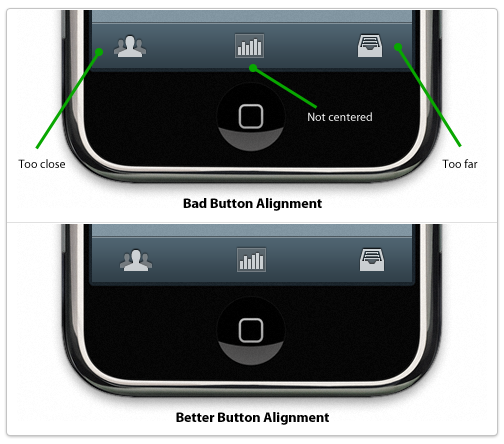
Misaligned elements, uneven paddingElements in a design should be aligned to something: other elements, a grid, a golden ratio frame, the edge of the page, something. If it looks like you tried to align it to something else and it's not perfectly aligned then you failed, it's wrong. Either something is perfectly aligned to something else or it's not aligned to the other element at all. If it's 98% aligned it's wrong. The same goes for padding around elements and whitespace. If you are designing tabs for a website and the text is not aligned properly within each tab it's wrong. 1px off is wrong. It's sloppy, it's junior, it's not professional. What if a plumber only half-tightened a pipe and it was only leaking a little bit? Would you think that was acceptable or would you ask him to actually stop the leak? The same applies here. Either things are aligned properly and have uniform padding or they don't. Either a pipe is leaking or it's not. Simple as that.
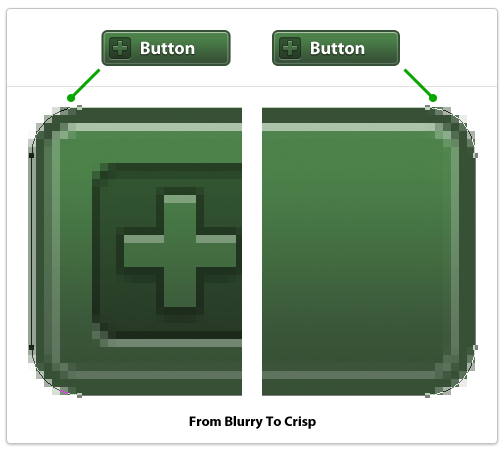
Blurry edgesThese look terrible and can ruin a design instantly. What's a blurry edge? It's an edge of a vector object that doesn't lie fully on a single pixel but straddles two pixels. The most egregious examples are long, straight lines that the designer was too lazy to make sure were the width of a whole pixel so they end up using 2 pixels when they should only use 1. To fix these in Photoshop (if using vector shapes) switch to the white arrow tool and select points of your shape individually, then zoom in close and use the arrow keys to move points over a tiny amount until they're perfect.
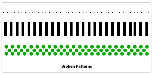
Broken patternsA pattern is a technique that a designer sets up and reuses in a repeating fashion. Dotted lines would be one example, an overlapping plaid pattern could be another. Anything that repeats in a set manner needs to adhere to its own defined pattern or else it's a mistake. A dotted border that is missing a pixel or has too much spacing between two dots. Ten boxes in a row and the space between the 3rd and 4th is a few pixels off. A stripe pattern using lines 10 pixels wide uses a 9 pixel line by accident. These are mistakes, it's not a subjective matter. If you're not careful when copying and pasting layers in Photoshop it can happen.
Techniques To Avoid Design Errors
If you're not sweating every pixel then you're already off to a bad start. What does that mean? It means using alignment and measurement tools to make sure everything is perfect. It means double-checking to make sure an element that's supposed to be centered actually is. The details are the design. They're not an afterthought or something you fix later, it's something embedded in everything you do. Every icon, every line of text, every box, every pixel should be cared after as if it's 10 feet tall staring you in the face.
Design errors separate stock-photo-slappers, clip-art-arrangers, and programmers-turned-wannabe-designers from real, world-class, totally-fucking-amazing professional visual designers. If you're not a world-class designer but aspire to be one, don't ever commit a design error. Your visual tone could be off, the colors could be muddy, the concept could need tweaking but you should never, ever make a mistake that I've listed. There's no excuse, and the best part? Fixing a design error requires no design talent. You don't have to write like Ernest Hemingway to be able to spell words correctly and you don't have to be a great designer to simply double-check every pixel and make sure it's in the precise place you planned it to be.
Back To Dribbble
Designers who care about their work want to know when something is wrong. Not subjectively wrong (although that's good to discuss as well) but objectively wrong like a design error. A flat-out mistake. If someone spots a design mistake in my work I want to know because I want to fix it; I want my work to be perfect and represent my best efforts. It's not an ego thing, it's not a hurt feelings thing, it's a professional thing. If a plumber leaves a pipe leaking then it's a mistake. If a writer misspells a word in a novel then it's a mistake. If a designer makes a design error then it's a mistake. Plumbers who don't care about leaky pipes aren't professionals. Neither are writers who leave misspellings in books nor designers who make egregious design errors in final designs. Either you're a professional or you're not, it's as simple as that.