Back when I was doing design work for clients, it seemed like my work would get re-purposed by fledgling and not-so-fledgling designers every month. Sometimes I'd get a tip in my email about a theft that someone saw, or sometimes the offenders would link the assets right off my client's website, but regardless of how I found out about the theft, it'd piss me off more than anything else. I was the one who opened Photoshop, I cranked through iteration after iteration, I thought of execution details in the shower, I stayed up late at night, and then someone else just takes all that work and passes it off as their own. Sure, usually there were some slight modifications, but designers can always tell when someone else is using their design. It's sort of like a parent being able to identify their baby's cry while all the other babies are crying as well.
Lack Of Understanding
A few friends and I were the co-founders of 9rules, one of the largest independent blog networks of its day. I designed the fairly well-known (if you had a blog back in the mid-2000s!) 9rules leaf logo, which, to this day, is still the only good thing I've ever made while using Illustrator. For some reason, this was my most copied design ever. Toyota copied it for a yearly conference they run. Hell, it's even used as the logo for a mall in South Africa.
The dumbest thing about using the 9rules leaf logo for something other than 9rules is that the logo had a specific meaning. We had 9 principles we followed with the startup so there were 9 leaves. The design was meant to resemble a '9' and an 'r' side by side. The colors meant something, too. The logo represented our startup, it wasn't some arbitrary swoosh or vector swirl, we spent a lot of time on it and it was unique to our business.
When companies steal a design made for something else, they skip the part where they toil over the design and develop a deep love and appreciation for it. In 2009, Jason Fried wrote a blog entry about why you shouldn't copy them or anyone else. Here's a snippet.
"Here’s the problem with copying: Copying skips understanding. Understanding is how you grow. You have to understand why something works or why something is how it is. When you copy it, you miss that. You just repurpose the last layer instead of understanding all the layers underneath."
Copying someone else's designs, the way Samsung did with Apple's interface and industrial designs, skips over the whole part about why they were like that in the first place. Why did a designer throw out 20 iterations and pick the 21st design to be the one to ship? What led them to the those specific conclusions and insights? What down-the-road thinking influenced the design? Samsung doesn't know why Apple went with a homescreen with a fixed row at the bottom, they just know that the iPhone is hot and they want all their phones to look like the iPhone in the eyes of consumers. That's why they stole Apple's interface designs: to short-circuit the innovation process and jump straight into the line ahead of everyone else.
I really don't care about patents or trademarks or trade dress or any of that. To me, a designer, it's just about honor. Deciding to use someone else's pixels as your own is not just lazy, but it's dishonest. It's a slap in the face. And that's why I'm glad Samsung owes Apple over a billion dollars, because so much design theft happens in the world, it's about time someone or some company got knocked down a few pegs because of it. This victory isn't just a victory for Apple, it's a victory for every designer who has been ripped off by people who didn't care or thought they could get away with it. Tonight it's clear that sometimes they can't.
Great product design involves thinking about what features to prioritize, planning the user flow from screen to screen, getting user feedback and lots more, but at the end of the day, someone is going to be in Photoshop pushing pixels. The final visual design of a digital interface isn't going to design itself, and when a designer is crafting the look and feel, here are some elements they're typically designing:
Buttons
Panels
Windows
Profile Pictures
Icons
If you really think about it, most interfaces (especially for iOS apps) use tons of rounded rectangles in different shapes and sizes. Long and skinny ones with lots of shine. Squarer, flatter ones with some texture. Smaller, slightly inset ones with photos inside. The list just keeps on going. I actually joke around with friends that my main job is making rounded rectangles look great, so I thought it was time to show off some common techniques.
Drawing Them
It's important to keep your elements in Photoshop in vector format as long as you can because they can be scaled and re-styled easily. To draw a rounded rectangle, I use (gasp!) the Rounded Rectangle Tool with Snap To Pixels turned on. This is incredibly important or the edges of your shape will lie on a half-pixel and look blurry. There are some other ways to draw rounded rectangles in Photoshop (which Marc Edwards has conveniently outlined) but I typically stay with the vector shape tool because it's easy.
If the edges of your shape aren't sharp, then strokes/gradients/highlights/shadows you add later won't be perfect.
Up or Down?
If your goal is to craft subtle and realistic user interfaces that look and feel like real world surfaces, you'll be making a choice: is this element popping off the screen (convex) or indented into the screen (concave)? Buttons are convex whereas large panels containing text and other elements are typically concave.
On the left is a convex button that is designed to look like it's bulging off the screen. It appears bulged out because it's made to appear just like a convex object would appear in real life if it had 90°, top-down lighting. That means that 1) the light catches the top of the object and adds a lighter stripe of highlight, 2) as the bottom bends back down towards the screen, the light is blocked and it gets darker (light-to-dark gradient), and 3) it casts a very subtle shadow, indicating that it's sitting on top of the surface. This specific combination of highlights, gradients and shadows is the most basic way to make a rounded rectangle appear bulged out and convex.
On the right is a larger panel that is designed to look inset into the screen. The fill color is a mostly-transparent black, it has some inner shadows, and then a thin white drop shadow at the bottom. If we analyze this using the same lighting conditions as the previous example, it's made to look sunken in because 1) the edges or lips of the shape are at the surface and cast an inner shadow inside (these edges block light like an awning off a building blocks the rain, causing a shadow) and 2) as the bottom edge of the shape comes back up to meet the surface, the light catches that lip and causes an edge highlight.
Most iPhone apps that display profile images have them look slightly sunken into the surface or popped out and semi-glossy. This is achieved with mainly the same techniques from above, but for the glossy one I added a diagonal gloss line (a white-to-transparent gradient cut into a triangle) as a separate layer.
Although there are distinct elements common in most convex-or-concave elements, there's no special formula for how to accomplish these effects in Photoshop. I typically tweak size and opacity sliders on Inner Glow, Inner Shadow, Stroke and Drop Shadow layer styles until things look good. Other people are Bevel & Emboss specialists. Here are some more examples of rounded rectangles styled in some different (but reusable!) ways.
These are just some of the myriad ways you can style and use rounded rectangles in your interfaces. If you really want to see some creative designs, check out some icon designs on Dribbble. All it takes is some imagination and experimentation, and you can use gorgeous rounded rectangle designs throughout your interface.
At lunch earlier today I snapped a picture of the top of a Heinz ketchup bottle.
It's not remarkable, but it caught my eye because the look of the embossed text in the cap is exactly the look that so many designers are trying to replicate these days, myself included. What look is that?
The emulation of physicality.
A current trend in the design of digital interfaces is to subtly hint that the objects on the screen have weight, volume and surface undulations like they would if they were manufactured and held up in front of you. This is why Apple puts defined, shiny gloss lines on buttons and toolbars: because they're emulating a plastic lens shape and how lenses interact with light. Lenses refract light in precise ways and the specific coloring, gradients and glows used in iOS toolbars and buttons were put there specifically to make them look more like a long, plastic convex-on-both-sides piece of glass instead of just pixels on a screen.
Imagine if the iPhone's interface were manufactured and put up on a wall. There'd be realistic textures like linen, leather, shiny plastic and matte aluminum. These textures wouldn't all sit at the same distance from the surface, they'd be staggered — some elements indented, some elements poking out — because the real world isn't flat. Everything is either convex or concave, shadowed or highlighted. Just look at how many angles and surfaces a simple light switch has. Convex, bubbled text that casts a shadow. Indented, shadowed crevices. Light-to-dark gradients on surfaces.
And peopleallover are putting realistic switches into digital interfaces. They're trying to emulate the highlights, shadows and gradients that a real switch has when lit from above. Indented buttons, convex panels, glossy shines, textured mattes, embossed text, and it goes on. These are the elements that interface designers use to make their products appear touchable, tactile and hefty.
Now this physical emulation of real objects can be taken too far, but just like with everything else, moderation is the key. Some of the top apps in the App Store use these exact techniques to great effect. The leather and embossed buttons in Camera+. The indented and matte tweet actions row in Tweetbot. The textured opening screen of Path. You may not immediately notice these little details, but they make digital interfaces appear more valuable, like little hand-crafted executive paperweights: expensive, heavy and solid.
The pixel-perfect emulation of physical surfaces and lighting in a digital interface is the secret weapon of interface designers. Little touches like panels that are slightly indented and shadowed, subtle cloth-like texturing, and white highlights on embossed label text may not be immediately perceptible, but they add a richness to the overall experience that most apps just don't have.
Today, Twitter unveiled redesigns for their website, iPhone and Android apps. As a long-time Twitter user and Twitter app aficionado, I've come to expect a certain level of thought & polish in everything Twitter does, so I'm sad to say I'm not a huge fan of their new direction.
Low Information Density
Mobile phone screens are small so each pixel is incredibly valuable. Horizontal screen real estate is even more valuable because you have fewer pixels on the horizontal axis than you do the vertical if you're holding your phone in portrait orientation.
Apple provides UITableViews two main display modes: plain and grouped. Plain rows extend to both edges of the screen and are primarily used when a lot of information needs to be displayed like in Mail, the App Store, Facebook, Music and all previous versions of Twitter for iPhone. For reasons I cannot explain, the latest version of Twitter's iPhone app uses the grouped style that doesn't extend to either side of the screen. This automatically introduces 10px of padding on each side which cuts the horizontal resolution down to 300px, leaving 20px less room for each tweet. Since the primary focus of Twitter is to, wait for it, read tweets, this is not a good thing. In fact, this coupled with the removal of the text size setting causes the new version to show fewer tweets per screen compared to the old version.
Twitter yesterday is on the left, Twitter today is on the right. I scrolled to the same spot in both apps to make the row height comparison more obvious.
And I can't exactly put my finger on it, but the new grouped tableview style makes the interface feel more claustrophobic, more boxed in and constricting. Because of this change it no longer feels like you're in Twitter, it feels like you're just watching Twitter, or viewing Twitter's website inside the app. Margins on either side of an interface are for the web. This is an app, and apps need to expertly use the few measly pixels they have.
Forced "Discovery"
A main focus of this redesign is the new Discover tab which 1) shows random things to you, and 2) cannot be hidden. Seriously, I can't make heads or tails of what it's supposed to be showing me. I think it's a personalized-social-graph-recommendations-search thing all jumbled together. Unfortunately, using search and/or giving a shit about hashtags is at the bottom of things I use Twitter for, mainly because the trending topics are dominated by stupid rap music memes or Justin Bieber fans. Here are some of the most popular trending topics this past year: #aintnothingsexyabout, #4wordsaftersex, #BestSexSongs, #secretturnon, #youknowitslovewhen, #muchlove, #IsmileWhen, #yougottaloveitwhen, #youdeserveashoutout, #ItsMyAddiction, #WhatNotToSayAfterSex, #sevenwordsaftersex, #thingsblackgirlsdo, #thingsblackpeopledo, #doesntmeanyourblack and #NotAllBlackPeople so please excuse me if I don't trust Twitter to bubble up and show me interesting, recommended, personalized content.
Removal Of Gesture Shortcuts
My primary usage of Twitter includes the following:
Clicking on a link within a tweet.
Replying to tweets.
When I wake up in the morning and check Twitter, these are the actions I take. I see tweets with links and I check out the link. I see mentions and I reply back. The way that I accomplish these tasks is through the use of gesture-based shortcuts that I've come to know and love, and, unfortunately, the shortcuts I use to quickly accomplish these two tasks are now missing and I have to tap more times to do it.
Previously, to view a link inside a tweet, I'd tap once on a tweet, then tap on the link to view the webpage, then swipe back in the navigation bar when I was done. In the new version of Twitter, it takes the same number of taps to get to the webpage, but it now takes 2 taps to get back to the spot in the timeline where I was previously at instead of a single swipe.
To reply to a tweet from the timeline view, you used to be able to swipe on the row to expose the action icons allowing me to swipe-then-tap to initiate a reply. In the new Twitter, this gesture has been removed so I need to tap on a tweet, wait until the next screen loads up, then tap on the reply icon on that screen to start the reply. Then, after I post the reply, the new version of Twitter brings me back to the single tweet view forcing me to tap one more time to get back to the timeline. On the old version of Twitter, as soon as the modal tweet window is dismissed, you're already back in your timeline. More taps, more waiting.
Removal Of Features
Removing features from an app once they're in place and being used is a tricky decision. On one hand, it can make your overall product simpler and cleaner but on the other hand it pisses off people who were using those features. The latest version of Twitter for iPhone ditched a lot of existing features and it's already causing some consternation. Here are a few features that are no longer available:
Favstar integration
Translation of tweets
Link reposting
Copying a link by long-holding it
Turning a Twitter user into a contact
Shortcut to reading a link later
Changing text size
Showing only username or only full name in timeline
Landscape mode
Can no longer quickly tell if someone follows you
This is a fairly long list of things to remove, and I'm sure I still missed a few. I'm already really annoyed at seeing full names in my timeline and having a larger text size means fewer tweets shown on the screen at once.
Things I Like
The new Twitter for iPhone isn't all bad, there are some significant additions that I'm a fan of. I like the Interactions area which shows favorite, follow and retweet activity. I like the favorite and retweet counts on the individual tweet screen. And, although the padding on the outside of tweets is a bad thing, I do like the slightly-tweaked padding on the inside of tweets and the removal of the gradient.
I think the new app will be more inviting and accessible to new users, but I don't like that this comes at the expense of the user experience and existing gesture shortcuts. There's a way to make both novice and advanced users happy, and I hope Twitter 4.1 does a better job at appealing to all sides of their userbase than 4.0 has done.
The previous design looked faddish and I stopped liking it almost instantly after it went live. Too blue, too bubbly, too a lot of things. For this design I wanted something that would stand up and look good awhile from now, not fall on its face and be dated in a month. But at the same time, I wanted to keep the elements of the previous design that I thought worked well, namely, the typography design for an individual article. The column width is the same, the fonts are the same, and the spacing is nearly the same, but the chrome around it is now cleaner and more subdued.
Up to about a week ago, a lot of things on the page animated into position; logos fading in, navigation sliding across, etc. After taking a hard look at it, I decided to remove the superfluous initial animations and take the experience down a notch into a more subdued feel. I love animation, and I really love CSS3 keyframe animation, but I don't want people to be distracted if they're here on my site to read an article, especially if they came here via a search engine. So, I took it all out.
One design concept I really liked about the previous site was that nearly every section of the site had its own feel with a slightly customized version of the main layout. I wanted to retain that same feeling with the redesign, so you'll notice that my portfolio, services page, about section and contact form all have a look that's unique compared to the other main sections. Personal sites can get rather tedious so I wanted to make sure visitors were greeted with a little bit more personality than they were expecting.
Services
I don't take on much client work, in fact, I haven't said "yes" to a project for a number of years until very recently. The reasons for this are numerous, but primarily it's a matter of time. I have a fun full-time job (that I don't plan on quitting) so outside of work if I'm using my computer I'm typically working on Design Then Code or various unfinished apps. However, outside projects can be fun if they're the right kind of project, so I'm taking a bit of a leap and plan to take on a few, small projects throughout the year. My new services page outlines the type of things I offer as well as my current hourly rate.
And Finally
As someone who doesn't blog as much as he should, I believe I'm contractually obligated to say that this redesign will make me want to write more. I hope that's the case, but please don't hold your breath!
And, oh yeah, there's a tweet button now at the bottom of all entries. I hear it's what the cool kids are doing.
On mobile devices, there is absolutely no room for error. No room for blurry pixels, no room for confusing icons, no room for user experience mistakes, no room for sluggishness. The entire device is one big constraint: a flat piece of glass that accepts touch input with a few millimeters of metal chrome around it. That's it. All you have is the glass and how things behave under the glass.
If things under the glass move as you move your finger, the illusion of direct manipulation of a digital interface is created. If you move your finger and, then, a split-second later something moves in response to your movement, that breaks the illusion. Apple has fully understood this from the beginning, and the iPhone has always responded to pinches and flicks with nearly 1:1 accuracy, especially in the browser, which is where iPhone users (myself included) seem to spend most of their time.
Android, on the other hand, has always felt laggy to me. I've used the Nexus One, all the carrier versions of the Galaxy S, the Nexus S, HTCs, Droids, the list goes on, and none of them have felt right-on-the-button perfect when I move my finger around on the screen. I move, the phone processes some things, and then the interface moves. This has been the Android way since Android's inception. The built-in browser is the most egregious example of sluggishness, especially when pinch-zooming or double-tapping. Check out this video of an iPhone 3GS vs. a Nexus S. Astoundingly, jaw-droppingly bad.
Now with this in mind I just saw that the Galaxy Nexus, the new supreme king of Android phones, has been unveiled. This Is My Next has a hands-on review and this is the single line that stood out to me:
The subtle, pervasive lag that has characterized the Android UI since its inception is still there, which is not a heartening thing to hear when you’re talking about a super-powered dual-core device like the Galaxy Nexus.
Pervasive lag? On a mobile device that's running the very latest Android version? Powered by one of the beefiest mobile processors in the world? Samsung's cream-of-the-crop phone running Ice Cream Sandwich is still, still laggy?
Totally fucking unacceptable.
Imagine if your mouse cursor couldn't keep up with your hand movements, or if letters didn't appear on the screen until a moment after you pressed your keyboard. That's how egregious of a user experience problem this is. If a user interface doesn't respond as quickly as possible to a user's intentions and movements, it's a pile of rubbish. Immediate touch response has been solved by Apple for years, why can't Google and Samsung and Motorola and HTC solve it as well?
Some teams spend a year or more crafting an iPhone app that uses every ounce of their good taste and development talents. These apps are big gambles and a big payoff is needed to justify all the expense and self-sacrifice.
Other teams crank out apps every few weeks, throwing the proverbial app at the wall to see what sticks. To be frank, most of these apps are ugly and useless and they bring the overall bar of the App Store lower and lower. Unfortunately, some huge successes in the App Store have fell into this category: apps that nearly every developer has taken a look at and said, "I could build this in a weekend!"
The most recent trend-cum-scam in the App Store is the faux security app where you build background images that look like an Android lock screen graphic. These apps just make images, they don't really do anything related to security. Tens of thousands of people have bought these apps under the guise of enhanced security but, inevitably, leave low-star reviews when the app doesn't actually do anything it says in the description.
After discussing these Android-lock-screen-maker apps with my friend Kyle, I told him I wanted to do a little experiment: I wanted to build an app in about 10 hours that was made "for the masses" to see how it might do. I don't know why, but the first thought that popped into my mind was an app that showed reaffirming, positive messages to the user after they press a big red button. Very exciting. So I started working on it and I gave myself a maximum timeframe of about 10 hours to design it and code it.
After the design was done and the app was mostly developed, at about 2am one morning, I woke up with an idea. Why just show nice phrases? Why not show mean ones, and do the whole yin/yang good/evil thing? It adds a new dimension to the app and it might expand the audience to a wider demographic. So after a little bit more time than I had originally planned for, I had a finished app. Two sides, each has a big red button. One side tells the user Something Nice, the other tells them Something Mean. The icon uses the well-known greek tragedy & comedy masks.
May I present Nice & Mean, an app that can brighten your day (or ruin it!) depending on which side of the app you use. Find Nice & Mean in the App Store.
An Experiment
I have no idea what to expect. It could sell 10 copies, 100 copies or 10,000 copies. People might love it, they might hate it, they might think it's dumb or they might think it's hilarious. All I know is that even though it's a simple app, I put a lot of thought and polish into it. I don't know how it will sell, but I do intend to write a follow-up after a few weeks.
This is based on speculation and my opinions on the future of Apple products. I know people at Apple but they don't give me any information.
1. 15" & 17" MacBook Pro refresh. The next iteration of these two laptops will include a removal of their optical drive to decrease thickness and overall weight. They won't have soldered on flash memory like the MacBook Air but I bet an SSD drive will be the standard configuration.
2. 13" MacBook Pro will slowly fade into that good night. The "Pro" line will be mostly designated by size and a 13" MBP is the odd-man-out.
3. 11" & 13" MacBook Airs will be Apple's bread and butter laptops and will get faster processors and better batteries as time goes on. No PC manufacturer can beat Apple on the price of an "ultrabook" even if Intel dumps tons of money into the arena. The Airs are selling like crazy so I can see Apple doing nice updates every year or so.
4. The iPhone 5 will come out in October and will be thinner, have a larger screen (but same resolution), and will be much speedier than the iPhone 4. Hopefully with more RAM, too. The screen will be closer to the right and left sides of the phone and will take up a greater overall surface area compared to iPhone 4.
5. An iPhone 4S will be released at the same time as iPhone 5. This will be made of slightly cheaper components so Apple can sell it for $99 on a 2-year contract. Mostly same dimensions as current iPhone 4 but potentially with more RAM or a faster processor. The big deal is this will be sold to Chinese carriers.
6. How many times does Apple have to say that this year is "the year of iPad 2" for people to understand that an iPad 3 won't come until next year? iPad 3 will have a screen with 2048x1536 resolution at the same physical dimension as the iPad 2. Form-factor will mostly be the same except the home button will look more closely like the upcoming iPhone 5's wider button. It'll likely have more RAM and a faster processor. It could also cost more than existing iPad 2 and then Apple could keep making iPad 2s but price it $50-$100 lower per model to stay attractive at the low end and kill Android tablets that try to undercut.
7. Mac Pro gets killed and replaced by a new type of desktop machine or configuration, perhaps just some Mac Mini-like boxes Thunderbolted together for hyper-fast processing. Apple is caring less and less about the professional end nowadays and more about the prosumer end so a product revamp here aligns well.
Earlier today I tweeted a link to Andy Rutledge's latest entry, "Web Design is Product Design" which, in the first line, offended at least 50 of my followers on Twitter:
A designer who does not write markup and CSS is not designing for the web, but drawing pictures.
The reason I know that this stirred up controversy is because I received dozens of replies, nearly instantly, about how much they disagreed with the statement. On the other hand, the tweet was retweeted over 70 times so that means a healthy number of people agreed with Andy's view of the web design profession.
So who's right? Is there a correct answer? I don't know, but what I do know is that designers who are also programmers are incredibly valuable so let's talk about why.
I'm the odd combination of both a designer and software engineer. I've been designing websites and software for more than half my life, and I've also been developing websites and software for the same span of time. In the early 2000s I helped start a successful design firm and a (mostly) successful startup, and as any entrepreneur can tell you, you have to be able to wear multiple hats and do a great job no matter what you're doing. Hell, I was even half-decent at cold-emailing companies and selling advertising spots. After the iPhone came out I learned Objective-C and the Cocoa APIs and now I also design and build iOS software. I work on web software during the day and mobile apps at night.
I design all day long, I code all day long.
But most people don't do that.
Most of my friends who are designers are pretty amazing at what they do. World-class icon artists. Apple Design Award-winning user interface designers. Terrific web designers. The crazy thing about most of my hyper-talented friends is that, for the most part, they were the ones who disagreed with the notion of designers needing to know how to code. They had well-written thoughts about the importance of specialization and how teams of individuals doing individual jobs worked well, and there's really nothing wrong with that.
My issue with this whole situation is that it seems that designers were against even learning, just a little bit, about how to be a programmer. It's like the mere notion of them stepping outside their comfort zone was an affront to their talents, when nothing could be further from the truth.
If someone is talented enough to do a great job within his or her skill set, then they're probably talented enough to learn a bit about someone else's job, too. Designers learning how to program. Programmers learning how to design. Product people learning how to actually design or build something instead of just writing about it. (I kid! Sorta.) Whoever you hand your work product over to, that other person's skill set is what you should learn about.
Do It All, Reap The Rewards
Almost everyone has read stories about businesspeople with ideas for products or mobile apps and "all they need are some programmers and designers" to make it real. Or perhaps about programmers who build amazing systems and prototypes but they lack the polish a designer can bring. Or how about designers who design immaculate interface mockups but need a developer to make them real. All these stories are cop-outs. They're tales of woe from people who lack the curiosity and drive to just Figure It Out™ and start learning a new skill.
Do you know who the most valuable software people are in the world? They're the ones who can think up great ideas, elaborate these ideas on paper, design the interface, then prototype and build the idea into a real thing. Idea to design to code to product. One person who can do it all. One person whose skills cut across job titles and areas of purview with an overwhelming drive to do the whole thing because that's just how they do things.
I can't really speak for anyone else, but I'm guessing the common trait amongst us is that we're curious, almost to a fault. I'll read about programming languages, science, math, psychology, economics and space until the cows come home. I absolutely had to write software for the iPhone when it was announced so I had to teach myself C and Objective-C. Jesus, it was hard, but I did it. It took awhile, but now I consider myself a fairly competent Cocoa software engineer and I write & sell tutorials that try to teach others what I learned.
So do designers absolutely have to learn how to program to be a good designer? No, it's not a requirement. There are plenty of amazing designers out there who don't know CSS. But there are also plenty of designers out there who know CSS and advanced JavaScript. There are others who know CSS, JavaScript, Ruby on Rails and some SQL. And a few more who can setup and administer web servers. And a couple more who can write iPhone apps. And maybe a few more who know Java pretty well, too.
Can you be one of those people? Someone who is great at their main area of expertise, but also pretty good at other areas of expertise as well? Someone who can dream up software then design it, build it, and ship it? Yes. A thousand times yes. Like anything else, it takes determination, hard work, and lots of curiosity.
Human attention is a scarce commodity in this flashy, New Thing Comes Out Every Day™ world we live in. Startups that dominate the blog headlines one day may be all but forgotten a mere 24 hours later. This is especially true for mobile apps. If you're launching a mobile app, how do you stand out from the crowd and gain traction? Here are four ways.
Delight users with a beautiful look & feel
Take a novel approach to an interesting problem or market niche
Inspire user confidence through user experience consistency and ease-of-use
Guide newcomers around so they can learn and then show others
Making users feel comfortable, welcomed and intrigued at the possibilities your app offers are some of the most important things you can focus on. Don't just dump them into a field and expect they'll find their way to water, guide them and teach them so they'll become experts at using your app (then tell their friends!).
Here's John Gruber's take on the importance of the first-run user experience.
Another aspect of the Mac OS X user interface that I think has been tremendously influenced by Steve Jobs is the setup and first-run experience. I think Jobs is keenly aware of the importance of first impressions... I think Jobs looks at the first-run experience and thinks, it may only be 1/1000th of a user's overall experience with the machine, but it's the most important 1/1000th, because it's the first 1/1000th, and it sets their expectations and initial impression.
The tough part about focusing on the first-run user experience is that, as a developer, you never see it. You start up your app, start adding data and using it, develop, test, develop, test, debug, use it some more, then launch it. Unless you're consciously thinking about it, you'll probably never see a bunch of blank screens. This is incredibly dangerous because all your users will see a blank screen in the first 10 seconds, and you may not have seen it in weeks, months, or ever.
Color
Color, a new photo-sharing app, just launched last night and while the major news outlets were gushing over the money they raised, the real story unfolding is that the app has a terrible first-run user experience and their app is getting decimated in the App Store with 1-star reviews.
The primary reason why users hate Color is because they completely botched the blank slate user experience. From Jason Fried:
Ignoring the blank slate stage is one of the biggest mistakes you can make. The blank slate is your app's first impression and you never get a second...well, you know. […]
Unfortunately, the customer decides if an application is worthy at this blank slate stage — the stage when there's the least amount of information, design, and content on which to judge the overall usefulness of the application. When you fail to design an adequate blank slate, people don't know what they are missing because everything is missing.
When you first start up Color it asks for your name, then it prompts you to take a photo of yourself. Once you've completed these two steps it essentially feels like there's nothing else to do. The screen shows the photo you just took and… nothing else. It's all whitespace. There's nothing to browse or explore, nothing to poke around or get interested in, no indicators that there are other things to do.
Now there are most certainly cool aspects of Color, but these are only apparent if the app is being used by a number of people all within the same vicinity of each other. Unless a dozen people all in the same room or event are using Color at the same time, there's really nothing to see. It's a photo-sharing app that only works if others near you are also using it. The problem is that since no one is currently using it, no one wants to continue using it. It's a classic chicken or the egg problem, and unfortunately for Color, the $41 million they raised didn't solve it.
What's really interesting is that Color could have actually gotten around this problem by launching at SXSW and making a big splash to get tons of people using it all in the same geographic area. This might have vaulted them past all the issues people are experiencing now as people download it around the world, but few people are using it in close proximity to one another. The idea that the executives at Color specifically chose not to launch at SXSW boggles my mind.
Solving The Color Problem
Color already blew their first impressions with hundreds of thousands of people, but there are some changes they could make right now to stop the bleeding.
Check geographic regions at increasing sizes until a decent number of photos are actually available to be seen, then show those in the app. The point of Color is to show photos from people nearby, but showing photos from people in other states is at least better than showing absolutely nothing.
Work hard on a well-designed interactive tutorial that is launched the first time someone starts the app. It should explain what Color is, why it's cool, why you want to use it, and get users started and interested to find out more.
Acknowledge that Color is more interesting when many people in the same vicinity are using it, encourage people to tell their friends about Color. They have $41 million, if they gave away a few dozen iPad 2s, t-shirts and stickers that'd probably jumpstart users' excitement.
Is it too little too late? Time will tell. Let's hope Color doesn't turn out to be the Cuil of 2011.
Before the iPhone came out, phones looked like this:
Different shapes and sizes. Flip phones and sliders. Candybars and decks of cards. Lots of hardware buttons. A hundred takes on the D-pad. A small screen (or two). This is what mobile phones looked like from the time I bought my first in the late 90s till early 2007.
But since the iPhone debuted, they all look like this:
They're all rectangular with a screen that fills up nearly the whole front face of the phone. Some still have physical keyboards, but that's a vestigial tail that will certainly fall off at some point in the future. All have only a few hardware buttons. All have nearly the same dimensional proportions. All have nearly the same thickness, give or take some tenths of an inch. All have nearly the same weight and feel in your hand.
Why is this?
Because the future of mobile hardware design is for it to fade away completely and have the focus be the OS and apps it runs.
Nokia's Windows Phone 7 Concept
Engadget recently posted a concept design showing a new Nokia phone that would run Windows Phone 7. Predictably, it looks like an iPhone and every other smartphone that's been manufactured in the past year or two: rectangular, a huge screen, small outside bezel, thin.
It looks good, or, I should say, the tiny amount of surface area not dedicated to the screen looks good. It will probably feel good in a person's hand, but what phones don't feel good in a person's hand nowadays? They all do, because they're all designed to look the same. They're all designed to look like the iPhone. A glowing rectangle surrounded by a thin strip of material that sends data to the rectangle.
The Future Of Mobile Hardware Design
I've looked into the future and have seen what mobile devices will soon look like. I know, it sounds impossible, but here it is.
All screen, no bezel, no chrome, just interface.
Look at the mobile hardware trends in the last few years: the screens are staying about the same size but the hardware around them is shrinking. Thinner phones, thinner bezels, more focus on the screen. At some point in the future all we'll have is the screen and the software that it's running because that's all that matters.
The iPhone started the trend of the focus being on the software. Your phone becomes the app that it's running. How many people focus intently on the bezel around the screen while they're using their phone? No one does. You stare at the screen. As technology advances and miniaturizes, everything will get faster and smaller. The hardware will fade away and software will be the only thing people care about.
I'm great at starting things, not so great at finishing them. I get really excited about something, work on it intently for weeks or a month or two, then the next cool project catches my eye and I shift over to that leaving the old project to sit forever unfinished.
Near the end of last summer I had an idea of what I could do with these various unfinished projects: turn them into in-depth tutorials. So many friends of mine are designers who have never programmed before, or developers who never learned iPhone development, so the least I could do is re-package these forgotten projects (and new ones!) into something that might teach others what I've learned about iPhone UI design and development.
Design Then Code will be the site where these tutorials are published. If you go there now you can register to be notified when the first set of tutorials are available.
Design, Development or Both
Each tutorial has two parts: design and development. The design half discusses how to create a particular app's user interface in Photoshop with all steps explained along the way including lots of screenshots. It includes the PSD file as well. The development half discusses how to execute that design in code. This half includes the Xcode project.
I imagine that current iPhone UI designers would only want the development half, whereas iPhone developers would want the design half. And many others might want to read the entire thing. That's why I split them in two instead of making each one a monolithic guide.
I don't go through every screen and every feature of these fictitious apps. What I discuss is more like a fully functional interface prototype for a single screen. Each tutorial includes high-fidelity design instruction coupled with the UI code to make the interface real for a part of an app, usually the main screen. I think that coding custom iOS app interfaces by hand is an extremely important skill, and I want to teach people what I've learned about Cocoa user interface development.
Here's a preview of the first two tutorials. The first is a futuristic music production app for iPad, the second is a retro, western-themed design app for iPhone.
Building iOS Apps From Scratch
While working on these tutorials, I realized that if someone is starting with no knowledge of Objective-C or the Cocoa frameworks they might have some trouble getting up and running. To help teach people the fundamentals of iOS development I wrote an e-book called Building iOS Apps From Scratch and will be providing that for free so people can learn the basics of Objective-C and Cocoa. If you signup at Design Then Code you'll get instant access to an early (but complete) version of this guide. The final version will launch at the same time as the main site.
Look for the full site and the first set of tutorials soon!
One of the challenges of creating a Twitter app for Mac is exactly how to build the timeline interface. Not the design, although that's very challenging as well, but the implementation of the timeline since it's very important to the overall stability of your app. Beak used a Webview because when I built it I didn't know much about AppKit or custom interface drawing. It's good for when you're just starting out, but if you really want to build great apps, you're going to eventually need to learn how to draw things natively.
Earlier this year I started work on a totally native implementation of Beak and the timeline code was perplexing. I played around with using an NSTableView (NSCells suck), an NSCollectionView (uses too much memory to have all tweet views in the timeline at once, also, inflexible), a custom NSScrollView (built like UIKit's UITableView with reusable views, this was the best solution), but in the end the most interesting part was drawing the individual tweets.
Drawing plain text with the same style throughout isn't that tricky. Drawing an NSAttributedString with some custom styles isn't that tricky either. The tricky part is that there are various interesting parts of a tweet's text (links, hashtags, usernames) and they all need custom styles and the ability for the user to click on them to initiate an action.
Step 1: Initial Paragraph Style
The content within our NSTextView is an NSAttributedString. What's an attributed string? It's actually a very simple concept: it's a string with some key-value pairs attached to parts of the string. These key-value pairs could be anything, but if you're adding styles, the key has to be one of a variety of pre-defined values that AppKit provides. For example, say a string has three words in it and you want each word to be a different color. You could set a color for the special key of NSForegroundColorAttributeName for each word and then you're golden, it'll be drawn with three different colors. There are a number of these stylistic attributes and a full list can be found here.
You can have more than one attribute defined for a particular word or range of characters. By default, we're going to set a number of styles for the entire range of the status string. These include a paragraph style (line height, spacing, text alignment), a text shadow to make the text appear inset on the gray background, a color, font size and more.
We're looking for links, usernames and hashtags, so the best and most customizable way to do this is to use regular expressions to parse through the string and pluck them out.
I used RegexKitLite and the libicucore framework to provide the backing for the regular expression code, and then wrote the following methods to return an NSArray holding strings that matched the expression.
These regular expressions aren't as great as they would need to be to ship, but they do the job for the purposes of this tutorial. There are better regular expressions out there for matching URLs in strings, and if you find one, make sure to adhere to the strict escaping rules outlined in the RegexKitLite documentation.
Step 3: Do Something With The Matched Strings
We have arrays holding the interesting bits of our tweet status string, so what do we do now? I iterated across each array, found the character range where the string exists, then added custom attributes to the NSAttributedString at that exact position to style it differently.
for (NSString *linkMatchedString in linkMatches) {
    NSRange range = [statusString rangeOfString:linkMatchedString];
    if( range.location != NSNotFound ) {
        // Add custom attribute of LinkMatch to indicate where our URLs are found.
        // Could be blue or any other color.
        NSDictionary *linkAttr = [[NSDictionary alloc] initWithObjectsAndKeys:
          [NSCursor pointingHandCursor], NSCursorAttributeName,
          [NSColor blueColor], NSForegroundColorAttributeName,
          [NSFont boldSystemFontOfSize:14.0], NSFontAttributeName,
          linkMatchedString, @"LinkMatch", nil];

        [attributedStatusString addAttributes:linkAttr range:range];
        [linkAttr release];
    }
}
This is all pretty normal except for the final attribute I add for the custom key "LinkMatch". Here, I attach the actual matched string as the object attached to the "LinkMatch" key. Now, our attributes are not only storing style information for this link, they're also holding the URL itself. This will come in handy in a bit.
I also iterated across the username and hashtag matches and added the custom attributes "UsernameMatch" and "HashtagMatch" respectively.
Step 4: Display In An NSTextView
At this point our NSAttributedString is good to go. It has default styling across its full length, and it also has custom styling for individual parts defined by our regular expression. If we display it within an NSTextView it should look perfect, and, from the screenshot at the top of the entry, you can see that it does.
Displaying a tweet is all well and good, but what about user interaction? How do we trigger custom actions when a user clicks on the links, hashtags and usernames within the status text? Ah, that's where the custom key-value pairs described up above come in. What we want to do is know when the user clicks on anything inside the tweet text, and then identify the exact mouse coordinate of the click. Using this coordinate we can then make some calls to figure out what was under their mouse when they clicked and if it was a part of the text we want to take an action on.
First, we need to be notified when clicks happen within our text view. I found that the easiest way to do this is to subclass NSTextView and override the -mouseDown: selector to inject our own functionality. Here's the first part of that code.
@implementation TVTextView

- (void)mouseDown:(NSEvent *)theEvent {
    // Here's where we're going to do stuff
    [super mouseDown:theEvent];
}

@end
Notice that at the end of the selector we pass the event back up to super. This is so that the default NSTextView mouse-handling code can fire, like selecting text with a mouse cursor. If we didn't pass the event up to the super class then all built-in mouse click actions would be broken.
Now for the meat of our implementation. We have to identify the coordinates of the mouse event, then translate that into the part of the string that falls underneath the mouse cursor.
The characterIndexForInsertionAtPoint: call is the key to this entire tutorial. Starting in Leopard, NSTextView provides this neat functionality to retrieve the character position for a given coordinate, that is, if you provide a specific point it will tell you at how many characters into the string it occurred. Since we can retrieve the index of the mouse event, we can then make the following call to retrieve the attributes for that specific position:
Why access the attributes? Well, we tucked away some interesting metadata back in our original attributed string definition, so we can get that back and immediately know what username, hashtag or URL is sitting underneath the user's mouse cursor when they click and act on it accordingly. Presto!
if( [attributes objectForKey:@"LinkMatch"] != nil ) {
    // Could open this URL...
    NSLog( @"LinkMatch: %@", [attributes objectForKey:@"LinkMatch"] );
}

if( [attributes objectForKey:@"UsernameMatch"] != nil ) {
    // Could show a Twitter profile HUD overlay...
    NSLog( @"UsernameMatch: %@", [attributes objectForKey:@"UsernameMatch"] );
}

if( [attributes objectForKey:@"HashtagMatch"] != nil ) {
    // Could flip to the Search view and search for this hashtag...
    NSLog( @"HashtagMatch: %@", [attributes objectForKey:@"HashtagMatch"] );
}
And that's it! Custom-styled tweet text displayed in an NSTextView subclass that can identify when users click on different parts of the tweet and act accordingly.
Download the full Xcode project here and, as noted in the source code files, you can do whatever you want with the code.
(This is a guest post by my friend Nick Paulson @nckplsn who is a Cocoa Developer working on various cool things including CloudApp.)
As a developer, I want to keep my applications safe from piracy. Itʼs always a predicament to find a solution that will not bother your real customers. We are going to look into some common licensing schemes, but before we do, letʼs make sure we are all on the same page.
Definitions
Serial Sharing Giving a serial number to a friend or a group of friends that use it beyond the purchased license count. This can be done by both sharing the serial number itself or by sharing the preferences property list file that is most commonly found in ~/Library/ Preferences/.
Cracking Also known as patching: changing certain bytes in an application in order to make it think itʼs registered at all times. It also includes the app being changed in a way so that it accepts any registration information. Every application update has to be cracked individually, it does not carry over version to version.
Keygenning Creating an application that generates serial numbers. This is done by inspecting what an application checks for in a serial and then producing serial numbers that will validate under that scheme. For example, a serial might be considered valid if it is 5 characters long and the first character is A and the third character is 1. Therefore, a pirate would create an application that creates serial numbers that follow that scheme, such as A21GD, AQ111, etc. Keygens are overall the worst thing that can happen to your application because you cannot differentiate between a serial number that is legal and one that is illegal, except using a purchased serial number database.
RSA An acronym for Rivest, Shamir and Adleman, the original creators of RSA. It is a form of cryptography that uses a pair of private and public keys to encrypt and verify data. A message sent encrypted using the private key will only decrypt properly with the public key, which makes it possible to verify that the sender of the message is who you truly believe they are. Licensing schemes sometimes use RSA in order to confirm that licenses only came from the application developer, and not a pirate.
Now that that is out of the way, on to the schemes.
Offline Activation
This is the most basic of licensing schemes. It involves the user inputting a serial number with an optional name or email address, and verifying it locally on the userʼs computer. It is vulnerable to all forms of piracy because the verification schemes are available for the pirate to reverse engineer and there is no checking against a purchased serial database. Blacklisting can be implemented to stop rampant serial numbers, but because it vulnerable to keygenning, blacklisting can only go so far.
Though it is vulnerable, it does not bother real customers. It is a great solution if you are confident in your application and arenʼt concerned with piracy.
Online Activation
Online activation is the next step up from offline. It verifies the serial number over the internet in order to prevent people from sharing their licenses. If a license were activated 500 times on 500 different computers, obviously the license is being shared. Online activation makes it easy for a developer to blacklist serial numbers on the fly. Usually the verification is done by loading a URL such as https://myawesomeapp.com/verify? user=nickpaulson&serial=THIS-ISMY-LICE-NSE1 and reading the response. The responses can be many different things, but two are most common, with one being more secure than the other.
The first is by returning plaintext information about the result of the verification. It could return something like “status: success” or “status: blacklisted”.
There is a problem, however. Once the serial number is verified, it is most likely going to be placed in the applicationʼs property list so it can be verified locally on the next startup. It would be a burden on the user to have to verify their serial number with the server on each startup, especially if they are trying to run it without an internet connection. Therefore, this method is vulnerable to serial sharing, cracking, and keygenning. A keygen can be created that generates a serial number and then writes it to the applicationʼs preference file. This bypasses the internet verification completely. The userʼs preferences file can also be shared, and a crack can be made by changing (usually) just a few bytes.
The second response is something more complicated, but also more secure. Instead of returning a simple string, it can return an RSA-encrypted message containing the result of verification along with the serial number. If this cannot be decrypted, then someone else must have created the message artificially, and it therefore must be invalid.
Instead of writing the serial number to the preferences file to be verified on startup, the RSA-encrypted message would be. On the next startup, if the message in the property list fails to decrypt, someone was messing with the license. Because the RSA- encrypted message cannot be created by a third-party, this method is not vulnerable to keygenning. It is, however, vulnerable to serial sharing (via a shared preferences file) and cracking.
Third-Party Solutions
Many companies provide licensing schemes for a cost. Two examples of such companies are Kagi and Esellerate. There is also a free, open-source solution named Aquatic Prime. Letʼs take a quick look into how they work.
Kagi & Esellerate These companies provide a framework or library to be included in your application. They supply you with a unique identifier that is used to verify licenses. It is a quick and simple drop-in solution for your application, and they also handle payment processing for you. However, there are some rather large drawbacks to using these companies. It is very obvious to a pirate that you are using Kagi or Esellerate, and it makes the stealing processing much easier for them. Once the generic algorithm for verification is reversed to create serial numbers, your application, along with all others that use Kagi or Esellerate, are instantly vulnerable. It is not difficult for a pirate to find the identifier in your application, and stealing your application becomes very simple. As a result, Kagi and Esellerate are vulnerable to cracking, serial sharing, and keygenning.
Aquatic Prime Aquatic Prime is an open-source framework for the creation and verification of licenses. It provides an application that developers can use to generate licenses, along with a framework that can be dropped into an application for license verification. It is RSA-backed, which adds to license security. But donʼt be deceived, Aquatic Prime is quite vulnerable. First off, like Kagi and Esellerate, it has a generic scheme with a unique identifier. In this case, the unique identifier is the RSA public key. This generic scheme is very easily patched by pirates. Also, if the framework is linked instead of compiled inside the application, a pirate can just replace the AquaticPrime.framework in the application bundle with his own. He or she might force all licenses to verify as correct or even hardcode a different public key inside so they can generate their own licenses. Therefore, Aquatic Prime is vulnerable to serial sharing (sharing the license file), and cracking, and a keygen+crack combo.
DES3 Protection Caution: Advanced Topic
This is a form of application protection that, while not widely used, is interesting to take a look at. DES (which stands for data encryption standard) is a form of encryption/ decryption that uses a secret key. One way to use DES3 in an piracy protection scheme is to use it for application integrity. For example, you could create a plist file that contains some constants as keys along with class names or selector strings as their values:
Once the application has been compiled and is ready to ship, the property list can be encrypted using the SHA1 value of the application binary. This can be calculated using the following command in Terminal:
Then, put that file in the application resources folder and make sure the unencrypted property list file is not inside.
On the application side, it should calculate the SHA1 value of the application binary using a third-party framework (such as SSCrypto.framework) and then create an NSTask object that does the following command:
Read the property list into the application, get the needed constant, and return to the workflow. Make sure to delete the decrypted file when completed. If the property list fails to decrypt, the constant will not be returned and cause some application functionality to cripple. Basically, if even one byte is changed in the application binary (such as, for a crack), the application becomes crippled. This will help to hinder pirates from cracking your application, but it does not prevent it whatsoever. It will also slow down your application quite a bit depending how many constants you use, because the decryption must be done each time it is loaded. So this method will hurt your real customers.
You may be asking, “how can this be cracked?” Basically, the pirate decrypts the encrypted property list file and replaces the encrypted one with the newly decrypted one. After, he NOPs (no operation) the decryption process, so the application essentially just loads the “encrypted” file into memory, and then converts it to a property list without decryption. Because it is already decrypted, this works fine and the piracy protection has been broken.
Conclusion
There are a number of ways to protect your application from piracy. However, when it comes down to it, piracy cannot be stopped. Whether you like it or not, if someone wants to steal your application, they will. On this note, pirated copies should not be considered lost sales. Most pirates had no intention of purchasing your application in the first place. Donʼt hurt your real customers. If your application is good enough, people will buy it. The best way to prevent piracy?
About 4 years ago I heard Jim Coudal give the opening remarks at SXSW Interactive and his words struck a chord with me.
He spoke of a changing industry where "creatives" were no longer stuck in the wacky room at some large corporate entity but were now responsible for crafting products from beginning to end. Forget consulting work, now anyone could create a thing and sell it on their own. Illustrators learning sales forecasting. Designers learning media buying. Writers building widgets.
How does someone learn new things like this?
By being curious.
The CEO of a company I worked at in the 90s was talking to me about their new website I had built. We talked about some tagline and copy adjustments and out of the blue he fired up an FTP client and dove into the HTML. He had 20 years of experience in sales and didn't know RAM from ROM, but he told me he read some web design tutorials and "knew enough to be dangerous."
He learned something new, on his own, just because.
Learn New Things
You've heard this story before: a "product guy" has an idea but can't do anything with it unless he finds a designer and a coder to make it a reality. Or how about this one: a designer has the grandest ideas and mockups for iPhone apps but has never written one line of code. Or a coder that makes interfaces that look like a FrontPage template. Or user experience professionals who can only make wireframes, not real designs.
What's the common thread throughout all these examples? A lack of curiosity.
Just because your business card says you do X doesn't mean you can't dabble in A, B, C or Y in your spare time. Designers should learn how to code a bit. Hackers should learn the fundamentals of good design. Business guys should learn enough about technology that they don't sound uninformed. Technology folks should learn about finance and economics. Web designers should learn the basics of print design. Print designers should learn how to make a webpage. Marketers should have a deep knowledge of how their products work.
If you do something and then hand it off to someone else, learn about what the next person is actually doing. Talk to them, read books, subscribe to blogs, be curious. Learn in your spare time. Have a side project that makes you uncomfortable. Force yourself to figure things out. Get just enough knowledge to be dangerous.
How I Learned About Design
I've been designing professionally for many years but I have no classic design training. I drew some things as a kid but never considered myself an artist. I learned and experimented and played and worked for many years to develop good design taste and it wasn't an overnight thing.
Here's how I taught myself about design: I read every single design book in my college's bookstore. I'm not lying. There was a huge, comfy, leather chair in the bookstore and there were 4 gigantic shelves filled with design, art and typography books. Every day after class I'd stop in, pick up a few books where I had left off, and retire to the comfy chair to poke through them. I didn't read every word, but I did look at every page and tried to absorb what I was seeing. It took the entire fall semester but I finished the entire section.
And when I was done I started reading programming books. And science books. And math books. And business books. And anything else that looked interesting.
A design can be wrong. The entire thing can be wrong, parts can be wrong, or even a tiny, 10x10 pixel area can be wrong. Not, "I think it's good but it needs improvement" but flat-out wrong. 1 + 1 = 3 wrong. A spelling mistake in a book wrong. A syntax error in a code file wrong. It's not an opinion, it's not a matter of subjectivity, it's a fact: a design can be wrong.
Dribbble Mayhem
Dribbble is a site where designers can upload small screenshots of their upcoming work and receive critiques from other designers. Recently Jason Lynes posted a screenshot challenging the status quo at Dribbble and asking others to hold all feedback unless the designer explicitly asks for it. A mini-firestorm kicked up in the comments, but the most interesting comment was from Jason himself regarding the concept of design criticism:
Screenshots are 400x300, too small to convey purpose, context, and intent in the design. How is that enough information for you to tell me my font's not working, or my color's wrong? For design criticism to be effective, you absolutely must have context. Dribbble has none.
Is he right? Do you really need to see the whole picture before commenting on design execution? No. Definitely, absolutely, positively no. A design can be wrong without any context. Here's why.
What Can Go Wrong
Designs can succeed or fail on a number of levels, some of which are subjective, some of which aren't. Things like the overall concept, mood and its visual appeal are subjective: one person might think a design succeeded in its overall goals whereas another might think it failed. To decide this you probably need to have knowledge of the big picture, the overall design goals, the context. In most cases this cannot be decided by a quick glance at a 400x300 screenshot. If it's a miserable, hopeless failure then you can, but if it's on the border then context is what's needed to make a final call.
So without any context what can you really critique? Design execution. The execution of a design is the nitty-gritty details of the design. The pixel-level details. The alignment of individual elements. The kerning of a logo or headline. The sharpness of an edge. These can be wrong. These can be so incredibly wrong that they stand out no matter how good the overall concept, mood and visual appeal may be. Screwing up the execution of a design ruins the design. Game over, it's wrong, and no context is needed to understand its wrongness. A 400x300 pixel screenshot on Dribbble can be wrong without knowing anything about the project. An iPhone app icon can go from right to wrong in just a few pixels. One misplaced pixel. One misaligned button. One blurry edge. This is what makes a design wrong, this is what makes an execution of a design go from good to garbage.
Examples Of Wrong Design
Wrong kerning on a logo or headlineYes, you can screw this up if it's obvious enough so make sure to manually adjust kerning between letters if needed.
Misaligned elements, uneven paddingElements in a design should be aligned to something: other elements, a grid, a golden ratio frame, the edge of the page, something. If it looks like you tried to align it to something else and it's not perfectly aligned then you failed, it's wrong. Either something is perfectly aligned to something else or it's not aligned to the other element at all. If it's 98% aligned it's wrong. The same goes for padding around elements and whitespace. If you are designing tabs for a website and the text is not aligned properly within each tab it's wrong. 1px off is wrong. It's sloppy, it's junior, it's not professional. What if a plumber only half-tightened a pipe and it was only leaking a little bit? Would you think that was acceptable or would you ask him to actually stop the leak? The same applies here. Either things are aligned properly and have uniform padding or they don't. Either a pipe is leaking or it's not. Simple as that.
Blurry edgesThese look terrible and can ruin a design instantly. What's a blurry edge? It's an edge of a vector object that doesn't lie fully on a single pixel but straddles two pixels. The most egregious examples are long, straight lines that the designer was too lazy to make sure were the width of a whole pixel so they end up using 2 pixels when they should only use 1. To fix these in Photoshop (if using vector shapes) switch to the white arrow tool and select points of your shape individually, then zoom in close and use the arrow keys to move points over a tiny amount until they're perfect.
Broken patternsA pattern is a technique that a designer sets up and reuses in a repeating fashion. Dotted lines would be one example, an overlapping plaid pattern could be another. Anything that repeats in a set manner needs to adhere to its own defined pattern or else it's a mistake. A dotted border that is missing a pixel or has too much spacing between two dots. Ten boxes in a row and the space between the 3rd and 4th is a few pixels off. A stripe pattern using lines 10 pixels wide uses a 9 pixel line by accident. These are mistakes, it's not a subjective matter. If you're not careful when copying and pasting layers in Photoshop it can happen.
Techniques To Avoid Design Errors
If you're not sweating every pixel then you're already off to a bad start. What does that mean? It means using alignment and measurement tools to make sure everything is perfect. It means double-checking to make sure an element that's supposed to be centered actually is. The details are the design. They're not an afterthought or something you fix later, it's something embedded in everything you do. Every icon, every line of text, every box, every pixel should be cared after as if it's 10 feet tall staring you in the face.
Design errors separate stock-photo-slappers, clip-art-arrangers, and programmers-turned-wannabe-designers from real, world-class, totally-fucking-amazing professional visual designers. If you're not a world-class designer but aspire to be one, don't ever commit a design error. Your visual tone could be off, the colors could be muddy, the concept could need tweaking but you should never, ever make a mistake that I've listed. There's no excuse, and the best part? Fixing a design error requires no design talent. You don't have to write like Ernest Hemingway to be able to spell words correctly and you don't have to be a great designer to simply double-check every pixel and make sure it's in the precise place you planned it to be.
Back To Dribbble
Designers who care about their work want to know when something is wrong. Not subjectively wrong (although that's good to discuss as well) but objectively wrong like a design error. A flat-out mistake. If someone spots a design mistake in my work I want to know because I want to fix it; I want my work to be perfect and represent my best efforts. It's not an ego thing, it's not a hurt feelings thing, it's a professional thing. If a plumber leaves a pipe leaking then it's a mistake. If a writer misspells a word in a novel then it's a mistake. If a designer makes a design error then it's a mistake. Plumbers who don't care about leaky pipes aren't professionals. Neither are writers who leave misspellings in books nor designers who make egregious design errors in final designs. Either you're a professional or you're not, it's as simple as that.
Sorry folks: Beak, my fledgling, ever-unfinished Twitter app for the Mac and iPhone is dead and will never be worked on again. Why? Please let me explain.
Beak's Beginnings
The first line of Objective-C I ever wrote was for Beak. Starting out in the world of Mac development with a Twitter app is pretty ambitious and I learned a lot. I didn't know what delegates were until I started using MGTwitterEngine. I never knew how to build custom AppKit user interfaces either. I never opened Interface Builder before I started designing Beak's (underwhelming) Preferences window. In short, I cut my teeth on Beak and it shows. It was never really polished, nor did it represent any kind of best practices for Mac development; the main interface component is a WebView so that says a lot by itself. It was my learning tool, my first trek into Cocoa development.
Why I'm Done With It
I have a full-time job working on the web and Cocoa development is my evening & weekend passion. If I'm lucky I'll have a solid 2 hours at night to crank on some code, but many nights it's less than an hour, or no time at all. Building a fully-functional Twitter app is hard and it takes a lot of time. To build a nice offering in the market you have to implement the same 30 features as everyone else and then after that you can start to differentiate. Ever heard of a Twitter app without Favorites? Or Direct Messages? There are a bunch of things you absolutely need or else people complain. Heck, I still get a few emails a week about Beak not saving your password. (Hint: I didn't forget about that feature, I just didn't know how to store anything in the Keychain when I first wrote it.)
Besides lack of time, I broke the golden rule: I didn't build an app that filled my own needs. I don't use Beak. I never used Beak. I also never used Twitterrific or TweetieoranyotherMacTwitterapp. I use the Twitter website. Why? Because my primary usage of Twitter is for finding new links and I read those in a browser. I don't like being in a desktop Twitter app, clicking a link, being transferred to Safari, reading an article, then switching back to my timeline in a different application. It's just how I use Twitter. Everyone uses it differently, and I'm probably the oddball here, but that's just how it is. Perhaps if I made Beak a gigantic, full-screen application with a built-in web browser I would've used it.
My third reason is simply a lack of interest in long, time-sucking projects. Like I said before, I do Cocoa development on the side, as a hobby, and as such I like to be entertained and to feel motivated. Dragging along to build an app for months isn't exciting to me. I like tiny projects because they keep me excited and I can always see the light at the end of the tunnel. Digital Post was a nice, concise project. I spent about 40-50 hours of work to build the 1.0 version. I could envision the entire project in my head at all points, so I was always shooting for the finish line. These kinds of projects just fit me better and they keep me motivated, excited and pushing hard at all times. It seems like a simple concept but it's taken me years to understand what motivates me and what doesn't. Beak 1.0 for Mac and, recently, Beak 1.0 for iPhone were both so complex their launch loomed far in the distance, like a mirage I could never run fast enough to touch.
Lots Of UI, Not As Much Code
I'm a designer. More specifically, I'm a user interface engineer. I design software and then I implement these designs. The main reason I write software is to make my mockups clickable and real. I have 50+ PSDs of never-implemented Beak interfaces. I have dozens of NSView & UIView subclasses with prototyped custom interface components ready to be hooked up. My brain and mouse would rush ahead to knock out the user interface and UI code but then, time after time, I'd get sidetracked and bogged down by network code, error-handling, API issues, memory leaks, 45fps scrolling instead of 60fps, caching code written & rewritten, complex text layout problems, etc. I'm good at solving these problems but after spending night after night tweaking and rewriting non-UI code I'd just get burnt out and would ditch Xcode for Photoshop just to give the other side of my brain something to latch onto. Then, inevitably, I'd start designing the UI for the next big Beak feature and would get frustrated knowing that I still had the previous feature to finish before I could move on.
Thank You
Over 30,000 people have downloaded Beak since it first debuted, a number that's just incredible to me. Even with all its flaws I still get emails and Twitter replies from people who think it's fantastic. It sounds crazy, but Beak made people think of me as an app developer and no longer just a web designer. It completely revitalized my skill set and realigned my career trajectory. It taught me Objective-C and made it possible for me to build an iPad app that launched Day 1 of the iPad App Store. It opened my eyes to real, double-clickable (and single-tappable) software development that I had never experienced when working on the web. I owe Beak and everyone who ever downloaded Beak a sincere Thank You that cannot be expressed in hypertext. Honestly, thank you.
(To answer a question before it pops up, I have no plans to open source Beak, nor do I want to hand the project off to someone else to finish. It's a project too close to my heart to give away so it will simply die an elegant death on my hard drive and in the cloud where it sleeps at night.)
I've been playing with my iPhone for a little bit, here are my quick, unorganized thoughts.
I bought a bumper, and before I put it on, it felt like the phone was incredibly droppable. The tapered edges feel like they want to slip through your fingers. I highly recommend the bumper.
The plastic back on the 3GS has a slightly higher coefficient of friction (less slippery) than the new iPhone 4 back which I assumed before I got the phone. Not slippery, but definitely slipperier than my previous iPhone.
The camera is astounding. I took a quick picture of a flowering tree outside the office and it was incredibly sharp and beautiful. Probably the nicest picture I've taken in years.
It's thinner, about the same size as just the plastic case on the 3GS. Slightly thicker than the iPod touch which is like a wafer.
The screen is making my eyes buggy because it's so sharp. I've never seen a screen with this type of pixel density and it's so sharp it's almost jarring, like my eyes aren't used to it yet.
The screen is brighter and has a different color profile than the 3GS. It's a lot more contrast-y, blacks are blacker, whites are whiter. The angle at which you can view the screen is incredible due to the new IPS display.
Text rendered on the new screen looks foreign it's so sharp. I've never seen Helvetica like this. Viewing text on the display is now my favorite thing to look at.
Apps that haven't been updated with 2x-resolution raster images look like shit; pixelated and blocky and clunky. I didn't think I'd notice but I definitely do, it's unmistakeable which ones aren't optimized for the new screen.
The fast app switching feature in iOS 4.0 makes the phone feel way faster than the 3GS. Obviously if you load iOS 4.0 on your 3GS it'll seem faster too. I think this feature is biasing my overall feeling of quickness on the iPhone 4, but everything seems much faster. Apps feel like they want to start displaying their interface before their opening image is done zooming out. Reminds me of when apps open really fast on a Mac, before their first bounce is done.
Your app has too many settings, too many things to tweak. API endpoints? Colors of the rainbow? 100 different fonts and font sizes? Temperature in Kelvin? Switch the app to use Esperanto?
Kill the settings, kill them all.
Your Vision Is Your Software
You're the developer, build what you want. Your app should be an expression of your opinions. Jason Fried from 37signals shares this thought as well. Here's what he had to say in his first book Getting Real:
Some people argue software should be agnostic. They say it's arrogant for developers to limit features or ignore feature requests. They say software should always be as flexible as possible.
We think that's bullshit. The best software has a vision. The best software takes sides. When someone uses software, they're not just looking for features, they're looking for an approach. They're looking for a vision. Decide what your vision is and run with it.
And remember, if they don't like your vision there are plenty of other visions out there for people. Don't go chasing people you'll never make happy.
His company has made millions of dollars leaving out the fluff that others love to include. They built their first application Basecamp to satisfy their own needs and left out the features they didn't think were important. Jason considers his team software curators, continually trimming and editing features down to their essence. They build opinionated software.
Trim The Fat
If there's a choice between setting a value to A or B, and you always choose A, why not just make A the main, unsettable, unchangeable choice? If you think A is the best decision, why even let people choose B? Well, in App Store land, people like to whine about B. They'll post 1-star reviews asking when B will exist and say that they'll bump it up to a 5-star review when B is implemented. Others will see that review and ask about C, or D, because they think those are equally important.
This is all bullshit.
You're the developer. Everything is up to you. Apple doesn't listen to users and they're the most successful technology company in the world. They have a fearless leader who's not afraid to piss people off by removing floppy drives or buttons on a mouse. He's not afraid to scrap successful, acclaimed products and start over from the ground up. He builds what he wants because he knows he's building great stuff. That's what you should do, too.
The previous design ended up being overwhelming for normal users (and even some experienced ones) and became very confusing for people with multiple accounts since it was unclear which account was performing a search or looking at trending topics. There were also three different areas to set preferences and many of the options in the preferences were unnecessary and confusing to most users so they were avoided or left to defaults anyhow. So we took a leap and removed the preferences completely, only adding them back in when we found something that absolutely needed it.
Here's a comparison screenshot between the old Settings options and the new, completely slimmed-down version. They gutted their Settings; they're nearly gone. This takes a lot of guts and you can only do this if you really know what kind of software you want to build. You've gotta have the big picture in your head and you have to know where you won't compromise. Inevitably some power users may be upset but the Iconfactory is looking at the overall user experience and that matters more than what some tech bloggers think.
Power Users Don't Matter, Build For The Masses
Feature lists and pages of settings get a small segment of power users excited, not regular users. Regular users want elegant, smart software that just works right without having to fiddle with any additional settings. A perfect example is multitasking in Android vs. iOS 4.0. Apple waited to introduce multitasking because they didn't want to build a system where background apps drain the battery. Compare this to Android: just a few weeks ago Larry Page said that some background apps will drain your battery if you let them. Multitasking in Android was built solely for power users who are expected to force-quit apps and manage their phone's radios in order to maximize battery life. (Here are 20 tips to improve an HTC Evo's battery life.) Jobs made the call to build multitasking the way he saw fit, not the way the tinkerers and phone hackers wanted.
Don't compromise your vision, don't compromise your opinion. If you think 12px font looks best in an interface, don't allow people to move it to 10px. If you could never picture yourself changing a setting to anything else but A, don't even give the option to change it to B. Just don't do it. Build software for you. There are many, many people out there just like you who will appreciate it.
Digital Post, my newspaper app for the iPad, uses a number of custom user interface elements to build out the full user experience. One of these custom components is a horizontal topic selector that you can swipe and also tap to select individual topics.
Original Concept
Facebook for iPhone was one of the first apps to use a horizontal scroller to let you navigate various screens or topics. When first designing the interface for Digital Post I thought it was a perfect opportunity to do my own version suitable for an iPad app.
Building The Main Slider
The requirements were simple: can be swiped left or right and each item in the menu can be selected. This led me to make the main component a UIScrollView subclass. I subclassed it because I needed to do my own custom drawing in its drawRect method to execute the design. Let's take a look at the drawing code, it's very simple:
Here we're taking a PNG, stretching it horizontally, and drawing it in the precise location that this scrollview is located. The left cap of 15px means that the first 15px of the image are kept pixel-precise, the 16th pixel is used to stretch across the wide area, then the final right pixels are kept pixel precise also. This is a common technique to execute custom designs, I wish I could do this in CSS!
Adding The Tappable Topics
To make a UIScrollView actually scroll you need to know the total width (or height) of the content it contains. For my scrollview, I programmatically add the tappable topics and then calculate the total width of them once I'm finished. I first thought to make each topic a custom UIButton but for some reason, if the buttons are one-after-another with no pixels in between, the touch events they intercepted stopped the slider from scrolling. I couldn't quite figure out the issue but fortunately there are numerous ways to accomplish the same design. Instead of UIButtons I decided to use UILabel subclasses and add the tap events myself using UIGestureRecognizers, one of the new APIs available on the iPad. Here's the code that calculates the total width of this scrollview's content:
Here I'm using NSString's method sizeWithFont to calculate the exact size of a string rendered using a given font. The 30px extra is to account for 15px padding on the left and right of each one. Once I've iterated across my entire array of topics, I now have an exact pixel amount to assign to the contentSize property.
After calculating the total width, I add each topic one at a time to the scrollview. (DPTopicLabel is my UILabel subclass.)
First, I create the CGRect that will be the exact position of my tappable topic. The CGPoint startingPoint is updated at the end of each iteration to push it ahead to where the next topic will go. Next, I create my new DPTopicLabel and use my custom initWithFrame:andText: method to pass in what the text should be. If the string is "Top Stories" then I call my setSelected method which draws the custom background for a selected topic.
After I create the topic I need to make it respond to touch events. There are a few ways to do this but I like how the new gesture recognizers work so I used that. Once you add a gesture recognizer to a view, you tell it what type of gesture you want it to recognize (complicated, eh?) and then what method you want it to call when it happens. In this case I'm catching tap events and passing in my handleTap method which will toggle the selected state of my label.
All that's left to do at the end is change my startingPoint variable and add the label to the overall scrollview. Done!
Conclusion
This isn't magic and it's not all that complex. Building custom UI components is all about being thoughtful and planning out each step. The steps here:
Add a scrollview
Draw its background
Add custom labels one at a time
Set one of those to be selected, that has a custom background
Feel free to use these techniques & code in any personal or commercial projects you may work on.
Apple doesn't do business like other technology companies. They don't do any market research nor hold any focus groups. They spend money on advertising but far less than industry rivals and in spite of this their global brand recognition has increased year over year. When they first unveiled their aluminum, unibody MacBook Pro refresh, Steve Jobs and his industrial design right-hand man Jonathan Ive gushed over the new manufacturing process that made it all possible. They designed a brand new process because it was the only way they could execute this new design. I can't think of any other technology company that's ever done such a thing, let alone made it a focal point of a new product launch.
While other companies are fighting thin margins and are in a race to the bottom, Apple's margins are consistently high with iPhone margins nearing 60%. When you've sold over 50,000,000 iPhones with that kind of margin you're doing a lot of things right as a business.
Why Apple Wins
If someone is trying to understand why Apple products do well and they're putting them in a feature comparison matrix against competitors, they're already doing it wrong. When the iPod first launched it famously had "less space than a Nomad" but it ended up dominating the industry. The specs for Nokia's high-end smartphones blow the iPhone's away but their U.S. market sales are abysmal and almost non-existent. The iPad doesn't compare well against a netbook in a feature-to-feature lineup but it has over 2,000,000 sales in less than 2 months.
Apple's products sell because they focus on the overall user experience and how people actually use the device, from when they buy it in an Apple Store to the first time they open the lid on a MacBook Pro all the way through its lifetime. Apple treats each product as something special by itself; a treat for the person who bought it. Even the cheapest iPod nano has beautifully-executed packaging while other companies throw their most expensive products in a cheap, brown, cardboard box.
Apple products are easy to use. It's cliché to say this now, but people can pick up a brand new product like the iPad and figure out how to use it without getting frustrated. Apple's products work well. They don't get viruses and they don't get crapware automatically installed in the factory. Their products and user interfaces are beautiful and beautiful things just work better. When's the last time someone called a computer or phone beautiful that wasn't made by Apple?
The iPad was designed by people with taste, passion and opinions. It's an expression in minimalism and the missing features are a testament to Apple's philosophy just as much as the features they chose to include. No camera, no USB ports, no Flash, no multitasking (yet), no widescreen ratio, no keyboard. What it does do it does extremely well. Apple designers are curators. It's their job to say no, and they did, and many people bitched and moaned but they still sold an iPad every 3 seconds for the first 60 days.
Why Others Fail
When a computer company has over a dozen sub-brands that means no one is trimming the hedges, no one is editing, no one is caring enough to say no. Too many disparate decisions, too many hands in the pot. Too many committees, too much design-by-committee. Too many bland products without personality that don't get people excited.
Many companies are now planning to compete in the tablet space currently solely occupied by the iPad. They're planning to beat Apple by one-upping them, by adding features the iPad currently lacks, by being more "open" and more flexible. The problem is that no one is asking for this, no potential customers really care about "openness" or external USB ports on a tablet. People want things to work, work well, work quickly, and do the things they want it to do. Does the iPad do that? Yes. Is it fast, or more simply, fast enough? Yes. Does it have thousands of good apps available to download? Yes, and more are coming every day. Where are the gaps that a competitor hopes to fill? iPad customer satisfaction is at 91%. If a competitor wants to take down the iPad they have to beat 91%. Good luck with that.
Other companies fail because they don't know that details make or break a product. Most companies can get the big picture together — they can produce a thin & rectangular MP3 player, they can make a tablet-sized touchscreen device — but they fail on the details. The iPad has the best screen you can buy with millions of colors on a bright, sharp picture that's still pretty bright in daylight. Companies using OLED screens on a device you take outside have already screwed up an important detail. What's the main way you interact with a touchscreen device? By touch. I've used a Droid and a Nexus One and I can tell you neither of them have the screen reaction time of the first-generation iPhone let alone the 3GS. An iPhone has had perfect, fast touch recognition since Day 1. All Android devices I've used took a split-second longer than my iPhone to recognize when I touched the screen and I can tell you it's annoying, and it's definitely not how you beat the iPhone.
How To Beat Apple At Their Own Game
You can't, just like you can't beat Google at Search. You have to win at something else, something that your company is uniquely suited to do. This doesn't mean you shouldn't hire the most talented engineers and designers in the world, it just means you shouldn't go up against Apple on their own turf. The technology industry isn't a zero-sum game, there can be multiple winners. Win at something unique, don't worry about what Apple or anyone else is doing. Building great products that customers feel connected to is something every company should do.
This site was first designed in early 2008, it was time to give it a fresh look.
Design
I went through a lot of revisions to this design, I think the header is on its 10th fully-polished and implemented version. The goal with this design was to present a more cohesive look and have a more traditional layout enabling me to have a real sidebar. It still has a desaturated blue as its base color but I'm using semi-transparent colors and borders for various sections to liven it up a bit. The font in the header is Bello Pro and the main logo was made in Photoshop, however the faint text that fades in around the logo is native HTML text set using Bello Pro using Typekit.
One trend I really like right now is having various sections of your site have a totally custom design so I thought it'd be neat to see what I could put together. If you check out the new About or Contact pages you'll see they have some custom design elements that don't exist anywhere else on the site. I don't have the time or desire to do custom designs for each blog entry like some other folks, but I am working on new Portfolio and Services pages that follow with this motif. Those will be coming soon.
Code
This site now uses HTML5, but what does that mean? Well, it means a lot of things, mainly that I'm now using brand new HTML5 semantic tags like header, section, article and footer to give better structure to the outline of this site. After reading dozens of articles on semantic structuring of tags, I'm fairly happy with how things are nested and the semantic goodness that lies within. The new tags in HTML5 are still very new so there's bound to be some shifting so if you have any thoughts on how I can improve the structuring of my HTML, please give me a shout.
I also have a brand new Twitter sidebar. This is different from the last one because it has a little profile box on the top and, more importantly, only shows my full tweets, not any replies. I reply to people all day long so showing those is dumb, I wanted a system to show the meat of my Twitter stream. Unfortunately, this is actually a bit tricky so I ended up creating a list with my Twitter username on it and then using a widget to display this list. The default widget comes prepackaged with a bunch of CSS so I had to jump through some hoops to restyle it. I've also added Twitter @anywhere hovercards to the site which adds profile information to usernames you mention. With a bit of hacking I got these to show up in the sidebar widget as well.
I tested the site in the latest versions of Safari and Firefox and it looks good, which is all I care about.
Ads
I'm now part of Fusion Ads! You'll see their beautiful ads atop the right column on many pages of the site. I've found some very cool sites and iPhone apps through Fusion Ads on other people's sites so I wanted to give them a try. I'm psyched that they've included me in their network, thanks guys!
What's Missing
I wanted to get this new design out as soon as I could and that meant cutting features for the 1.0 release. Right now, comments are disabled across the site (and pre-existing comments are not displayed). I'm reworking the commenting system and plan to integrate some Twitter API features so that you can "reply" to posts and some other neat things, so that will be coming back soon. Other missing things: my portfolio, a new services page, a nicer way to browse archives and redesigned Beak & Digital Post sub-sites. Those are all coming soon as well.
Thank You
I've been posting little screenshots and snippets of the site to Twitter and Dribbble for a few weeks and have gotten some great feedback. Thanks for taking the time out to give it a look and tell me what you think! If you've got any more feedback please don't hesitate to hit me up on Twitter (@flyosity) or via my contact page.
Apple's differentiator has been quality for a long time; beautiful industrial design coupled with an elegant user experience. Independent developers building Mac OS X apps know how high Apple's standards are because to build a really great app for the Mac it should act and feel as if Apple made it. Some developers go above and beyond the HIG and produce beautiful, custom UIs that surpass what Apple might have built if they developed the same app. If you're working at this caliber then perhaps you're gunning for an Apple Design Award or have already won one.
When the iPhone App Store first launched, many of the first available apps were written by established, well-known Mac developers who were well aware of Apple's standards for quality. Few people had experience with Objective-C and Cocoa outside the Mac developer community so it was a given that Mac developers would be out in front, leading the way.
Now that the App Store is hugely profitable most iPhone apps are developed by newly-minted iPhone developers, not hardened Mac folks like when the App Store debuted. These developers are coming from dozens of other platforms to try and strike gold on the iPhone. This may be the first time they've heard of Cocoa or even used a Mac. If you haven't been using a Mac for awhile then you're bound to not really understand what makes an app "Mac-like." Here's a quote from John Gruber:
"Anyone involved in Mac software development is familiar with arguments over whether a particular app is "Mac-like". In the early days of the Mac -- the first decade or so -- the entire Mac community was largely in agreement about just what this meant. To be un-Mac-like was to be ignorant of the fundamental concepts and norms of the Mac OS. It was something you could spot in an instant -- software designed by engineers who just did not get it."
If you love the iPhone platform and want to build an app that feels "iPhone-like" then using Xcode and standard UIKit interface elements is a simple way to start. You'll subscribe to some iPhone development blogs, buy some Cocoa Touch books, and really dive into the new platform. If you really, deeply care about the user's experience then you'll probably hire an interface designer and tell him or her that you want your iPhone app to look as if Apple could've designed it. You'll sweat every detail including every icon, every widget, every pixel, every font. You'll cherish the first time you use your finished app.
If you're building an iPhone app because the iPhone is the hot platform and you're interested in cashing in then you might take a different path. You might be coming from another platform and another language and want to get started right away. You might not want to spend the effort and time to learn Objective-C, you'll probably want to utilize the skills you already have. Hell, you might not even own a Mac or even particularly like the iPhone. You'll probably search for ways to start building iPhone apps without using Objective-C and find some interesting "meta-platforms" that you can use. You care about the user's experience insofar as the user can access the features of your app without much trouble. You're not interested in fancy animations and other things you think are just window dressing, you just want your app to work. You'll cherish the first time you sell a copy of your app.
Using Xcode and Objective-C are not surefire ways to build decent iPhone apps, and using "meta-platforms" and other languages are not surefire ways to build crappy, non-Apple-like iPhone apps. Are they indicators about how much passion someone has for the iPhone platform and building quality iPhone user experiences? In my experience the answer is yes.
Steve Jobs wants Apple to be the arbiter of quality in the App Store, denying apps that are ugly, poorly-thought, lame, explicit or featureless. He can't say that in the Terms and Conditions so instead they're using carefully-worded language that excludes certain technologies associated with the kinds of apps he doesn't like. Steve Jobs doesn't want shit in his App Store. If you're a developer who may be interested in building shit, there's another platform right down the street.
Speaking from the point of view of someone who wants to build beautiful, high-quality apps for the iPhone and iPad: if you're too lazy to learn how to build iPhone-like iPhone apps using Apple-supplied tools then get the hell out of my App Store, too.
I'm a power user; a professional software designer and developer. I use computers (specifically, Macs running Mac OS X) to do my job and I'm guessing that most of you are in the same boat.
Most people are not power users, they mainly consume content using their computer rather than produce it. When they produce content it's more casual: posting to Twitter, updating Facebook, writing personal blog entries and notes, uploading photos. Their personal computer usage may include the following:
Chatting with friends
Sending and receiving email
Listening to music
Watching videos
Playing games
Browsing the web
The iPad excels at almost all of those things. Some of those tasks can be done at the same time on the iPad (or using the same application) but some cannot, so building multitasking into the iPad seems like the logical way to fully duplicate how most people use their personal computers at the moment.
Most people who attended the iPad unveiling and are now writing about the iPad are misunderstanding its intended audience because they're not in it. Some smart folks — who happen to also be power users — see the iPad's potential and are trying to convince everyone else. This will certainly take some time, just like there are still iPhone doubters even after Apple sold 40 million of them.
The market for potential iPad users is tremendous, possibly larger than the iPhone's market. There are millions of PC users who are dissatisfied with their virus-ridden, clunky computers who just want it to work better for the simple things they do every day. They might want a MacBook knowing that it's easier to use, but the thousand-dollar price point scares them off. But wait! For $500 less they can own a piece of Apple technology that lets them do almost everything they currently do in a form-factor that's more convenient, mobile and beautiful. This is the iPad's intended audience. People who have a PC and use 10% of its features and software 90% of the time. People like my Mom & Dad who browse the web, read news, send email and watch videos. People like my cousin Jenny who chats with friends, uses Facebook and uploads photos. Regular folks. Consumers. People who use computers to stay informed, connected and entertained.
There are also many people not in the iPad's intended audience who want one, myself included. We'd use it as a secondary computing device; a casual, home-browsing entertainment piece. The iPad is perfect for this.
The iPad is not made for you, it's made for everyone else.
The underlying secret to beautiful user interface design is realism: making 2D objects on your screen appear to sit in 3D space with volume, surface properties and undulations that might appear in real life. These faux 3D objects have highlights and shadows just like objects on your desk might have, and they have textures that emulate real objects from glass to sandpaper and everything in between. Designing beautiful user interfaces has more to do with the why than the how.
Thinking in 3D
If you're trying to design a realistic-looking user interface element then you have to think about what that object would look like in the real world. What's the easiest way to do that? Look at it from the side. What would a button look like if you viewed it from the side of your monitor? Let's take a look.
Here's a button-shaped panel that's designed to look slightly raised and have a matte surface. It's thin, has a subtle convex shape, and has a small edge that goes around the outside. In a 3D space, the light source would illuminate the edges (slightly brighter on the topmost edge) and would not fully illuminate the bottom slope of the panel past the apex. The object would cast a small shadow since it's not raised off the surface very much.
Pastebot, the new app from Tapbots, has a table view filled with panels that look similar to the one from above. Let's see what it'd look like with multiple panels next to each other.
This looks like a realistic series of panels because of the Top Edge Highlight up against the Inset Shadow which, from the side, would look like this: <. The Inset Shadow appears because the light source does not illuminate that area but then the next panel starts and pokes out, catching the light and showing a highlight.
Design elements that we think look great are usually the ones that look the most realistic, as if they could be in front of us on our desk or on the wall. Paying close attention to how light would strike the object as if it were real is crucial to executing a realistic user interface element.
Designing The Material & Surface
In my internet globe icon tutorial I stressed the impact an object's material has on its overall look. Not accustomed to thinking about an object's material? Get used to it! It adds a new dimension to your design and keeps the object's realism in the front of your mind. If you're designing an interface element and can't immediately name what type of material you're emulating then how can you execute it with perfect realism?
I recently linked to some beautiful Dock replacements for your Mac and many of these illustrate how important the material is to your overall design. In one named Phantom the designer uses two different materials to make the Dock: a textured, grainy surface coupled with a semi-transparent glass edge. The textured surface seems like the back of a notebook pad or a heavily-used wallet whereas the front edge looks like a clear, solid block of lucite.
Apple has been using shiny, gloss-laden user interface elements in Mac OS X for awhile but recently there has been some chatter that they were gearing up for a total interface refresh using matte elements. This full refresh never happened but matte interface elements have been steadily making their way into Mac OS X for a number of years.
With the latest version of iTunes, many user interface elements like scrollbar sliders and buttons have been given the updated, matte look.
Apple's also been using the matte look in some of their Pro software, most notably Final Cut Server. In that application's interface, Apple's removed the gloss from nearly everything and kept convex buttons close to flat with only a slight highlight on the edge. Also, the icons on buttons are not set into the button (accomplished via a thin, white drop shadow on the bottom, a style used throughout Mac OS X) but instead sit on top of the button through the use of a dark drop shadow on the icon. The entire interface pane is slightly raised and looks like dark, textured steel, making the application look like the instrument panel to a high-tech piece of equipment.
Here's an assortment of icons that all show how different surface materials contribute to the overall look of the element:
Next time you want to create something shiny, think about what type of material you're really executing: is it plastic? Glass? Reflective aluminum? If you're designing a matte element, think about just how grainy and textured it should be. Paper or sandpaper? Cardboard or anodized aluminum like an iMac? Is there transparency? Are you emulating something in real life or creating a material that's more hyperrealistic?
Tips For Execution
It's one thing to look at beautiful interface elements, icons and illustrations and quite another to build them yourself. Here are some ways that I build designs using Photoshop.
Noise Layer Matte interfaces are hot right now and one of the key elements of a matte surface is that it's not perfectly symmetrical, it has some texture and grain to it. The easiest way to accomplish this is by creating a layer of one flat color and then using the Noise Filter to add some texture. The key is to keep it subtle and barely noticeable.
Radial Highlights The main light source comes from the top but that doesn't mean you can't introduce a secondary light source for emphasis. Below I've created a custom navigation bar for an iPhone application that uses a subtle radial highlight for added dimension and detail. The Blend Mode has been set to Overlay to brighten and saturate the overall color and the transparency has been knocked way down to keep it realistic. Also note the edge highlights to make it look more like a raised surface.
Creative Layer Styles Layer Styles are a key part of my design workflow, I use them for everything. Usually I'll draw a vector object, set the Fill to 0%, and design the entire thing using Layer Styles. Anyone can add a Drop Shadow to something, but if you get creative with Layer Styles then it enables you to really transform what you're working on. For example, you can only apply one Stroke but you can emulate 3-4 different stroke styles through creative use of the Inner Glow and Outer Glow styles if you crank up the Spread and Choke sliders and turn your glows into solid lines.
Once you turn glows and drop shadow styles into solid lines you can achieve a lot of effects with minimal effort. Below are some Layer Styles applied to rounded rectangles that use 1px glows and shadows. The PSD file for the following examples is released under a Creative Commons license: Button Examples
Reality Is Subtle
When something looks "off" in an interface, it probably looks fake, like it wouldn't exist in the real world. How do you keep your interface elements looking real? Here are some things to always keep in mind:
Keep it crisp. No blurry lines or edges.
Always adjust opacity. Nothing is totally black or white, dark or bright. A semi-transparent black or white line, glow, shadow or shape goes a long way.
Go vector when you can, it can be resized later. Don't Free Transform vector objects: use the Direct Selection Tool to move individual points.
Experiment with Layer Styles. White Inner Glow makes shapes pop. Use Overlay blending mode to liven up and saturate colors.
Drop Shadows will ruin your design if you don't do it right. Things should be right up against their surface which means using a 1-3px Drop Shadow size. And 0-3px distance. This isn't WordArt.
To save a complex shape as a PNG or GIF, turn the layer into a Smart Object first, then Rasterize it. This preserves color blending modes.
When using type within an interface element, it either sits on top (dark 1px drop shadow) or is inset (white 1px drop shadow), it's never at the same surface as a button or widget.
Real-world objects rarely have perfectly square corners. Use subtle rounded corners to make objects look real.
In real life, everything casts a shadow. Unless you're drawing vampires, if you intend your object to have depth and be resting on a surface then it better have a drop shadow, even an incredibly subtle one.
Beak was an experiment, a way for me to do something new and be proud of it. It was my first application for the Mac and my first time using Cocoa. I never took C in college, I had to learn the Cocoa APIs, Objective-C, and C all at the same time. It was, and still is, a great adventure, and the adventure is just getting started.
A Complete Rewrite
When I originally wrote Beak, I wanted to do things with the interface that I didn't yet know how to code. I took a shortcut and made most of the user interface a WebView, allowing me to design the UI in HTML & CSS with Javascript as the "glue" between the UI and the Objective-C application code. This allowed me to rapidly produce an application I was proud of without getting in over my head.
Only one problem, WebViews are a memory-hogging, slow-scrolling cop-out.
I didn't want to release Beak 1.0 and have it still use a WebView so I went back to the drawing board. I rewrote the entire interface using native drawing methods and I rewrote the entire backend, too, to be more scalable and flexible. Not one line of code is shared between Beak 1.0 and the current version 0.95. It's all new.
Oh, and there's an iPhone version, too.
Beak for iPhone
I never planned on building an iPhone version of Beak. One day, while struggling to build a scalable, elegant timeline view for the new Mac version (more on this down below) I got so frustrated I started a new iPhone project in Xcode and threw my models and backend code in there. Then, I spent about 2 hours throwing together a nice, custom UITableView and poof, Beak for iPhone was born. So why make Beak for iPhone? Because it's easy! The Cocoa Touch APIs are so thoughtful, new and elegant that it makes building applications a joy. Using AppKit to build complicated interfaces is tedious and complex but the newer components in UIKit for iPhone are fantastic. It's like going from eating cauliflower (AppKit) to cheesecake (UIKit): I'll choke down the cauliflower because it's good for me but the cheesecake I'll eat and love it.
Building a Timeline View in AppKit
80% of the total amount of time I've spent building Beak 1.0 for Mac has been spent on the timeline view. Why? It's not because I couldn't make up my mind in Photoshop, it's because it's hard to code! There are no perfect-for-this-problem, pre-built, drop-in components that let you build beautiful, one-column listings of boxes that support multiple heights.
For the iPhone there's UITableView, a staple of iPhone development. Every row is a UIView object that can be customized to your heart's content. For Mac, you have NSTableView, an antiquated slug of a component that uses NSCell objects instead of NSViews for various historical and performance-related reasons. NSCells are difficult to customize and cannot contain NSView objects (without jumping through hoops and introducing unnecessary complexity) which are the lifeblood of an interactive, engaging interface. Clickable hyperlinks inside of a span of text inside an NSCell? Good luck! Hover effects and Core Animation slickness? Yeah right! NSCell is like a mirage: it looks nice from afar but once you get up close and personal with it you wish you never saw it to begin with.
I think every native Twitter application for the Mac currently does something different for their timeline. Loren Brichter essentially wrote a UITableView port in order to make Tweetie's timeline and Steven Degutis has recently been working on an NSCollectionView-based timeline for his Twitter app. The new Echofon beta timeline is something different entirely with a completely custom text and layout manager that allows for hover effects on links as if it were a WebView. As for Beak I won't be getting into specifics in this entry but I'll just say that it's a totally custom NSScrollView with some fancy caching in the background. And, yes, it took me a long-ass time to come to this version after many, MANY other implementations.
Motivations & Business Ruminations
After lots of thought and back and forth, I've come to the following conclusions regarding the price of Beak for Mac & iPhone:
They will be free. Gratis. $0.00. (Not open source, however.)
They will have some beautifully-integrated and unobtrusive ads.
You can make a small donation to remove the ads.
The price coincides with a change in thinking about my motivations for building Beak and I wanted to get some of these thoughts down, digitally, before they escape my head.
First and foremost, I'm building Beak for me. I'm a designer and developer who has worked on the web for a very long time and I'm desperate to build something more tangible and real. Beak fills this need. Beak also lets me be creative and have fun without worrying if it will pay the bills since I have a fantastic full-time job that does that for me. I'm not building Beak to supplant my full-time income, I'm building it because it's interesting and lets me learn new things.
Second, Beak is not competing for your Twitter application-purchasing funds. I want you to go out, right now, and buy Tweetie, Twitterrific, Birdfeed, Reportage, Birdbrain and every other beautifully-designed Twitter-related application for Mac & iPhone. Go support quality developers, it's extremely important. When Beak 1.0 ships the new website will have links to my favorite Twitter apps at the bottom. Why? Because they deserve to be purchased and supported.
Third, Beak is a side project and will not have every feature you love. I have some strong opinions about which Twitter API features should be included in Beak and not all of them will be there, because, again, I'm building Beak for me. Lists & Retweets are in Beak 1.0 but they've got a twist. Things I don't like about Twitter or that I think are pointless probably won't be included, but that's just because I'm going to work on what I want to work on, and lame features just aren't fun to implement. I'd rather sweat the details on the things I choose to include instead of half-assed features that have been suggested that I hate.
When?
When it's done! The screenshots at the beginning of the entry are taken from real, working versions of Beak 1.0 for Mac & iPhone, so if that gives you some insight into the timeline then so be it :)
Sign Up To Learn More
People signed up for the email announcement list will be the first to hear breaking news so please head there and sign up if you haven't already done so. Also, there is no alpha/beta testing going on at this time but if I need some guinea pigs in the near future you'll be the first to know if you follow me on Twitter.
One of the largest remaining questions about the Apple slate device (aka, the iTablet, Mac touch, or my favorite, the iPod maxi) is its operating system. Why? Because the iPhone's main selling point is the App Store and last I checked, apps listed in the App Store only run on the iPhone OS. So does this guarantee the Apple tablet will run jumbo-sized iPhone applications on a larger screen? I'm not so sure. Here are some potential scenarios:
It Runs iPhone OS With Scaled-Up Apps
If Apple were rushing to get this product to market then this could be a possibility: iPhone apps scaled-up to fit the larger screen resolution of a tablet. Everything would look the same except everything is bigger — perhaps exactly 2x as large with a 640x960 resolution screen.
Advantages: If all UI elements are automatically scaled then nearly every currently available iPhone app would immediately be available on the new tablet.
Disadvantages: This seems like a half-assed solution. A tablet's screen resolution is much larger than the iPhone and merely scaling existing apps is a cop-out. It doesn't use the advantages of a tablet-sized device so why pay extra for a tablet-sized device? Also, the normal way to interact with an iPhone is to hold it in one hand in portrait orientation. The normal way to interact with a tablet-sized device is to hold it in two hands in landscape orientation. Most iPhone applications are made to be used in portrait orientation so if they're scaled to tablet-sized proportions and not rotated then you'll have to hold the Apple tablet like a Kindle and not like a normal tablet to use any of the apps. This isn't optimal for a variety of reasons.
It Runs Customized iPhone OS With Multiple Running Apps
If the resolution of the tablet's screen is 960x480 then you could potentially run multiple iPhone apps at once, side by side, on the screen all at the same exact pixel dimensions for which they were designed.
Advantages: Developers wouldn't have to rewrite their applications and users could finally run multiple applications at once.
Disadvantages: This still doesn't let individual apps take advantage of the larger screen resolution — they'd still be locked into 320x480. Also, this would only really work if the apps were all using portrait orientation so they could be tiled side by side when holding the tablet horizontally. If an application was built to be used in landscape mode then it'd throw off the other applications on the screen and would look cluttered and messy.
It Runs Customized iPhone OS For Usage On Larger Screen, No Third Party Apps To Start
This seems like the most Apple-like solution to me. When the iPhone first launched there was no iPhone SDK, there were only Apple-created apps. Developers were clamoring for an SDK and by the time it was introduced there was a feeding frenzy — it was a gold rush.
The apps included on this tablet device would be a small assortment of Apple-created apps like Mail, Safari, iTunes, etc. These would all have redesigned user interfaces that would use the entire resolution of the new screen. Imagine iTunes LP format on a beautiful, new, widescreen display or Mail with multiple-panels just like its Mail.app big brother on the Mac.
Advantages: Totally redesigned applications made for a larger screen open up a world of possibilities for user interaction and functionality. There's no doubt that the ones Apple redesigns (or, more accurately, re-develops) will be beautiful and will be a wonderful showcase and selling-point for the tablet.
Disadvantages: If Apple's trying to keep the tablet a secret then there will be no publicly-available SDK at launch and therefore no third-party, tablet-centric redesigns of App Store gems when the tablet first goes on sale. This is a big disadvantage but it could be downplayed in a few ways: 1) large App Store developers (EA comes to mind) would gain early access to the SDK and could rewrite some key iPhone apps to be included in the "Tablet-Only" section of the App Store at launch or 2) Steve Jobs announces the tablet and sets a launch date a few months in the future, just enough time for serious iPhone developers to get an early, tablet-centric version of their app completed for launch.
It Runs Mac OS X
An unlikely scenario is that the tablet simply runs Mac OS X at a smaller resolution than normal.
Advantages: Running full-blown Mac apps would be great in some ways, especially for the creative crowd. Developing for it wouldn't require any new SDKs and Snow Leopard already has multi-touch support built-in.
Disadvantages: No App Store, no access to the current 85,000 apps is a gigantic negative. Other problems include the fact that a finger is a lot larger than a cursor and Mac OS X interface elements are designed for cursors so expect a lot of misplaced touches.
It Runs Some OS X & iPhone OS Hybrid
This would be the best of both worlds but it'd be very tricky to get exactly right. Do you launch iPhone apps from the Finder? Do you launch OS X apps from Springboard? Do iPhone apps run in little simulator rectangles? Do you use AppKit or UIKit to code interfaces?
Advantages: The key advantage is that you'd still be able to access the full App Store catalog but also run full-blown Mac apps if needed.
Disadvantages: Jack of all trades, master of none. If the tablet isn't 100% focused on a singular type of application user experience then there will be problems. Tiny buttons on Mac OS X apps would be frustrating to hit but then when running iPhone apps UI elements are correctly-sized — the dichotomy would be very annoying. The overlapping APIs would also be really tricky for developers to figure out.
Other Tricky User Experience Issues
The form-factor of a tablet is fascinating because it surfaces so many user interaction dilemmas that haven't been totally solved yet.
For example, the simple act of entering text via an on-screen keyboard. When holding the device in portrait orientation then the on-screen keyboard could be essentially the same as the iPhone's in concept, but what about when you're holding the tablet horizontally with two hands? How does the keyboard work in that scenario? If you stretch the keyboard across the device's screen when in landscape orientation then your thumbs won't be able to hit the middle keys without stretching and reaching. This orientation works on the iPhone because the screen is only 480 pixels wide but what happens when the horizontal dimension of the screen is 800px or 1200px? This same layout just doesn't work.
One idea is to split the keyboard and have the left side anchored to the left side of the device and the right side anchored on the opposite end with a large, open gap in the middle. It might look funky but now your thumbs can easily reach the middle keys since they're physically closer to where your hands are located.
Another issue is how you watch movies. The natural angle of the screen is to be flat whereas a traditional laptop's screen is angled up which increases visibility. How do you watch movies on a 7-10" tablet screen that has no keyboard? I know how much of a pain it is to watch movies on an iPhone since I usually do that when I fly — most times I end up holding it front of my face with one hand for an hour or so. I imagine that the tablet will come with some sort of stand — either built into the back like a picture frame or external like a small wedge — because otherwise users will have a hell of a time getting it at the correct viewing angle for prolonged interaction.
Fascinating Time To Be An Apple Fan
The build-up to the launch of the original iPhone was unprecedented. Years of rumors, tidbits, second- and third-hand accounts all culminated with the famous Steve Jobs unveiling of three magic devices that were actually one iPhone. I remember where I was when I first saw the magic text stream across MacRumors' live feed and how I felt, it really was magical. I think I'll have the same feeling when the Apple tablet is unveiled because it's Apple and I can't see them launching something that's not incredible. It won't just be a device to surf the web in the bathroom, it will be a new way to consume media that will revolutionize many industries.
Update: Changed the blog entry title to reduce confusion.
The iPhone is one big constraint — no keyboard, small screen, few buttons — so designing applications for the iPhone is an exercise in building smart, simple software. Bloated apps on the iPhone? You won't find many. Most applications pick one feature or group of related features and centralize the product around that central theme.
When Apple began crafting UIKit, the set of APIs used to build the user interface for an iPhone app, they had to see into the future and predict what the most common application design models would be and make sure those could be accomplished easily. It may seem obvious to us now because we're so used to iPhone application design but the high-level navigation and interaction concepts available to iPhone application developers are really quite brilliant:
Dive deep into hierarchical levels of application information and then surface back to the top easily
Switch between different main pieces of functionality without losing your place on one when moving to another
Edit and adjust information without losing your place contextually
Display a list of information or choices
These three main interaction concepts correspond to three different types of View Controllers: Navigation Controllers, Tab Bar Controllers, Modal View Controllers and Table View Controllers respectfully. These are the building blocks for crafting iPhone applications.
Displaying Main Application Features
Displaying a list of available features of your iPhone application so the user can navigate through your app is a common practice. But given the variety of ways to display structured information in an iPhone app, which is the best way? What's the best way to present entry points to an app's main features? There is no best way but there are a variety of established patterns you can learn from.
Things, iStat & Birdfeed
Things, iStat and Birdfeed are three iPhone applications that have a variety (or variable number) of main views, too many to fit inside a Tab Bar Controller on the bottom of the screen. How do they deal with this? They use a Table View Controller as the application's main screen and list the main features there in a scrollable panel. Each table row would normally display a Navigation Controller once tapped.
Advantages: Main app features available in a simple, clean list design. Order & grouping connotes importance of features.
Disadvantages: No way to directly move from Feature 1 to Feature 2 if within Feature 1's Navigation Controller hierarchy, takes extra taps to get back to main screen.
Squirrel, Tags & Tweetie
Squirrel, Tags and Tweetie utilize a Tab Bar Controller as the main navigational pivot for the application. (Note: Squirrel & Tweetie have an initial view before their main Tab Bar Controller view. Squirrel has a vault passcode lock and Tweetie has a Table View of your saved accounts.) Typically when using a Tab Bar Controller each tab item would display a Navigation Controller and have a full feature hierarchy beneath it. When pushing & popping views within a specific tab, you can choose to hide the main Tab Bar to give your new view more room on the screen.
Advantages: One-tap access to switch between main application features. Switching back keeps your place within the Navigation Controller hierarchy (if used).
Disadvantages: Only works well when there are less than 5 main application views. If an app has more than that then the Tab Bar would typically show a More tab item as the 5th, and secondary application features would be tucked away below that tab.
ESPN ScoreCenter, Phases & Weather
ESPN ScoreCenter, Phases and the default Weather app are examples of a flattened navigational hierarchy where there's a single type of main view and a variable number of them showing. Applications using this design pattern are normally information-rich and designed to be utilities rather than applications you spend a lot of time in.
Advantages: Natural gesture interface for navigating between views, quickly display structured information.
Disadvantages: Getting from Card 1 to Card 4 takes a variety of swipes. No direct access between views more than 1 card away. Useful only for flattened (or nearly flattened) navigational hierarchy.
Follow The Leader Or Blaze Your Own Trail?
The application design patterns and examples shown above work with nearly-default navigational models that Apple has provided. They may customize the interface elements but the general interaction concepts are stock UIKit. There's nothing wrong with following standard Apple conventions for navigating around your app but what if you need to go beyond? What if you have a totally custom paradigm? The following are examples of applications that have defined their own interface paradigms.
Weightbot & Convertbot
Arguably two of the most tactile and beautiful applications available for the iPhone, both the applications from Tapbots have completely custom interfaces that center around a specific interaction point they designed from scratch. For Weightbot they use a horizontally-scrolling picker wheel and in Convertbot they have a mechanical, spinning dial for selecting units. There's a great behind the scenes entry at their blog about the making of the Convertbot dial.
Collage & Fortune
Tapulous has been making fantastic applications for the iPhone for awhile, and both Collage and Fortune are less well-known than their big brother Tap Tap Revenge. Fortune is a simple application that lets you crack open a fortune cookie and read the message but instead of going the simple route they designed a totally custom interface for what is essentially a fairly simple application. Simple concept + brilliant interface = winner.
Collage is a social picture-sharing app that redefines what a Tab Bar Controller paradigm can end up as. Their totally custom film strip interface and sliding, animating panels is some of the finest UI work you'll find in the App Store.
Beats
Beats by Bjango is a beat and key-matching app for DJs and musicians. There are a variety of custom elements but the main screen design emulates a Tab Bar Controller in the middle of the screen with the main content areas extending above and below this tab bar.
Postage
Postage by RogueSheep is an Apple Design Award Winner and has an iLife-feel to the entire application. Postage uses standard Apple UI conventions with a totally custom implementation that perfectly matches the app's postcard-creation workflow. An important part of Postage's interface is the custom horizontal slider letting a user choose a specific style or font from a group of choices.
Choose What Works Best
There's nothing wrong with using unmodified Apple UIKit elements and paradigms, in fact most of the applications in the App Store and those coming from Apple get along fine with the built-in interface paradigms and objects. Apple's built a solid framework to use when creating applications, but some app developers aren't fully satisfied so they take designs and interaction paradigms into their own hands. This was a showcase of some beautiful interface design decisions but be careful as it's easy to go overboard and screw things up.
A good rule of thumb is this: if you can't design something better than Apple, don't do it.
This morning a good conversation broke out in Twitter, which is not the best medium for real-time conversation, but hey we take what we get. It was concerning this article where Lukas Mathis said that for people who design user experiences, knowing how to code is detrimental to your ability to produce quality, user-centric designs. I greatly disagreed with his article, and we then had a conversation on Twitter spanning many dozens of Tweets.
A user experience designer designs the user experience, obviously... but is it really that obvious? What's the user experiencing when we say "the user experience"? On the web, there are many things that contribute to the user's overall experience using the website or application:
Look & feel of the application
Ability of the user to accomplish the tasks they set out to accomplish
The overall perceived speed of the website or web application
Expectations being met. If a user thinks X will happen and it doesn't, there's a gulf of execution
These are just a small sampling. So what's part of a quality user experience? Everything is.
The user's experience with your website or application isn't just what the app looks like or what happens when a user clicks a button. It's not just the workflow they navigate through to execute a task. It's everything. Everything that the user does and experiences from the moment they load up your website or application to the moment they leave it is part of the overall user experience. A user experience designer's job is very important and requires having knowledge of many things in order to be effective.
What Should A User Experience Designer Know?
Designing the user's overall experience is not the same as designing the user interface, it's a lot more than that. In my mind, a user experience designer's job includes user interface design, includes designing the workflow to complete tasks and accomplish goals, includes being knowledgeable about usability testing, includes being knowledgeable about accessibility and users with special needs, and includes having knowledge about how the underlying application architecture works.
The best user experience designers are the ones that bring in knowledge from multiple disciplines (design, development, psychology) and put it all together so that the user benefits.
For example, in my Twitter conversation with Lukas, I gave the example of a UX designer needing to know how Ajax works in order to use it effectively. If you don't know how Ajax works or how web server requests work, how can you decide that in a particular situation Ajax would be best for the user's experience? Lukas replied with this tweet:
That's a perfect example of ignoring the code for a better user experience; page refresh would be easier and quicker to implement.
As I pointed out in my next tweet, what Lukas said is actually not true — in many circumstances an Ajax request is literally faster to execute than a full page refresh. Refreshing the full page makes more HTTP requests to the server (to pull CSS & Javascript files, images) however an Ajax request is only sending back a block of text in many circumstances, so it makes far fewer roundtrip requests to the web server. In most cases, an Ajax request to send data and get data back is faster than a full page refresh.
How do I know that? Because as someone who designs the user experience for web applications, I know how HTTP requests work and how Apache responds to a browser's request, I know about what happens at most places within the roundtrip to the server, and I know about what code is executing server-side when I make an Ajax request. I need to know about these things in order to make the call to use Ajax in a certain scenario over a page refresh. Most often when I decide to use Ajax it's because it will simply be faster and will make the application appear more responsive to the user. A big part of the overall user experience is how the user perceives the speed of the application, so I made a user-centered decision to use Ajax because I know it will enhance a user's experience.
If someone only knows how Ajax works from a superficial standpoint ("something happens without the page refreshing"), then when the choice is made to use Ajax instead of a page refresh, that decision is made without full knowledge of how Ajax works, what it's good for, what it's not good for, how it affects application performance, how it impacts application caching infrastructure, etc. It's a decision made without full knowledge of the consequences.
A Master Designer Knows His Tools
Architects don't just draw blueprints, they need to know what the ground is like under the building, what types of weather the region receives, and what building materials work best considering all the variables. They don't just draw, the craft the entire structure, and need a deep understanding of materials and processes in order to effectively do their job.
Chefs don't just put ingredients together and hope for a delicious dish, they have a deep knowledge of food and how things taste to people in certain situations.
Potters aren't just sculpting clay blocks into beautiful forms, but also firing the clay to keep it in its shape forever. They need to know about glazes and temperature and the science of firing in order to create their works of art.
User experience designers on the web need to know the environment and medium too, just like architects, chefs, and potters. A web designer is someone who designs for the web and knows the HTML & CSS needed to make their designs into real interfaces. If they don't know HTML & CSS, then they're not really designing for the web because they're not designing for the constraints of the medium. So what happens when someone who considers themselves a web designer doesn't have an in-depth knowledge of the medium? They make poor decisions. Decisions made without full knowledge of how their decision impacts the overall user experience. Here's a scenario:
Designer A hands HTML & CSS developer B a mockup of an interface. It's a complex interface and every single corner of every box in the design is rounded and has 3 different borders on it, plus a drop shadow. Every typeface in the mockup is a font the designer just bought, not any default web fonts that users will have.
In this scenario, because the designer isn't familiar with the constraints of the web, they are making design choices that negatively impact the quality of the user's overall experience. To execute rounded corners on a box — one that will expand with the content inside of it — you need additional HTML markup, CSS, and images to make it happen. Multiple borders and border styles? That's more markup and images. Drop shadows? That's a whole bunch of extra transparent PNGs. Custom fonts? You're either using a Flash image replacement method of dynamically-generated images for each one.
Tons of additional markup, images, Flash files, and Javascript just to execute an effect that doesn't make anything better or simpler for the user. Many more kilobytes of data needed to be loaded by the user before they can see the page as it was intended. Additional milliseconds or seconds of load time just because a designer with no knowledge of the web medium didn't design with the environment or constraints of the medium in mind.
Does this mean you can't execute a beautiful interface on the web? Of course not, look at how many beautiful websites and web applications are out there that also work beautifully, too. But a graphically heavy website or web application that is bulky and slow? That has visual effects that don't better the overall user experience? That's not so beautiful, and that's not how you design for the web.
You Don't Gotta Be An Expert
To understand how an Ajax request works you don't need to be able to write the Javascript needed for an Ajax request by hand off the top of your head, or wax technical on Apache process handling, but you do need to understand it fully enough so that you can make educated decisions about its usage. Architects don't choose one material over another just because one looks cooler, they make the decision based on many factors like structural rigidity, price, regional scarcity, etc. They know enough about the material to make an educated decision about whether to use it.
A user experience designer on the web needs to know enough about the environment and the web medium to make quality, user-centric decisions. If a UX designer wants to use a complicated interaction paradigm like drag-and-drop, then they should know the programatic constraints of its usage on the web. Drag-and-drop on the web isn't like drag-and-drop in a desktop app, so you have to know why it's different, how it's different, and how to correctly use drag-and-drop in order to effectively implement it. If you're obsessed with your application's speed then knowledge about how many kilobytes of Javascript it takes to implement DnD is important. You also have to be knowledgeable about how an impaired person uses the web and how to make a drag-and-drop experience still usable for them. You have to know how to handle a situation where a user has Javascript turned off.
Making what seems to simply be a "design decision" never is. It's a decision based on numerous factors encompassing design, development, architecture, usability, and accessibility. A user experience designer's job is to make decisions based on the entire scenario and environment in order to be as effective as possible. Benefiting a user's experience in one aspect, while negating that benefit in another, is the result of not being knowledgeable enough about what you're deciding.
...But It Helps To Be An Expert
Having sufficient knowledge to make a good, user-centric decision is great, but having a more in-depth, advanced knowledge is the best scenario. If you're a user experience designer and you want to use drag-and-drop in an interface, it helps if you can prototype the full interaction to get a feel for the timing and overall experience of the feature. There are some things you just can't know about until you're using a real, live interface, and it's extremely valuable to be able to build a prototype of a real interface to flush those things out early in the design process.
As Apple's operating systems have evolved, so too have their paradigms for user interaction. In Leopard and in many newer Apple applications, animations and advanced user interaction scenarios are used as part of the overall user experience. If a UX designer at Apple has no idea how CoreAnimation works at any level, and they can't use an application like Keynote or Flash to at least prototype an animation effect, then they can't truly express their vision for an interface. In fact, Visual Interface Designers at Apple are expected to know either Flash or Keynote in order to prototype their interfaces. Wait... an interface designer is expected to know how to code ActionScript in order to do their job? Yup, and if you don't, you can't be as effective as other interface designers on your team who do.
Take a look at the folks who are creating cutting-edge Mac and iPhone applications — they're designers with intimate knowledge of how their interfaces are implemented and developed. Designers who are learning Cocoa so they can prototype iPhone interfaces since the key component of good iPhone application design isn't just the visual design, but the interaction. These are the folks who are most successful on the iPhone — the ones who know both design and development and are intimately aware of the constraints of both. Look at the iPhone! It's tiny, low-powered, and doesn't have a keyboard. The entire device is one big constraint, so you have to know what these constraints are to be successful on the platform.
What's A User Experience Designer Mean To You?
There are so many titles for what people do on the web nowadays it's just ludicrous. You've got interface designers, interface engineers, visual interface designers, UI developers, information architects and user experience designers. Then you've got usability engineers, usability testers, web designers, and web developers. With so many titles, and so many people whose skills span a variety of these separate disciplines, where does one know where a UX designer stops and a UI developer begins?
All I can discuss is what's made me more successful in my career, and that's learning as much as possible about the medium in which I work. On the web that means I design workflows, interaction scenarios, interface design mockups, full HTML/CSS/Javascript prototypes, and occasionally implement these prototypes into the backend and hook it up to a database. I started out designing for the web and knowing HTML and Javascript, then I learned CSS, jQuery & Prototype libraries, then PHP, MySQL and some Ruby. I continued my education wherever possible because it's impossible to be too familiar with something when you're trying to make the most educated decision you possibly can. The more information you have access to, real-life experience you can fall back on, and in-depth knowledge you have the better your overall decisions are and the better and more user-friendly your websites and web applications are.
You can't be too knowledgeable when making an important, user-facing decision. The more knowledge you have the more likely it is that you'll see a decision from all possible sides.
It's an interesting experience, diving head-first into the unknown, trying to soak up all the information you possibly can on the way down into the abyss of Mac application development. Everything is new, most of it is documented, and the rest can be learned by reading as much as possible and asking for help when you're lost.
I'm new to Objective-C, new to Cocoa, but have been a hardcore Mac aficionado since 1996 when I got my first Mac — a Performa 6200 — so I have "Apple-ness" running through my veins which is extremely helpful. Creating a beautiful and successful application for the Mac usually means that it looks as if the engineers at Apple could have created something similar, so the expectations are extremely high as far as interface polish is concerned. I'm learning just how much effort goes into a beautiful Cocoa app, and it sure is a lot.
As far as the development process is concerned, it's a big crap shoot. I worked on piecing together the user interface components early in the development process so I could get a better feel for how the app behaves, but making the interface actually function can't happen until X is written, which is dependent upon Y code, which I'm confused about until I do an hour or so of Googling, so it's a chicken and the egg problem. Fortunately, I've been working hard on a lot of the application glue code so that in the next few days I'll be hooking up the interface and giving things some real-world usage.
I've been coding for a long time, but have never really learned C, so initially writing Objective-C was difficult because not only did I have to learn ObjC's syntax, I also had to give myself a crash course on pointers, header files and memory management at the same time. After being absorbed in the Cocoa development world for a few months, I've realized that reading other people's code is the single greatest way for me to get acclimated to "how things are" when developing for the Mac. How to structure your classes, how to load NIBs, the best way to store user data, all these things I learned by pouring over open source Cocoa code I've found online or in Apple's example applications. Seeing how other people have conquered similar problems is probably the best shot in the arm out there.
Finding Other Developers
One thing that has made a huge impact in my ability to learn Cocoa is having a group of people I know can potentially help me if I get too confused along the way. Here's a short list of people who have helped tremendously:
So how did I find all these people? Mainly through being a Mac application connoisseur — downloading everything that comes out — and then finding the brilliant people that created them. Twitter has been extremely helpful, in fact I follow every one of those people on Twitter so I can try to absorb their offhand tips and tricks. Emailing people is good too — you'd be surprised how helpful and friendly people are if you just send them a nice email. I've always made an effort to email people out of the blue and commend them on the work they've done, and my Mac development experience has been no different.
So What Am I Working On?
I don't really believe in nebulous descriptions of work-in-progress, written to pique curiosity. I'm working on my first Mac application, an application that I've had in my head (in some form or another) since 2005, and I'm building it mainly to fill my own needs, but I'm hoping that it fills the needs of others, too. Like most Mac applications, you'll be able to download and use it for free, but additional features/functionality will need to be paid for.
I'm working hard on it, and details will surely be coming soon, but for now I think I should shut my mouth and get back to work! Nothing is worse than vaporware.
Apple's paradigm for indicating network connectivity is nicely-detailed globe icon with crisscrossing wires across it — you can see it in the System Preferences for Network settings. Wolfgang recently rejuvenated this UI analogy in his work on LittleSnapper's interface. I thought it'd be fun to do my version of this icon and step you through the process as I go.
Spheric Realism
Before getting into the tutorial's steps I thought it'd be good to go over some key techniques for creating a realistic sphere.
Designing a nice, shiny ball has many applications and is a nice skill to have in your back pocket. When designing a ball that's meant to look as round as possible here are some things to keep in mind:
What material is it? Glass, plastic, anodized aluminum? The material of an object is its most important attribute as that defines how it is supposed to reflect and transmit light in the real world. Most textures on shiny spheres are semi-reflective glass or metal, rarely do you see a rough metal used as the material.
It reflects light inside too. Not only do you have to worry about the global OS light but you have to keep in mind that light gets reflected inside the sphere as well, bouncing around the walls. Depending on the type of material of your sphere and the transmittance properties it will look different. Opaque material lets no light pass through so there will be no internal reflections.
Is it totally round? Designing a perfectly spherical ball is not necessary all the time, sometimes all you want is a mostly-rounded button or disk. These have similar properties as spheres but the edges will have light reflections and shadows rather than the top or bottom of the ball. Spheres don't really have edges to catch the light since, um, they're spheres!
Lots to think about! Don't remember high school physics and how a material's refractive index changes light passing through it? Don't worry, just follow along and we'll have you building spheres in no time.
Step 1: Draw Your Base Circles
To make the globe look three-dimensional, it'll take more than one crack at Photoshop's Layer Styles which means a little onion-skinning will be necessary.
We're designing our icon at 256px so get your new document open and use the Ellipse Tool to make a circle sized so that it allows for a shadow underneath it. We're applying two layer styles — Gradient Overlay and Inner Shadow — in order to get the basic lighting in place. The Gradient Overlay is radial and I used the mouse to move it down to the bottom of the sphere representing the light passing through the top of the sphere, reflecting off the bottom. The Inner Shadow was also positioned at the top to give it some initial radial shading.
I need to apply some additional effects to the base circle so I duplicated my previous circle, turned the Fill to 0%, and re-opened my Layer Styles. I gave this second circle an Inner Glow with Multiply blending (half opacity) and an additional Inner Shadow positioned only at the top with Soft Light blending.
Step 2: Lay Your Shadows
Before we add the final lighting to our sphere, let's position its shadow first.
I drew a small ellipse at the bottom of the sphere and filled it black. Next I converted it to a Smart Object and applied a 73px horizontal Motion Blur and a 12.5px Gaussian Blur. To darken the center a bit more since that's where the sphere is "touching" the surface I duplicate my previous shadow and shrink it down a bit.
Step 3: Circular Highlights
Realistic lighting and highlights can't be fully reproduced using Layer Styles, you'll need to draw some more ovals.
Draw a circle about 3/4 the height of your previous ones and align it a few pixels from the top of the main circle. Make sure it has a 0% Fill and give it a Radial Gradient layer style from white to transparent with the white directly on top.
Now convert it to a Smart Object and give it a 3.9px Guassian Blur to soften it a bit. This represents the main OS light hitting the top of our sphere. (Note: Others may have a different preference regarding how blurred they want their top highlight. Some people won't want to blur it at all. Do whatever you think looks best.)
To make the center of our top highlight a little brighter, let's duplicate the layer and shrink it down proportionally. Now we have two ovals at the top of the sphere representing our top-down lighting.
For the bottom-up lighting, duplicate your larger highlight you created, flip it vertically, and move it down to the bottom of the sphere. Change the Blending to Soft Light. Here's what it looks like:
At this point we're done with our sphere but we still have the lines to draw, so let's get to it.
Step 4: Draw The Network Lines & Hubs
The network lines proved to be a little tricky to get just right. Here's how I did them:
Use the Ellipse Tool to draw a circle that is approximately the same size as your main sphere.
Free Transform your circle to flatten it out a bit.
Rotate it a bit on its center axis, make it look like a hula hoop wrapped around your globe.
I hopped into the Layer Styles and gave it a 2px white stroke with Blend Mode of Overlay. I also gave it 4px Inner & Outer Glows both white. Doesn't look like much yet, but here's what we've got at this stage:
I'm going to use this loop as both a foreground and background network line, so I duplicated the layer and hid the second one for now.
I used my Eraser Tool with a big brush that's fluffy on the edges so I can keep the edges of the loop anti-aliased as it hits the sides of our sphere. On your foreground loop, erase the left side completely, and erase just enough right at the top and bottom of your loop so that it fades into the sides of the sphere. ow for the background loop, erase the right side and use the same technique for the top and bottom edges.
To make the lines look as if they're sitting on top of the globe more, I duplicated each layer, gave it a slight Gaussian Blur, and then nudged it a few pixels away from its twin. I could've achieved this look with an Inner Glow, but hey, there's different ways of doing what you want in Photoshop.
I've now done this a few more times (foreground and background loops) and we're done with this step.
Final Step: Adding The Network Nodes
At this stage I think it looks pretty good, but we're not quite finished yet. Where our network lines cross we need some glowing network nodes. Fortunately, these are really easy. Take your Ellipse Tool, draw the node, fill it white, convert to Smart Object. Then, give it a little Gaussian Blur and change the blending and opacity appropriately. We're done!
Our final icon is on the left. On the right is a slightly tweaked example showing what you can do by changing some Blending Modes just for kicks.
Download The PSD
Reading about Layer Styles isn't that appealing, so if you want to check out exactly how the objects look, download the PSD all zipped up right here: you're free to do whatever you want with it.
The newest product in the Realmac Software stable is LittleSnapper, their all-in-one screenshot and image organization utility, aka, their answer to Skitch's dominance in the screenshot annotation market. Wait, there's a market for that? Apparently there is!
Realmac makes some of the nicest Mac software around, and you have to look no further than RapidWeaver to see the effort they take in crafting their application's interfaces and icons.
I recently downloaded the app and pulled out some of the beautiful, high-resolution icons they use within the application. I love the network globe icon as it's subtly different than the standard Mac OS X version, as well as the Flickr icon they put together.
Update! I'm not sure how I missed this one, but the icons and UI work for LittleSnapper was done by my very talented friend Wolfgang Bartelme. He's also got a new iPhone game out called Dashball that looks fantastic.
One of the most anticipated web-based applications of this past year was the debut of 280 Slides, a presentation application whose interface matches or rivals Apple Keynote. Beyond it having a beautiful (and desktop-like) interface was the architecture that powered the app. It wasn't written like other web applications, it was written using Cappuccino, an open source application framework that marries the elegance and sophistication of Cocoa programming using Objective-C with Javascript allowing Cocoa programmers to create web-based applications the same way they'd write normal desktop apps.
The 280 Slides interface isn't like normal web applications — it's designed to look like a desktop-class Mac application with typical Mac-like interface stylings, and more specifically, it was designed so that Keynote users would feel at home.
The extremely talented Miles Ponson designed the 280 Slides application icon as well as the entire user interface and was kind enough to answer a few questions I had regarding his work with the 280 North team.
Me: So Miles, how'd you get hooked up with the 280 North guys?
Miles: Well, almost a year ago, I got an email from John Hering about a UI project to design for developers who worked with the iPhone team. I didn't know a lot until I had a video conference with Francisco and Ross. and then I got really interested in designing the User Interface for 280Slides.
Me: For the application's interface, it sounds like it was important to make it look as "Mac-like" as possible, as if a Mac application suddenly landed in your browser. Have you worked on the UI for Mac software in the past? How did the process of designing a browser-based "desktop" application work compared to normal web-based design projects?
Miles: I started to design icons for desktop customization a few years ago, just for fun, and I really loved it. I enjoyed drawing my ideas and then share the shiny icon with everyone to enjoy. And then I started working more seriously for software developers, and open-source such as OpenOffice project.
I did not find any huge difference between a desktop and web-based app, simply because 280Slides is built on a powerful foundation, Cappuccino, that makes 280Slides amazingly behave and work the same way as a desktop class Mac application and therefore, makes the task of designing UI elements natural, as if it would be for a regular app. It worked the same for me. The toolbar icons are in 32 pixels, the buttons in 3 elements, etc... It's just great!
Me: When it came time to integrate it into the application, what was that like? Did you hand over PNGs or any HTML/CSS? How did you have to slice up the various UI widgets, if at all?
Miles: When the time has come to integrate everything, you have to slice the pizza, the buttons must be in 3 elements, left corner, right corner and 1 pixel wide middle, the HUD window was in 7 elements, the top-left, top-right, bottom-left, bottom-right corners, bottom-center and top center part, and body middle part. When it comes to slice all the elements, I got some sweat on the forehead and a load of tiny 1x30 windows open everywhere in Photoshop. The hardest is to keep track of all the elements, put them in assigned folders and make sure that you did not forgot a piece of the puzzle, hehe. I did not hand any kind of code over though. The 280 North team made an incredible job at coding everything.
A design fad that's been around for awhile now is the "blueprint" look: people drawing architectural blueprints/sketches either as a background to their roughed-out icon, or integrating a blueprint into the icon/design itself. What does the blueprint represent?
Unfinished, in flux
Creativity, making something brand new
When should you use the blueprint look in your icon?
What you use to represent metaphors in your icon design is completely up to you, however it's clear that most icons that incorporate a blueprint are indicating that "this application is used to build stuff" whatever that "stuff" may be. For Apple's suite of developer tools it means building other applications or widgets. For your blueprint icon it could represent building anything you'd like, but something that a user can actually build within the application.
Here are a few full-size icons that use the architectural sketching metaphor, oh, and can't forget about MacThemes' website!
Laurent Baumann is a brilliantly talented designer and is very well-known within the Mac UI customization community for his icon sets and work on Bowtie among many other projects. He's currently working on a next generation Mac theming app Architect and its soon-to-be-unveiled partner app, Façade. I caught up with him over email to pick his brain!
Me: Hey Laurent, great to be chatting with you! I've gotten to know your brilliant icon and UI design work over the past year but still don't know as much about you personally. Where are you currently living? How did your interest in design — especially icon design — get started?
Laurent: Thanks for the chat Mike, I'm really glad you like my work! I'm currently living in Cannes, in the south of France. I had interest in drawing and design since as far as I can remember. After 4 studious years at a design school in Aix-en-Provence, I started as a freelance designer in print and web design. To be honest, it didn't work out very well, and I often had some free time, so I started designing for myself. My interest in icon design really started when I switched from OS9 to OSX. I had the idea of making a full system replacement set based on the bezel design (I think you can still find them somewhere on InterfaceLift). And since I didn't know how to create an icon, I started to search for some good advices, and found MacThemes and its early small community. I met some of the best icon designers here, and I learnt a lot from them. After some time and releases, I figured out that icon design was just something I loved, was not that bad at, and was comfortable with.
Me: You've designed some fantastic application icons as well as quite a few free system replacement sets. What would be a typical process for you when starting out a new icon design project? What are the differences between designing an icon set (toolbar or system replacement) versus an application icon?
Laurent: When I'm designing a free system replacement set, I just obey my passion for design. I'm haunted by ideas until I can't help it, and start sketching the first drafts. It's also a good way to try new stuff, to challenge myself (with a totally black and white system replacement for example). It usually takes me months to finish an icon set. For an application icon, it's different of course. In my opinion, an application icon is at the crossroad of logo design and illustration. An application icon concept, just like a logo, has to be understood in 2 seconds at most, while still providing enough details to be eye-catching even after a long period of time. I guess I would say that I'm less available when I'm designing an application icon, but in fact it really depends on the client ;-)
Me:Bowtie is a huge hit with the Mac design and GUI customization community right now, especially over at MacThemes where it debuted. How did the idea for the project start? Who else is working on it with you?
Laurent: I started working with Matt Patenaude on his application TuneConnect, then did some work for a small utility called Colors. At some point, I felt the need to rethink the whole iTunes desktop controller concept, because I wasn't satisfied with desktop coverart/controller in every software I worked on (mainly CoverSutra and Cover Stream). So I came up with a mockup and asked Matt if he would like to help me concretize it. Each time we were talking, I was changing the mockup, without being able to nail the controller of my dreams. I guess he got tired of me, so to speak, when he offered me to implement a fully themable html+css+js controller, so I could play with it by myself, try to implement some ideas (and letting him work on Façade and Architect, *laughing*). And it turned out that I started making tons of themes for it, exploring paths none of the other iTunes controllers did. We then found a fun name for the app, along with a playful icon, trying to stay in line with with the simple concept we both love now, and keep it that way.
Me: You've worked with Pieter Omvlee to define DrawIt's updated interface, and then designed the icon for the application *with* the drawing program itself. I've been playing with DrawIt for a few weeks and find it a lot of fun to use. How did your design process change when using DrawIt instead of your usual arsenal?
Laurent: DrawIt uses a radically different approach than my usual "arsenal", which is Photoshop in fact. I think the beauty of DrawIt lies in the simplicity of the UI, along with the "coherent" workflow you can have (objects creation on left, object position on center, and objects effects on right). When I was working in Photoshop, I often had to duplicate my layers multiple times, to achieve multiple inner-shadows for example. And effects like radial-blurs were so annoying to handle that I avoided them. In DrawIt, the CoreImage engine make everything live and non-destructive, along with very "layers saving". Last, but not least, I'm a Cocoa applications lover, and DrawIt blends deeply with my system than my usual arsenal…
Me: There's a lot of buzz about the two Mac OS customization apps you're working on, Architect and Façade. GUI customization fans have been waiting for these two programs for awhile and are really excited that they'll usher in a new wave of Mac OS customization and theming. I downloaded the beta of Architect and it looks awesome -- how's work on Façade coming? Could you explain how Architect and Façade work, and how they'll be working together?
Laurent: Architect is the "free, developer" part of the couple. It allows you to easily create a theme by drag and dropping your custom-made elements in place of system ones. A validation system insure that the format and the size are valid. A live preview system, called LiveAqua, allows you to quickly check how your elements go together. When your theme is done, you can release it as a bundle, the Façade theme format. Façade is the other side of the couple, intended for people who will apply themes. See Façade as an iPhoto, specialized for themes. It perform all the necessary backups in order to make switching system resources very safe, along with some more features I can't talk about right now :)
Me: You've designed the interfaces for applications like DrawIt, Architect, and a bunch more. What is your process like for designing a program's interface, and when the project is complete, what are the deliverables you send over? If you use Interface Builder, how does that fit into your normal design process?
Laurent: Designing a user interface is really different than designing icons. There is no "artistic" part in this job. This is more about laying out a good interface, and to constantly see it as it was the first time you were discovering it, trying to always make it simple and welcoming for the first time the user will see it. I'm very curious about other software's user interface, and I'm trying a lot of them, to keep up-to-date with (numerous) innovations in this domain. I'm not using Interface Builder, because switching nib/xib in projects is not a easy task (and you would have to link every actions and outlet again from the "early working UI" the developer often start before I ship him the final UI). The biggest base of a mockup is usually a collage of Apple apps screenshots, in order to look and feel like a regular OSX UI, then I'm drawing the custom elements, like I would do for an icon. I'm delivering complete mockups of every views of the software, as pictures. If the gradients and such are not drawn in code, I also need to slice every needed tiles and caps.
When I first started designing for the web (don't ask how long ago that was!) I was constantly finding websites that had a particular "look" that I didn't know how to reproduce. When you're a flat-out beginner you don't have anything in your mental repertoire to pull from — techniques and concepts that you can do blindfolded. Now that I'm working harder on icon design, I've found that the easiest way for me to get experience and learn is to try and reproduce the fantastic work that others have put together. It's only for learning, however, I absolutely do not advocate taking anyone's creative work and passing it off as your own.
Now that I've got that out of the way, let's take a crack at doing our own version of the brilliant Billings application icon (designed by the extremely talented Cian Walsh) in Photoshop.
Step 1: Draw the basic shape
The Billings icon is meant to look like some sort of futuristic stopwatch (and perhaps EVE from WALL•E!) so the shape is essentially a stretched out circle. To get this shape, I grabbed the Ellipse Tool and drew a circle that approximated the dimensions of the top half of the stopwatch.
The full shape isn't a circle, so we've got some work to do to make it look how we want. Grab the Direct Selection Tool. Click directly on the object's path and drag the bottom point of the circle down to where the bottom point of our stopwatch object will end up being. This will warp the circle, but not to worry, you can reshape it by grabbing directly on the curve and moving it to where you want it to be. Manipulating the path's curves will force the bezier points on either end of the curve to adjust themselves to fit your adjustment. Tweak the individual bezier curve handles in order to fine-tune your shape, but remember to leave the overall shape smooth with no jagged points. I've got my stopwatch shape colored #e1e2e1 as my base color for the object.
Step 2: Draw the shadow
I like to work on the shadow early in the design process as it gets my mind into 3D mode faster, letting me better visualize the lighting of the object.
I find it easier to create drop shadows on icons via separate layers rather than Layer Styles because when trying to emulate perspective, the shadow's size needs to look like it's behind the object and therefore visually smaller to your eye. Feel free to use normal Layer Styles to create the drop shadow if you'd like.
Duplicate the layer you were just working on and move the duplicate behind your actual stopwatch layer. Next, give it a black fill and resize it down a little bit — proportionally — using the top-right handle. Rasterize the layer and give it a Guassian Blur enough to start making it look like a nice shadow. I also gave my shadow a Motion Blur from left to right to spread it out a bit more. Here's what we've got so far
Step 3: Initial shading on the base object
The shape we're drawing has some complex lighting so it can't be taken care of with just one Layer Style, it'll take a few layers overlapped on top of each other to finish the shading. In this step, we'll be roughing out the initial shading with a Gradient Overlay and an Inner Shadow.
The Gradient Overlay has Blend Mode: Normal, Opacity: 100%, Gradient: #fff->transparent, Style: Radial, Angle: -65°, and Scale: 117%. For radial gradients, the angle changes the size of the radial gradient. To get the placement of the gradient exactly where I want, while I was working on the Gradient Overlay I just grabbed and moved the gradient right on the object itself while the dialog box was still open.
The Inner Shadow has Blend Mode: Overlay #000, Opacity: 100%, Angle: 164°, Distance: 26px, Choke: 9%, Size: 24px. Just like with the Gradient Overlay, to get the perfect placement I grabbed and moved the shadow myself. This was important because to duplicate the shading exactly, there should be no shadow on nearly the entire right side of the object.
There's a lot more work left to be done, but here's where we are so far:
Step 4: Onion-skinning your way to realism
Most of the time your object will need additional shading details that just can't be created with a single group of Layer Styles — you'll need to layer a bunch of effects on top of each other to make it look how you want. Here's what a typical process is like:
Duplicate your original layer, name it something recognizable.
Drop your Fill to 0% if it's not there already. You want your effects to layer up and not block-out the original layer.
Add new Layer Styles and adjust your Blend Mode to accomplish the look you want.
To build up additional effects, start back at 1, rinse and repeat
Why is this necessary? Because Photoshop doesn't allow you to have multiple versions of the same Layer Effect on a layer. That means if you want an inner stroke, and outer stroke, and a center-aligned stroke on the same layer, you're out of luck. Multiple inner shadows? Sorry, no can do. You can accomplish a build-up of the same effect via this onion-skinning technique, but keep in mind if you ever have to change your initial shape you'll have to tweak all your duplicated layers as well.
I've got 3 duplicate layers on top, each with 0% Fill and a series of Layer Effects applied. Here's the list of layers and their effects in the order they're shown in Photoshop:
Inner Shadow: giving a bit more depth
Stroke: a white stroke to give the bottom corner of the stopwatch a small bevel
Gradient Overlay & Inner Glow: the gradient overlay is a transparent -> white linear gradient from left to right, and a thin white inner glow around the entire object.
Step 5: Drawing the face of the stopwatch
Compared to the body of the stopwatch and all its shading, the face is much easier technically. It's comprised of only a few layers:
Dark blue dial — an ellipse that's been tweaked for perspective, it has Radial Gradient for the center highlight, an Inner Shadow for the top left dark area, a Stroke for the thick blue border, and a Drop Shadow of white at the top.
Minute/hour markers — just a bunch of circles drawn with the object tool in a circular pattern around the dial. Each has an Outer Glow applied.
The time wedge — this was drawn with the Pen Tool and has a Gradient Overlay and Inner Shadow.
The sheen — I duplicated the blue dial, shrunk it a bit, applied a Gradient Overlay, then chopped the bottom part off with a circular cut.
Finished!
There are some small tweaks to be made like darkening up certain areas of the icon for enhanced contrast, and adding the stopwatch button at the top right, but I think this is a good place to leave off. Some quick tips:
If you're designing an icon for multiple resolutions, it's a good idea to stay vector as long as possible for easy scaling. I usually keep my layers as editable vector shapes with Layer Effects applied, and only rasterize if absolutely necessary. Also, if I rasterize a vector shape, I like to keep an original vector version around (hidden) if I need it later.
Use the "onion-skinning" technique to get a build-up of multiple effects that can't be done in one layer style. Multiple inner shadows, multiple strokes & gradients are crucial when designing icons for maximum realism.
One of my favorite pieces of UI design on the iPhone is the toggle switch that lets you turn something on or off. The design and the smooth flow between the two states is perfect. I thought it'd be fun to emulate this element in Photoshop as a quick tutorial.
Step 1: Design The Button
For maximum flexibility, I'm going to be using vector shapes and Layer Styles. To draw the button, grab the Rounded Rectangle Tool and use a 3px radius. Draw the shape similar to what I've got below.
Hint: When you resize vector shapes, it scales each part of the shape to the new size which means your rectangle's corners will get stretched out. To keep the correct border radius, use the Direct Selection Tool to select the 4 points on the side of the shape you want to move. This will keep the corner radius intact.
The coloring for these effects comes straight from the iPhone's slider via a screenshot. I typically use both Gradient Overlay and Inner Shadow together to render my lighting effects. The gradient is for the overall light hitting the button, and the inner shadow (in this case, a thin white line at the top) is the highlight right at the top of the bevel.
Step 2: Design The Track
Here, we'll be designing the blue "On" state of the toggle switch. The "Off" state has the same shape but is a light grey instead of a vibrant blue.
The track has the same height and border radius as the slider button, so the easiest way to create your track object is to duplicate the slider button you just made. Select your Move Tool and have your slider button object highlighted. Hold down the Option + Shift keys and drag your cloned object to the left of your original slider button. Now, resize your slider track so that it's about 1.5x the width of your slider button and make their right sides line up.
Now it's starting to look pretty close!
There should be a shadow on the left side of the slider button, indicating that the slider track is recessed and that the button is closer to the light source than the track. Let's add that in the next step.
Step 3: Finish The Switch
To show the drop shadow to the left of the slider button, we'll go back to our button layer and add a Drop Shadow that's facing directly to the left — Blend Mode: Normal #000000, Opacity: 38%, Angle: 0%, Distance: 3px, Spread: 23%, Size: 2px.
The relatively high shadow spread is so that it will fill out a few pixels to the left of the object, eliminating the "leak" we'd get if we simply boosted the size of the shadow. If we increased the size beyond 2px, it would show the drop shadow above and below the slider button which isn't what we're looking for.
To finish it off we've added the "On" text and gave it a thin drop shadow to indicate that it's inset on the slider's track.
And that's it! Now you've got an iPhone toggle switch that you can use on your own projects.
Designing icons for Mac OS X is an intricate and painstaking process because the maximum resolution is so high, up to 512x512 pixels. At that size, Apple suggests that your icons be as photorealistic as possible, which calls for a lot of design talent. Icons for OS 9 and earlier versions of Mac OS X didn't need to be so incredible detailed as they were never shown at large sizes — letting a designer get away with some pixel imperfections here and there.
The current school of icon designers aren't typically at 1600% zoom in Photoshop placing each pixel precisely, but are using scalable vector illustrations and 3D renderings to produce the realism they desire. I've talked to many icon designers and although rendering icons in 3D is the ultimate way to get photorealism in an object (shading, lighting, perspective, etc.) many are still using Illustrator and Photoshop to work their magic. The last few versions of Photoshop have offered vector drawing tools similar to Illustrator, so now even Photoshop allows you to design nicely-scalable graphics which are very important when designing application dock icons.
I download applications all the time — normally to actually use the program — but sometimes just because I like to study the dock icon at full-size and see how certain lighting and shading scenarios were created. In case you're not aware, here's a quick way of viewing the full .icns file with the high resolution icons:
Download the application, find the main .app bundle.
Right-click on it, go to "Show Package Contents".
Navigate to Contents > Resources and find the .icns file for the app.
Open the file in Preview to see all sizes.
Shown above are some beautiful application icons I've seen recently. In numerical order is 1) Relationship designed by Icon Drawer, 2) Architect & 3) Bowtie, both designed by Laurent Baumann, and 4) CSSEdit.
I've spoken to Laurent and he's told me that he still works completely in Photoshop for all his icon work, even though his designs look beautifully photorealistic. The chess pieces in the Relationship icon look very real, so I'll guess that it was easier to accomplish that realism by using a 3D rendering app like Cinema 4D. The CSSEdit icon has some great hidden text on the bottom left if you're viewing it at full-size.
Seen any other great icon design work recently? Let me know!
I've been blogging since 2003, but this is my first "brand new" blog I've started in a few years. So why did I do it?
To learn, to teach, and to explore the realm of software interface design.
I've been working on my first Mac OS X application, and off the bat I learned that there weren't a lot of resources to show you the best practices of designing a Mac-like interface. Obviously there are the Apple Human Interface Guidelines, but when comparing the layout and positioning of similar UI elements in Apple-made applications like the Finder, Address Book, and iPhoto, I found that they were all slightly different. Sometimes, more than slightly different. Apple doesn't follow their own standards, so how was I to know what the best place for a particular button is?
When designing a Mac OS X application, I've found the goal isn't to follow the Apple HIG to the exact letter, but to make your app look "Mac-like". Here's a quote from John Gruber:
"Anyone involved in Mac software development is familiar with arguments over whether a particular app is "Mac-like". In the early days of the Mac -- the first decade or so -- the entire Mac community was largely in agreement about just what this meant. To be un-Mac-like was to be ignorant of the fundamental concepts and norms of the Mac OS. It was something you could spot in an instant -- software designed by engineers who just did not get it."
"In the last decade, however, accusations of "un-Mac-likeness" have largely degenerated into meaningless hand-waving. You still occasionally see UI mistakes that are genuinely un-Mac-like -- like, say, outright Windows-isms such as ordering dialog box buttons OK/Cancel rather than Cancel/OK -- but in most cases, when someone complains "that's not Mac-like", what they really mean is "I don't like that."
This blog will attempt to discuss what makes interfaces and icons "Mac-like" and how you achieve that look through articles and tutorials.
 It's important to keep your elements in Photoshop in vector format as long as you can because they can be scaled and re-styled easily. To draw a rounded rectangle, I use (gasp!) the Rounded Rectangle Tool with Snap To Pixels turned on. This is incredibly important or the edges of your shape will lie on
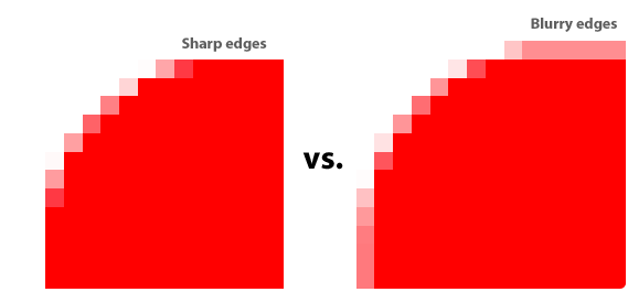
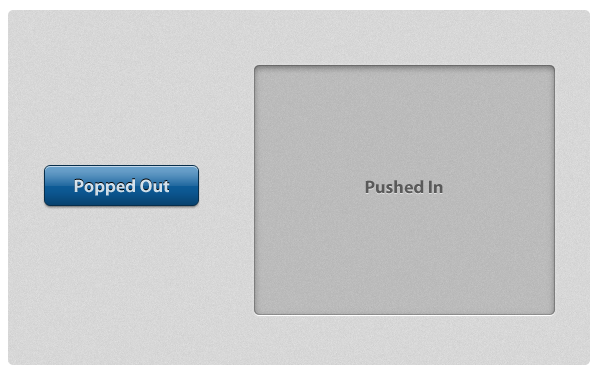
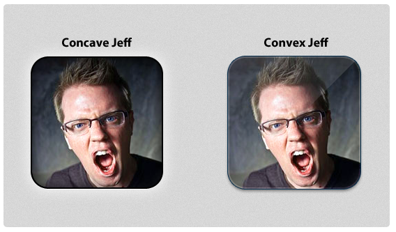
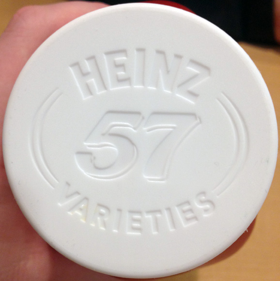
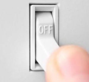
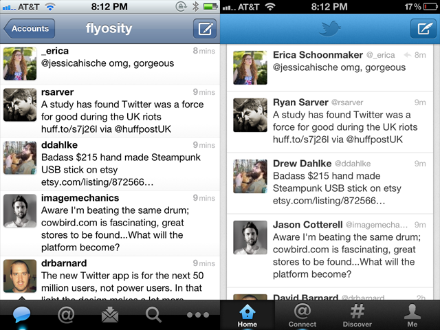
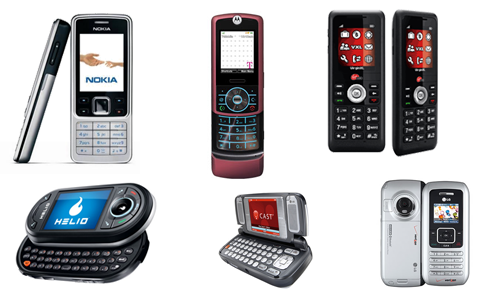
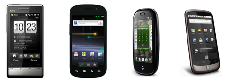
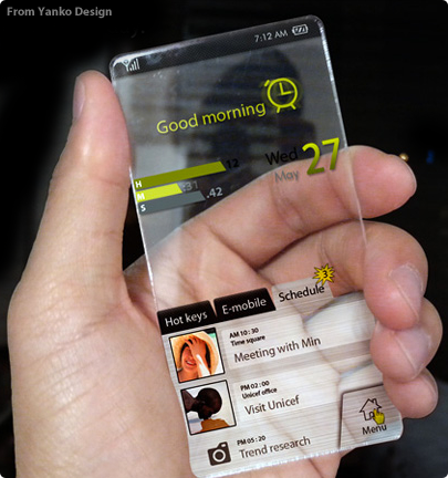


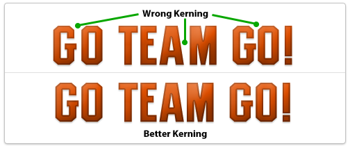
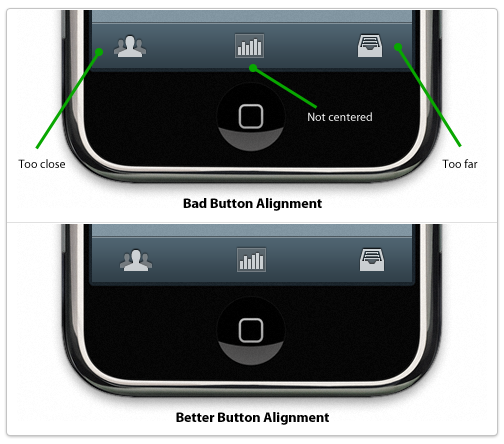
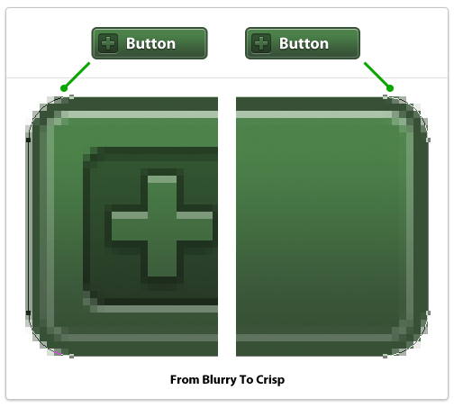
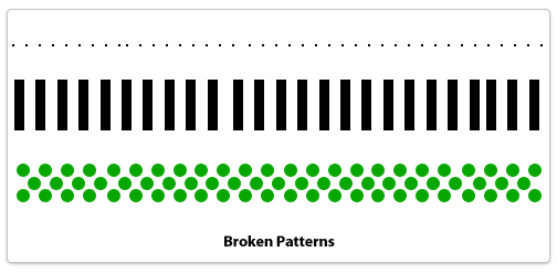
 I never opened Interface Builder before I started designing Beak's (underwhelming) Preferences window. In short, I cut my teeth on Beak and it shows. It was never really polished, nor did it represent any kind of best practices for Mac development; the main interface component is a
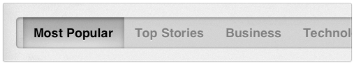
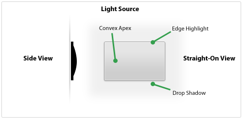
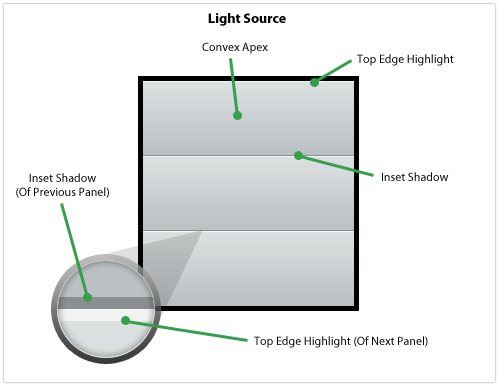
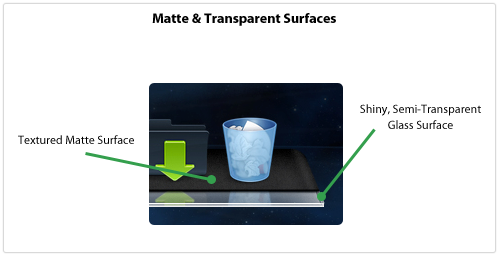
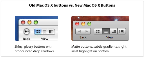
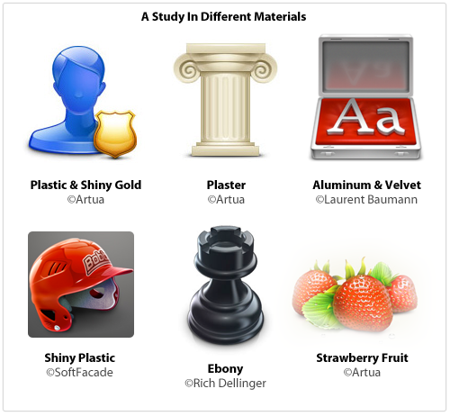
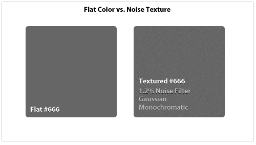
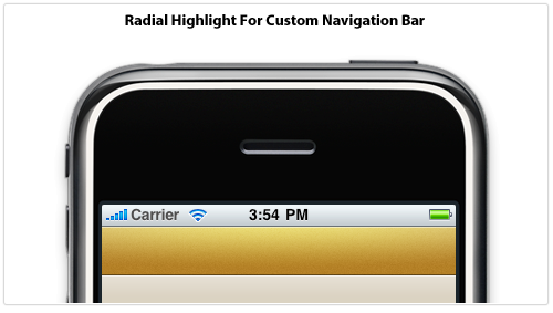
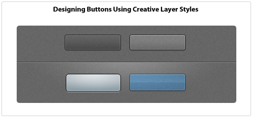
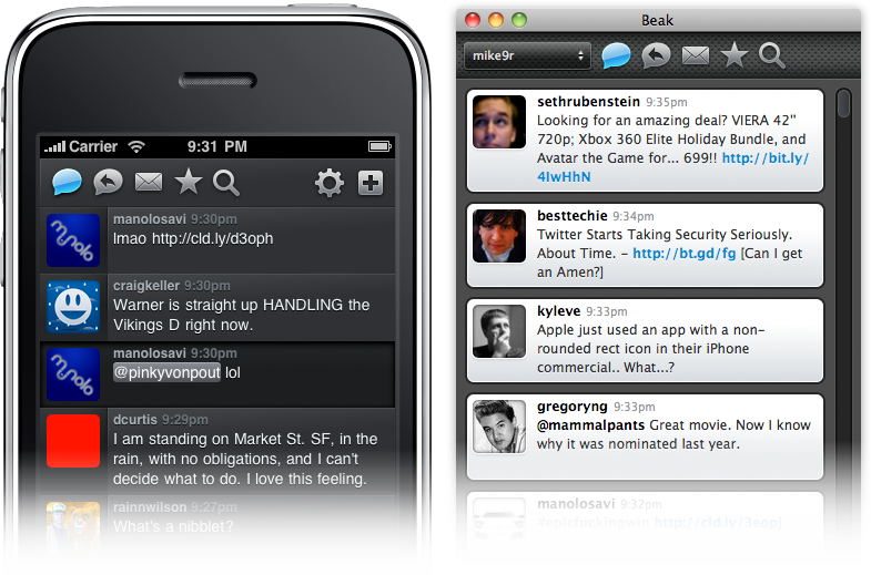
 The application design patterns and examples shown above work with nearly-default navigational models that Apple has provided. They may customize the interface elements but the general interaction concepts are stock UIKit. There's nothing wrong with following standard Apple conventions for navigating around your app but what if you need to go beyond? What if you have a totally custom paradigm? The following are examples of applications that have defined their own interface paradigms.
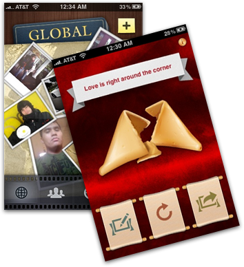 Collage is a social picture-sharing app that redefines what a Tab Bar Controller paradigm can end up as. Their totally custom film strip interface and sliding, animating panels is some of the finest UI work you'll find in the App Store.


 Now that I've got that out of the way, let's take a crack at doing our own version of the brilliant
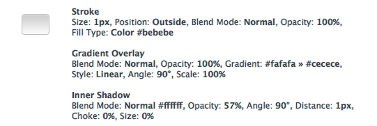
